Designing a brand logo is a task that requires meticulous attention to detail and in-depth knowledge about that specific brand. That is one of the reasons why the process of designing logos can vary quite a bit in complexity. The higher the complexity, the more it costs, which some companies might be reluctant to pay.
Getting the right logo design is paramount to the success of a company's branding. The right logo design will not only portray your company's aesthetic, but it will also be designed to embody the message you want your customers to know, both current and potential. And if you know how to copyright a logo for your business, you can ensure that your design remains distinct, unique, and easy to remember.
Having a visually appealing and recognizable logo is an excellent source for a business to plan its branding around. Fifty percent of customers would prefer to patronize a brand whose logo is familiar to them and appeals to them visually, according to StudyFinds.
What defines a great logo?
If we look at companies with iconic logos such as Apple, we will find that they all have something in common – their logos are simple and easily memorable.
Taking a note from their success, we can surmise that a simple logo would be easy for people to remember and thus instantly recognizable at a glance. And looking at the history of such iconic logos, we can see how they went from portraying complicated designs to simpler ones over time.
A lot of effort is required to design such a logo and a little luck too. A logo designed this way will effectively embody your brand identity and be a great tool to lure people to your brand.
A large part of that effort is spent doing research. Researching the market, the company, and the prospective customers will help you develop a brief for the perfect logo for that brand.
This research will also allow you to define the person who you want to target with that logo. Knowing who the logo is for will help you tweak it into a useful branding tool for the brand.

How to design such a logo?
The goal for any business looking to have a logo designed would be to have a logo that speaks what the company stands for so that the viewers easily understand. Before starting the design process, a designer needs to know:
- the type of logo the company desires,
- the color scheme
- the required fonts
and many other pieces of information to design the perfect logo for that company.
Listed below are a few tips which will help take your logo design to a new height and make it the perfect voice for your brand identity.
Choose the type of logo that best for your brand
Currently, there are three categories of logo design
- Image-based logos
- Text-based logos
- Combination logos
The various kinds of logo design available can be broken into one of these three categories, and finding out the style that works best with your brand's aesthetic is vital. To choose the best design, you need to consider
- Your brand's niche
- The target demographic
- Any design preferences or requirements
Combined with your company's name, these factors will be a great start to finding out what type of logo will work best for you.
Let's look at what each category of logos offers.
Image-based logos
These logos, relying on a symbol or an image, are a popular style of logo. Highly memorable and instantly recognizable, they are a great way to portray a company's brand.
For the brands that use this type of logo, the image or symbol used is something that is related either to the company's name or a product/service they offer.
Twitter uses the symbol of a blue songbird, which relates to the name of the company itself and the "tweets" of a songbird. Kentucky Fried Chicken identifies with the iconic image of Colonel Sanders, which people instantly recognize. Similarly, Apple too uses the image of its namesake, the apple fruit.
This type of logo is useful for brands committed to offering the same product or service throughout their lifespan or uphold the same values they do now. Another point to note is that it will be a little while before people start associating that symbol or logo with your company, so it will take some time and effort to build your brand for recognition, as was the case for the companies mentioned above.

Text-based logos
Taking a complete 180-degree turn from image-based logos, these logos entirely forgo the use of images and instead rely on stylized text and attractive colors to make their logos look good.
Now, businesses with shorter names can use their full names for the logo or use an acronym like the companies with longer names.
FedEx, UPS, CNN, IBM, and many other businesses use this type of typography or text-based logo to significant effect. This allows their audience to automatically and quickly associate their logo with their brand, as the logo literally had the company name incorporated in it.
For this type of logo, the choice of fonts and the colors used play a significant role in their attractiveness and how memorable they become.
This type of logo is excellent when the goal is to draw the viewer's attention to it and instantly portray the business's name. Coca-Cola has been using this type of logo for years now. The result is that anyone using that combination of colors and the typography instantly brings to mind the Coca-Cola company.

Combination logos
If you think that your logo could benefit from both text and image, then the combination type of logo is the one for you.
These types of logos utilize the advantages offered by both text-based logos and image-based logos and allow you to design a versatile logo for use in a number of scenarios. It also allows you to play with several visual styles and options, which gives a better range of creative ideas to choose from when designing your logo to embody your brand's message.
An important thing to note is that when using this type of logo, it is imperative that the images and the text are compatible. If your logo's text and imagery clash together, that would result in a logo that repels instead of attracting the viewer.
Brands such as Burger King, Doritos, and Nestle use combination logos to portray their company aesthetic and message and have been quite successful.

The right colors can be your friend
Just like the right logo design that can help portray your aesthetic to the viewer, the right colors complimenting that design can go a long way towards making your logo successful.
The colors you use within your logo can be used to make your brand's story more relatable, as they have a way of influencing their viewers' minds. Colors can be used to portray the emotion behind the brand's message and can also influence the audience into thinking a specific way.
Each color elicits its own emotion and can be used accordingly.
- The different shades of red can be used to embody different emotions. Red is the color of gentle love, of fiery passion. It is also the color that exudes comforting warmth and revitalizing energy.
- Yellow is the color of friendship and the happy, youthful energy that comes with it.
- Green is nature, prosperity, and health. It is the color of money and the calm that comes with it.
- Blue is respectable, sophisticated, and wise. It is loyalty and spirituality combined to portray something you can trust.
- Black is modern, practical, sleek, and luxurious. It is the color of power and strength, something that at the peak of achievement.
- White is purity, health, and clarity. It is a blank slate, free of clutter and unmarred by anything terrible.

Colors have a way of making our minds associate the imagery with a specific emotion. Be mindful of the color you use, as that is the association your final logo will make.
While you can use a single color for your logo or a combination of them to efficiently portray your brand's specific aesthetic, an important thing to remember is to make sure not to use too many. A combination of two or three colors is all you need to enhance your logo efficiently, but any more than that, and you will end up confusing your viewer.
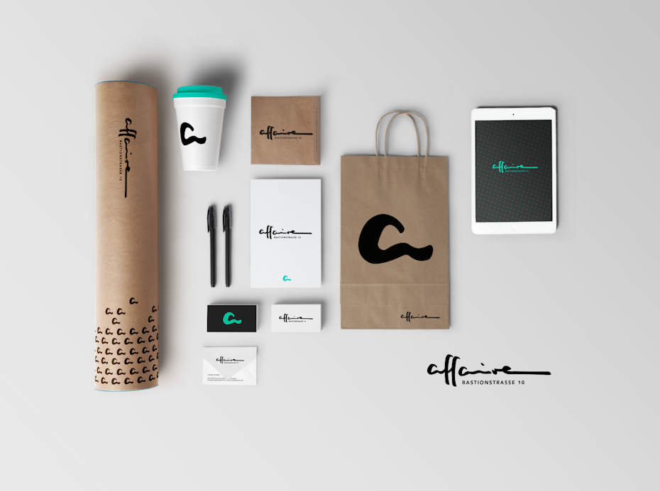
Try out your logo everywhere
Your logo is the one piece of your branding strategy that will appear on everything. Wherever your business is featured, your logo will be there representing your brand.
Websites, social media handles, business cards, flyers and posters, and many other products would require the use of your logo. Therefore, the message it portrays should be evident in every format, and most importantly, should be consistent everywhere.
Checking for consistency in your logo's portrayal of your brand's message is vital. Consistency in message portrayal can result in even the best branding strategies failing.
Reluctant to print it in real-time? Use soft wares that can help you create mockups of how the logo might look printed on various merchandise.

Conclusion
Finding the right combination of design, colors, and font for your logo takes time and effort. But once the design is finalized, it will become a solid base for developing your branding strategy
A logo is the sum of your brand's aesthetic, its message, and the product/service they offer. A well-designed logo does not look good for the sake of looking good. It looks good because it does the job it was designed to do – portray your brand message as effectively as possible.


