4 Colors to Make Your Logo Pop and Wow Your Audience
Using the right colors can be a great way to make your logo pop and wow your audience. Check out 4 great color ideas here!
So, you're starting a business and trying to get it off the ground? Congrats on taking the leap and being you're own boss!
Small businesses make up 99.9% of all businesses in the United States. But did you know that only half of all startups survive past the five-year mark?
If you look at the glass half-empty, that number is scary. But, if you look at the glass half-full, that means a lot of people are doing something right!
A lot of businesses make it or break it based on several factors. Marketing your brand is a major influencer and it all starts with making your logo pop.
We're going to show you four colors that will make your brand stand out and get customers to stand in line.
Be Fab, Not a Fail
When it comes to logo design, some are fab and some are fails. Being creative and thinking outside of the box is always encouraged but make sure you know what your logo means.
It sounds simple, but simple is good, right? So is being clear and concise.
Don't pick fonts that are too difficult to read and whatever you do, don't use more than two when creating your logo or business card.
Clean lines, clever text, and logo colors that stand out - what more do you need?
4 Colors That Will Make Your Logo Pop
Sometimes choosing the best logo colors for your brand is more important than the logo art itself.
Think about it. Do you know what the Starbucks logo actually is? Or do you know you're at the java juggernaut because of the green and white logo?
Chances are, it's the green and white that call to you, not the topless double-tailed mermaid (Yup, that's what it is!).
As you already know, red means passion but it also symbolizes danger. Black is sleek but can come across as unimaginative.
About 60% of all Fortune 500 brands use blue in their logos. Blue represents confidence but with that many brands using it, it can be difficult to stand out.
Let's go over four colors that you may not have considered.
1. Orange
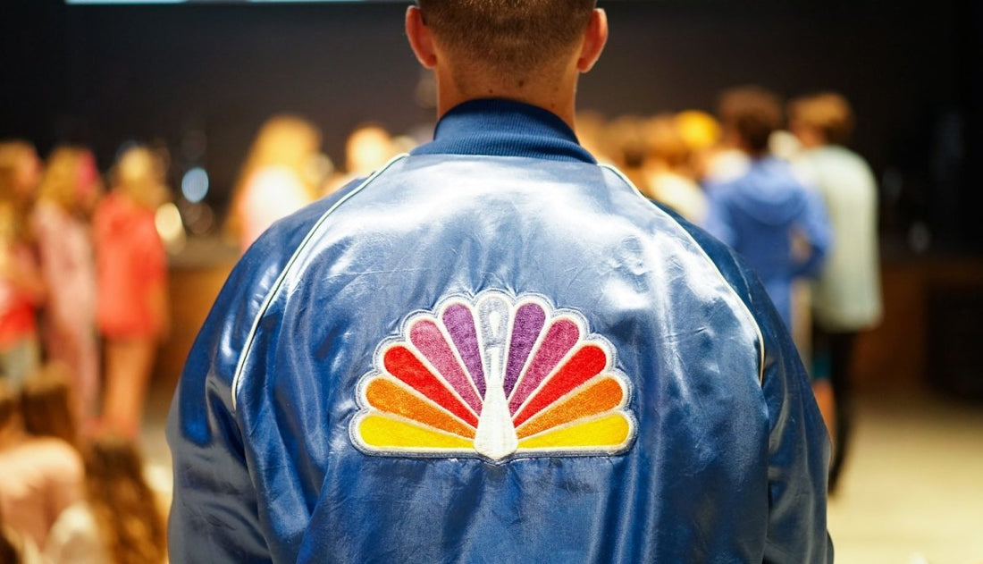
Orange means youthful, energy, and adventurous. If your brand is trying to attract creative, out-of-the-box customers, this may be a good choice for you.
2. Yellow
Yellow is the color of happiness. It gives off a cheerful yet creative vibe that's great for playful brands. Some shades of yellow can be a bit drab, so be wise when choosing your yellow!
3. Purple
If you're all about luxury, purples are your palette. Depending on how light or dark you go, purple can be on the feminine side (think lavender) while darker shades ooze opulence.
4. Green
Green is a universal color used in a wide array of industries. Finance companies like it for its representation of money. Health food brands choose it for its association with nature.
Like purples, green is all about the shade. Lighter and brighter shades lean toward vitality while darker ones exude prestige.
Be Refreshing. Be Creative. Be You.
You should base your logo color on your brand and the message you're trying to get across. If that means a more traditional marketing color, so be it! It's all about how you want people to feel when they see your logo.
If you want to make your logo pop, you need to get the right team to design it. At Print Peppermint, we have the resources you need to get your brand on everybody's mind.
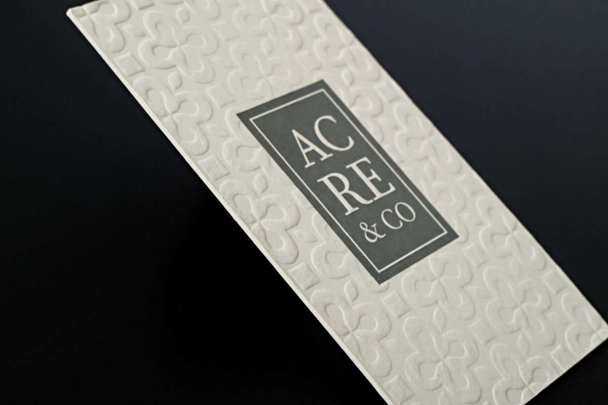
It starts with the design and ends when your high-end business card is in the right client's hand.
Check out some of our products or contact us for a custom quote. We have real people who are experts in design and printing waiting to hear from you!


