Material design is a popular design style used in almost every website, blog, app, and design created after 2015. This style was introduced for the first time by Google in their presentation Google I/O 2014 - Keynote that has almost 2 billion views.
These days material design is used not only for digital projects, but also for printed materials. In this article we are going to share with you five surefire ways to apply material design principles for your printed design templates.
What is Material Design?
Material Design is a design language that was developed and announced by Google in 2014. Its main aim was to unite the user experience across Google products and different platforms.
Initially, Material Design was called Quantum Paper. Its developers used some classic design principles, on the one hand, and innovation in technology and science, on the other hand. They tried to make the right combination to present the best product designs. In general, materials of the real world serve as the base for Material Design.
According to material design concepts, developers and designers can use depth, shadows and lighting, to make designs in such a way that they looks like how we see in the real world. Being based on paper and ink, and print-based design, Material Design uses a particular set of color combinations to present, well, designs.
We have prepared for you five surefire ways of how you can apply material design principles into your print design templates.
But, first of all, we want to name the critical principles of Material Design:
- The design should be bold, graphic, and intentional
- Use shadows effectively
- Don’t be afraid to use bold colors
1. Use of Bold Colors
One of the critical principles of material design is being bold, graphic, and intentional.
It means that a designer should not use a significant number of design tools and stylistic preferences as well as should follow some restrictions. That is why they should seek to create meaningful visual designs and emphasize on the right focus.
One of the ways for doing it is the use of bold and even loud colors. In this regard, material design color schemes are usually much more colorful and brighter than those which are used for other digital design types. Like in this resume template for instance, you see the blue color stands out and directs the attention of the viewer to the important parts of the document without the use of intricate design effects.

Resume template by Martynas Palaima
And in this case, bold colors are beneficial and worth the use.
Moreover, bold colors serve different functions in material designs too, like making things fun or creating a delightful outlook for its users. If you own a bakery for instance where bold colors play an important role in creating catchy marketing material designs, then you’d best use them. Some examples of bold colors are included here:

Image: Bakery Logo Colors
Bold colors can be used not only for bakery logo templates, but for resumes, business cards, flyers, brochures, and other printed design templates as well.
2. Use Shadows for Hierarchy of Elements
Some of the core tools used in material design include:
- shadows (as realistic as possible);
- lighting;
- surface;
- and edges.
You should always add depth to your design using the minimum and at the same time, effective application of these tools.

Use of shadows by Mat Voyce
Shadows, for example, are essential as they serve to express the hierarchy of elements and give depth to a design template. When you create a template design, say, for your poster design then creating shadows realistically helps emphasize the visual hierarchy of the layout, message and overall graphic therein.
Since graphical effects are discouraged in material design, you should use simple shadows to highlight your elements on printed materials. This way you can create focal points on certain items, such as icons or typography.
In the end, the designer should examine whether the whole design structure reflects the concept of authentic materials, or not. Would the same shadows work with printed materials like a T-shirt or business card? Would it work with a menu card design?
3. Remember White Space
Utilization of white space is essential in any kind of material design due to its ability to improve both layout and typography to a great extent.
For example, it is practical and useful to attract the attention of users to a particular object or create focus by giving plenty of whitespace around the graphic or text.

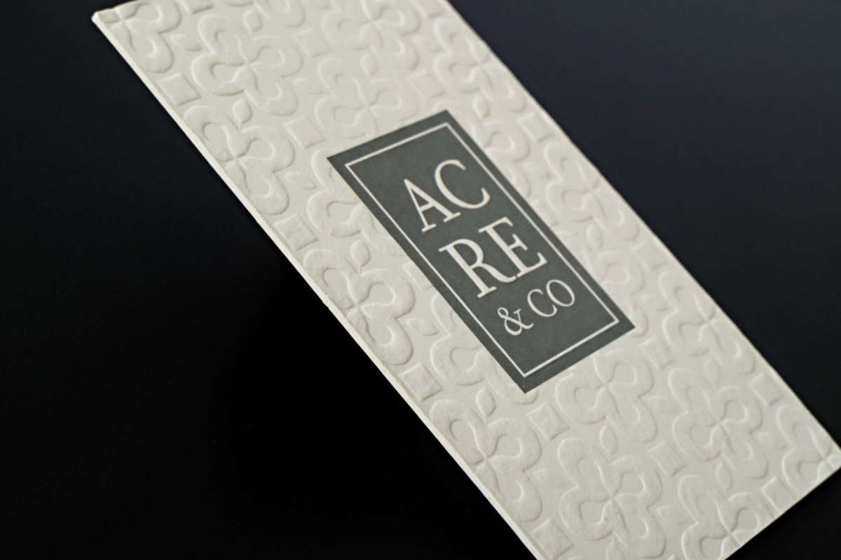
White space on business cards by Andrea Mata
As you can see on the business card template here, it features a lot of white space and it makes the words in the center even more meaningful. Don’t be afraid to use negative space for printed products, just like in digital design, to separate important elements from each other.
4. Simple Elements with No Effects
When designing for online visuals, it is easy to add icons and buttons to emphasize on calls to action. However, when designing for printed design templates, user interface is emphasized by the adoption of shapes and focal points.
As for shapes, they are also rather simple. Some examples are circles, rectangles, and squares which either have a curvature or angular edges, ideal for catching the attention of the viewer.
The main thing here is to make all design elements as simple as possible.

Bold colors with no effects by Oh Babushka
In the above design for example, the designer uses only color splashes and text layout for these flyers and they turn out to be very creative and outstanding even without extensive buttons or icons.
It is important to point out here that the use of effects in template designs is highly discouraged. It is a unique feature of material design because it works without any embellishments, including embossing, gradients, drop shadows, and other features.
Using no offects is great because it adds depth and makes all elements and boxes look more vibrant on printed products. Moreover, everything becomes distinct: background and foreground images, text, icons, and even image frames.
5. Focus on Typography
Due to the simplicity of material design, typography plays a big role in determining the design aesthetics. The typeface should fit into the whole design scheme.
For instance, if you have a simple layout for a brochure, your font should not be too pretentious. It is better to use bold typeface to make your content easy-to-read and get a consistent tone in both visual and at textual level.

Focus on typography resume by Diogo Ferreira
In this resume template for instance, the designer uses a few different fonts in red and blue colors. They catch the attention of the viewers immediately. Besides, you quickly understand that bold type on the top is a headline.
When it comes to printed products, serif fonts work the best because people tend to see such kind of fonts in books and newspapers. However, you can use sans serif fonts also, since they are simple and minimalistic that perfectly fit the concepts of material design.
Conclusion
You should realize that it is impossible to create a great product without good design. Those who rely on outside designers and does not control design process can lose a lot more than just a good layout. But when you follow the principles of material design, you can be sure of its quality and effectiveness.
Author Bio
A graphic designer by profession, Carol Alison also works as a freelancer on the side by writing about graphic design, branding and visual designs. Her favorite tools are Illustrator and Photoshop but she’s dabbled with Inkscape and GIMP as well.


