Some of the most memorable business cards ever made have gone for the vertical rectangular shape for the layout.
Multiple designers these days strongly believe that a successful business card ought to have a logo that is effective, simple and distinctive.
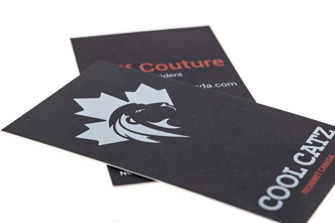
The business card shown above very smartly incorporates both the vertical layout feature and the effective-distinction logo feature.
What struck me most about this card is the orientation of the logo itself. Mostly, vertical cards are less narrow than horizontal ones. That means less space to spread a logo image.
But this business card places the logo image at its top such that it is not too small nor too wide, but just the right size to ensure visibility.
Not to mention the fact that the brand logo is a true depiction of its name.
The red hue of the typography, set against a dark background brings attention just as text on a business card is supposed to. However, it does not flash on the eyes but is just the perfect level of brightness.
The color of the brand name and that of the logo is made different from the rest of the text on the card, which makes the brand name and logo stand out all the more, what with its unique typography as well as color.


