
Source:https://artisanhd.com/blog/professional-printing/uploading-online-digital-art/
One of the biggest steps in a digital artist’s career is moving your art from the screen to the homes of the fans who love you. Allowing your digitally created art to flourish as high-quality prints is a fantastic way to not only cut down on the burden of new art creation, but allow fans to celebrate your creations and enjoy your hard work. It’s not quite as simple as tossing the printer a flash drive with the piece on it, however, and you need to make sure you’re ready for the transition back to physical media. Here’s our top tips on creating digital art that shines, no matter what.
Understanding Large-Format Challenges

Source: https://paulshipperstudio.com/shop/star-trek-genes-dream-variant
For many artists, the first challenge will arrive in deciding how you want to market your printed art. Large-format prints are a compelling way to display art, allowing every detail of your carefully crafted image to shine for the reader. Paul Shipper, for example, has made a lucrative career out of lovingly recreating his iconic movie posters for a wider audience to enjoy. Yet there’s a world of difference between pixels on a screen with limited size, and the wide-open canvas provided in oversized print jobs.
To adequately translate your image from something built pixel by pixel to a large format, clarity becomes a key focus. Most original art will blur at size, simply because of how small a pixel really is in comparison to inches or even centimeters on the page. Pixels are, quite literally, the very smallest element present in any digital image, best thought of as a tiny ‘grid’ of color information that builds your image in the eye of the beholder. Great for screens, not so great for acres of paper on the wall! Try it for yourself. Fire up any beautiful art piece. Now zoom in, and in, and in again. Do you notice how the image begins to become blocky and difficult to interpret as you mine the pixel data and stretch them beyond how they were supposed to appear on the screen? That’s the phenomenon known as pixelization.
Every image contains a set number of pixels. There’s no way to further subdivide them, or create more to fill in the blanks, without losing clarity and detail.
Considering DPI/PPI

Source: https://artsydee.com/digital-art-canvas-size/
Luckily, there’s already an in-built way to address this issue. You’ve likely heard of dots per inch, or DPI, a holdover term from the days of older printers. Today, this is more accurately called PPI, or pixels per inch, as we’ve become a firmly digital generation, but the two terms are somewhat interchangeable. It indicates how many pixels will appear per square inch of paper used.
This gives an effect called ‘resolution’, which is how the data in your image is interpreted to ensure it remains clear and precise. Ensuring your image is at the right resolution for a crisp print is the make-or-break for how professional your work will look when printed, so this needs to be a key consideration for you.
Most digital art is created by default at 72 ppi. That’s a fine number for screen-based activities, but hopelessly inadequate for most truly professional prints, where the larger canvas size needs a lot more detail per square inch to look https://getzonedup.com/ right to the eye. That's why most professional prints will need 300 ppi at a minimum. Here’s a handy chart showing the recommended art size for certain print sizes when the file is at 300 ppi.
It’s highly recommended that you plan with the correct ppi from the start, before you create the image. While a certain amount of resizing can be done to a print, this fast becomes a mess as the pixel data simply isn’t there for the best possible quality.
Raster or Vector?

Source: https://vector-conversions.com/vectorizing/raster_vs_vector.html
As a digital artist, you might already be familiar with these two terms, but let’s recap.
Vector images, as the name suggests, use mathematical formulas to shape each line on your drawing. The relationship between two points is always determined by formulas, so the images can be sized up or down to any size- including full building wraps- without any loss of clarity. It’s an incredibly useful format in graphic design, and commonly used on logos. That way, they can be used for a wealth of applications without needing recreation or rework.
However, photographs and stock photos remain the gold standard for how we create more artistic formats. Vectors simply don’t have the depth and vivacity to provide the rich canvas needed for more lifelike projects. These are what’s known as raster images. The data between points isn’t reinterpreted mathematically at each stage, it’s simply set in stone at the time the image is created. It’s raster images, particularly, that need to think ahead and build the image for the best resolution for the size it will be used in, as there’s no recalculation involved later on, and you will notice the pixel blur we mentioned if you try to adjust size too far out of the original bounds.
Using the Right Software

Source: https://fstoppers.com/photoshop/5-best-new-features-adobe-photoshop-2022-584777
While vector can be sized up and down at whim, you need to plan better with raster images. With the right resolution, you can print any raster image at any size. If the resolution isn’t up to the job, however, the results will be blurred and useless. So not only does this take pre-planning, knowing where and how your digital art will be used, it’s critical to make sure you’re using a high-quality art program that will help you capture the right ppi and the right resolution for the image’s final use. You may even want to make sure it will allow you to create presets for formats you commonly use, helping you to create your art quicker.
If you’re hoping to use an arrangement with one ‘original’ piece and several prints, try to envision these as similar sizes and dimensions, and look to make your ‘prints’ smaller than the original. That way, there’s no complicated attempts at resizing and changing the image, leading to clarity loss.
Understanding Color Prints

Source: https://www.quora.com/What-is-the-difference-between-RGB-and-CMYK
Unfortunately, getting great digital prints doesn’t stop with resolution! Color is a key impact on how your art is experienced, so you want a print that’s as true-to-color as it is possible to be. Obviously, this is a highly subjective viewer experience, but as the artist, you want to make sure the careful choices and nuances you created translate realistically to the page.
Both screens and printers use things called a color profile. This determines how the object interprets the digitally saved color data. Historically RGB (red-green-blue) and CYMK (cyan-yellow-magenta-key, a term for black) are the two most common color profiles. It’s perfectly possible to have created individual and custom color profiles, too.
RGB is most used by screens, and some desktop printers. It’s a great way to interpret color on backlit devices. CYMK, as it allows a better configuration of richer tones on ink printers for viewing with the human eye, is the default for the print industry. It’s one of the best ways to handle color, in fact. Historically, the inks would be mixed ‘on the spot’ during the print process, allowing for a wide range of versatile and vibrant color. Often, the art will be printed in ‘plates’, or layers, that apply all the color data for a specific color to the surface before overlapping with another.
Most modern image creation programs will allow you to select a preset color profile. It’s important to again think forward to the print, and choose a color profile that will allow your art to shine on paper as well as it does on the screen. Again, this is very difficult to change at a later point without a lot of time spent reworking the piece, so it’s better to plan ahead.
Other Pinter Facts to Know

Source: https://trillioncreative.com/differences-between-bleed-trim-safe-area-ads/
It’s also important to ask if your printer of choice needs a bleed area added to the art. It’s used solely to make sure that the image covers every inch of the available space. Historically used in advertising, too, the final print could be trimmed down, removing the bleed to focus on only the intended visible area. Otherwise, there was a risk of white borders appearing on the printed piece where none were intended.
Today, there’s many different paper and canvas types, and not all of them may need a bleed area. Make sure to check this with the print shop you are using, however. Otherwise, you may accidentally lose key areas of the design. It’s especially important when printing triptych art, where you want the continuity to flow through the piece and don’t want jarring extra infill lines or missing data. Most standard bleed areas are about 3mm.
It’s also important, if sending the file digitally, to make sure that all assets are embedded in the image or document. This does affect advertising, marketing, and copy more than art for arts’ sake, but it’s worth considering if you use text in your art. If it is present in a separate layer, rather than already rasterized into the image, it’s possible for the printer to not have access to the font style- and your font to get changed to a default. Work with completely rasterized final images, or make sure all such data is embedded in the file to avoid critical changes to the art.
There’s also a facet known as dieline that might apply for 3D art pieces. It’s the art of translating a 3D image to a flat space- think of it like printing the label for a box. It’s important that all elements of the flattened art fall within the dieline, if this applies to your piece of work.
The file format you present will depend on many factors, too, and is best discussed with the printer you want to use themselves. Many places will prefer PDF or TIFF files for art, as they provide the best quality with minimum loss, but JPGS and other formats can be acceptable too.
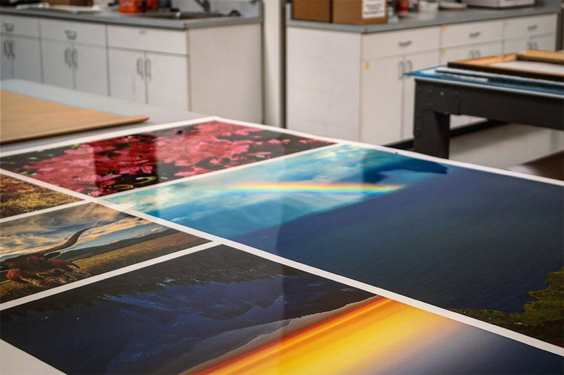
Choosing the Best Print Option

Source: https://printmeposter.com/blog/the-things-you-need-to-know-about-canvas-prints/
Lastly, you will want to consider the medium you’re printing your art onto. Most artists will choose between:
- Canvas: Rough and textured, it’s used for traditional wall art. It’s robust, but may need color correction to compensate for a less reflective, more textured surface.
- High Gloss Coat: High Gloss paper stands beautifully by itself, but can be very reflective, making it non-ideal for framing
- Semi-Gloss: Striking a pleasant visual balance, semi-gloss can be framed or enjoyed as-is
- Matte: Matte paper works wonderfully for framing, but can have an impact on how colors and vibrancy communicate themselves. It is ideal for monochrome prints
As you can see, each of these formats has their own pros and cons, and it will be a very individual choice. You can always communicate with your intended printer to leverage their expertise in assistance. They will often have the best possible knowledge not only of their printer system, but also how color, shade, and nuance translate from the on-screen art to the final product. Bear in mind that canvas prints will need to be boxed and framed, so there must always be allowance in the print job for this to occur.
Printing your digital art isn’t as simple as clicking a button on the PC, but it’s a rich and rewarding way to celebrate your artistic endeavor and make some money from fans who want your work, too. Ensuring that the piece translates between both worlds is the key to a fantastic print experience. With a little planning and forethought, you can make sure your digital art looks as great in print as it did on the PC screen, bringing it to a whole new audience.


