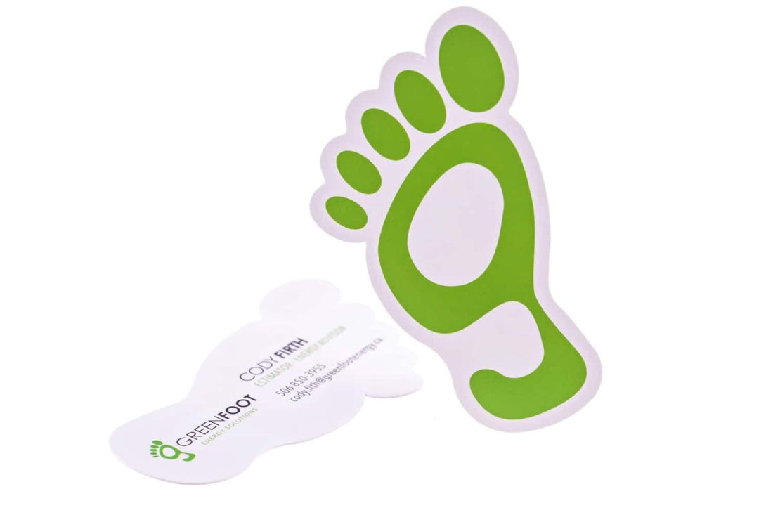
The Green Footprint
Every element in your business card ― the typeface, empty space, spacing, images, and colors ― should accentuate your brand personality. This card shaped like a detailed foot is consistent with the company’s name “green foot”. This gives it a coherent uniqueness and a solid foundation to lay the brickwork for the company’s message.
Nowadays, bland and glib business cards have little to no chance of converting. You have to raise your business card among the common herd. The apt geometrical uniqueness of this card does just that. But don’t just go for any shape without deliberating; choose one that is in line with your brand’s message and personality.
I love how the finish of this die-cut business card is so exquisite. It makes it seem professional, slick and clean.
The designer has played everything else safe in this business card ― bold, legible text, a lot of white space, and a solid call-to-action, among other things. It shows that he knows how to keep a card functional and make it speak to a broader audience.
If you’re a business looking for a design inspiration that ticks all the boxes, this is exactly what you’re looking for. It’s well-balanced and has enough creative salt in it to stand out on its own.


