How to Choose the Best Fonts for Your Business Card
Are you designing a business card, but aren’t sure which fonts to choose? Read on to learn how to choose the best fonts for your business card.
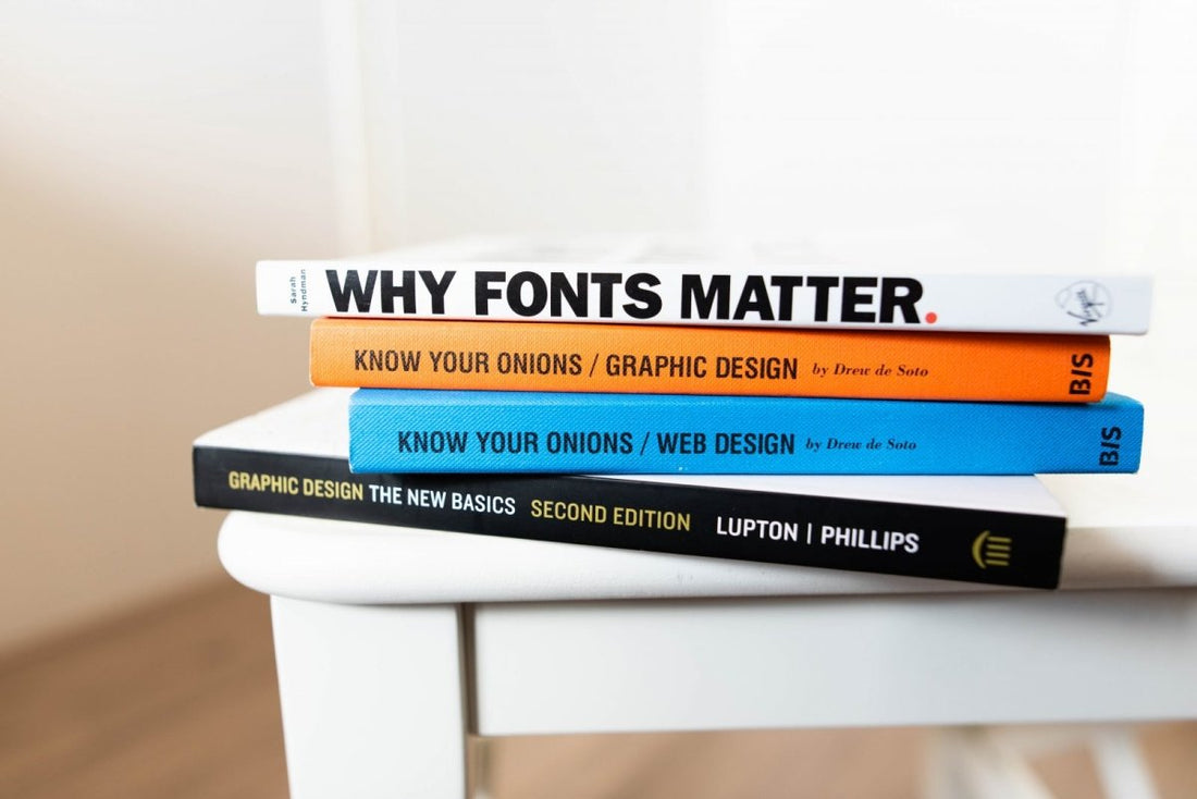
Believe it or not, business cards still matter in today’s digital age.
It’s one of the most important tools at your disposal. That said, it’s only effective if you make sure its design and content match your company’s identity.
You can start by choosing the best fonts for your business card. It affects how your intended audience sees your company and brand as a whole. This is especially important when you need to learn how to make business cards in Adobe Illustrator.
Read on if you’re ready to learn some font design tips:
1. Showcase Your Brand’s Personality
When you’re trying to choose a font for your business card, it should reflect your personality. It should showcase your business and brand identity to its receivers. Remember, a lot of people and businesses use cards with their personal branding strategies.
A lot of newer designs don’t include traditional logo placements anymore. That means you need to ensure that your font feels like your business even at first glance. There are fonts out there that can match your personality-not all cards need Arial or other traditional fonts to look professional.
2. Try Traditional
If you want to point out your professionalism more, you might prefer using traditional fonts. There are some tried and tested fonts out there that can fit your business card design. Its main advantage over other fonts is their consistency when it comes to printing and reading even at small-sized cards.
Most of these traditional fonts have typefaces at 12, 10, or 8 points. Remember, traditional business cards come at 3.5″ by 2″. This can affect the ease of reading if you choose not to use tried and tested fonts to point out the right information.
That means classic fonts work best if you’re using the standard dimensions for your business cards. Check what your printer recommends since it often features fonts that work well with it. If you’re not sure what to use, try using Sanserif fonts like Open Sans and the like since they’re the safest.
3. Look for Different Weights
Are you going to buy a font for your business card design? If so, it’s most likely for you to keep the economic benefits it gives on top of your list. https://littlescholarsnyc.com/ The best way to make the most out of your money is to get one font that comes in different weights.
The main reason behind it is the fact that it gives a lot of design flexibility options. Having multiple weights can help you create a certain hierarchy in design. It also gives your business card design a lot of variety without resorting to other fonts.
4. Find Premium Freebies
If you design business cards, chances are you’re more partial to classy fonts. These often come from premium, paid fonts. While these are great, they aren’t immune from quality and character set issues.
What this means is that you need to find other nice free font options. There are lots of nice choices out there, but you need to do your research. You need to put the character set into intense scrutiny to determine whether it’s usable for your design.
Ask yourself if it has all the characters needed for the letters and symbols you’ll use. It’s important to ensure that it also has the numerals, punctuations, and glyphs to serve your purposes. Make sure to do this before you start designing your card.
In case they don’t have all the characters you need, don’t panic. You need to find a second font that has a similar-looking character set. You can use this to fill in the gaps or replace the deficient first choice if it has all the things you need.
5. Readability is the Key
Always remember that readability is your primary concern. Nothing else matters as much as this factor when you need a font for your business card. If your receivers can’t read your cards, it’s often a waste of time for them.
The best way to get a readable font is to make sure its typeface isn’t too condensed or thin. Make sure that it has a lot of even stroke widths. Pay a lot of attention to its leading and kerning while ensuring it has nice bowls.
The general rule is to ensure that the card is easy to read even when it’s an arm’s length away. Keep this in mind and it will help decide the best business card font for you.
6. Look for Interesting Details
Do you want to make a memorable statement for your business cards? You need to get a strong character set that comes with a lot of interesting details. Some of these details you need to look out for include:
- Nifty ligatures
- Long tails
- Elaborate drop caps
Another way to see these details is by focusing on a single letter. The best place to start is the letters in your name. This can help you pick a special characteristic that defines your fonts more.
Typefaces with interesting details in its entire character sets are your priority. As an alternative, you can use ones with sets that have glyphs or ligature choices that expand from the original. It’s especially important once you start using a business card template.
7. Match the Font with Your Website
This tip works best if you’re a business that has more online operations. If you’re part of the eCommerce retail industry that’s projected to earn around $2.8 trillion this year, you need to consider this tip seriously. You need to match your website fonts with your business card fonts.
This can help your customers identify your business much easier. It aids your efforts in establishing your brand and maintaining your consistency. It ensures that your physical and digital identity is one and the same.
Take note that often, you don’t need to pick the same exact font. Getting fonts with similar shapes and weight can give off the same vibe. Keep this in mind if you want to give a little variety between your website and business cards.
8. Consider Font Pairs
You can apply this to other design projects aside from your business cards. It’s an easy concept that lets you pick two fonts that look great together. Pair them up and make it as a standard go-to choice for establishing individuality.
As a general rule, you can mix and match fonts that have different styles. You can try pairing serif fonts with their sanserif counterparts. The main goal of this technique is to get two distinct fonts that make a clear contrast and make it interesting in a visual sense.
For their similarities, make sure that the fonts have similar heights and shapes. Most professional designers have an eye for detail that makes them know when font pairs work. Don’t hesitate to make a judgment call here and trust your instincts.
9. Serifs are Great Too
Always remember that sanserif fonts aren’t the only readable ones out there. There are a lot of nice serif fonts out there that give the same level of readability. Some might even set a better tone for the design of your business cards.
Make sure that your use of serif or san serif fonts depends on your business type. Pick an option that people find appropriate and pleasing for your brand’s industry niche. It helps in communicating your information in a clear, precise fashion.
10. Match it to Your Printing
Printing makes a big impact on your choice of business card fonts. You need to consider a lot of things like the type of paper you use. Depending on the finishes, you need to give the appropriate matching styles to ensure consistency.
Ask yourself whether the paper soaks up the ink when you choose fonts that require high color options. Check whether you want the lettering to have a glossier, flashier finish. Consider whether you’re adding a foil or embossing to give off a better texture.
Your choices affect how the fonts look on the actual physical card once it’s printed. You need to visualize how accurate the card design’s digital representation translates to its physical form. If you’re not sure, ask your printing service about it.
Get the Best Fonts Today!
When it comes to business cards, the safest route is to use modern font options. The main reason behind it is the fact that it’s more readable and simpler to look at. If you must pick novelty typefaces, you need to ensure that the main bulk of the text stays readable even at a single glance.
But don’t stop here. Knowing the kind of font is only the beginning. Why not try making a business card today?
Struggling to make business cards or uncertain about your design? Let us help you!
You can contact us today and request a quote. We know the best fonts to ensure that your card has maximum effectiveness.


