Hey, guys. Austin here.
Anyways, I know you guys are going through our website and thinking "Jeez theres a lot of info here!".
For that reason, I thought I'd make a couple of quick videos to illustrate some things a bit quicker and more thoroughly.
One popular product for us is, of course, plastic business cards, and there are some kind of special nuances to be aware of when ordering or when talking about plastic cards with our support team.

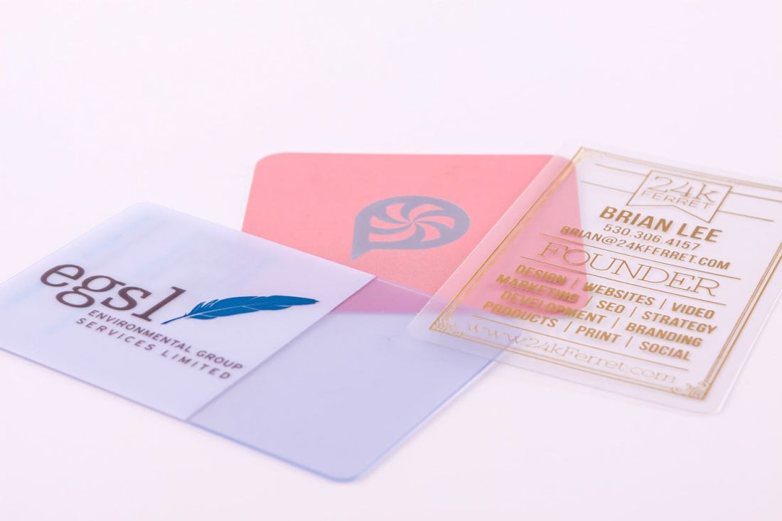
This is a 20-point frosted plastic business card. You can see the back of it. It has a bit of a more white kind of frosting to it. The frosting between our different plastic sheets is also slightly different.

This is also what I call a frosted card, but this is the 12-point frosted with a hot foil stamp.
I can bend this. It's very flimsy and light, but it is a nice card. It's not as substantial as the 20-point, which you can still bend but requires a bit more force.

And then the 30-point here, you can see is like a credit card. It's quite difficult to bend. You have to apply a lot of force.

This is a 30-point frosted plastic card. It does look colored because it's actually been printed with a full wash of this kind of pink, magenta kind of color to make it look like a colored plastic, which is interesting because often clients ask us:
"Do you offer colored plastic?"
Technically we don't, but we can do a full wash of color on a translucent plastic like this and make it look any color you want.
This, of course, also has a hot foil stamp in gold for this information here, and this information is printed, or actually stamped, using what's called a white backer.
We cannot print technically white ink on plastic because of the machinery that's used, so what we do is when a customer wants white design elements or white text, we use what's called a white backer, so it does have the effect of looking like white ink.
That is only available with the 30-point plastic products.

The 12-point, this particular product here, also has a hot foil stamp like this one, but this one can only be printed with a hot foil stamp the way that we're offering this 12-point product.
So, there actually is no ink printing. We have 8 foil colors for the 12 pt plastic cards - gold, silver, red, green, blue, pink, black and hologram for this particular product line. For the 30-point, we offer 15 standard foil colors.
Note: If you have to have white information in your design, you have to have a white backer, which is only available for our 30-point plastic products.
One other thing I want to show you about a white backer because this is pretty important, is the white backing process is kind of an imperfect process.
So, on the top here, you can see there's, like, this thin line of red poking through, and on the back here, you can also see it's not so easy to see.
You can see it here on the bottom. There's this white coming through. So, the application process of the white backer is not perfect, and that's why we don't recommend to do registered information with a white backer.
So, you know, for example, this is not a bad way to use a white backer, this fully solid area. This is also not a bad way to use a white backer, which is like just these design elements, these squiggles coming down.
This is our clear plastic which I typically don't recommend because it has a tendency, when you really look at it close, to scratch really easily.
This card actually looks really nice because the design is nice. I'm not saying we can't sell this stuff. We can, but a lot of times, the frosted is a better way to go because the information's just going to pop a bit better, but this is actually a pretty nice card.
I like that card. What I want to say about registration is that let's say, for example…let's say, for example, this is a 20-point frosted card, okay? Again, you can see it has kind of a white frosting to it, which makes the information pop and a bit more legible.
This is, of course, just black ink printed information, but let's say it was on a 30-point plastic or clear and you wanted to have a white backer behind it to make sure that the text was solid…because when you do shine light through this, it's not coming through very well on the web cam here, but you know, light is able to penetrate this information as you can see my thumb behind here.
So, let's say they wanted to make sure that this information here was perfectly solid and they said, "Okay, well, we want to put a white backer behind it," we would recommend against that because again, like I said, the registration, meaning how things line up with a white backer, is not perfect and will shift on each card. So, what would happen is there would actually be, like, a ghost behind the text in the same shape of the text, white, you know, that might be shifted to the left or or the right or to the top or bottom, and it actually ends up making the text much more difficult to read and unclear.
So, when using a white backer, you know, solid white areas like this and shapes, you know, design elements like this, that's a more appropriate and creative way to use a white backer as opposed to, "I just want to have, you know, my text be perfectly opaque and solid and so I want to put a white backer behind it."
That's not really always the best way to go unless the information is only white, then it would only be printed using the white backer and there wouldn't be any ink on top that's lining up. I hope that's making sense. That's why I wanted to do this video, is to just clear up some of the things because when you're reading the document, it's maybe not so obvious.
Here's a 30-point frosted plastic card. This does not have a white backer, but as you can see, the information is relatively legible and looks pretty good, you know, because they use the darker colors.
They chose darker colors. That's another thing that's in the plastic, kind of, nuances list is that typically darker colors are your friend because you can read them and everything. When you start using lighter colors, you know, it starts becoming more risky if you're going to be able to read it.
This one's also pretty legible, too, but still, lo and behold, we'll get customers who get it, get a card and they say, "Man, I really thought it was going to be perfectly solid." And as you can see, when I put this up to my hand, how those blues become, like, richer, but as I move away and light is able to pass through there, everything becomes less saturated, it becomes lighter, it becomes less opaque, all of these kind of terms.
This is something that's just a nature of a translucent medium with light being able to penetrate the information. It's going to have the effect of desaturating it. So one thing we tell people to do, just kind of a Band-aid… It's not a perfect solution, but we tell people that if they will increase… oversaturate their art, like something like, 30, 35%, sometimes even more, could be 40%, 50%, depends on the artwork, then that will compensate a little bit after the printing process for that information not to be so light.
Here's another 30-point card that actually has orange on it, and it looks okay. I think to me, to my eye, it is light. The information is somewhat light, but it's legible and seeable, and it looks good to me. It looks okay. So, each artwork is different, you know, and some of them turn out really well in plastic and some of them don't turn out as well, but there is a risk.
There's definitely a risk inherent to printing on plastic and especially translucent plastic as opposed to just printing on solid white paper. All right, I could make this video longer, but I think that's enough for now. So, thanks, guys, for listening and I will try to make some more of these to help clear some things up.
Thanks, guys. Bye-bye.


