Holographic foil on black — how to use it without cheapening the card
Applied badly, holographic reads like a scratch-off. Applied as a single well-scaled element on dead-flat black, it does something no other finish does: the card changes color as the room moves.
Pricing — holographic foil accent on black
| Quantity | Per card | Total |
|---|---|---|
| 250 cards | 1,16 US$ per card | 290 US$ |
| 500 cards | 0,78 US$ per card | 390 US$ |
| 1,000 cards | 0,60 US$ per card | 600 US$ |
Prices from our live price list. Free proof, checked by a person, before anything prints.
Holographic foil on black: how to use it without cheapening the card
Holographic foil earns its bad reputation from bad executions. Applied as background flood on a colorful sheet with too many effects, it reads like a scratch-off lottery ticket. Applied as a single carefully-scaled element — a monogram, a logo mark, one word — on a dead-flat black uncoated stock, it does something no other finish does: the card changes color as the room moves. That controlled dazzle is the whole point.
Two specs matter here: coverage area and pattern choice. Coverage under about 15% of the card face stays elegant; above that it starts to shout. Pattern-wise, rainbow prismatic is the loudest and the most immediately identifiable as "holographic"; silver holographic (a shift-only pattern that reads mostly silver until it moves) is our recommended default for anything client-facing. It gives you the effect without committing to the aesthetic.
Black uncoated stock is the frame that makes holographic foil work: it kills all reflected color from the surrounding card so the foil is the only thing throwing light. On coated black the whole card competes for shine. On light stocks the foil is invisible in most rooms. Deep black, matte, uncoated — that's the recipe. And keep the rest of the card design ruthlessly quiet; the foil is doing the whole conversation.
Common questions
- How much of the card should be holographic?
- Under about 15% of the card face keeps the effect elegant. Above that it starts to shout. A monogram, a logo mark, one word — that's where holographic works. Full-flood holographic on a business card almost never lands.
- Rainbow prismatic vs silver holographic?
- Rainbow is the loudest and most identifiably "holographic." Silver holographic reads mostly silver until it moves and then shifts through subtle pattern — our default recommendation for client-facing brands. You get the effect without committing to the aesthetic.
- Why does it have to be black stock?
- Black uncoated frames the foil by killing all reflected color from the surrounding card. On coated black the whole card competes for shine; on light stocks the foil disappears in most rooms. Deep matte black is the specification.
The next step
Not sure this is the exact spec you want?
Upload your logo and the Studio lays it out on real papers and finishes. It's a design exploration, not a proof: a person checks your final file before anything prints.
We've printed this
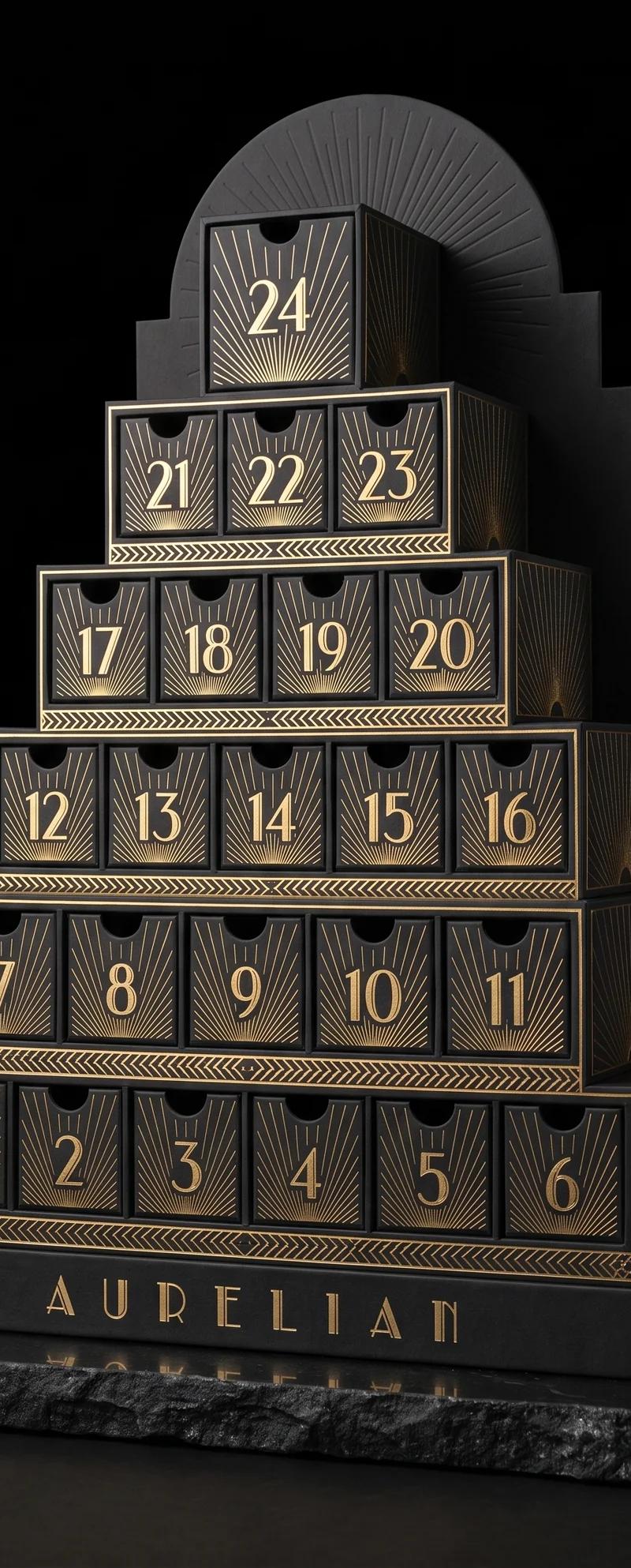
Peppermint design exploration
One brief, twelve design movements: the same 24 days, built the way each era would have built them, from papers and foils we actually stock.
Read the project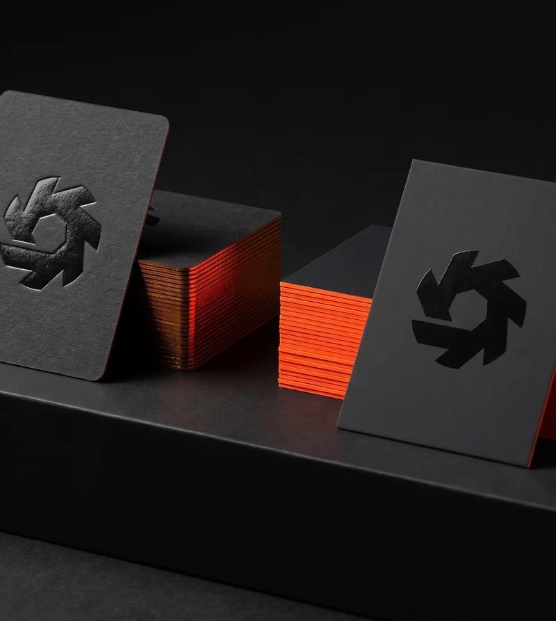
Soundtoys
The deboss wanted one paper. The neon edge wanted the other.
Read the project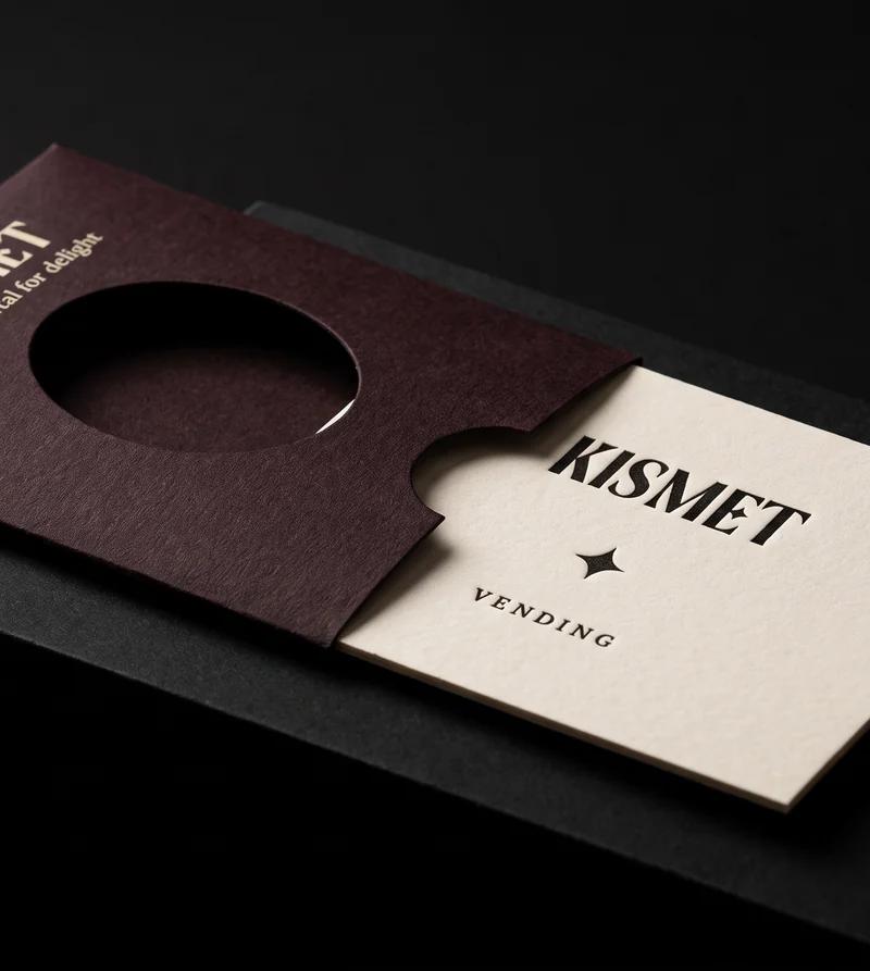
Kismet Vending
A card worth keeping, thin enough to fall out of a vending machine.
Read the projectEvery black build, priced: black business cards.