Case study · Business cards · Oditi Yoga
A mark you can read two ways
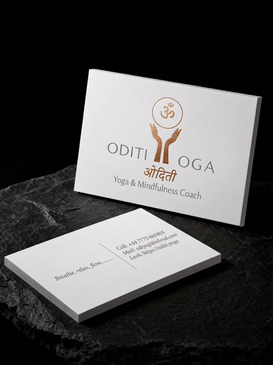
Oditi Yoga’s slim card uses clean white cotton stock with copper foil stamped hands, Om and Devanagari lettering, plus quiet grey type.
The idea
Oditi Yoga is a yoga and mindfulness coach based in the UK. The name appears twice on the card: in Latin capitals and in Devanagari script.
Two rules
- 01Foil only where the meaning is. Copper foil for the hands, the Om and the Devanagari only, with ODITI and OGA printed in soft grey on either side.
- 02A slim format. A slimmer card with generous margins, and a reverse that splits 'Breathe, relax, flow...' from the contact lines with one thin rule.
Why it works
The copper is only where the meaning is. Your eye goes first to the hands forming the Y, and then you read the name.
Start from these materials
Same paper, foil and finish, locked in — nothing of Oditi Yoga's artwork comes with it.
Questions
- Can non-Latin scripts like Devanagari be foil stamped?
- Yes. Check the thinnest strokes and the headline bar stay above the foil minimum, and have a native reader proof the artwork.
- What is a slim business card?
- A narrower-than-standard format, usually around 3.5 × 1.5 inches, that gives a clean, minimal layout more room to breathe.
- Should foil and ink be mixed on one card?
- Yes, when you want emphasis. Foil draws the eye first, so use it for the part you want seen first.