Marke spezifizieren · Peppermint-Konzept
Eine Vollfläche, eine Farbe und eine Feldnummer
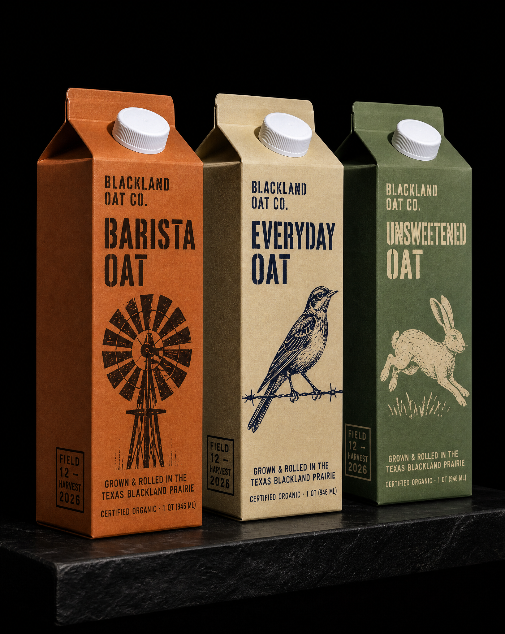
Eine Konzeptmarke für einen texanischen Haferdrink, dessen Hafer vor Ort angebaut und gewalzt wird. Handgeschnittene Linolschnitt-Motive aus der Prärie, Schablonenschrift im Stil alter Futtersäcke, eine Fondfarbe und eine Druckfarbe pro Karton sowie eine Feldnummer statt eines weiteren Bio-Siegels.
Die Idee
Niemand hat das beauftragt. Austin hat es als Spec-Marke entwickelt, um ein Argument zu belegen, das wir mit aufstrebenden Food-Kunden ständig führen: Präsenz im Regal entsteht durch Zurückhaltung und Präzision, nicht durch Vierfarbdruck und Hochglanz.
Six rules
- 01Borrow the architecture, not the brand. Kept the architecture, which is convention and belongs to nobody, and replaced everything inside it. The illustration system, the type and…
- 02Linocut, not line art. Hand-cut lino blocks of prairie subjects: an Aermotor windmill, a mockingbird on barbed wire, a jackrabbit, a bluebonnet, a cicada. Carved…
- 03Feed-sack stencil for the type. A condensed high-waisted stencil gothic drawn off old Texas cotton and feed sacks, with the stencil bridges left in the strokes. It is agri…
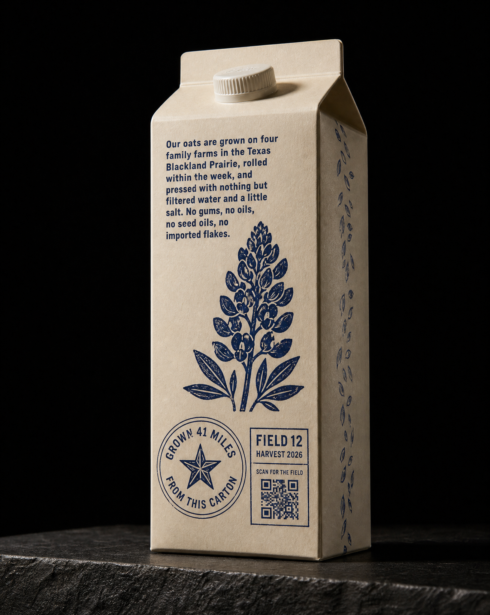
- 04A field number instead of a seal. Each carton carries a stencil-stamped FIELD number and HARVEST year, a circular badge reading GROWN 41 MILES FROM THIS CARTON, and a QR to…
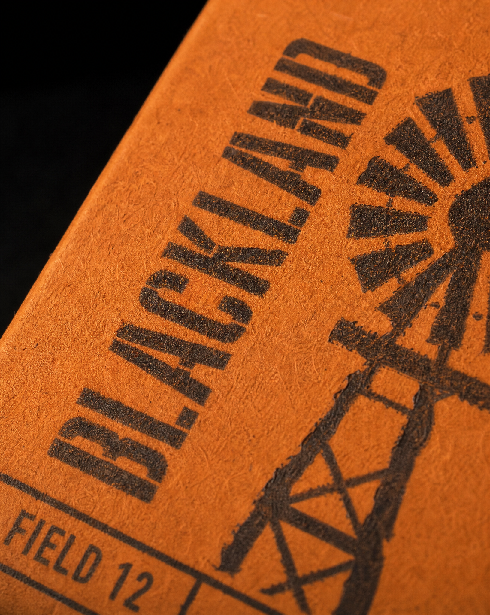
- 05One ink, and no coating at all. One flood plus one ink per SKU, printed on uncoated matte board with no gloss, no laminate and no varnish anywhere. The board tooth stays v…
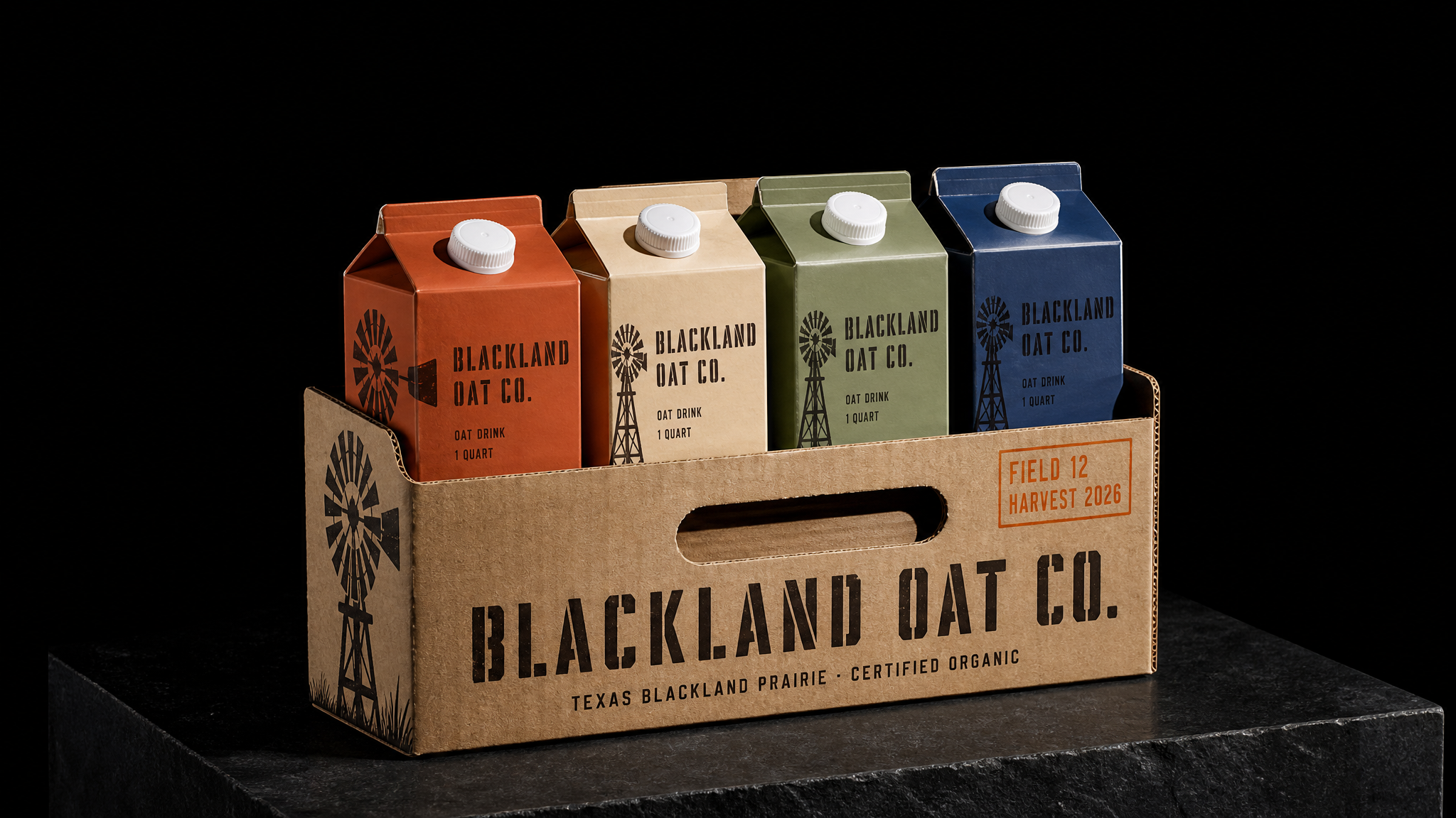
- 06The carrier is the retail unit. One die-cut kraft carrier with a punched handle, printed in the same two inks, strong enough to ship and good enough to sit on a shelf. Ret…
Eine Beispielmarke, gemacht, um etwas zu zeigen
Die Idee ist ein texanischer Haferdrink, dessen Hafer tatsächlich vor Ort angebaut und gewalzt wird. Der Name stammt von der Texas Blackland Prairie, dem echten Hafergürtel, der sich vom Red River bis hinter Austin erstreckt. So ist die Marke an einen Ort gebunden, bevor ein einziges Zeichen entsteht.
Alles Weitere folgt aus zwei Regeln: eine Farbe pro Artikel und keine Aussage auf der Verpackung, die auch ein Mitbewerber machen könnte.
Die SKU-Übersicht
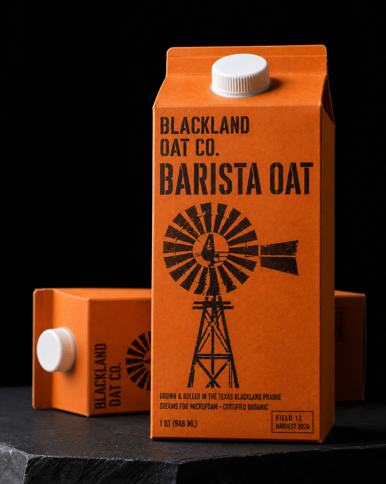
BARISTA OAT · Gebranntes Orange auf Schokoladenbraun · Windmühle
EVERYDAY OAT · Haferweiß auf tiefem Indigo · Spottdrossel auf Stacheldraht
UNSWEETENED OAT · Präriesalbei auf Creme · Eselhase
EXTRA CREAMY OAT · tiefes Indigo auf Buttermilchcreme · Bluebonnet
COLD BREW OAT LATTE · Ton-Terrakotta auf Creme · Zikade
Fünf SKUs, fünf Linolstöcke, je zwei Platten. Eine sechste kostet einen Stock und eine Flächenfarbe, kein neues Designsystem.
Mit diesen Materialien starten
Papier, Folie und Veredelung sind festgelegt. Nichts vom Motiv dieses Stücks wird übernommen.
Designed by Austin Terrill, founder.