Renaud Mignerey, an expert in creative design, believes that detail takes precedence over information in a business card. Anyone can scour the web for information on a product or a service. A business card should showcase textures and graphics and copy that is a striking representation of a brand’s personality.
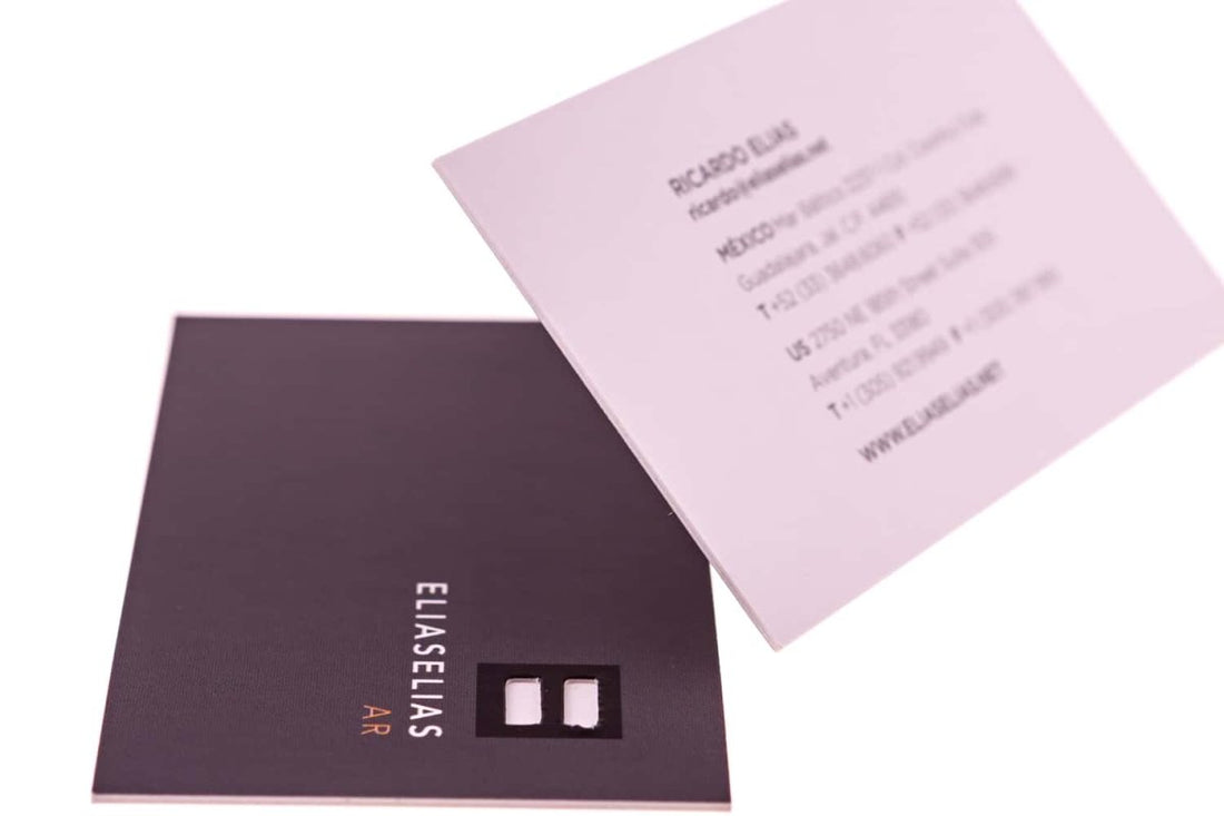
The above business card is a fine example of this. The dark and light purple contrast is consistent with Ricardo Elias’s brand. You could say that these two colors are his “signature colors”.
If you’re designing a business card, choose colors that sit well with your brand philosophy. And stick with them. Don’t overthrow them after a single advertising campaign. With time, this consistency will pay off and eventually translate to increased brand recognition.
The designer has also refrained from using a slew of fonts.
A single typeface doesn’t overwhelm the reader, whereas three or more than three jumps on his nerves; they drain his attention span. You can fiddle with the font’s color, make it italicized or embolden it to change things up, but as a rule of thumb, don’t employ the use of more than two typefaces.
I love how neat and clean this card looks. There’s an ample amount of white space to ensure the card doesn’t seem crowded.