A Rose-Gold Proposal Embossed with Love
Designing a minimalistic card requires great care and attention to detail. The risks are too high in its making.
To be on the safe side, designers stuff cards with bundles of unnecessary details. This approach completely kills the aesthetic simplicity and grace of the card, turning it into a comedy of errors.
You will see marriage cards cramped with numbers and poems and god know what other surplus details.
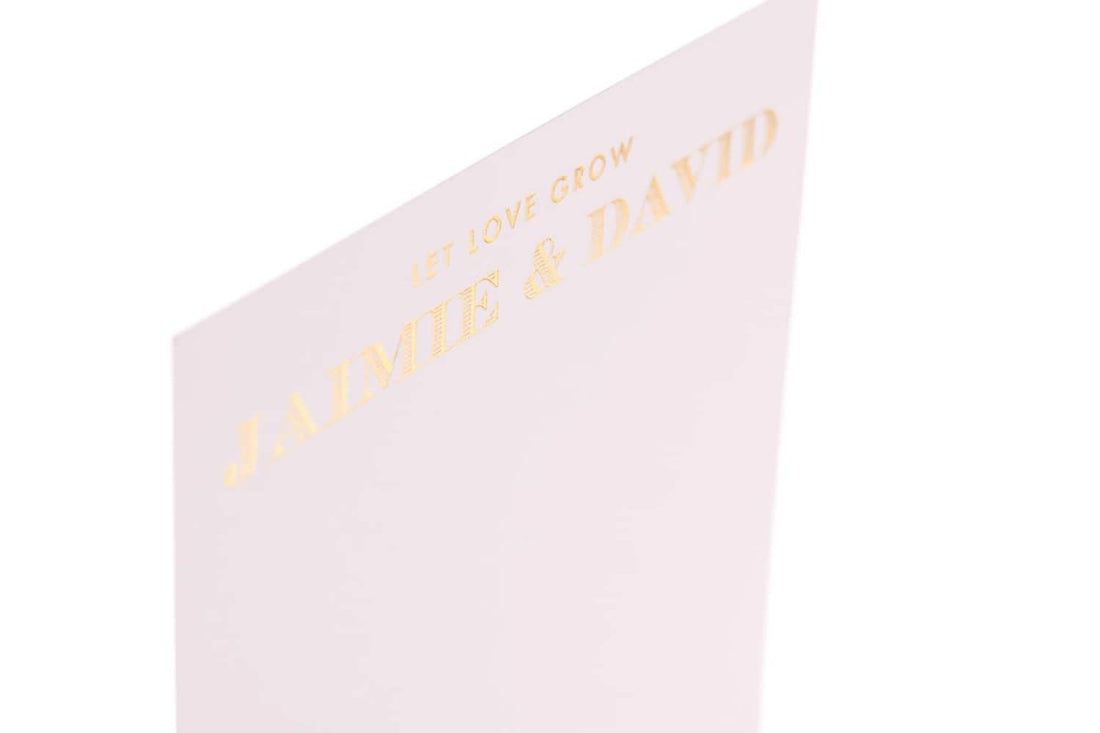
I appreciate the designer of this card for a number of reasons. Firstly, his choice of color― rose gold− is something you don’t normally see on marriage cards. People either go for a striking red or a bland off-white ― both of which are absolute clichés.
The rose gold color is mild, pleasing and easy on the eyes. It’s a perfect choice for a card that just wishes to invite people with a simple message.
You can see that most of the space of the card is occupied by the rose-gold background. This shows that the designer has confidence in the allure of this color.
Secondly, the gold lettering is like a cherry-on-top of a visually arresting rose-gold cake. It goes so well with the background that replacing it with any other color would be a crime.
Finally, the terse message on top of the names of the lucky couple, “Let love grow” puts everything into perspective. It gives the card a meaning, a theme.
If you’re someone who’s good at coming up with powerful and poignant one-liners and don’t really want to make a highly visual card, you can get ininspiration from this design. Also, if your business has a really good tagline or a motto, this design can come in handy.


