8 Essential Things to Consider In Your Billboard Design
Designing a roadside billboard for a massive audience seems like an uphill task but with a little bit of mind mapping and a slight touch of creative magic, it can become as easy as ABC. One big difference between a billboard and other outdoor advertisements like postcards and brochures is the size. It requires scaling of your design elements ― the logo, images, copy etc. etc. ― accordingly. It also entails rigorously mulling over the billboard’s location, its material, and many other factors to streamline the “actual” design process. Without doing the mind lifting, the heavy groundwork, the billboard is highly unlikely to serve its primary purpose ― building brand recognition. In this article, we’re going to tell you everything there is to consider for designing a billboard that generates tons of leads and brings your hard work to fruition.Billboard Designing: Factors to Consider
- Budget
- Location
- Scale
- Colors and Graphics
- Contrast
- Typography
- Printing
- Originality
-
Budget
- Traditional billboards or paper billboards, unlike digital ones, don’t have to share slots with other brands and can represent your business unfettered, for several months.
- Digital billboards aren’t energy efficient. They require a lot of energy to keep them powered up. Paper, on the other hand, can be easily recycled. And then there’s also the question of portraying a socially conscious image of your brand.
- Location: The costs are higher in busier areas of the city, such as highways and commercial areas.
- Size: The bigger the billboard, the costlier it will be. Due to the fact that it will occupy more land.
- Lighting: If you’re interested in keeping your billboard alight throughout the night, you will have to dish out extra.
- Visibility: Buying land for your signage in a visible, conspicuous are will also cost you more.
- Competition: An area with many billboards around will have steeper prices than an area with only a few
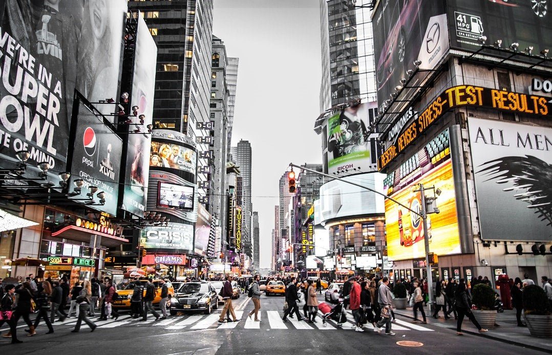
2. Location
The visibility of your billboard takes precedence over everything else. You want it to be seen ― to be prominent. If it stands shy or concealed, it’s going to affect your ability to generate sales. Here are some things to factor in when assessing visibility.-
Direction
-
Height
-
Interference
-
Traffic Count
-
Demographics

3. Scale
The size of the billboard can pose some challenges. But when you think about it: How is designing a billboard different from designing a, let’s say, a standard business card? I mean, if you know how to design a stunning business card, all you have to do is scale things up and replicate your design strategy for a billboard, right? Forget about the size. It’s of secondary significance. The scale, on the other hand, should be your primary concern. Your billboard needs to be visible, clearly legible, even from a distant location, for maximum impact. Keep this in mind while accounting for scale.
4. Colors and Graphics
Don’t hesitate to go massive with colors and graphics. Be bold, prominent and strikingly visible. Color is of utmost importance. It can make or break the design. Here’s what you need to consider while choosing it. As far as images go, one is enough. Too many images will overwhelm and distract the audience from your company’s message. You don’t want that. The selection of images and colors also depends on the location. For instance, if your billboard is placed amidst a bunch of lush green fields, then ask yourself, which color should contrast with their green to promote visibility? Think about your choice of color and graphics according to your billboards physical surroundings. And never opt for a blue background. It’s bound to blend in with the blue sky and make the copy totally inconspicuous.
5. Contrast
Contrast is a vital component of billboards. Pairing hues and choosing contrasts between limpid and vibrant colors is highly recommended. Remember: there is no predetermined combination of colors for designs; you have to tinker and see which contrasts provide the best visibility and appearance. Some popular contrasts used are enlisted below.- Standard Jet-black and White
- Stark Yellow and Lustrous Black
- Dark Green and White
- Scarlet-red and White

6. Typography
Simplicity and typography go hand in glove. An erect, legible, non-italicized typeface is advised. A Sans Serif or a Times New Roman or something along the same lines will do. And keep the font size humungous. Think in terms of visibility. Increase the font size with the increase in height from the ground and distance from your audience. Now on to the number of words. Again, brevity is your best friend. The most powerful and impactful taglines or brand messages are no longer than 15 words. As a rule of thumb, don’t integrate more than 5 words in a single line of text. The length of the words matters too. If they are overly long, you will likely have to decrease their count. Just make sure there is adequate spacing between them, and they don’t seem cramped. You can also embolden or italicize certain keywords to give them extra prominence. Be careful: Italicized words can cause confusion from a distance; steer clear from their overuse. Remember: your aim is to not just create a contrast between the background and the images and the copy, but also with the surroundings.
7. Printing
The medium will drive major design choices. Is your billboard going to be printed on a vinyl banner or printed or corrugated plastic? Depending upon the location, the choice of material will also vary. Some materials are more suited for outdoor postage while some for indoors. Before treading on the tricky terrain of billboard designing, be perfectly clear about the print material. Also, find a printer that has cutting-edge equipment and a formidable reputation to ensure your design comes out all neat and shiny. Trust me, figuring out these vital details beforehand will save you from a world of struggle.
8. Originality
You can adhere to every aforementioned rule. Choose the right colors, the perfect contrast, but if your billboard is a clone, a boring mess, something out of a cliché designer book, is it ever going to stand out? Absolutely not! You must dare to think outside the box. Using the above pointers as your foundation, craft an original and visually provocative masterpiece. Don’t get me wrong: I’m not suggesting creating something complex. In the case of billboards, you just have a couple of seconds to captivate your audience. If they don’t get the point of your billboard, the message of your brand in that limited timeframe, what’s the point? You have to craft something simplistically ingenious. A catchy tagline, a witty image, anything that bursts forth a couple of laughs or arouses curiosity ― not a contrived or stolen idea by any means. Original thought doesn’t just pay the bills; it makes you a millionaire.Silly Mistakes to Avoid in Your Billboard Design
Now that we’ve factored in everything, let’s shed some light on some funny and awful mistakes most designers make, to further nudge you in the right direction.-
Cramping
-
Grammatical Errors
-
Design Mistakes
-
Missing a call to action
-
Being Impatient


