Case study · Business cards · Fandom
Eine Kunststoffkarte mit einem Fenster
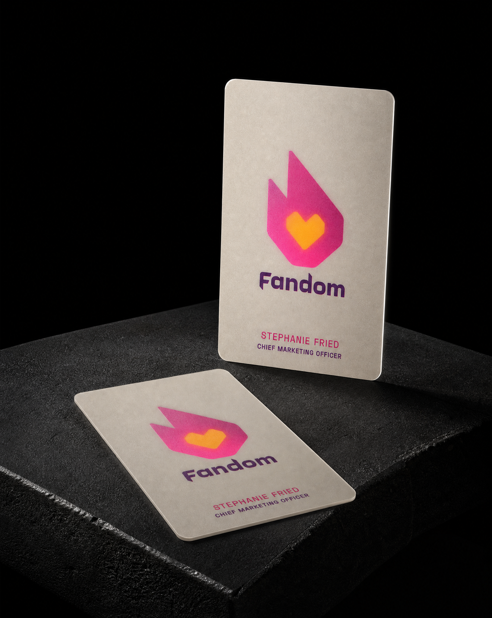
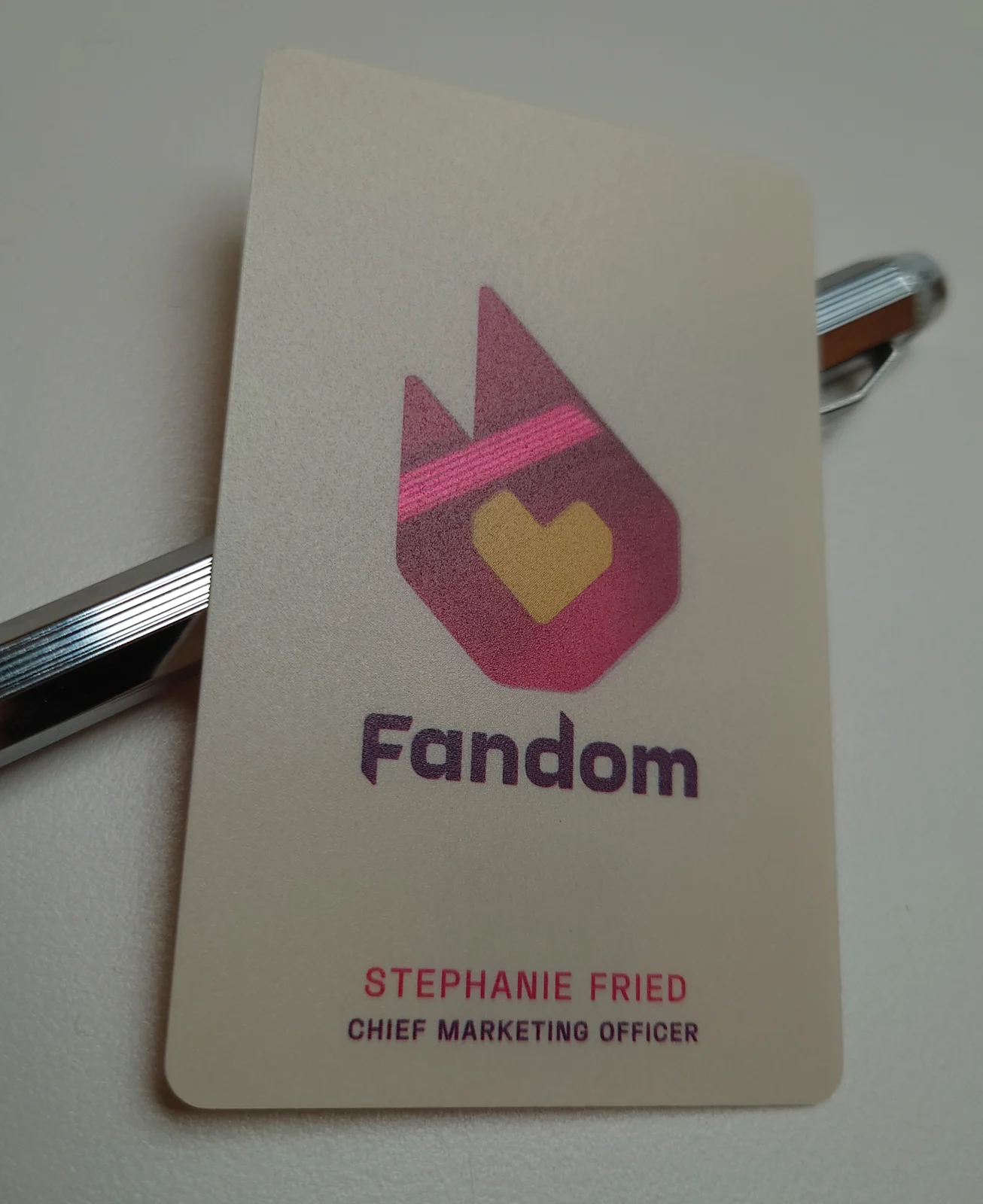
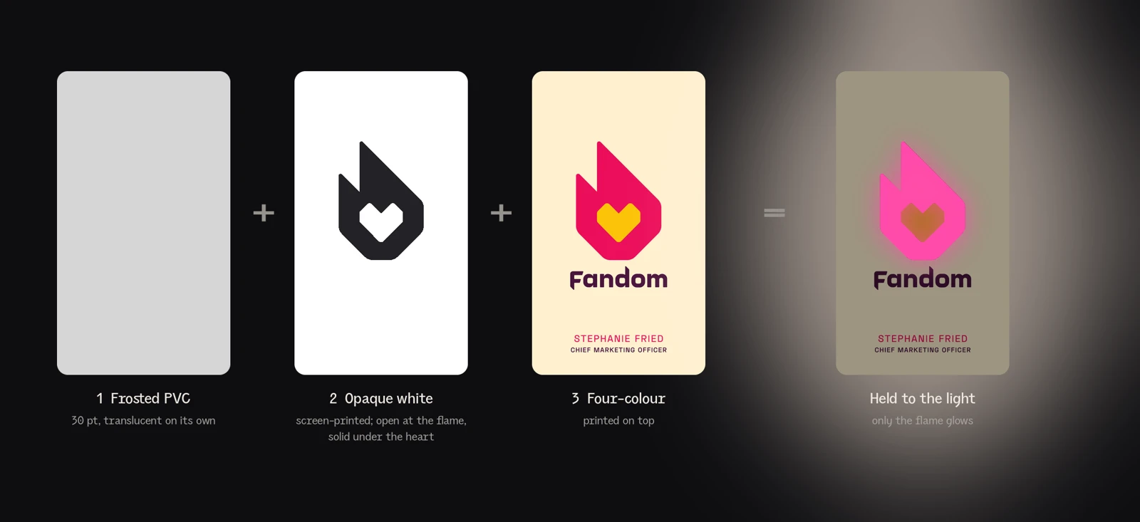
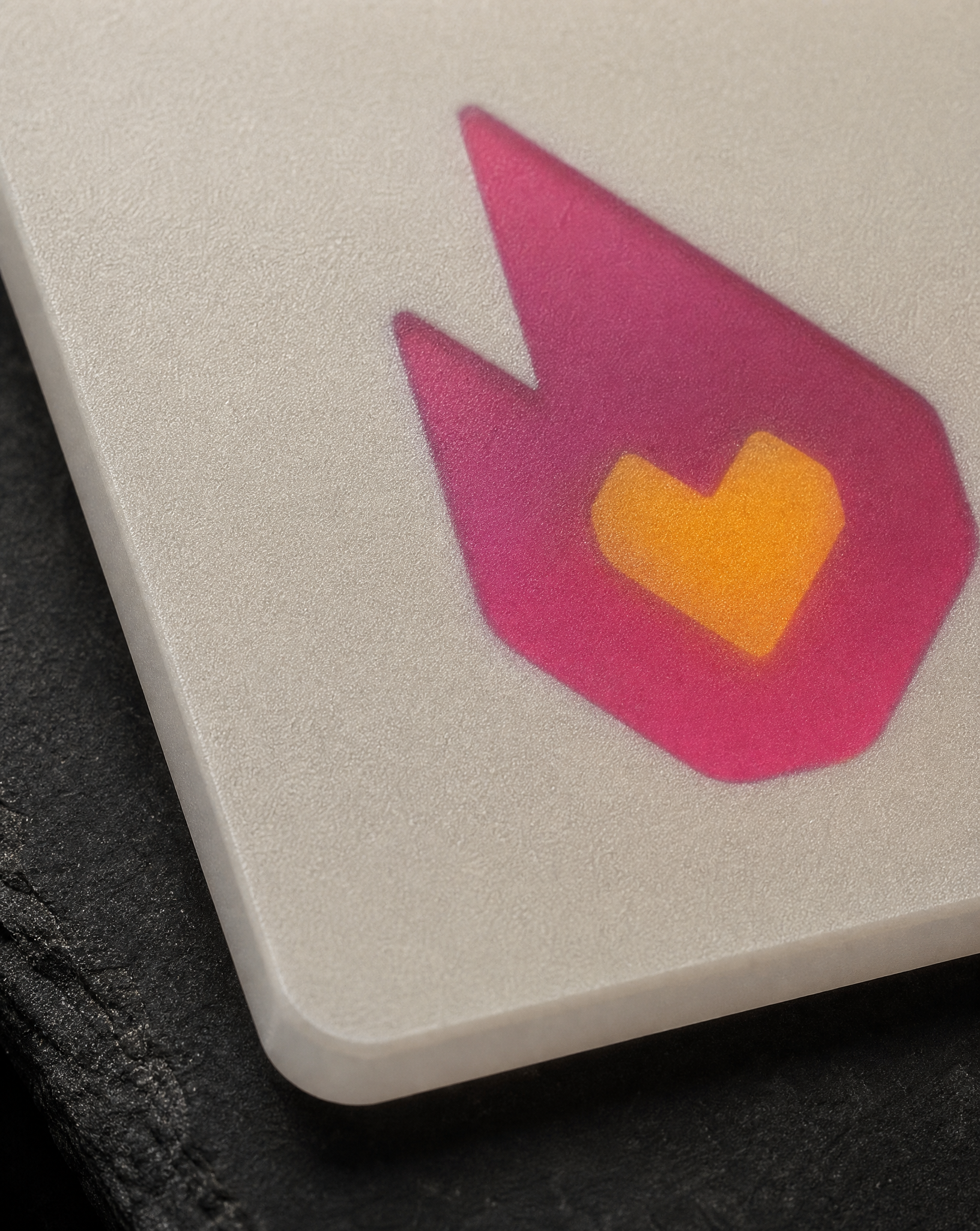
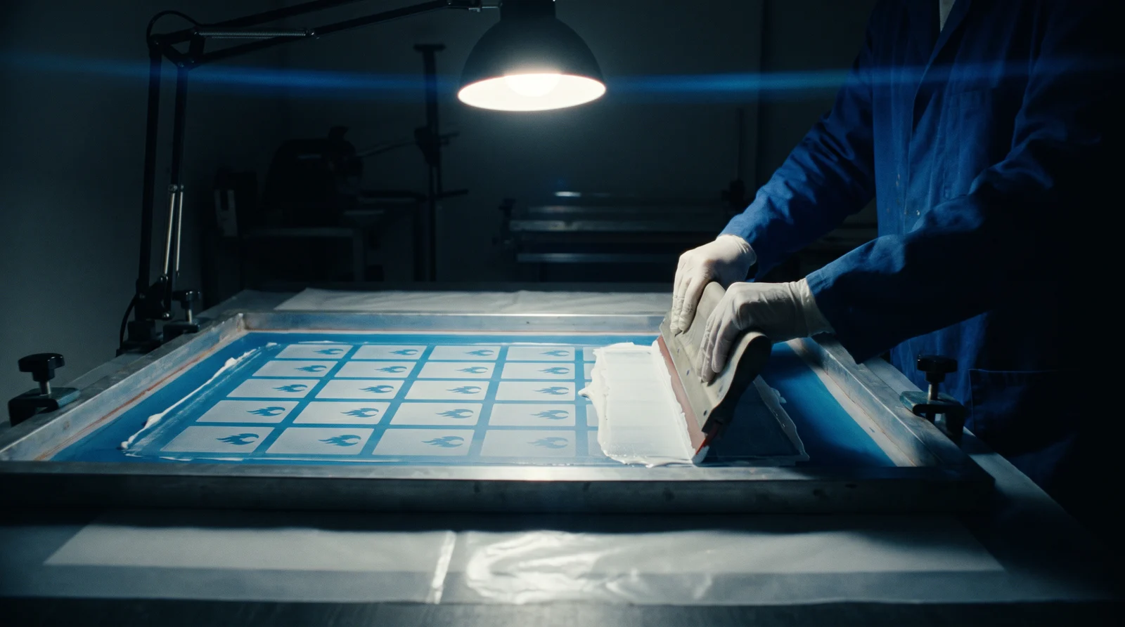
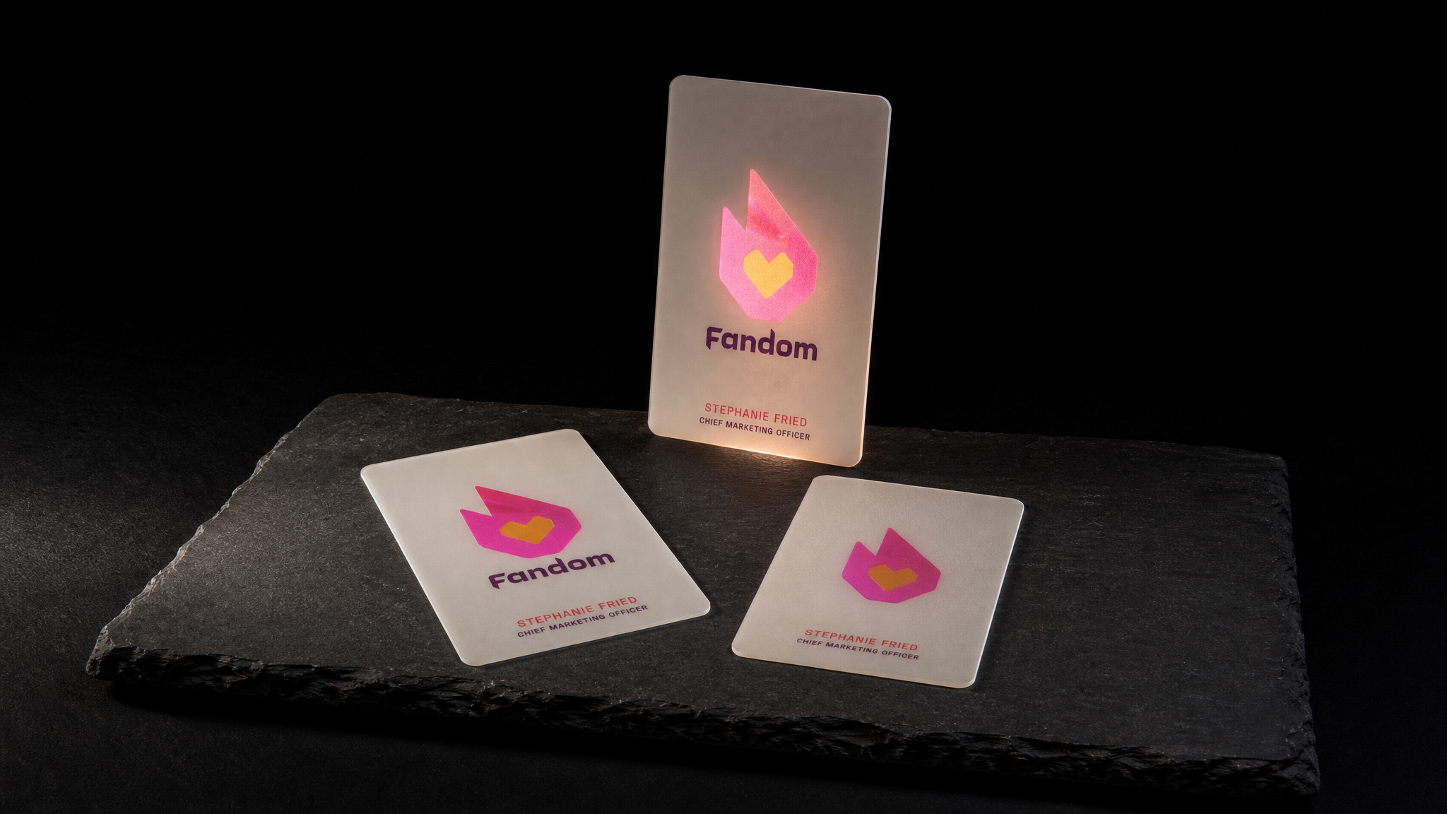
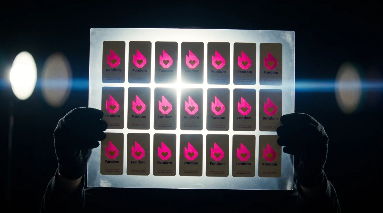
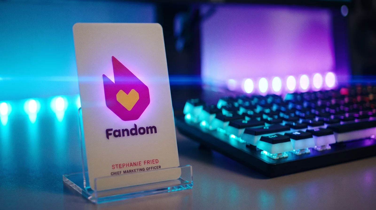
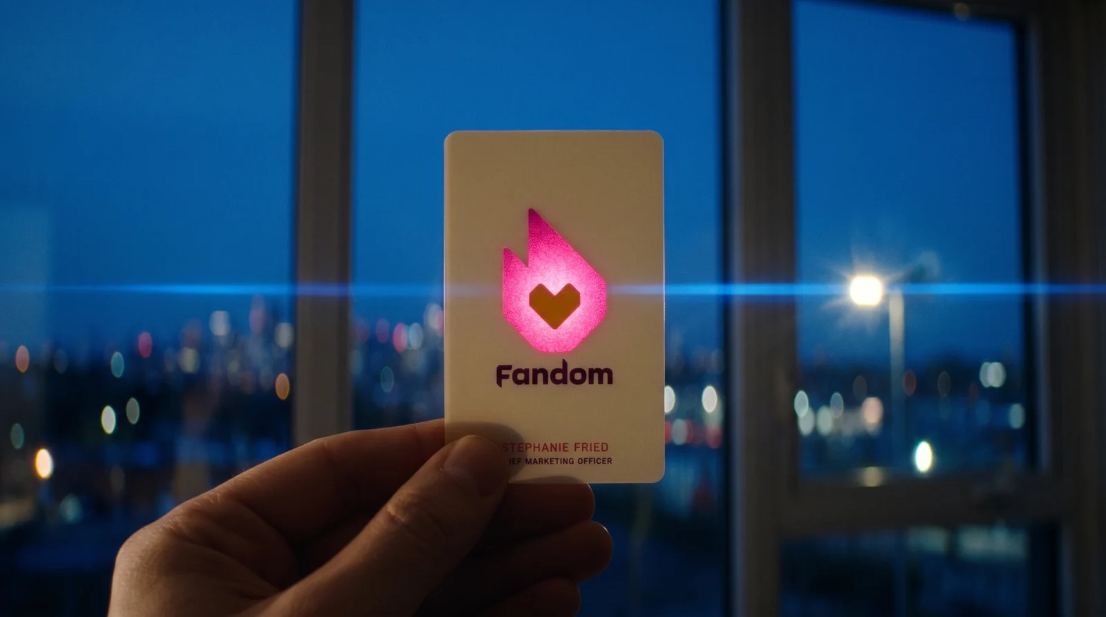
Fandom wanted a plastic business card for their Chief Marketing Officer, Stephanie Fried, that was solid everywhere except the flame in their logo. It's one sheet of 30 pt frosted PVC with no die cut. We screen-printed opaque white behind everything except the flame, so the flame is the only place light gets through.
Die Idee
Fandom's team came to us with the design finished and one question: how do you make most of a plastic card solid and leave the logo see-through?
Four rules
- 01The frost is not the opacity. An opaque white layer, screen-printed across the whole face and left open only where the flame sits. The frost gives the surface its tooth…
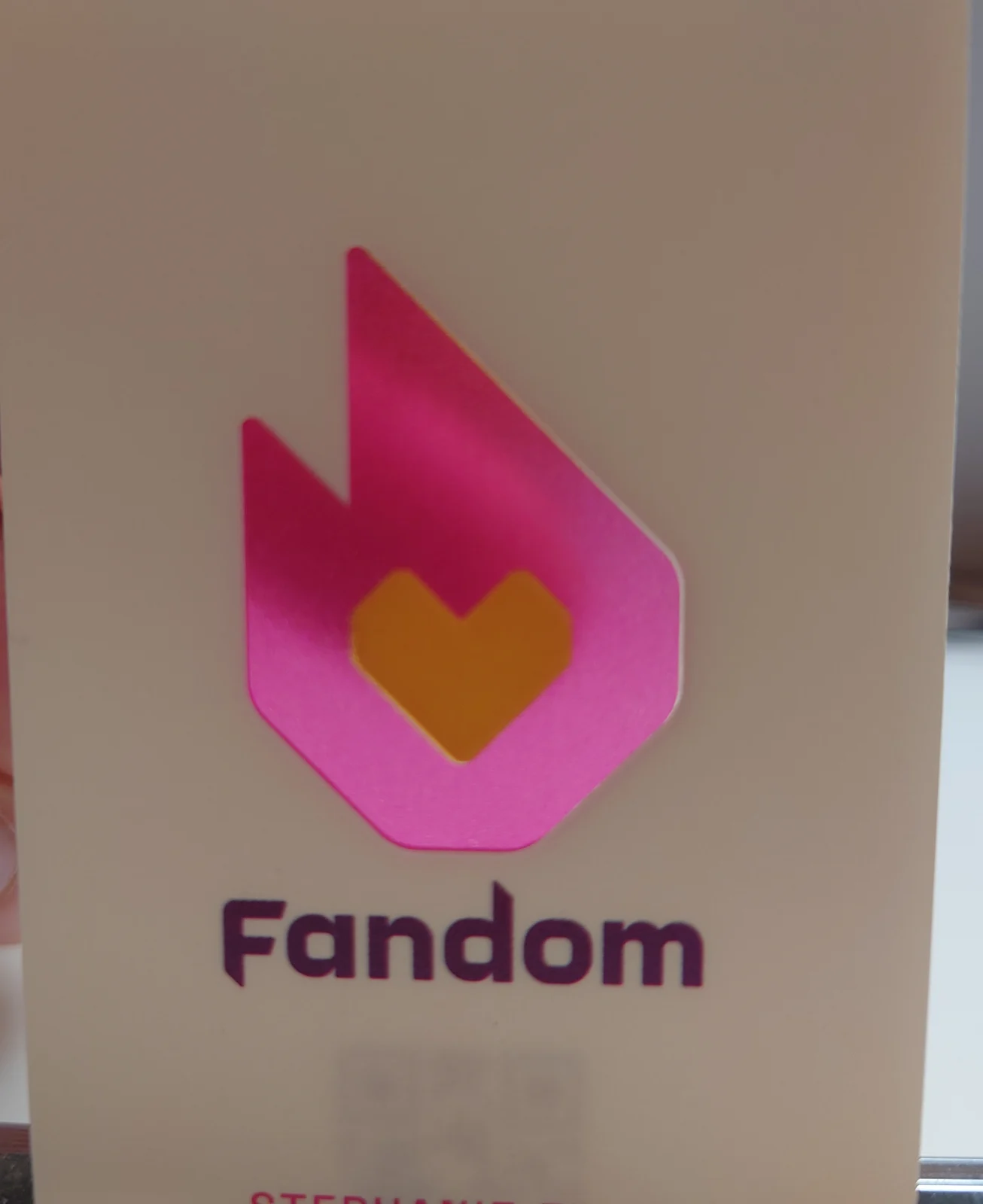
- 02The heart keeps its white. The white layer is open at the flame and closed under the heart. Colour prints on top of both, so the flame becomes a magenta window and th…
- 03Nothing gets die cut. Selective opacity instead of subtraction. The card is one uninterrupted sheet with no cut, no join and no aperture, which is why it still f…
- 04Two colour builds, one card. We accepted it and designed for it. Everything that has to hold its colour sits on white: the cream field, the wordmark, the name and the h…
Das Briefing
Fandom's team came to us with the design already finished and one question: how do you make most of a plastic card solid and leave the logo see-through? The card was for Stephanie Fried, their Chief Marketing Officer, and they wanted the flame in their mark to be the only place light could get through.
Die meisten solchen Anfragen enden in einem von zwei Kompromissen. Entweder ist die Karte transparent und das Logo wird deckend darauf gedruckt, also das Gegenteil des Gewünschten. Oder das Logo wird zur Stanzung: ein Loch statt eines Fensters, das die Struktur mitnimmt.
We talked it through on a call and the answer turned out to be simple: stop thinking about the plastic and start thinking about the ink.
Two designs, three orders
The first run was the cream card, in early 2022. Fandom came back that March with a second design built the same way: deep plum with a magenta border and the line “For the love of fans”. Then they ordered again later that year.
Every version uses the same rule. White goes everywhere the light should stop, the flame gets none, and the heart keeps its white.
Wofür sich diese Technik eignet
Selektive Deckkraft funktioniert, wenn eine Marke eine starke Form hat, die sich anders verhalten soll als alles andere auf der Karte. Ein Zeichen, ein Monogramm, ein einzelnes Icon.
It does not work for type. Small letterforms seen through a frosted sheet lose their edges, which is why Fandom's wordmark and contact lines sit on the white in solid ink.
Außerdem braucht es ein Motiv mit genug Fläche. Ein Logo aus Haarlinien bietet dem Licht nichts zum Füllen.
So entstand der Film
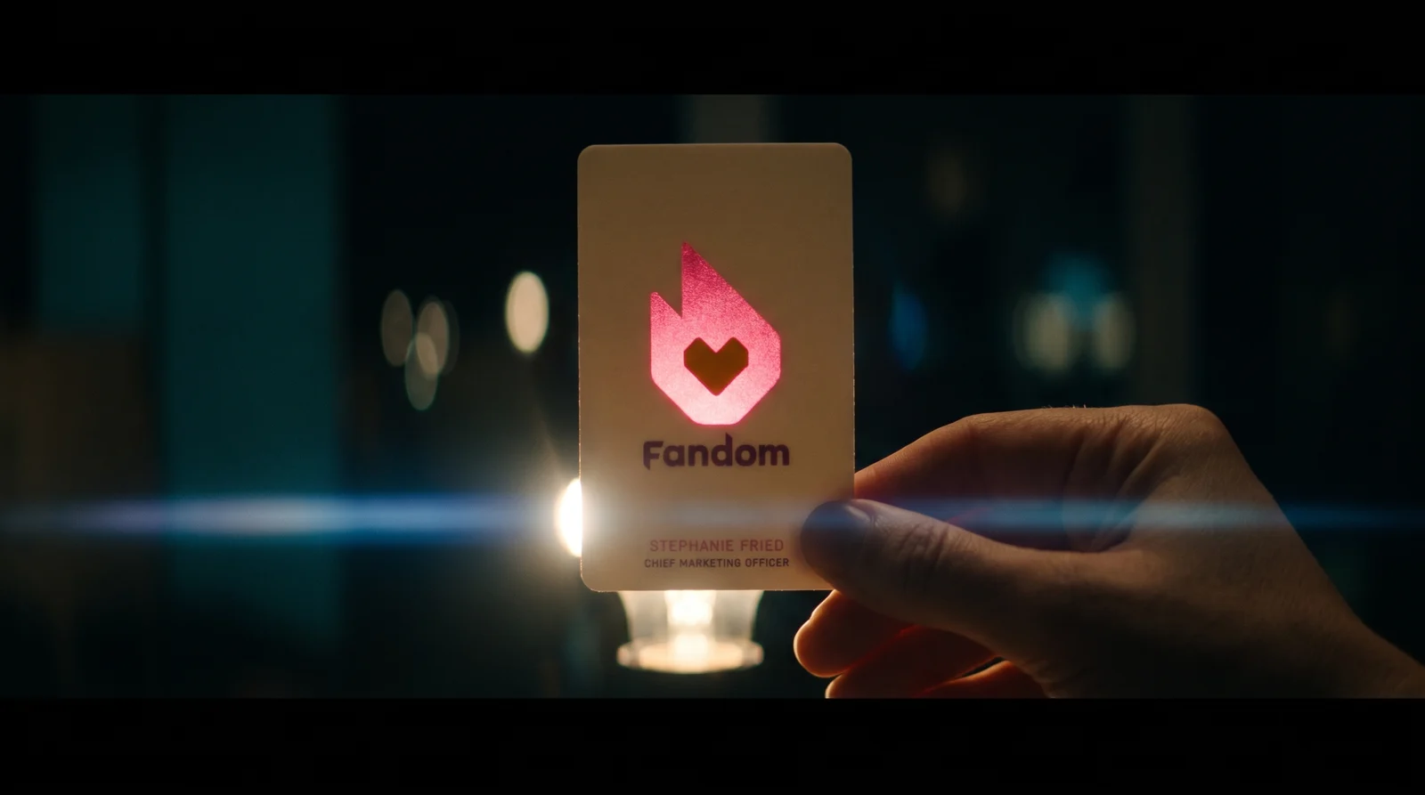
The card is about light coming through one shape, so we borrowed the film language best known for pointing light straight into the lens: the anamorphic sci-fi look that J.J. Abrams and cinematographer Dan Mindel brought to Star Trek (2009) and Star Wars: The Force Awakens (2015). Wide 2.39 frames, horizontal blue streak flares, teal shadows and practical lights in shot. Fan culture knows that look on sight, and it does the explaining: every shot is a card between the camera and a light.
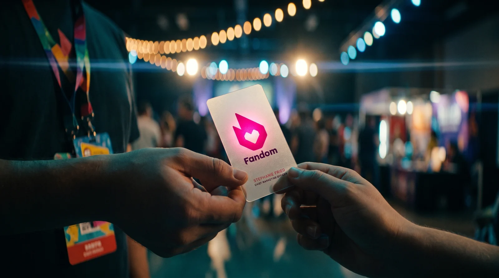
The scenes, hands and process shots are AI-generated, using Fandom's own artwork and our 2022 photographs of the finished cards as reference. The layer diagram is built from the real print files. The film is an homage and is not affiliated with any film, studio or filmmaker.
Mit diesen Materialien starten
Papier, Folie und Veredelung sind festgelegt. Nichts vom Fandom's wird übernommen.
Fragen
- Can you make a plastic business card that's opaque except for the logo?
- Yes. On frosted or clear PVC we print a layer of opaque white everywhere the card should be solid and leave it off where light should come through, then print the colour on top. Nothing is cut, so the card stays one continuous sheet.
- What is a white backer on a plastic card?
- It's a layer of opaque white ink printed under the colour on clear or frosted plastic. Without it, colour on plastic is see-through. With it, colour reads solid. On Fandom's card we screen-printed the white everywhere except the flame in their logo, which is what makes the flame the only window.
- Why frosted plastic instead of clear?
- Frost diffuses light. The window glows evenly instead of showing a sharp view of whatever is behind the card, and the matte surface feels better in the hand and hides fingerprints. On clear PVC the same build works, but the window reads like glass rather than a glowing shape.
- Does colour look different on frosted plastic?
- Yes. Without white underneath, colour on frosted plastic prints lighter (up to about 30% lighter than on screen) and shifts with whatever is behind it. Anything that has to hold its colour, like a brand field, a wordmark or contact details, should sit on white.
- Can small text or a thin logo be the see-through part?
- Not well. Seen through a frosted sheet, small letterforms and hairlines lose their edges. Selective opacity works best on one strong shape with real mass: a mark, a monogram or an icon.
- Could the logo be die cut instead?
- It can, but a cut-out is a hole, not a window. Detailed shapes get fragile, enclosed parts like a heart or the inside of a letter fall out, and the card stops feeling solid. A printed window keeps the card in one piece.