Two-color letterpress on cotton: what changes when you add a second plate
The jump from one color to two is a bigger event on the press than it looks on screen. Each color needs its own plate, its own ink mix, its own pass — and the second pass has to register against the first on cotton that just shifted.
Pricing — two-color letterpress on cotton
Every spec on this page is priced by a person. Get a price
Two-color letterpress on cotton: what changes when you add a second plate
The jump from one color to two is a bigger event on the press than it looks on screen. Each color needs its own plate, its own ink mix, and its own press pass — and the second pass has to register against the first, on cotton that's just been through the press once and may have shifted by a few thousandths of an inch. That registration is where the craft happens; a well-registered two-color card looks effortless and a poorly-registered one looks like a mistake.
Design implications: give any color that abuts another a hair of overlap (a "trap") so a tiny misregistration doesn't leave a white line between them. Avoid designs that put fine type from one color directly on top of a solid field of another — the register tolerance simply isn't there. Two-color designs that work best keep the colors in separate zones of the card and let the plate depth do the connecting.
The color choice matters more than in offset. Because letterpress inks are translucent, the second color reads truest against unprinted paper. Two dark inks on cream cotton is our most-run specification for two-color letterpress, and it hits every time. Two brights on white cotton is where things get lively — coral and navy, oxblood and forest — and the cotton stock softens the intensity so the card reads editorial rather than loud. Every two-color run gets a hand-pulled proof before we commit to the full run; the registration is what you're paying for.
Common questions
- Is the extra cost mostly plates or press time?
- Both, but plates carry the setup and press time carries the run. On short runs (100–200) the second plate dominates the price bump. On longer runs the press time evens out. The plates stay on file for reorders, which is why repeats get sharply cheaper.
- Which color combinations work best in two-color letterpress?
- Two dark inks on cream cotton is our most-run and hits every time. Two brights on white cotton is livelier — the cotton softens the intensity so the card reads editorial rather than loud. Avoid two similar colors that will suffer if registration slips.
- How do I design to avoid registration problems?
- Give any color that abuts another a hair of overlap (a "trap"). Avoid stacking fine type from one color on a solid field of another — the tolerance isn't there. Keep the two colors in separate zones of the card and let the plate depth do the connecting.
The next step
Not sure this is the exact spec you want?
Upload your logo and the Studio lays it out on real papers and finishes. It's a design exploration, not a proof: a person checks your final file before anything prints.
We've printed this

Studio Álvarez Interiors
A logo that could only ever be printed one way.
Read the project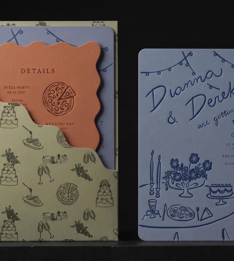
Dianna & Derek
Three colour-drenched pieces, one hand-mixed ink each, and one bold cut. Then the one we would have cut.
Read the project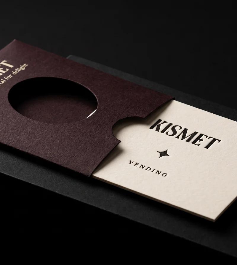
Kismet Vending
A card worth keeping, thin enough to fall out of a vending machine.
Read the project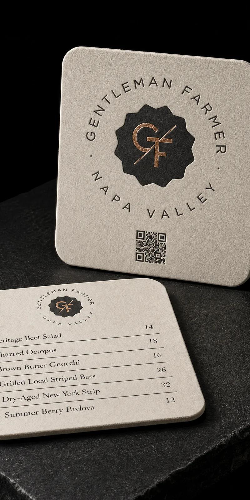
Gentleman Farmer Wines
Match a card they already loved. On a different object.
Read the project