Case study · Business cards · Fandom
An opaque plastic card with a translucent logo
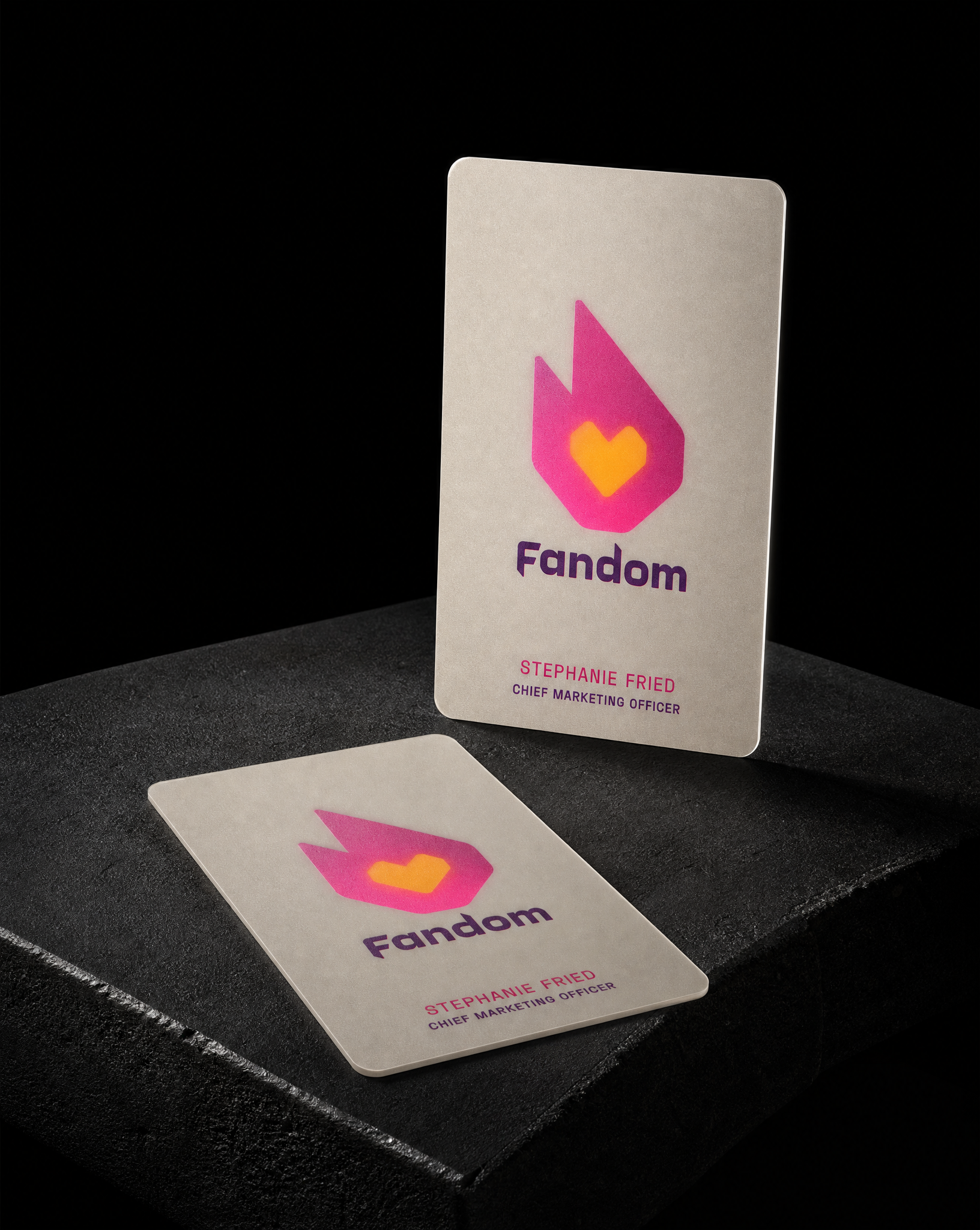
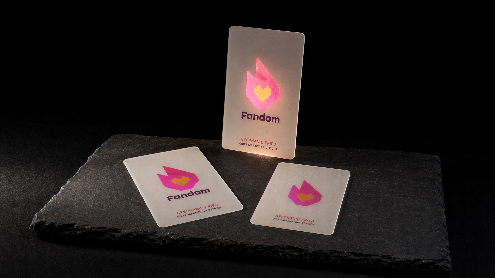
Stephanie Fried, Fandom's Chief Marketing Officer, came to us wanting a plastic card where most of the surface was solid and opaque and only the logo was translucent. Not a clear card with printing on it, and not a frosted card with a window cut out of it. One sheet of plastic, two different degrees of transparency.
The idea
Stephanie Reed brought us Stephanie Fried's card with a clear idea and no obvious way to make it: a plastic business card where the majority of the surface area would be solid and opaque, and only the logo would be translucent and partially see-through.
Four rules
- 01The frost is not the opacity. An opaque white flood printed across the full face, knocked out only where the flame sits. The frost gives the surface its tooth and its iv…
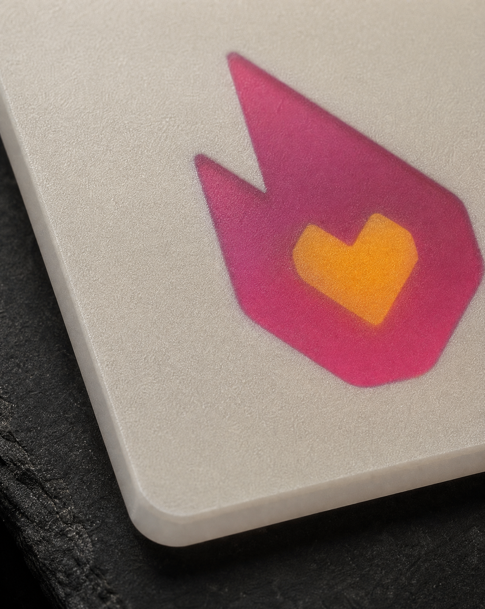
- 02Print the mark on the back. The flame and the heart print on the reverse face and are seen through the thickness of the frosted sheet. The frost diffuses them very sli…
- 03Nothing gets die cut. Selective opacity instead of subtraction. The card is one uninterrupted sheet with no cut, no join and no aperture, which is why it still f…
- 04Two colour builds, one card. Accepted it and designed for it. The type sits over the opaque white flood so it holds its colour; the flame sits over bare frost so it cha…
The brief
Most requests like this end up as one of two compromises. Either the card is clear and the logo is printed opaque on top of it, which is the reverse of what was asked. Or the logo becomes a die-cut hole, which is a hole rather than a window and takes the structure with it.
The answer was to stop thinking about the plastic and start thinking about the ink.
What this technique is good for
Selective opacity works when a brand has one strong shape and wants it to behave differently from everything else on the card. A mark, a monogram, a single icon.
It does not work for type. Small letterforms seen through the thickness of a frosted sheet lose their edges, which is why Fandom's wordmark and contact lines print on the front face in solid ink.
It also needs a mark with enough mass. A hairline logo has nothing for the light to fill.
Start from these materials
Same paper, foil and finish, locked in — nothing of Fandom's artwork comes with it.