Case study · Business cards · Studio Álvarez Interiors
Ottenere la A in pietra da quattro colori
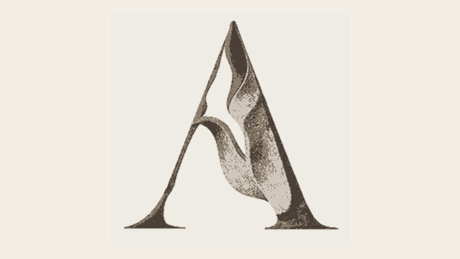
L'icona era un rilievo raster: bellissimo, ma riproducibile solo in quadricromia CMYK. Questo solo fatto escludeva lamina, letterpress, goffratura a secco, insegne monocolore, ricamo e qualsiasi dimensione sotto i 30 pixel circa. Per uscire dai quattro colori bisognava ricostruirla in vettoriale e trovare il modo di rendere la sensazione scultorea con un solo inchiostro.
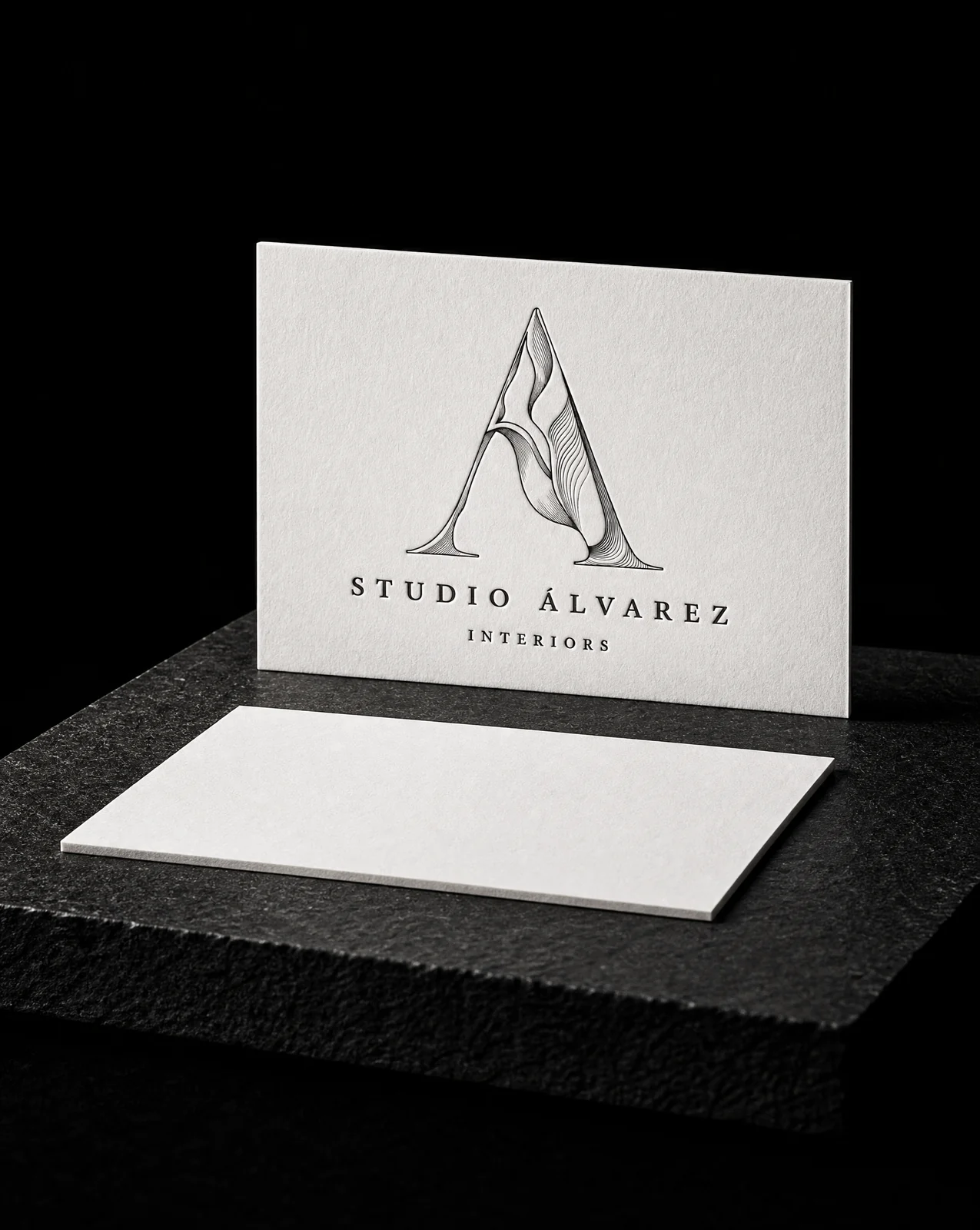
L'idea
Non è stato un restyling. Il marchio era giusto. Era nel formato sbagliato, e il formato sbagliato decideva in silenzio cosa il brand non avrebbe mai potuto fare.
Six rules
- 01Diagnose what the file actually forbids. Trace a vector master from the existing artwork rather than redraw it. The mark stays the mark; only its file format changes.
- 02Generate every variant from one outline. All five renderings are generated from the same single outline. The bevel is constructed from that outline's own distance field and lit fro…
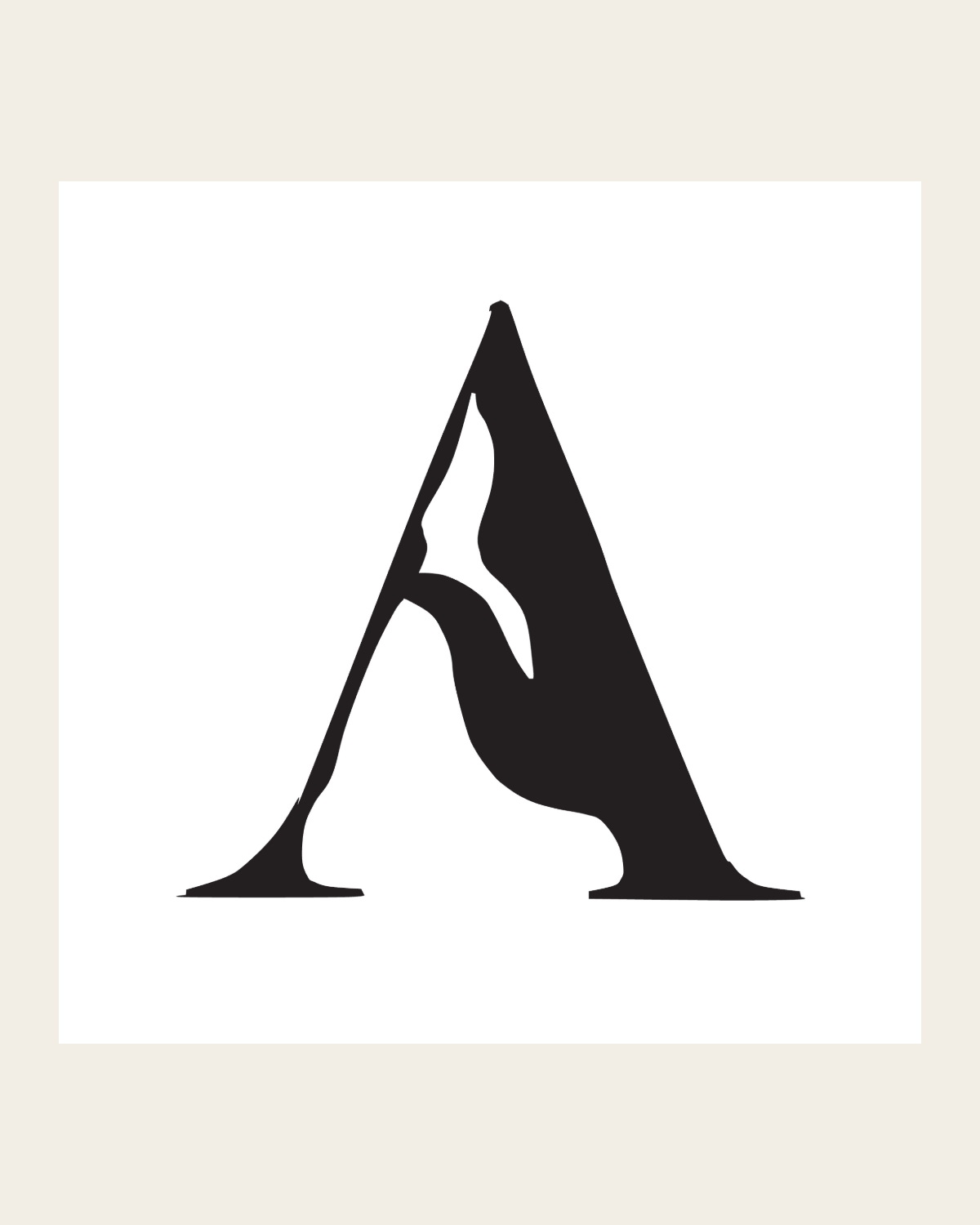
- 03Retire the two that describe an edge instead of a mass. Cut both. Kept the flat solid and the simplified silhouette, and developed the fourth idea properly — line weight driven by a light source…
- 04Let the line weight do the shading. Relief rules. Each rule thickens as it enters shadow and thins as it crosses a lit face, so the weight itself describes the form — the ribb…
- 05Quantise the shading rather than gradate it. Incised facets — the shading quantised into three flat planes, the way a V-cut inscription resolves into two walls and a top. Hard edges be…
- 06Keep one version that survives being made in metal. Monumental extrusion — the outline swept back along a fixed axis and closed off. No shading at all; the mass comes from depth. It's the one…
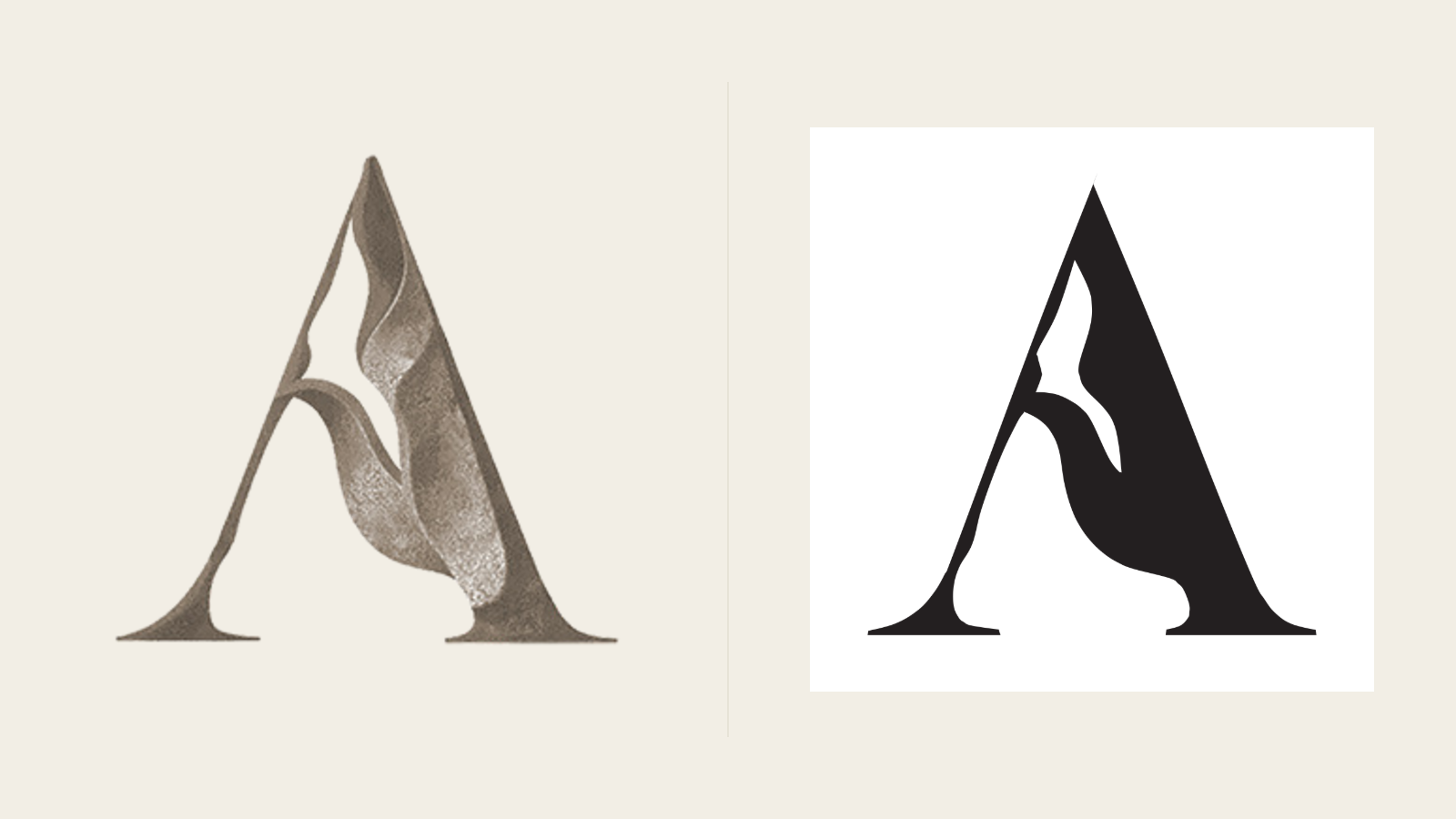
Lo stesso marchio, vettorializzato anziché ridisegnato. Tutto ciò che viene dopo (lamina, letterpress, rilievo a secco, insegne, ricamo) diventa possibile appena smette di essere un raster.
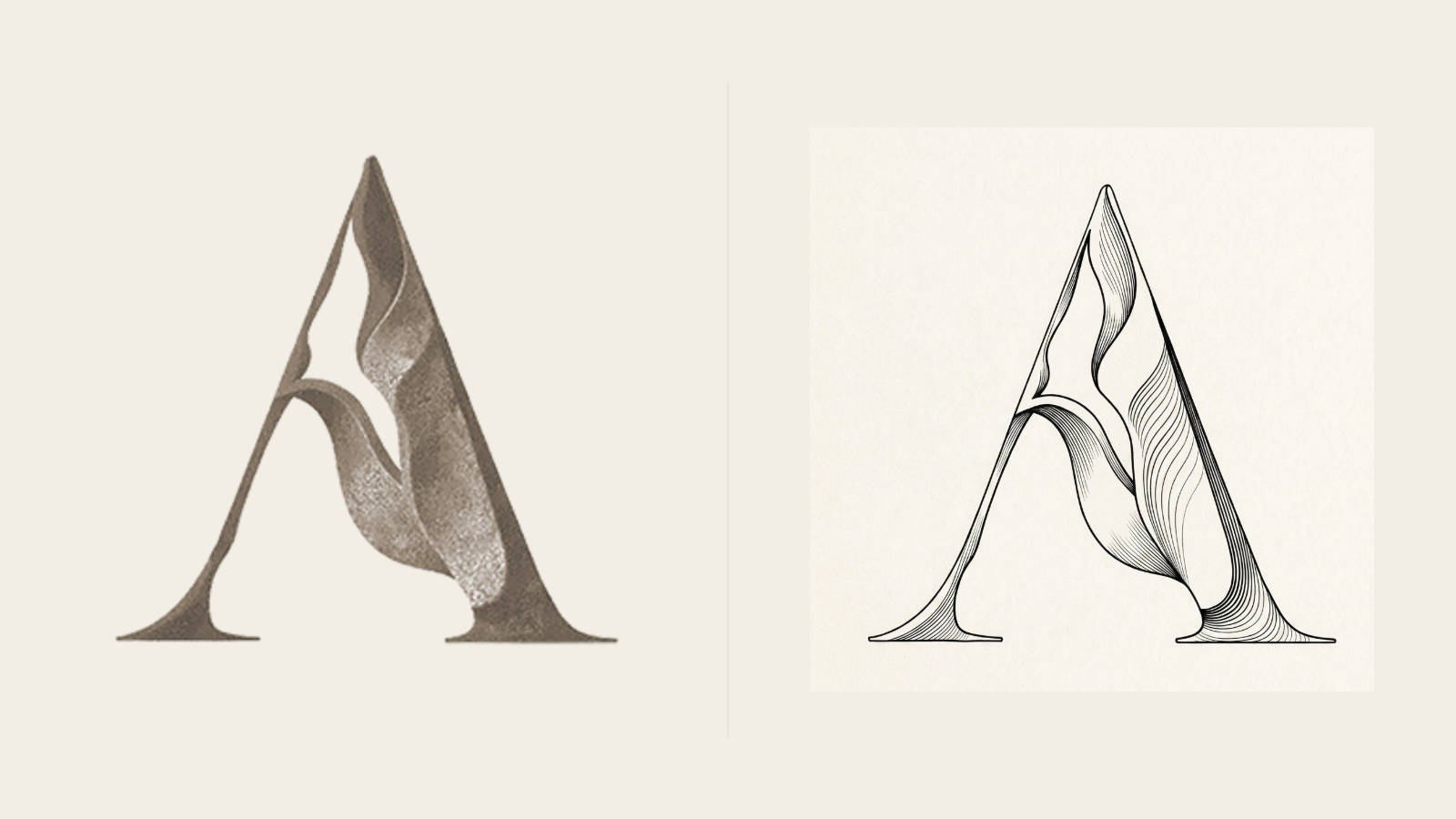
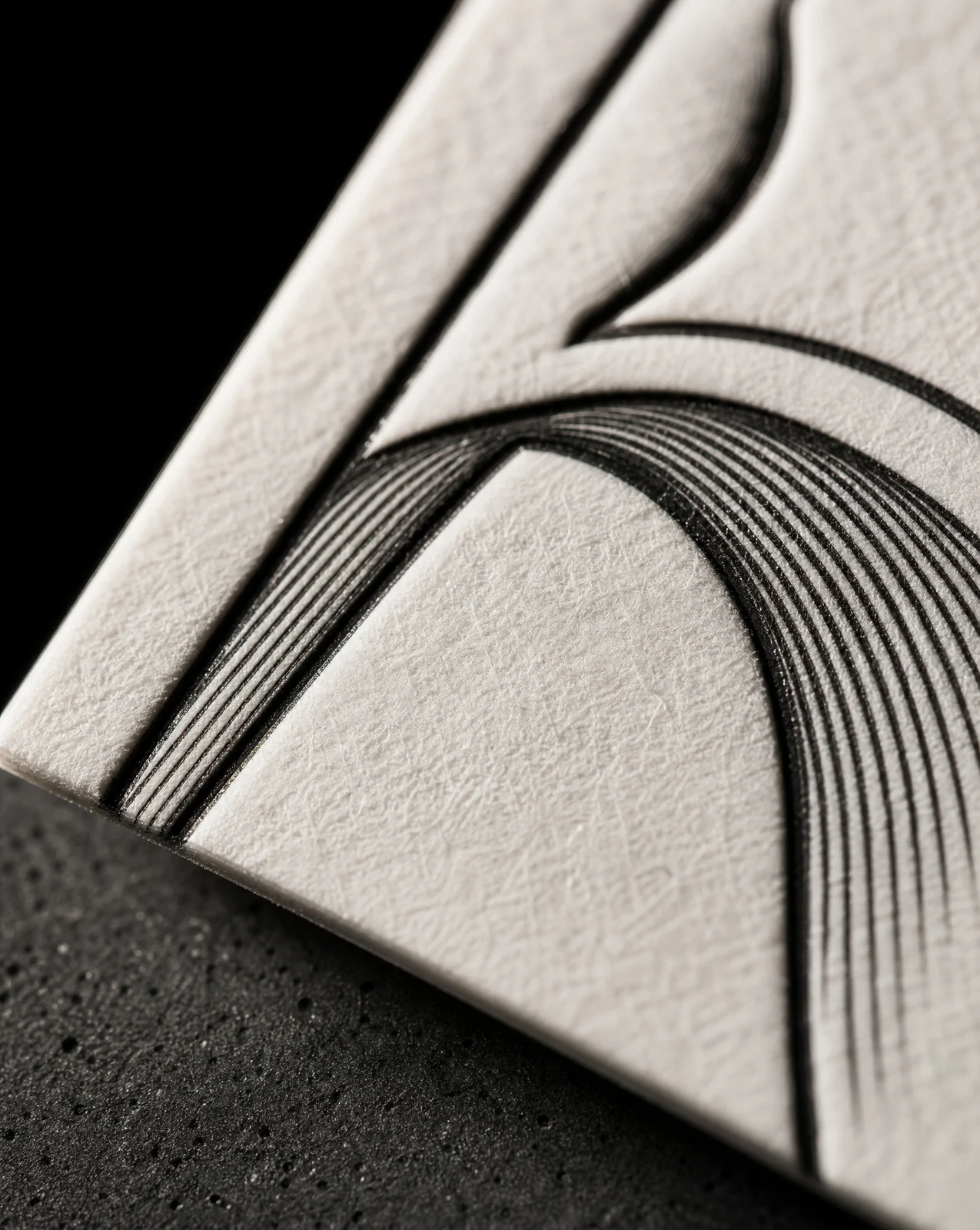
La sensazione scultorea affidata allo spessore della linea anziché al tono. Ogni tratto si ispessisce nell'ombra e si assottiglia sulle superfici illuminate, così è il disegno stesso a descrivere la forma.
Note di stampa per finitura
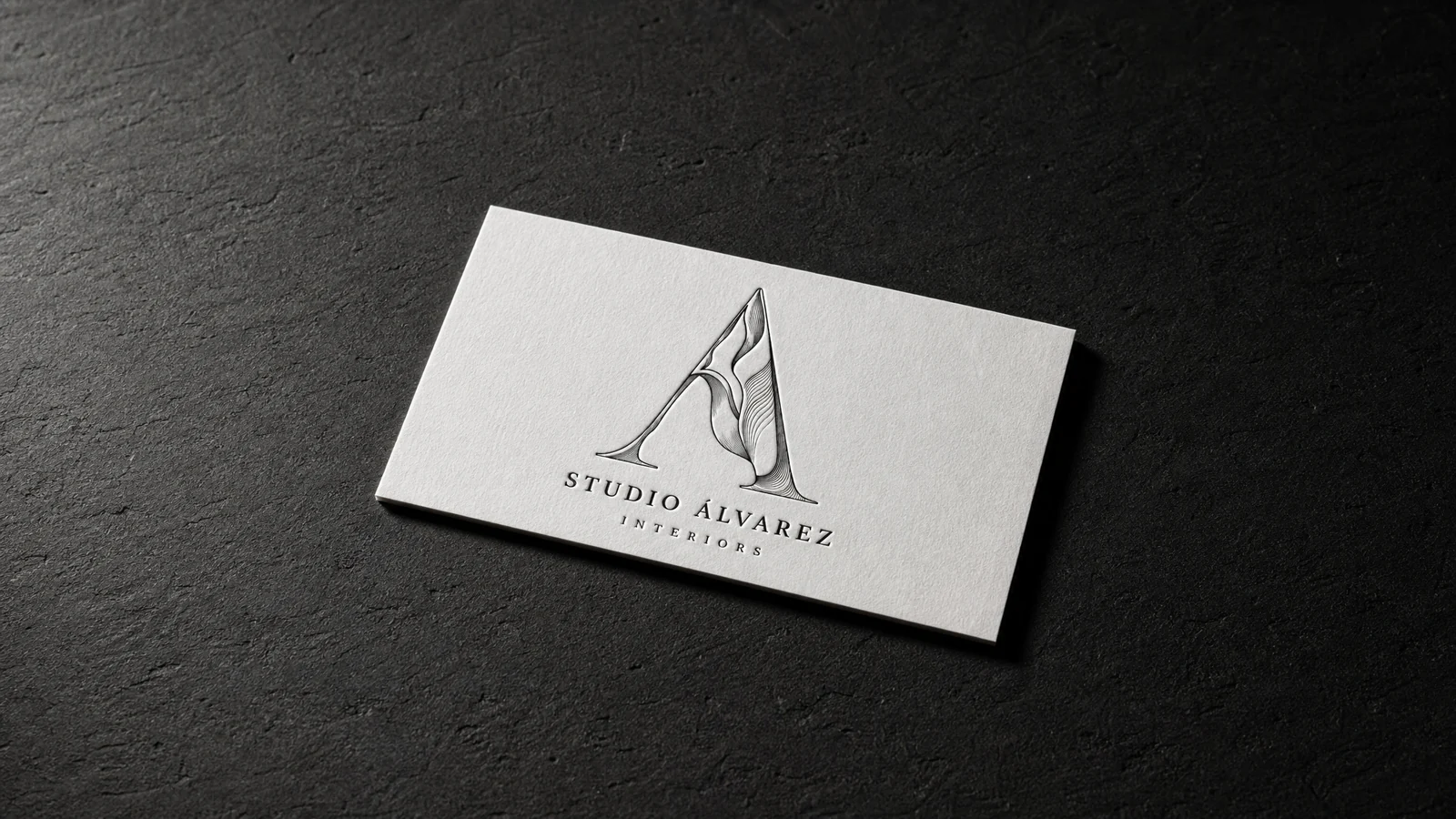
Regole per il rilievo: serigrafia, letterpress, offset, incisione e grande formato. Minimo 64px / 25mm, e la linea più sottile deve reggere 0.3pt alla dimensione finale.
Sfaccettature incise: un colore spot più retini, o tre spot pieni. Minimo 48px / 18mm. I retini vanno retinati, quindi non si tratta di letterpress né di foil.
Estrusione monumentale: nessuna ombreggiatura, quindi è l'unico elemento qui che regge sia la stampa piatta sia il taglio in alluminio.
Parti da questi materiali
Stessa carta, lamina e finitura, già impostate: nulla della grafica di Studio Álvarez Interiors's viene incluso.