Case study · Business cards · Kismet Vending
A fortune that fits the slot
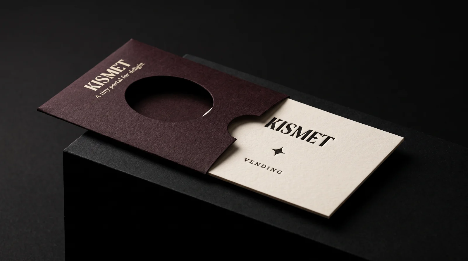
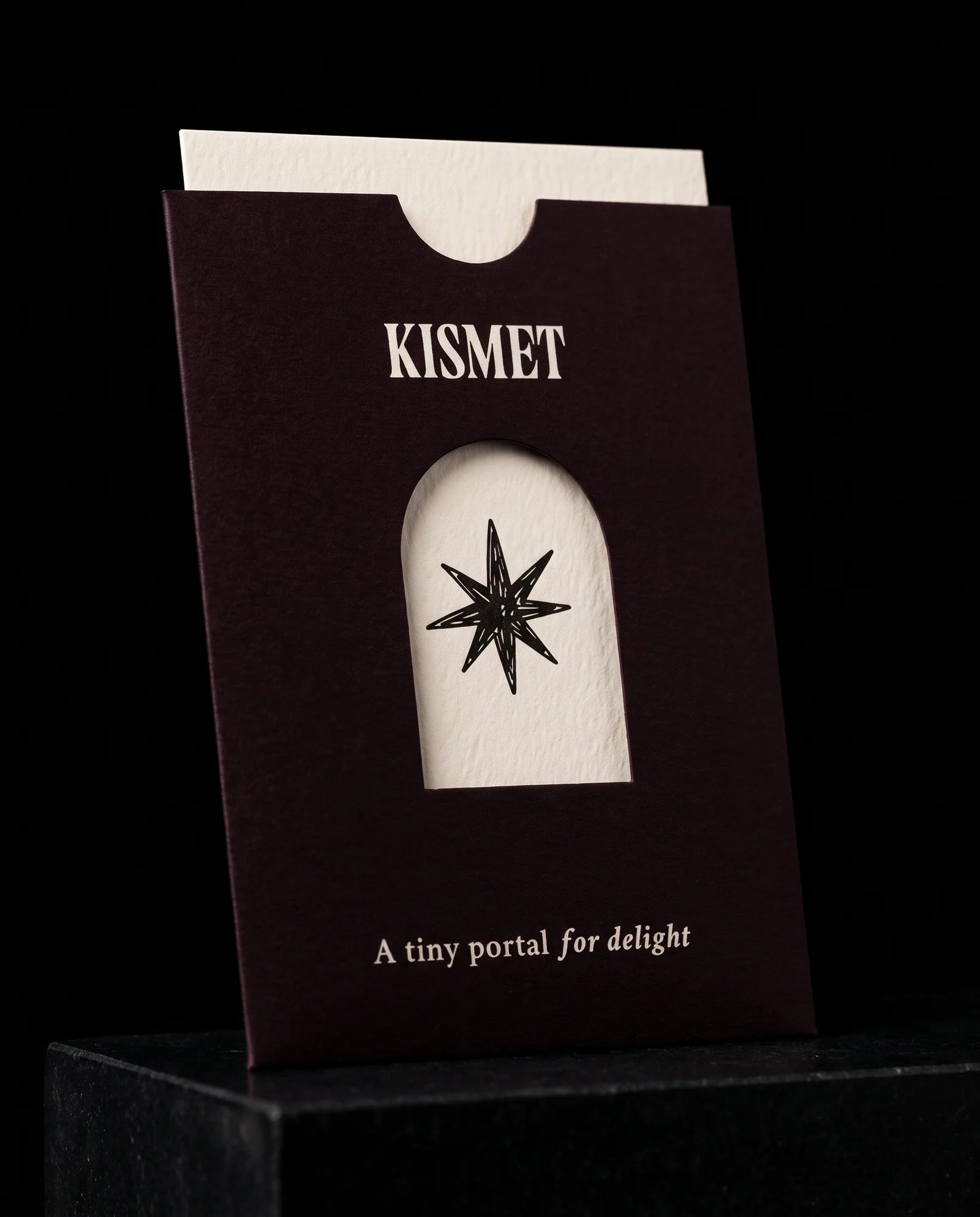
Kismet Vending is an Austin startup putting collectible message cards into vintage vending machines. The founders wanted a card people keep, fifty different messages, a die-cut sleeve, and one hard limit: card and sleeve together under 1.1 mm. We priced the best version first, letterpress on double-thick cotton, then sat down with both founders and built the piece back down layer by layer, like a pizza: paper, ink, foil, finishes, with one star of the show. Every image on this page is a production simulation made before a plate exists.
The idea
Kismet sells a small moment of chance. You put money in a vintage vending machine and a card falls out with a message on it, like a fortune cookie with more to say.
12 rules
- 01Price the best version first. Quote full letterpress first, with flat offset and raised gloss ink alongside, so the budget picks the method.
- 02Cotton, one black, both sides. 100% cotton in a natural off-white, one black ink on the front and back. Tree-free, and it takes an even, deep bite.
- 03Leave the photograph out. The founders dropped the photo card, so every template holds to the same single-ink line art.
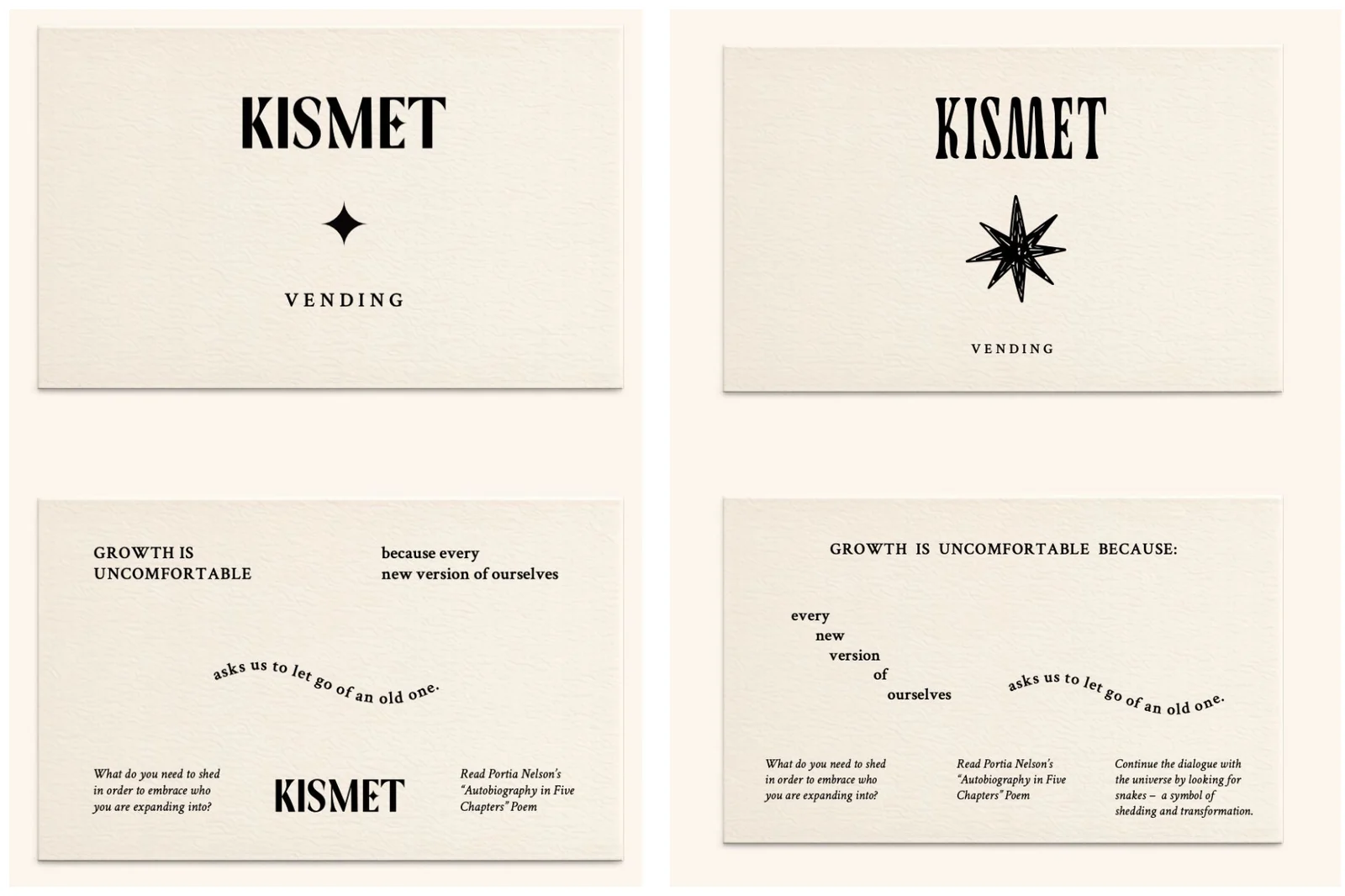
- 04Five templates, five blind dies. Five templates of ten messages each. Every template gets its own blind debossed mark, on the logo side only.
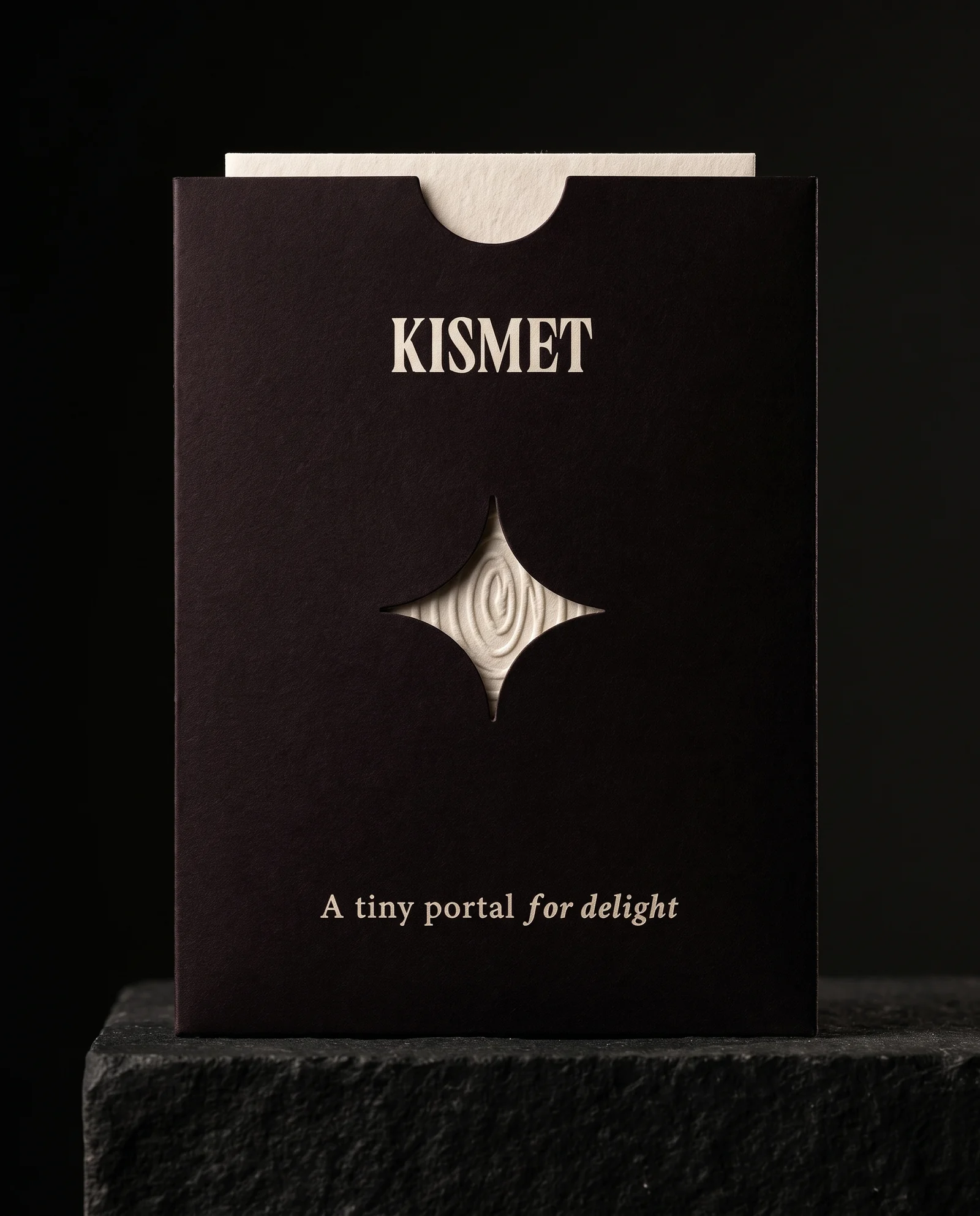
- 05Deboss in, and mind the back. On double-thick cotton the deboss stays on the front. On single-ply, lay out the back copy around the shape it leaves.
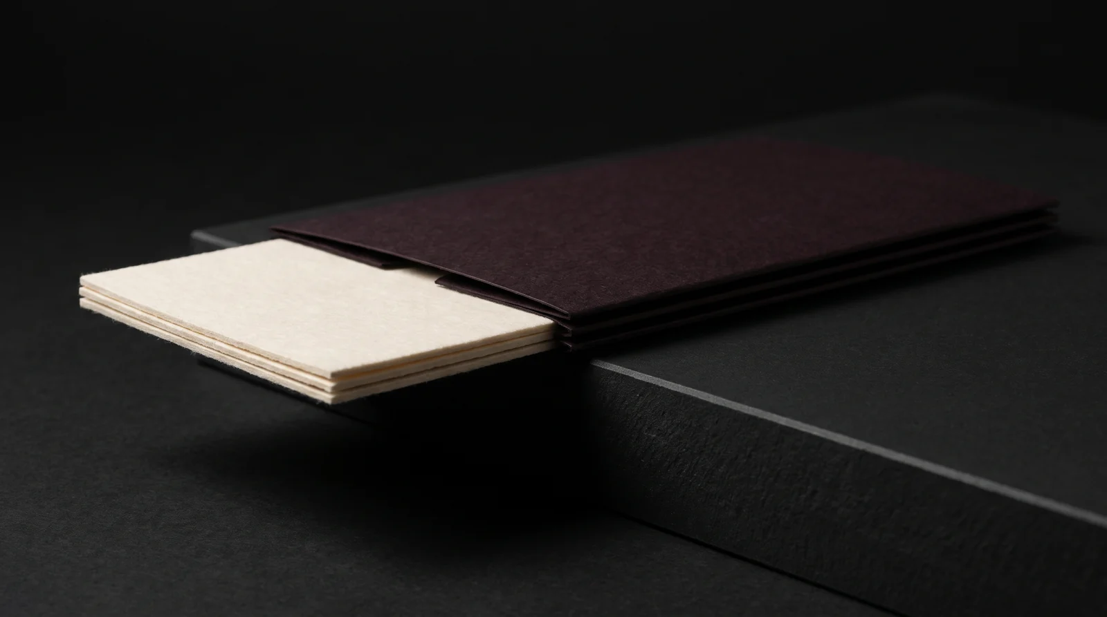
- 06Work backwards from 1.1 mm. Price single-ply and double-thick cards with a sleeve built snug to the card, then prove the fit with the prototype run.
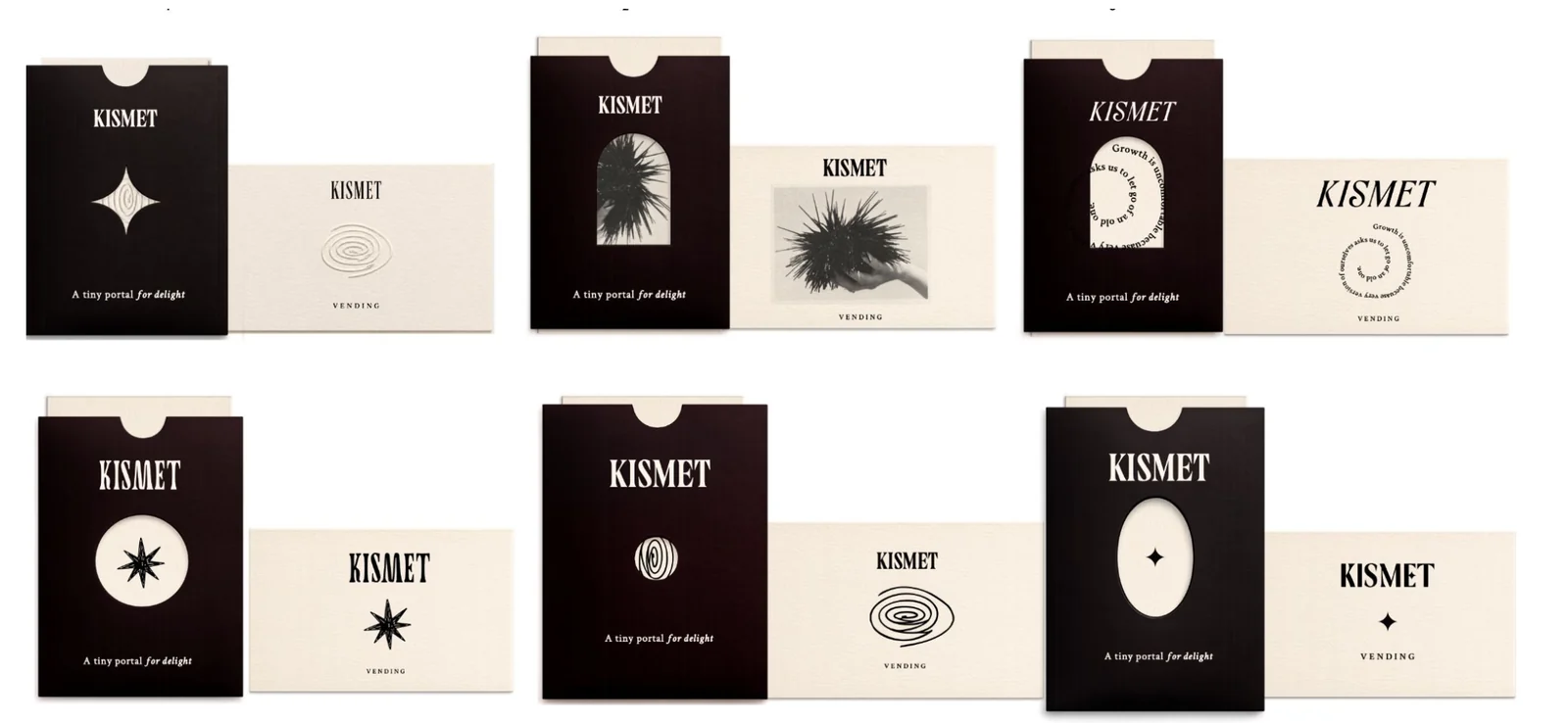
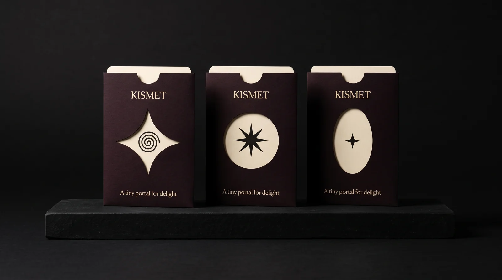
- 07One sleeve for all fifty. One sleeve with one window that works for every card, with the variable-window version priced next to it.
- 08Build it down, layer by layer. Walk the layers in order, paper, ink, foil, finishes, and price scenarios that take one away at a time, so the founders see what each one i…
- 09Letterpress comes off first. Set letterpress aside for this run. Spot-colour offset black is the baseline, with raised ink or black foil and a deboss as the one touch o…
- 10Hang-tag paper instead of cotton. Price a premium uncoated paper with real texture in a natural off-white, the kind high-end fashion hang tags use, next to single-ply cotton…
- 11One deboss shape, not five. Price one shared deboss shape against five, so the founders can see what the variety costs and decide.
- 12One sleeve shape, plus a folded option. One die-cut shape for all fifty cards, with each card designed to play with the window, and a simple scored, folded sleeve priced next to i…
If the card is going to be kept, framed or used as a bookmark, it has to feel like something. So the job was to find the most tactile card the budget allows, and to make sure it still fits through the machine.
The client
Kismet Vending is two co-founders in Austin, Texas, launching with machines around the city and planning to follow with hotels, coffee shops and bookstores, then capsule drops written by guest artists.
Their first message to us asked for full-colour printing on both sides, 2.5 × 3.5 in cards in sleeves, fifty messages shuffled rather than grouped, and a question most first-time clients ask: letterpress, embossing or foil, which one is worth the money?
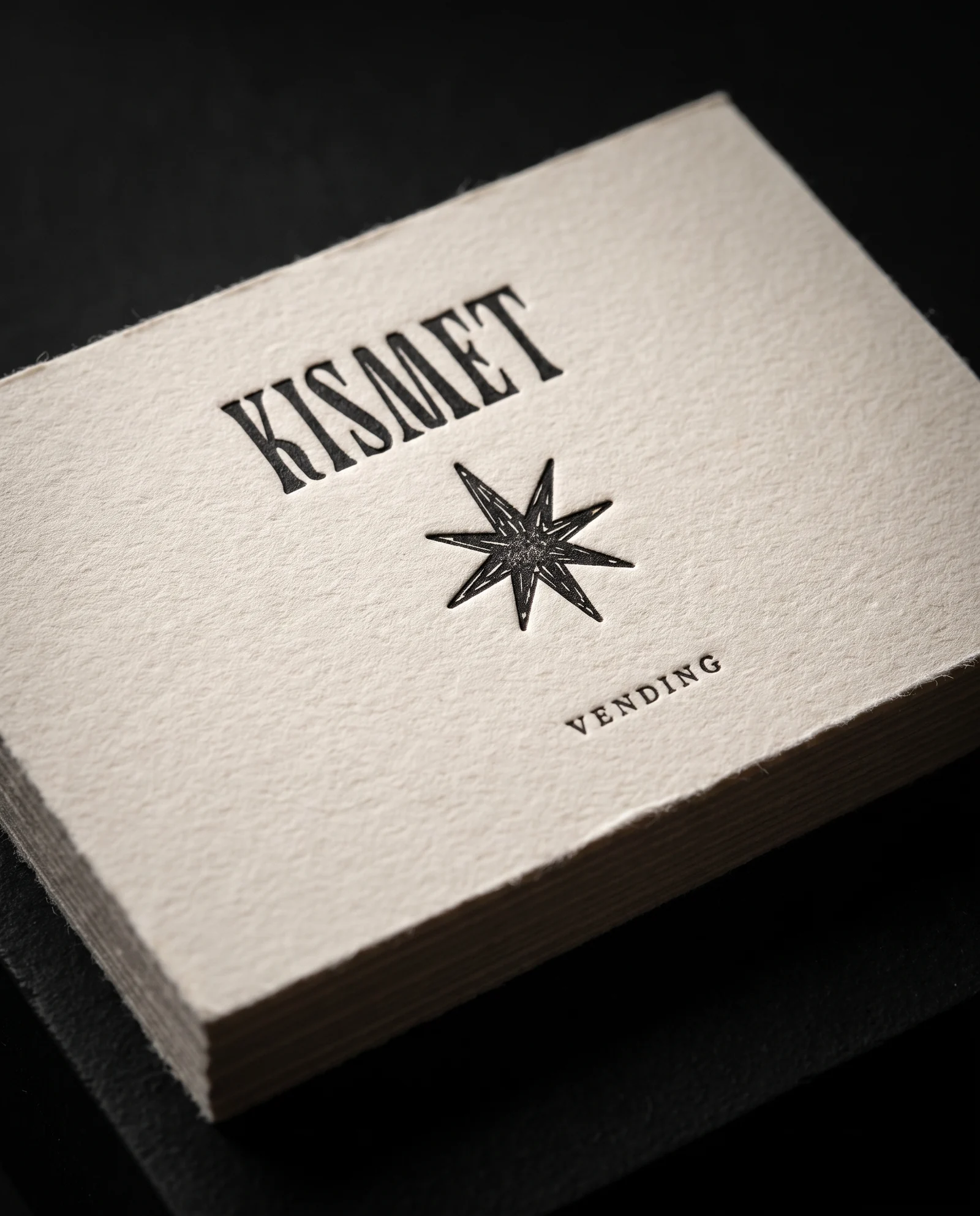
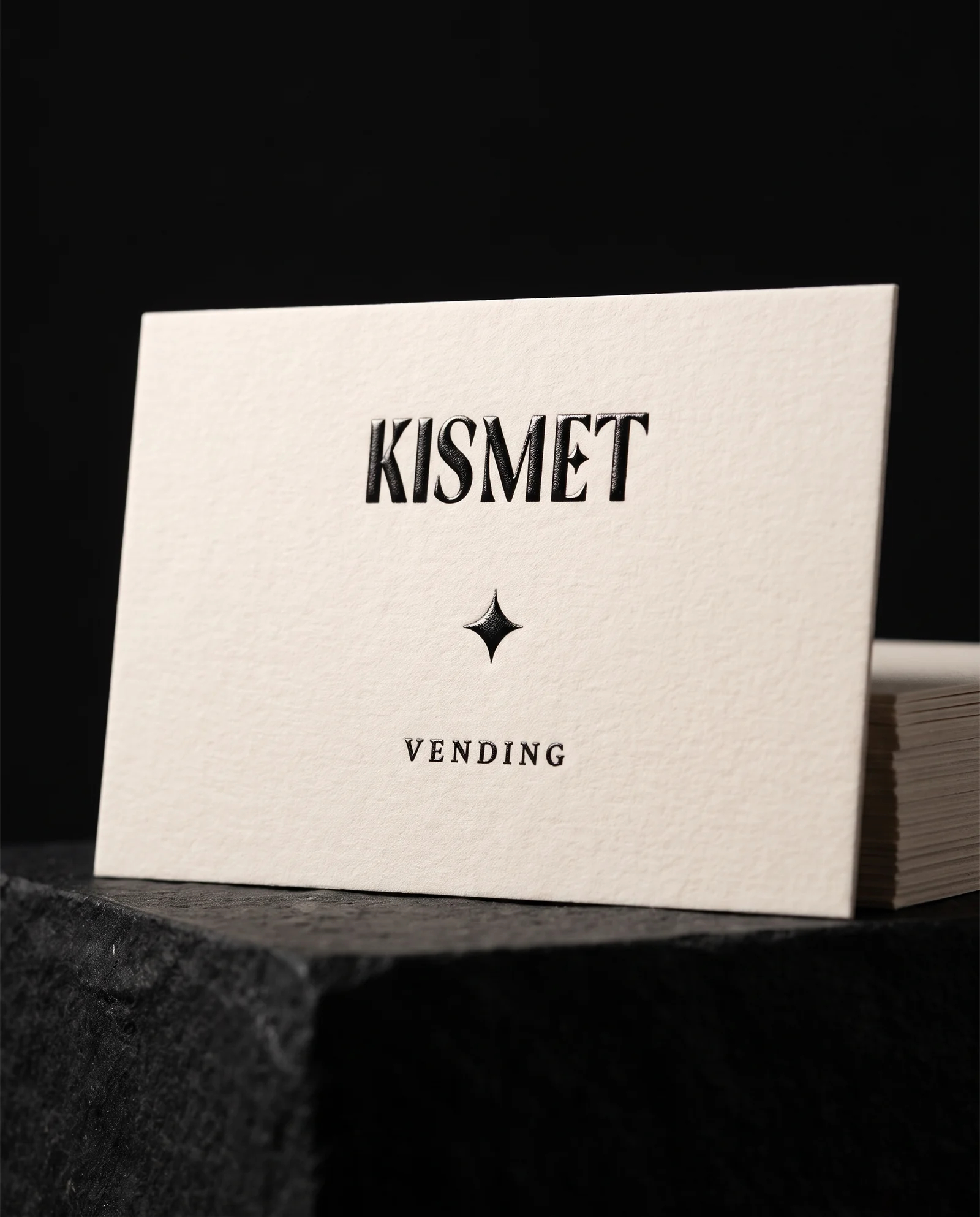
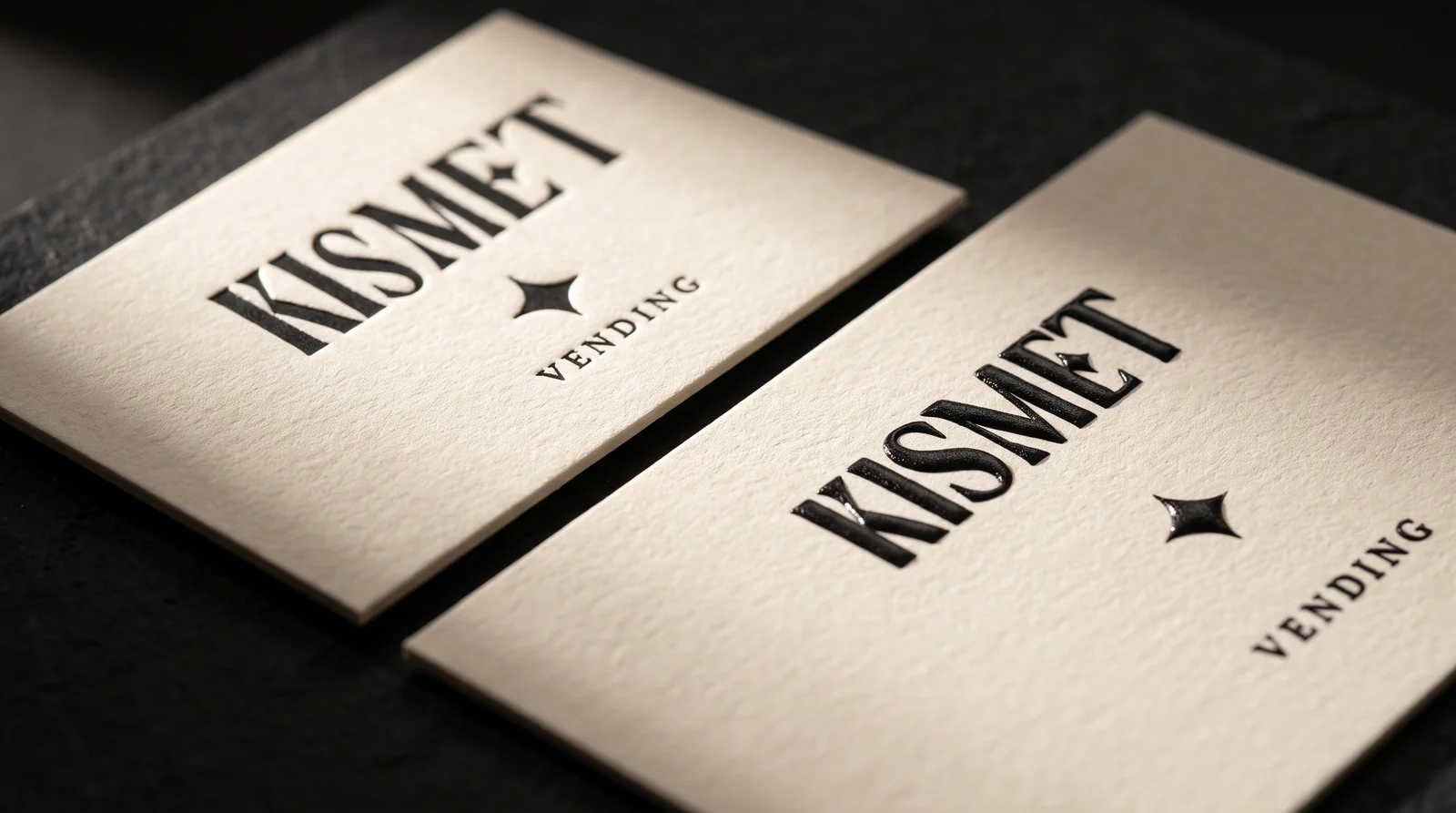
The same one-black artwork two ways. Letterpress sinks every stroke into the cotton and stays matte. Raised ink leaves the sheet flat and lifts the ink into a soft, shiny ridge, at about the price of flat offset.
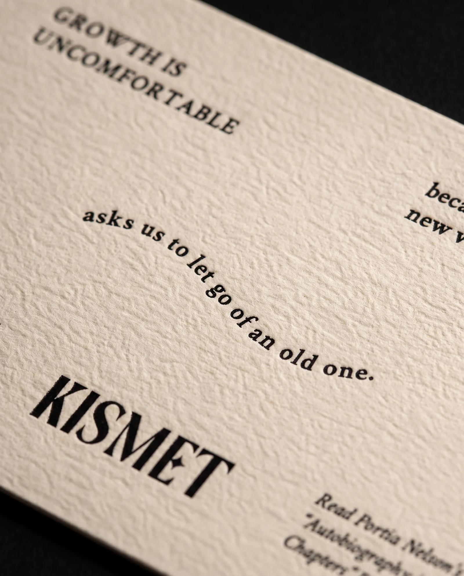
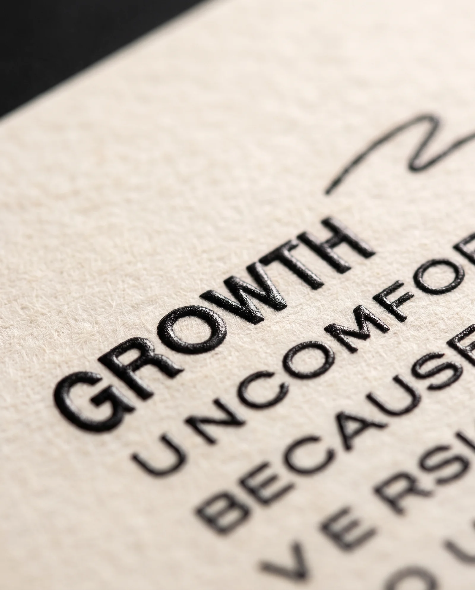
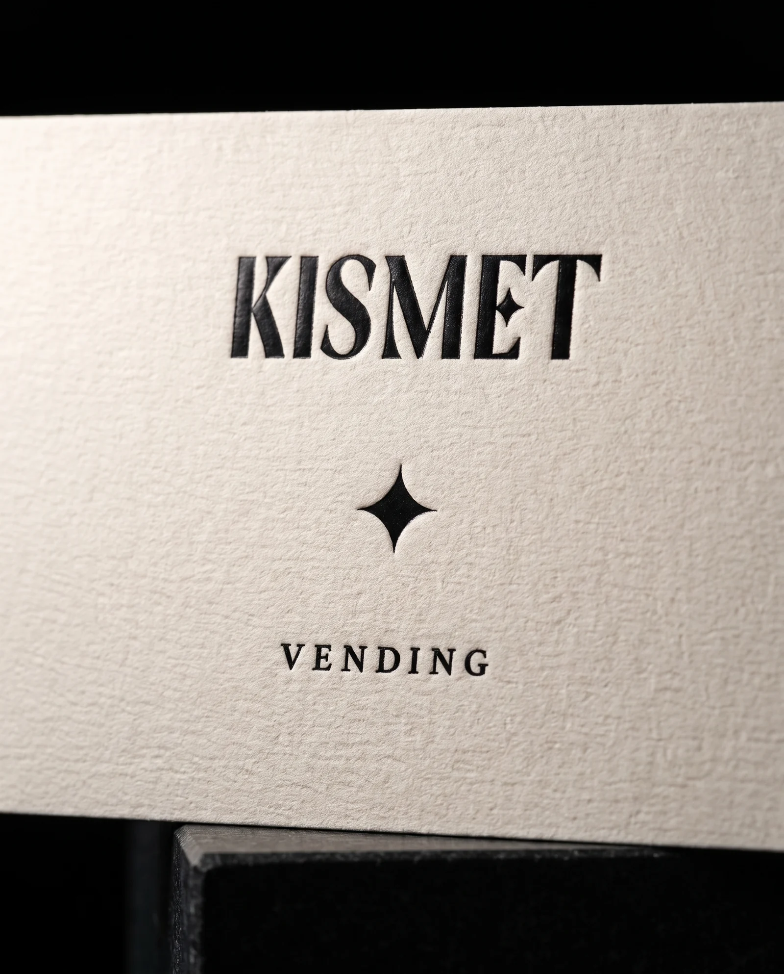
Up close, letterpress is a shadow and raised ink is a highlight. One reads as craft, the other as polish, and both hold small type on cotton.
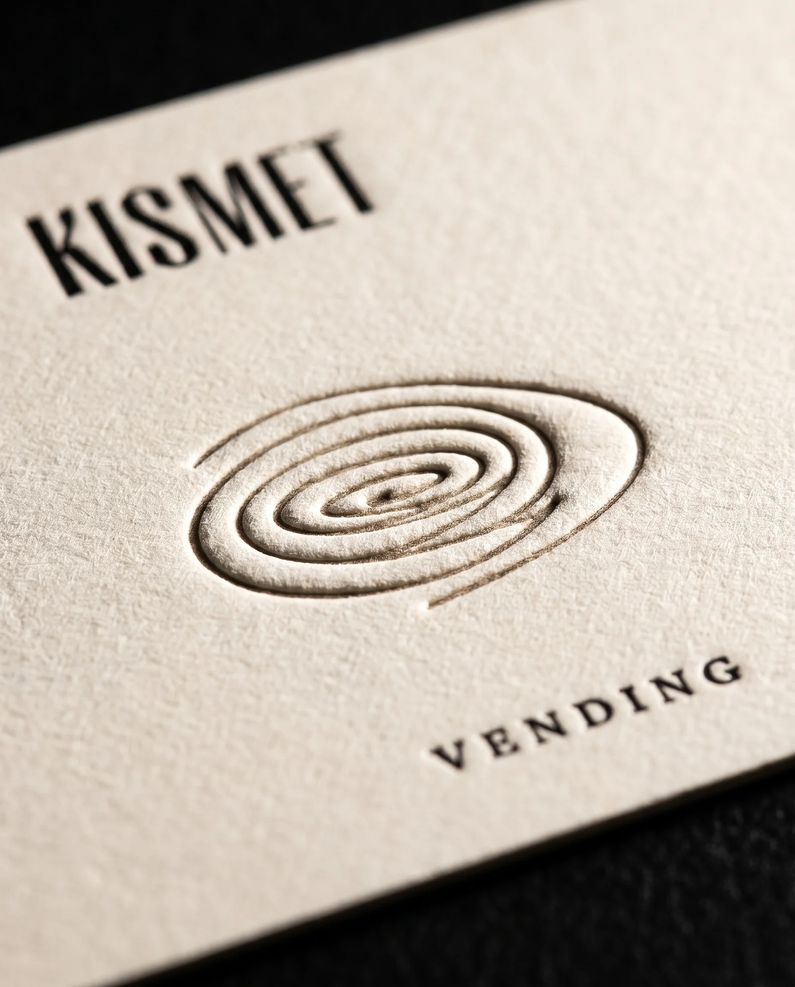
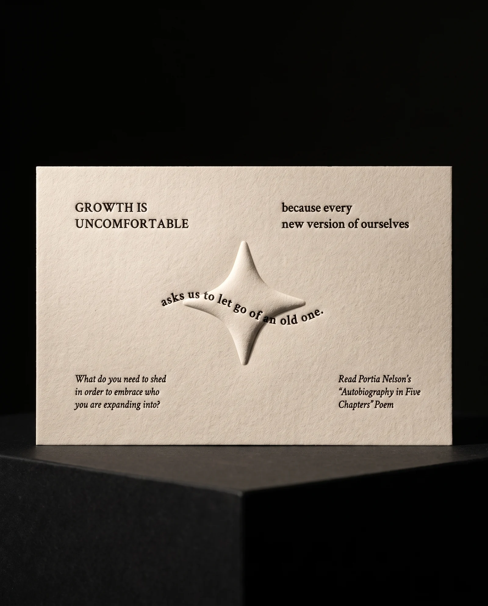
A blind deboss on double-thick cotton leaves the back untouched. On a single sheet the shape comes through as a raised bump, so the back copy has to be laid out around it. That only works if the designer knows before finishing the layout.


The same black, two ways. Offset lays it on the surface, sharp and rich, and it is the baseline the founders are pricing up from. Letterpress presses it into double-thick cotton so every stroke sits in its own shadow. Both are visualizations of options discussed, not the printed run.
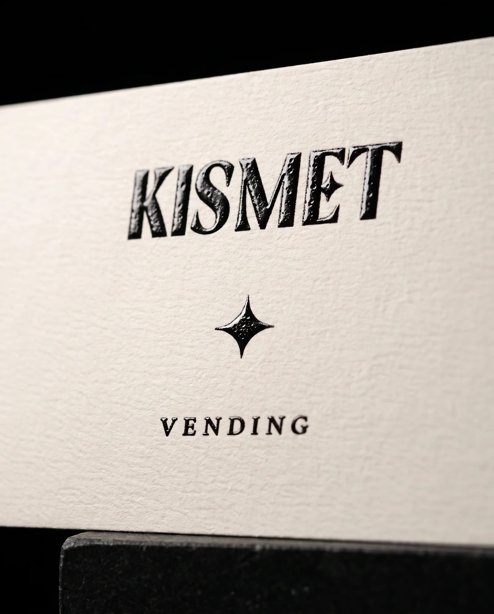
Two ways to add dimension to one black. Raised ink stands up off the paper with a lacquer shine and small dimples that grow on bigger shapes. Black foil sits pressed into the sheet with a satin sheen and a little of the letterpress feel. Similar in cost, very different personalities. Visualizations, not the printed run.
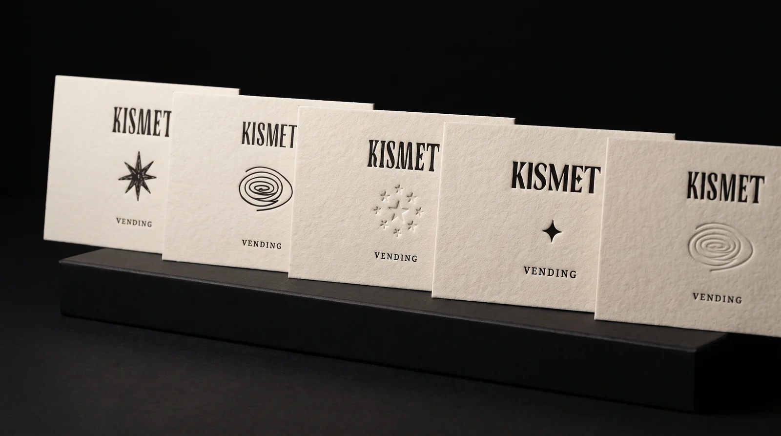

Three ways to print one black
Letterpress presses the ink into the paper. Each letter sits in its own shallow bite and you can find it with a fingertip. It is the most luxurious of the three and the most hands-on: every sheet is fed and watched on the press.
Flat offset lays the same black on the surface with no impression. It is the budget line, and on a good cotton sheet it still looks considered.
Raised gloss ink is printed flat and then lifted off the sheet. The ink stands up into a slightly domed, satin-shiny line you can feel. It is an old technique that high-end fashion hang tags still use, and it costs about the same as flat offset.
The numbers
Six machines hold about 300 cards each, so one fill is 1,800 cards. Three fills is 5,400 cards: 108 of each of the fifty messages.
That is the full run we are pricing, with a prototype of 100 cards of one design and 100 sleeves first, so the founders can put them through a real machine before committing to the rest.
Say it on the machine
If the card is letterpressed on cotton, say so where people pay. Letterpress, blind debossed, 100% cotton, tree-free. Those words are what let a card in a vending machine cost more than a sticker, and every one of them is true of the object in your hand.
Why simulate before quoting
Most people have never held letterpress next to raised ink. A screen shows both as the same black shape, and online photos are shot under whatever light flatters them most.
So we put both methods on the same cotton, under the same light, with the client's own artwork. The founders can decide what their fortune should feel like before a plate is made. Every photograph on this page is a production simulation; the real cards replace them when they run.
Round two: build it like a pizza
The first estimate had every bell and whistle in it: double-thick cotton, letterpress, a blind deboss for each template and a die-cut envelope that changed with the design. That is the right place to start, because it shows what the ideal piece costs. Then the founders gave us a target for card and sleeve together, and the job became getting as close to it as we can without losing what makes the card worth keeping.
So we built it back down the way we build every piece, like a pizza. The paper is the dough. The ink is the sauce. Foil is the cheese. Everything else is a topping, and every topping has a cost. You choose each layer so the whole comes together, and you take layers away in the order that saves the most while hurting the piece the least.
One star of the show
A small object doesn't need five special effects. It needs one thing done well, with everything else quiet around it. One black ink on a beautiful sheet, with the right impression, already makes a bold statement that stays understated.
So the question for the founders was never which finishes they wanted. It was which one finish is the star, and what we take away so the budget can afford it.
Four ways to print one black
Letterpress is the Rolls-Royce. A plate presses the ink into soft paper, so every letter sits in a pillowed bite with rich, hand-mixed colour. It is also the most labour-intensive way to print: a person feeds and watches every sheet. That is why it came off the table first for this run.
Spot-colour offset prints the same black flat on the surface. Next to digital black, which looks faded and greyish with soft edges on fine lettering, offset black is rich and crisp, and it still feels handmade. We can also pick a softer Pantone black, something closer to gunmetal, if a pure black is too loud.
Raised ink, or thermography, starts as that same offset black. While the ink is wet it is dusted with a powder, then heated, and the powder melts into a glossy, raised layer. It was everywhere in the early nineties and then mostly disappeared, which is exactly why it feels special now. The surface isn't a perfect dome: it has small crater-like dimples, and the bigger the shape, the more of them you see. Against a fibrous, glare-free paper, that moving, shiny black is all contrast.
Black hot foil with a deboss is the fourth route. A semi-gloss black foil is stamped with heat and pressure, and pushing it a little into the paper in the same hit costs almost nothing extra. It isn't glossy like raised ink. It has a soft sheen, flattens the fibres inside each letter, and gives back some of the letterpress feeling for less.
1.1 mm still decides the paper
The machine sets the last rule. Card and sleeve together still have to stay under 1.1 mm, and the founders are confirming the exact limit on their machines. A double-thick card may not fit once the sleeve wraps it, so the stock may end up thinner than anyone wants. That is fine: we would rather pick the best sheet that vends than the thickest one that jams.
Setup is a fixed cost
Most of the price of a special finish is setup, not paper. Every plate has to be made, every ink hand-mixed, every die cut from metal, loaded on the press and lined up by a person. That takes the same time whether we print one card or five hundred.
That is why the levers that move the price are the number of setups, not the number of cards: one deboss shape instead of five, one sleeve instead of five, one ink instead of two. Once the press is running, more of the same card costs very little.
Brief the designer before the last draft
Offset is priced per colour, per location. One black on the front and one on the back is two. Add a coral accent on both sides and it becomes four: a second ink mixed by hand, more plates and more press washing, just for a small dot in the corner.
Kismet's designs are minimal and clean, so this probably won't bite them. We said it anyway, because a lot of designers work on screens and never see a press. Design choices are production choices, and it is always easier to make the design fit the method than to force the method to fit the design.
Where it stands
Letterpress is off the table for this run, and the founders agreed on a single sleeve shape. We are pricing a few scenarios side by side, starting from a baseline of flat spot-colour black with no special finish, then adding one layer at a time: raised ink or black foil with a deboss, one blind deboss shape or five, cotton or a premium uncoated sheet, the die-cut envelope or a folded sleeve.
The founders are choosing their star of the show and testing sleeve materials in their machines. Then we fine-tune the chosen direction, send photos and video of real papers, and run the 100-piece prototype before the full run. Once the digital proof is approved, custom work like this is in hand in about three weeks.
Start from these materials
Same paper, foil and finish, locked in — nothing of Kismet Vending's artwork comes with it.
Questions
- What is the difference between letterpress and raised ink?
- Letterpress presses ink into the paper, leaving a recess you can feel and a matte finish. Raised ink prints flat and then lifts into a slightly raised, satin-shiny line. Letterpress reads as crafted; raised ink reads as polished and usually costs less.
- Can you letterpress a photograph?
- Not well. Letterpress prints solid shapes and lines. A photograph needs fine halftone dots, which fill in under letterpress pressure, so photos are printed flat by offset or digital instead.
- Will a blind deboss show on the back of a card?
- On single-ply stock, yes: the pressed shape shows as a bump on the back. On double-thick or triple-thick cotton the impression stays on the front and the back stays flat.
- What paper is best for letterpress?
- Soft, thick, uncoated paper, and 100% cotton is the classic choice. It takes a deep, even impression and has a felted, handmade feel. Cotton is also tree-free.
- How thin does a card need to be for a vending machine?
- It depends on the machine. For Kismet, the card and its sleeve together had to stay under 1.1 mm, so paper weight and sleeve construction were worked backwards from that number and tested with a prototype.
- Does printing fifty different messages cost much more than one?
- Each message needs its own plate, so setup grows with every variation. Paper, ink and press time are shared across the run, so the cost per card falls as the quantity of each message rises.
- Thermography vs letterpress vs foil deboss: what's the difference?
- Letterpress presses ink into soft paper, leaving a matte, pillowed impression; it is the most hands-on and usually the most expensive. Thermography prints ink flat, dusts it with powder and heats it, so it rises into a glossy raised layer with small crater-like dimples. Foil deboss stamps a foil film with heat and pressure and pushes it into the paper in the same hit, giving a soft sheen and a pressed-in feel. Thermography and foil deboss usually cost about the same and less than letterpress.
- How do you lower the cost per piece on a 5,000-card art run?
- Cut setups before you cut quality. Use one ink instead of two, one deboss shape instead of several, and one sleeve or die shape for every design. Then look at the paper: a premium uncoated sheet or single-ply stock costs less than double-thick cotton. Pick one star finish and keep everything else simple. On a run of thousands, the cost of each card falls fastest when the number of plates and dies falls.
- Why does setup cost the same for 1 or 500 pieces?
- Because the work happens before the first sheet prints. Plates and dies have to be made, inks hand-mixed, and every die loaded on the press and lined up by a person. That takes the same time for one piece or five hundred. Once the press is running, extra copies of the same piece cost very little, so small test runs cost far more per piece.
- Is thermography the same as raised spot UV?
- No. Thermography is ink with a melted powder on top, so the raised surface has small dimples and works on uncoated, textured paper. Raised spot UV is a clear coating that forms a smoother, more uniform dome and needs a coated or laminated surface to cure on. If a sample has perfectly smooth domes, it is probably raised UV, not thermography.
- Folded sleeve or die-cut envelope: which costs less?
- A folded sleeve, usually by a wide margin. It is one rectangle of board, scored and folded, and it can ship unprinted or with one ink. A die-cut envelope is printed flat, die-cut, folded and glued, and every window shape needs its own die. The envelope feels more premium; the folded sleeve is simpler and cheaper. For vending, both need a test in the real machine.