This is right if
The silhouette is familiar and worth keeping, but the drawing falls apart on paper: fine details close up, the emboss looks muddy, the foil version never quite works.
Your logo nearly works
Logo reinterpretation keeps the parts of a mark customers already recognise, the silhouette, the counter, the colour, and redraws everything else as three directions you judge printed on real stock.
Guide price. Every project is quoted — tell us what it is for and we come back with a number. Most reinterpretations land between US$ 1.450 and US$ 2.800. Half of every design fee is credited against your first print order over US$ 600.
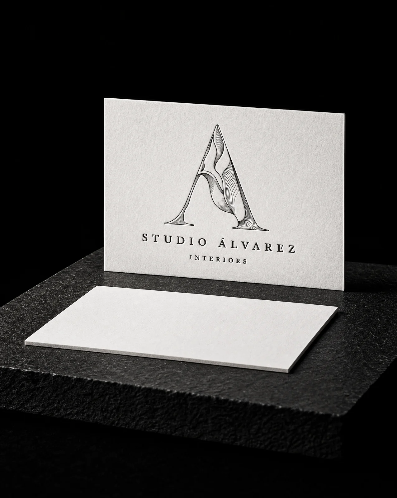
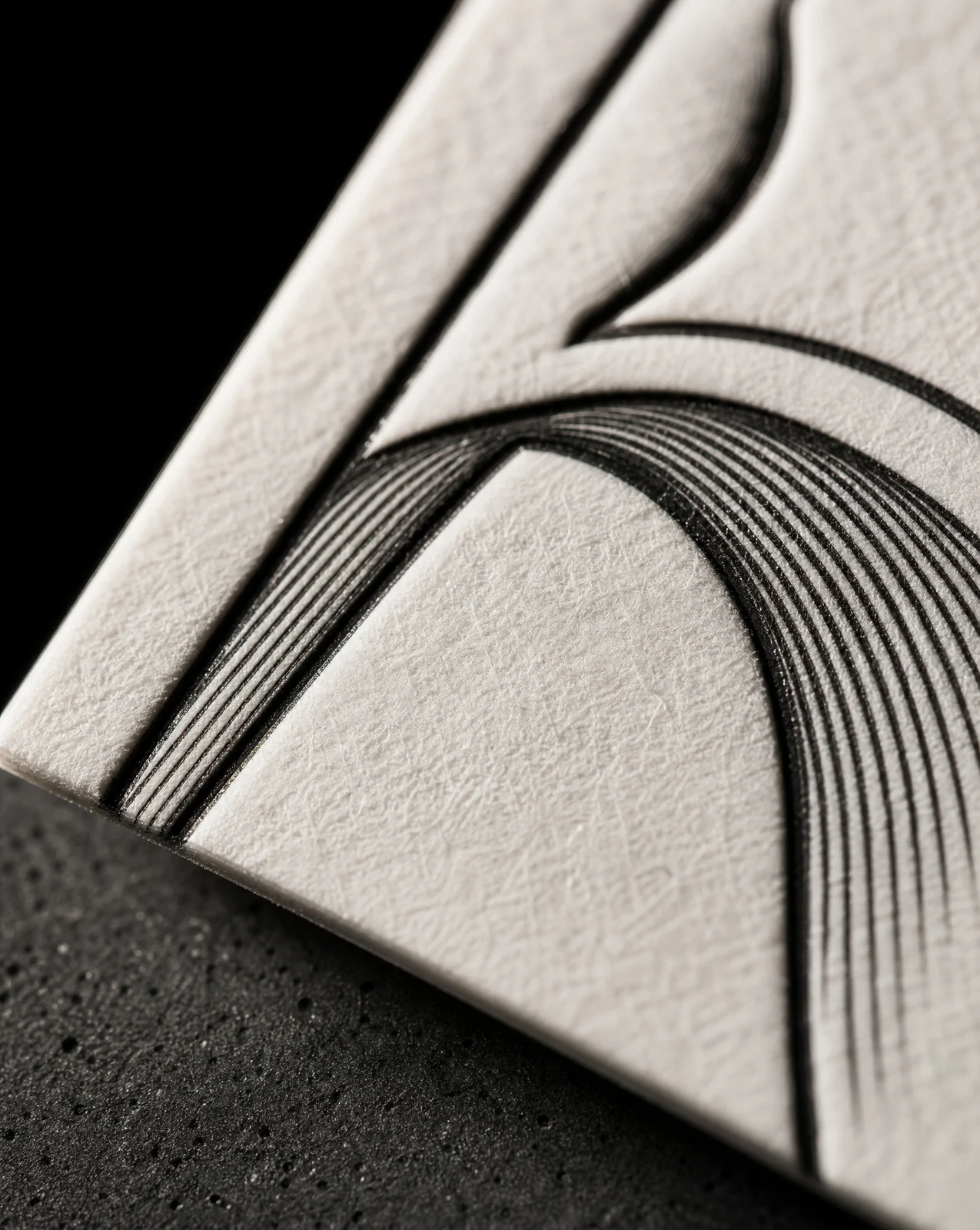
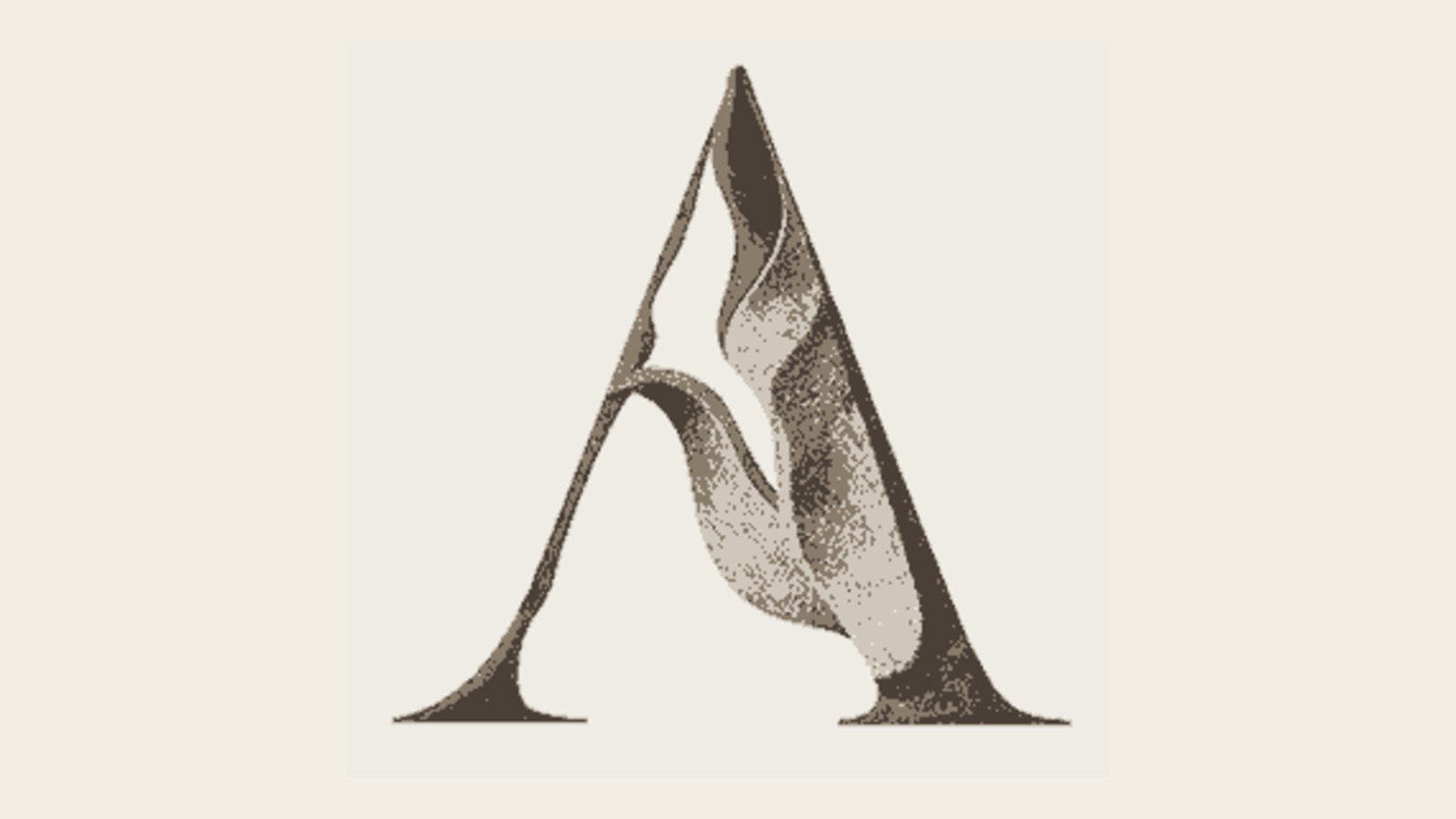
Alvarez Stone · the final stone A, relief rules in one ink
From a real project · Alvarez Stone
The final mark. The sculptural feeling is carried by line weight instead of tone: each rule thickens into shadow and thins across a lit face, so one plate describes the whole form.
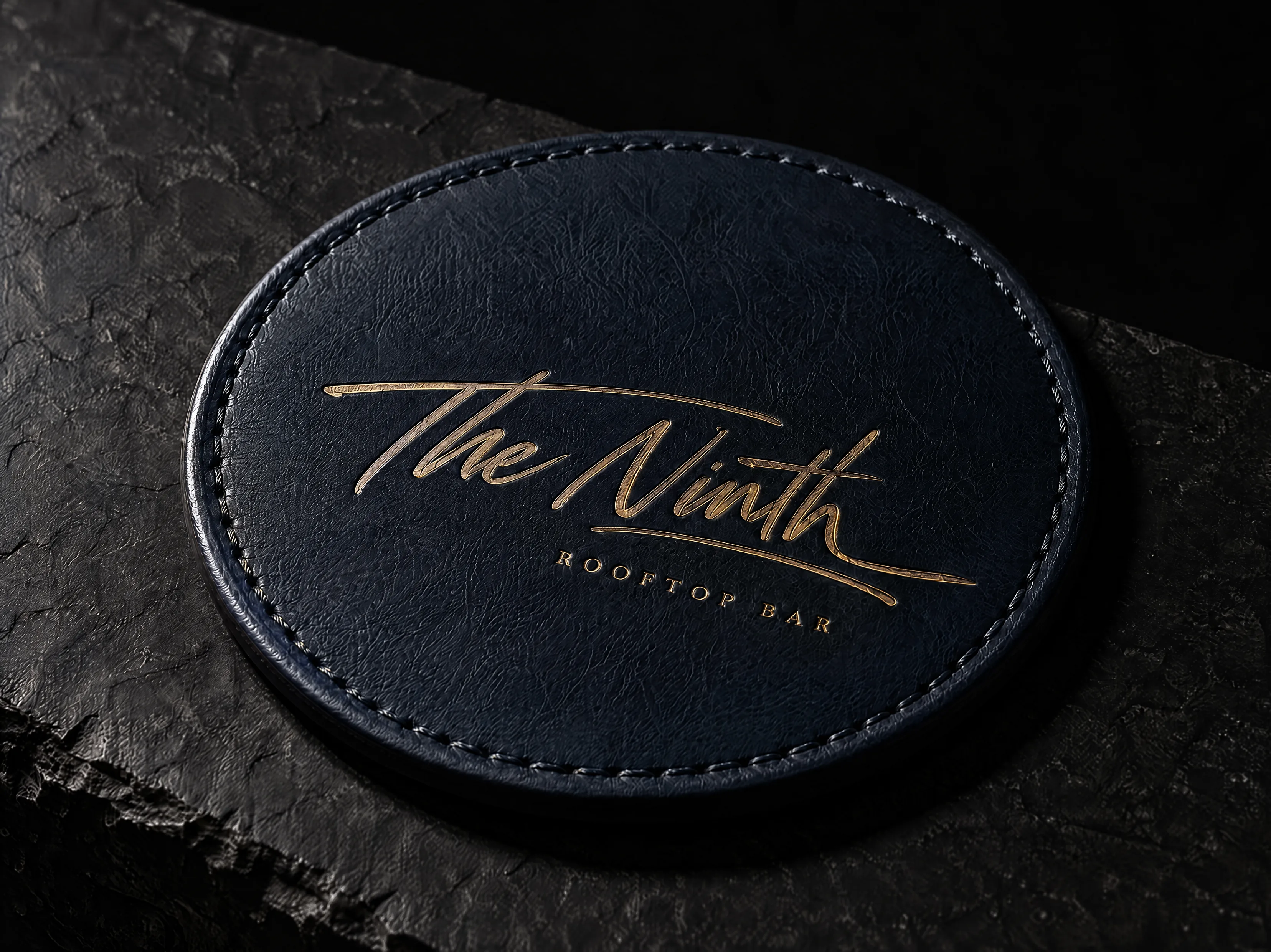
Read the Alvarez Stone case study →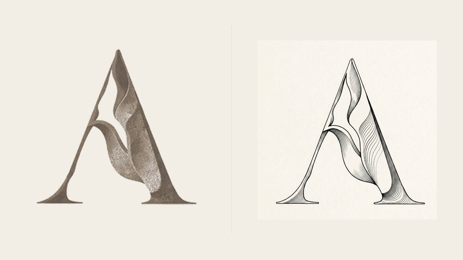
How it runs
Show us the mark customers know. We agree which parts must stay before drawing anything new.
Three distinct directions on the actual printed application, not marks floating on a screen.
One chosen direction is refined against your feedback and the limits of the selected process.
Outlined vector masters, process separations and a spec sheet naming what the press needs to hold.
The handoff
Is this the right service?
The silhouette is familiar and worth keeping, but the drawing falls apart on paper: fine details close up, the emboss looks muddy, the foil version never quite works.
The mark already works as a drawing. A redraw fixes the file for a fraction of the cost.
Press-Ready Redraw · from US$ 245 →
No established identity yet, or the business has outgrown it. Start with a full system.
Identity for Print · from US$ 3.200 →
Production standards
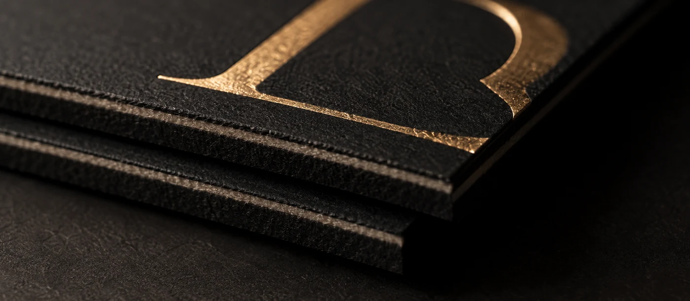
Test open counters and minimum strokes at the size of the finished piece, not on a large monitor.
Business card sizes →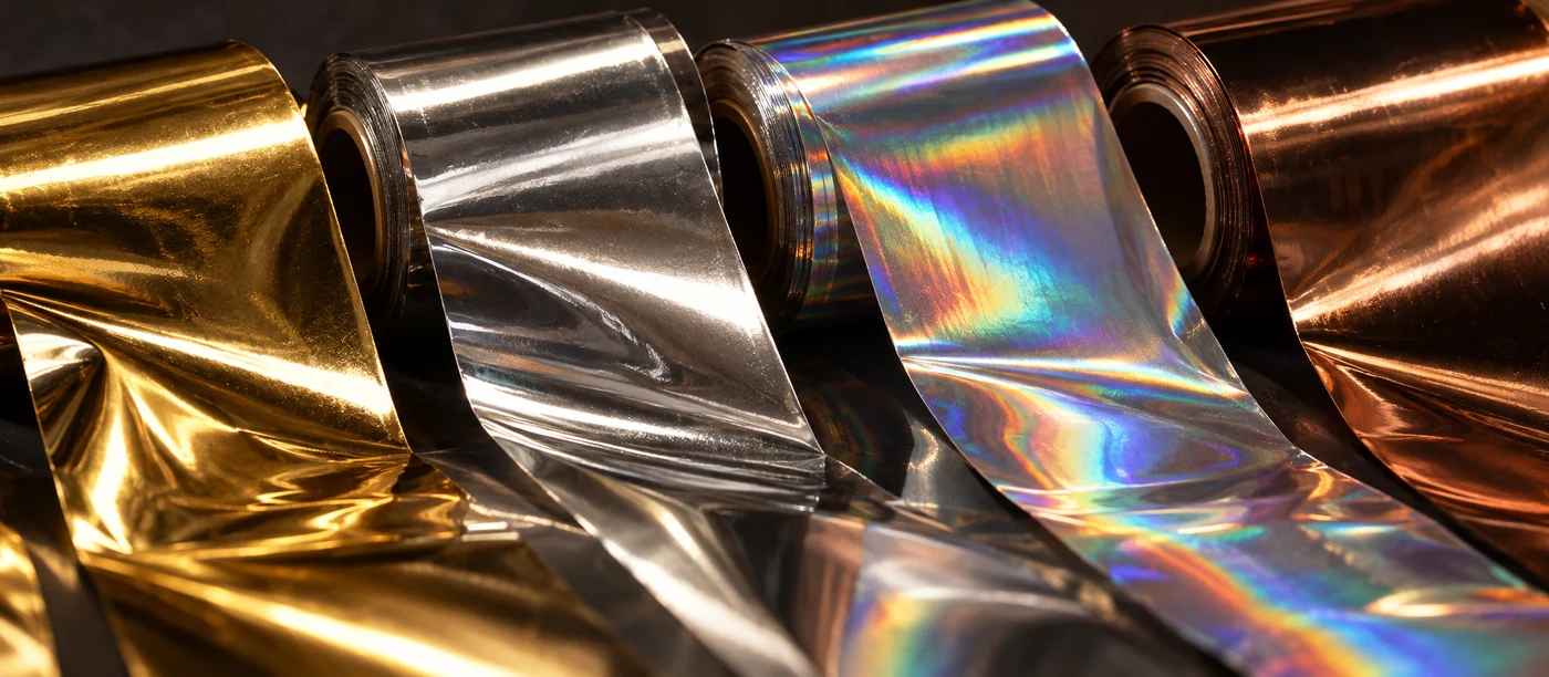
An ink gradient cannot simply become a foil gradient: the die needs one solid separation.
Foil stamping →That is the constraint we work inside. We agree what is load-bearing — the silhouette, the counter, the colour — before any drawing starts, and those elements do not move.
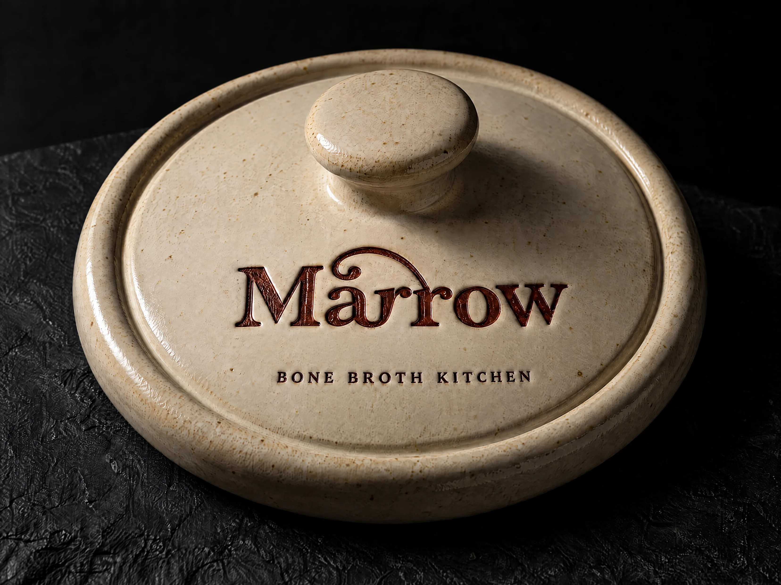
Emboss needs open counters and a single clear depth. Detail under about 1.5 mm collapses when the paper stretches. A reinterpretation opens the mark up so the depth reads.
Tell us what missed before choosing one to refine. If the brief has fundamentally changed, we discuss the new scope before drawing again.
Yes. The approved artwork and its production files are yours. Fonts licensed from others remain subject to their licence.
Send the best original file you have and your colour references. We keep what survives the actual stock and process, then show any unavoidable change before approval.
Updated September 2026
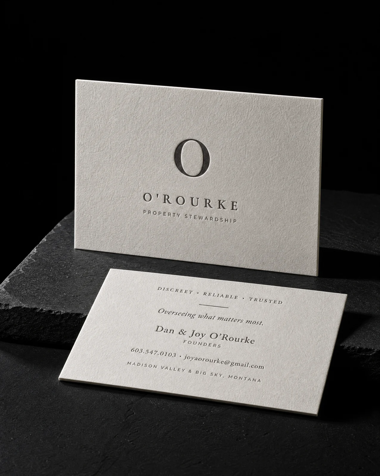
Two sides resolved against the exact trim, finish and stock, with every small detail set to survive the press.
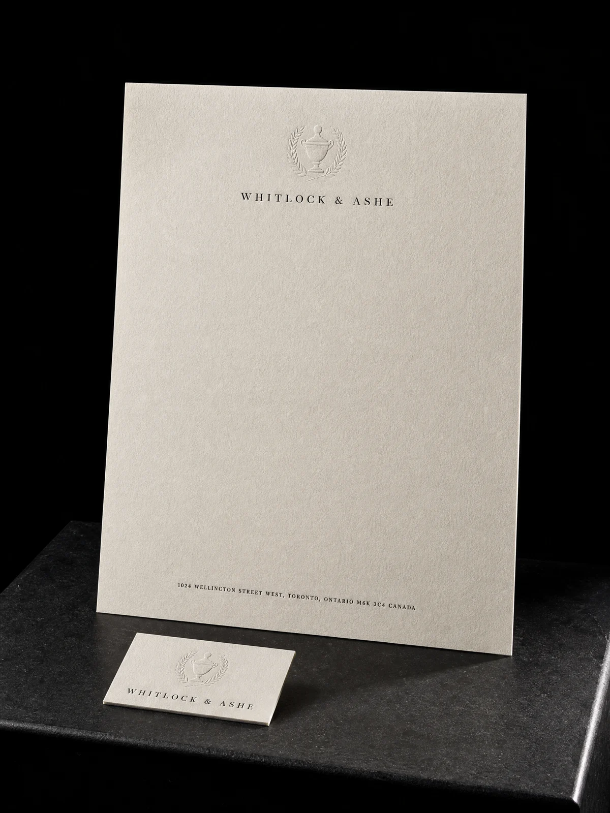
A card, letterhead and envelope with one consistent mark, thoughtful spacing and separations that make production simple.
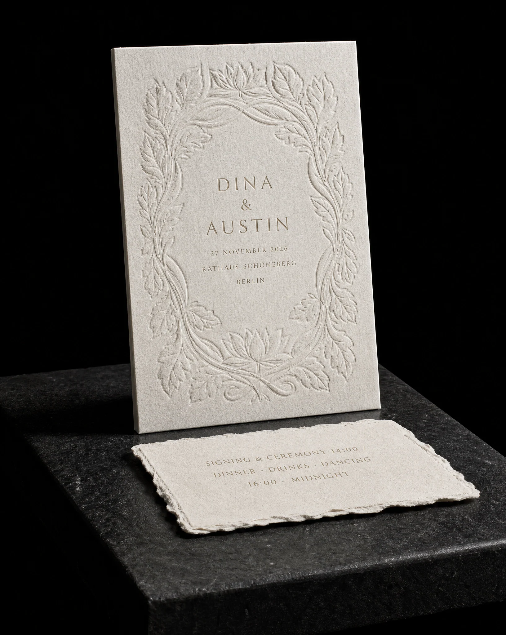
Invitation, reply, details and envelope considered together so the whole suite arrives as one clear gesture.