Here at Print Peppermint, we buy and sell a ton of paper... :( sorry trees!
And, we are really excited about this new paper series from Legion Paper called "Colorplan".
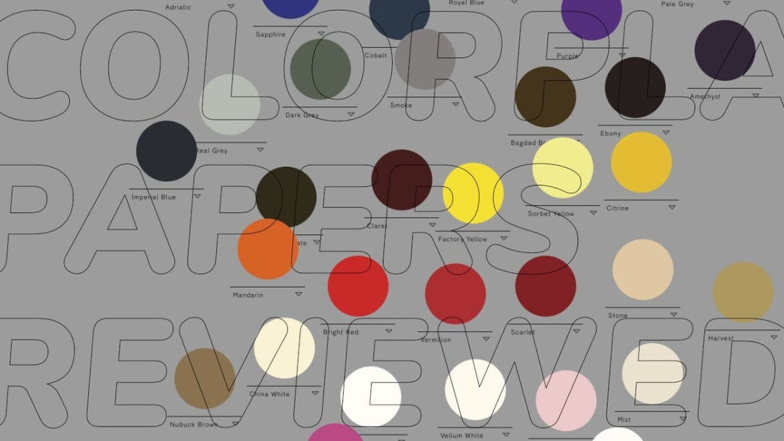
This family of papers contains:
Take a look at the video below, as Austin breaks out his handy lightbox to get a close up look at 5 of the custom embossings currently offered.
Transcript:
Hey, guys, Austin here from printpeppermint.com. And today, I'd like to talk to you about paper. At Print Peppermint, we buy and sell a lot of paper. Unfortunately, sorry trees, it's just how it is, but we use as much recycled paper as possible and we use chemical-free soy-based ink and all of that other good stuff. So today, this family of paper that I want to look at is called Colorplan.

Colorplan is manufactured by Legion Paper. It says here on the website, they've been in the business 25 years. And I can attest to the quality of their products. We use a lot of their paper, so, on a regular basis. So let's jump right in. What makes Colorplan exciting? Well, as the name suggests, color.
There are 50 colors to choose from, and they sort of curated these colors in a pretty brilliant way. I must say, their website is super slick. They have them sort of categorized, classic, new, corporate, light to dark. You can also choose an individual color and see what its complementary colors look like, what the adjacent colors look like.

If you have one of our sample packs, you've seen actually that there's a triplex card where we merged these three papers together, the lavender, fuchsia pink, and candy. It's the Peppermint cupcakes card. It's pretty cool. So you can also make the background of the website one of the colors, which lets you see what a large surface area looks like. But most of you designers will know that this is a website, we are looking at a computer screen, which is a lighted source.

So when you get the physical paper samples in your hands, they're going to look a little different than what they look like on the computer even if it's a cool MacBook Retina screen kind of thing. So they also offer, on top of the 50 colors, what they call embossings, and there's 25 of them. These are like different textures that you can stamp on to the paper or they'll stamp it before they ship it to you.
And you can click on them and even download a high-res image version of that and pull it into Photoshop and play around with it. Put an opacity layer on it and see what it looks like in your design. And they show what each embossing looks like on a white sheet and on a black sheet, and I just think this is super slick and really cool. On top of that, they also offer eight different paperweights.

So you've really got a multitude of combinations between 50 colors, 25 embossings, and now 8 paperweights. Everything they have is from 100 GSM, 67-pound text, which is like your cheap home copier copy-type paper, all the way up to 700 GSM, 32-point Imperial, which should be like a double-thick super nice business card.
So I got my handy Lightbox here today in my studio down here in the basement in Berlin. So let's dive right in, take a close-up look at what these embossings really look and feel like, as well as the colors. All right.

So I was originally going to do all 25, but then I realize, that would be like a mega-long video. So we're just going to do my top five for today. The first one up on the list is called Ridged, and it looks like this.

Source: https://colorplanpapers.com/25embossings?l=ame
It has these sort of very wide sections and then smaller lines in between. It's a big similar to Laid if you've ever seen that, but this one has much more pronounced, much wider sort of embossed sections.
It's a very nice paper and would work very well with a legal client or more conservative-type business looking for that old-world traditional feel. The next one up on our list is called Sandgrain, and it looks a little something like this.

Source: https://colorplanpapers.com/25embossings?l=ame
It definitely has kind of an appearance of sandpaper and a little bit of the texture when you run your fingers over it, not like a rough sandpaper that's going to scratch you, but more like an old one that's been used a million times, so sort of smoothed over. Also, kind of looks like viruses under a microscope.
So the next one up on our list is called Silkweave, and it looks like this.

Source: https://colorplanpapers.com/25embossings?l=ame
At first appearance, it almost looks like Linen, but I will say, in person, it has a much tighter sort of crosshatch pattern going on. It definitely does remind me of a fabric with a very fine, very small detailed sort of stitching, and I assume that's where the inspiration for the name came from.
I don't work at Legion Paper, so I have no idea. Either way, it is a fantastic embossing and would work well on a variety of creative print projects. The next embossing up on our list is called Damask, not dumbass.

Source: https://colorplanpapers.com/25embossings?l=ame
It is an old-world type fabric, silk-tight fabric, and it looks like this.
It's got these very fine sort of circular swirling type lines that remind me very much of a human fingerprint. I think it was a fabric pattern that was much more popular probably 200 years ago. Either way, it is a very fantastic looking texture and could bring a level of elegance to a variety of projects.
The next embossing up on our list is called Pebble, and it looks a little something like this.

Source: https://colorplanpapers.com/25embossings?l=ame
I believe that the name comes from a sort of stone inspired look, and if you really pay attention to it, it's got this kind of, yeah, polished sandstone tile sort of look that you might line your walkway to your front door with, and it definitely has a kind of organic feel to it, not a synthetic looking texture at all.
And I think that's really the appeal of this embossing is that it gives it a very of-the-world organic type of feeling if you were to use this paper and embossing on your project. Okay, guys, that's it for today. Thanks for watching. I hope you learned something. I completely underestimated the time it would take to go through the 25 embossings and all of the colors and the thicknesses and everything.
So if you enjoyed what you saw today here, let me know in the comments, and I will definitely take the time to make a part two and part three, where we can go through some of the other embossings and other colors and compare the thicknesses of the paper. Thanks for watching again, and we'll see you next time.


