Case study · Business cards · Clandestine – Bijoux Hors Territoires
Clandestine – Bijoux Hors Territoires ↗Half gold, half ink
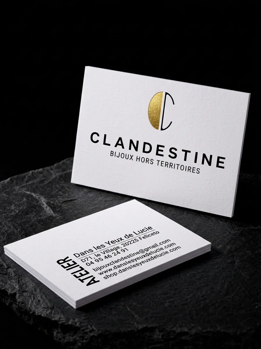
Card for Clandestine – Bijoux Hors Territoires, a brand of the Corsican atelier Dans les Yeux de Lucie: a letter C split between solid gold foil and a thin black stroke, the name in spaced black capitals, and an 'Atelier' reverse with the boutique's details.
The idea
Clandestine – Bijoux Hors Territoires is a jewellery brand of Dans les Yeux de Lucie, an artisan atelier and boutique in Feliceto, Corsica.
Two rules
- 01Gold for half the mark. A gold foil half-disc and a thin black stroke build the C together.
- 02Atelier on the back. The word ATELIER set vertically in bold capitals, beside the parent boutique's name and address.
Why it works
The only gold on the card is half a letter, so your eye goes straight to it and fills in the rest.
Start from these materials
Same paper, foil and finish, locked in — nothing of Clandestine – Bijoux Hors Territoires's artwork comes with it.
Questions
- Can foil and ink share one letterform?
- Yes. The foil and ink are registered to each other, so a mark can be part metal and part print, as here.
- What paper suits a jewellery brand?
- A textured uncoated sheet gives a small metallic accent more presence.
- How much foil does a card need to feel premium?
- Very little. One well-placed foil element often reads as more premium than a card covered in foil.