Design exercise · Boxes · Peppermint
Seventeen references, forty-four answers.
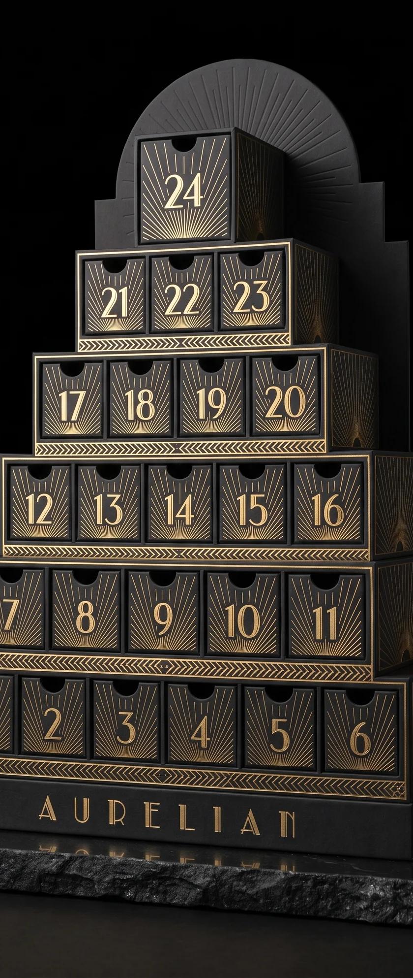
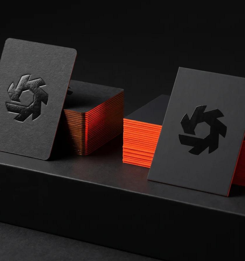
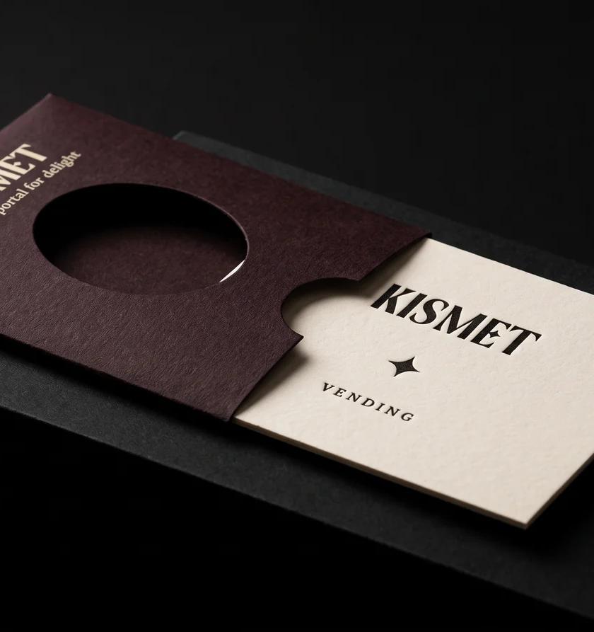
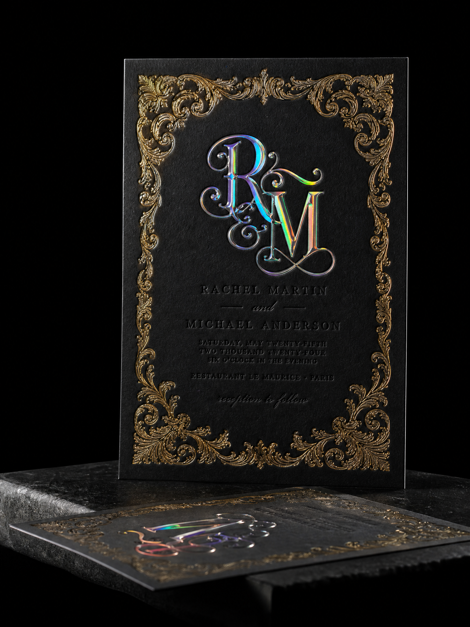
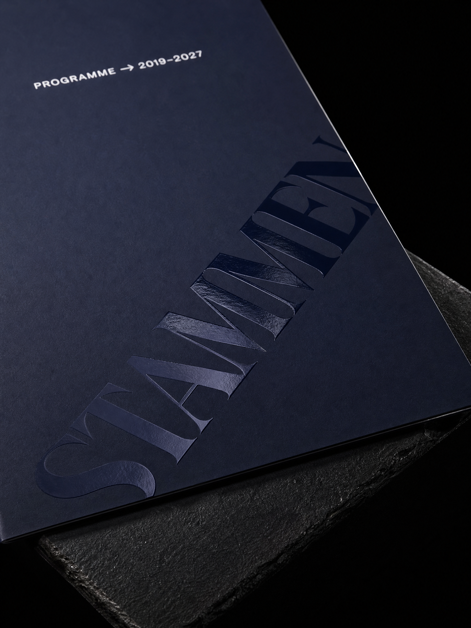
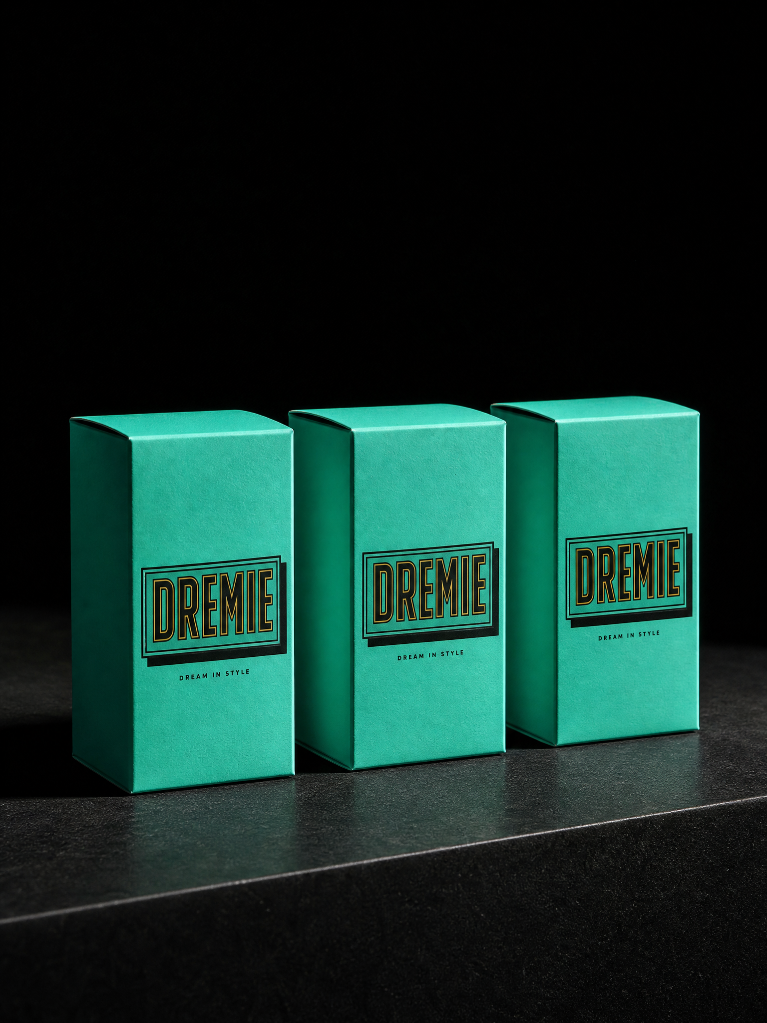
A reference exercise. Seventeen packaging and stationery pieces we admire, each rebuilt two or three times with a shifted palette, a different substrate and a typeface from a specimen library, so the production idea carries over and the design does not.
The idea
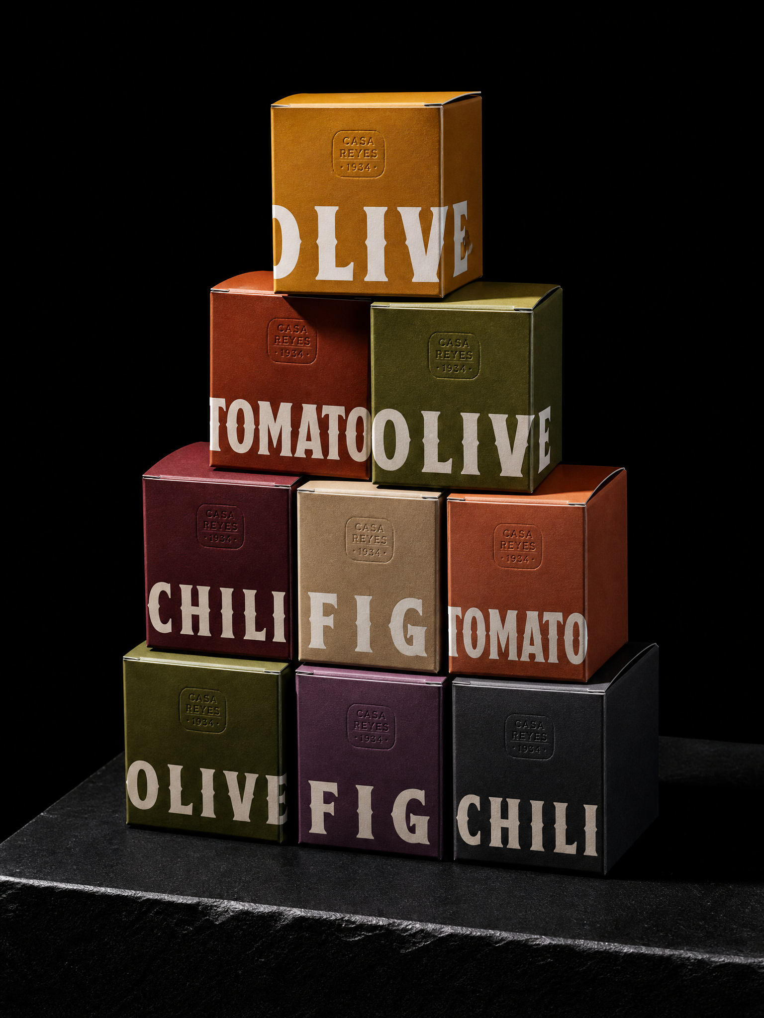
Seventeen pieces we admired, mostly packaging, a few cards. The exercise was not to reproduce them. It was to isolate the production idea inside each one and rebuild that idea somewhere it had not been used.
Three rules
- 01Borrow the process, not the palette. Kept the production idea intact, blind emboss under foil, a cut-through monogram, a tone-on-tone gloss pattern, and shifted every colourway…
- 02Let the type be the variable. Assigned each build a face from a specimen library: deli serifs, art-deco inlines, liquid chrome, blackletter, sign-painting brush, 70s bub…
- 03Four pieces from type alone. Four builds are pure typography: a riso sticker sheet, mint deco cartons, a blackletter mailer, heart-die-cut tags. No logo, no illustratio…
How this worked
Every colourway moved far enough that none of these reads as a copy. The type came from a specimen library rather than a house font, so the set does not collapse into one voice.

Start from these materials
Same paper, foil and finish, locked in — nothing of this piece artwork comes with it.
Designed by Austin Terrill, founder.