Silver foil on black: the cleanest contrast in print
Silver on black reads cool, modern, technical — a different luxury register than gold. If your brand skews editorial or minimal, silver is almost always the better call.
Pricing — silver foil on black uncoated
| Quantity | Per card | Total |
|---|---|---|
| 250 cards | 1,16 US$ per card | 290 US$ |
| 500 cards | 0,78 US$ per card | 390 US$ |
| 1,000 cards | 0,60 US$ per card | 600 US$ |
Prices from our live price list. Free proof, checked by a person, before anything prints.
Silver foil on black: the cleanest contrast in print
Silver foil on a true black uncoated stock is the most legible high-contrast combination we make. Gold on black reads warm and traditional; silver on black reads cool, modern, and — for whatever reason — expensive in a different register. If your brand skews technical, editorial, or minimal, silver is almost always the better call than gold, and the room reads that difference instantly even if they can't name why.
The pigment reality: there is no such thing as a true silver ink that survives a black background. All metallic inks have translucency, and the black paper eats the metal's brightness. Foil is the only route that keeps silver looking like actual silver. Mirror silver reads brightest; brushed and matte silvers hold up better to fingerprints and are our default for anything a customer will handle.
Design notes specific to this combination: silver foil has slightly lower perceived contrast than gold on the same black — the eye reads yellow-vs-black harder than silver-vs-black. Compensate with bolder type or a hair more foil coverage. And avoid pairing silver foil with a warm cream stock; the temperature clash is real. Cool blacks, deep charcoals, and near-black navies are where silver foil belongs.
Common questions
- Mirror silver vs brushed silver — which reads better?
- Mirror throws the brightest reflection and hits hardest at a glance. Brushed silver is our default for anything a customer will handle — it disguises fingerprints and reads more editorial. Both are real silver foil.
- Is silver foil harder to read than gold?
- Slightly. The eye reads yellow-on-black with more perceived contrast than silver-on-black. Compensate with bolder type or a hair more coverage. Fine hairlines that would survive in gold sometimes need to be nudged up for silver.
- Can I combine silver foil with a colored ink pass?
- Yes — silver foil plus one white or bright ink accent on black uncoated is a specification we run often. The white ink prints slightly translucent on black, which is a design consideration to plan for.
The next step
Not sure this is the exact spec you want?
Upload your logo and the Studio lays it out on real papers and finishes. It's a design exploration, not a proof: a person checks your final file before anything prints.
We've printed this
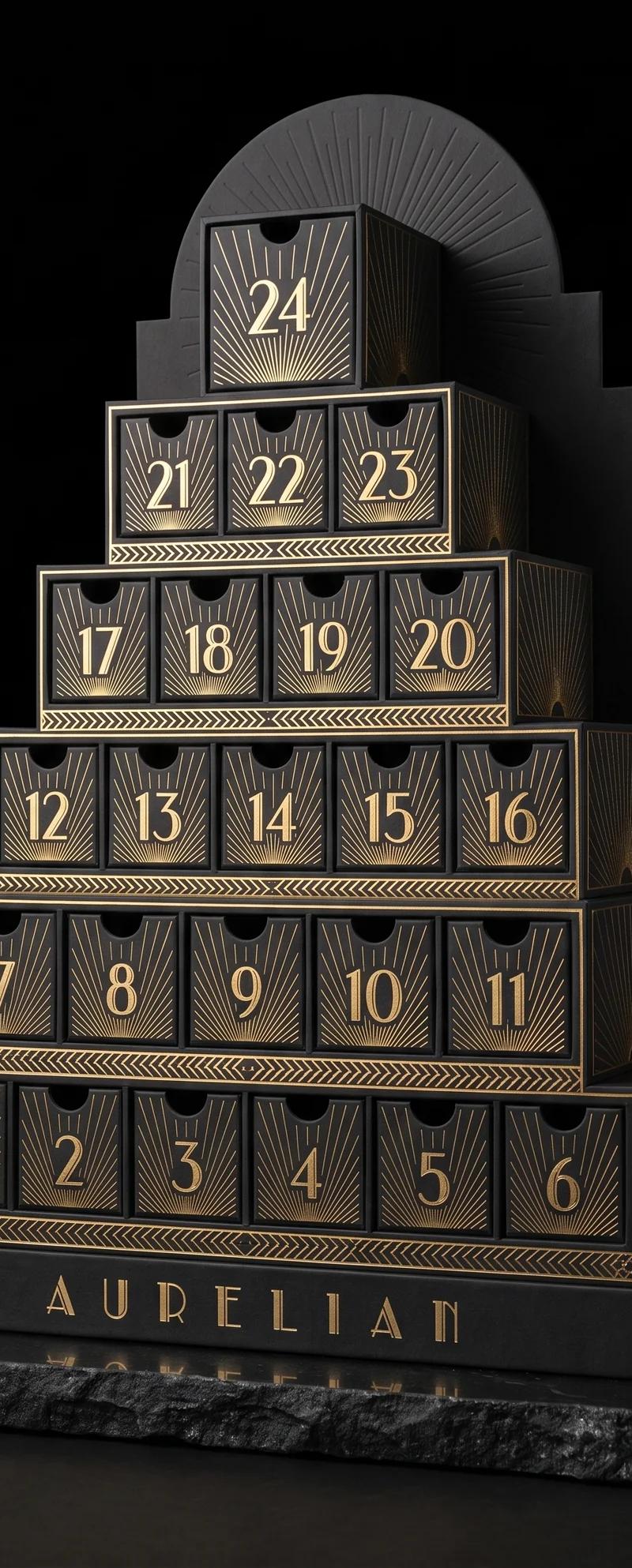
Peppermint design exploration
One brief, twelve design movements: the same 24 days, built the way each era would have built them, from papers and foils we actually stock.
Read the project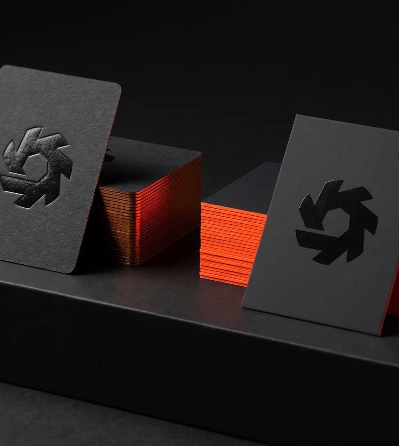
Soundtoys
The deboss wanted one paper. The neon edge wanted the other.
Read the project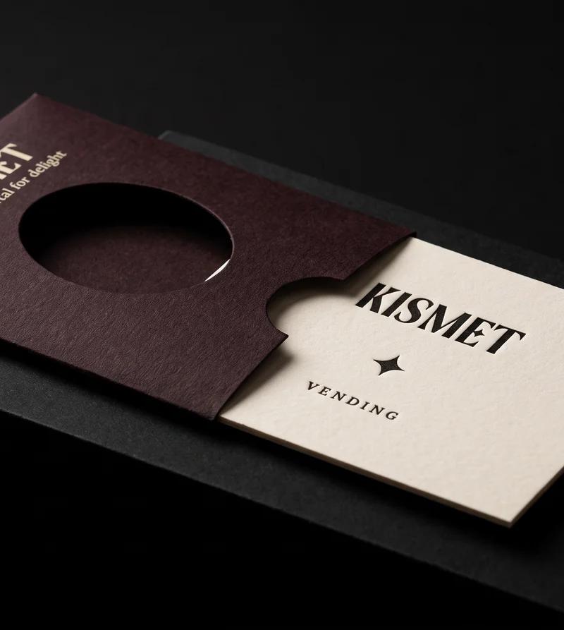
Kismet Vending
A card worth keeping, thin enough to fall out of a vending machine.
Read the projectEvery black build, priced: black business cards.