Case study · Business cards · Lazzereschi Group
Lazzereschi Group ↗Precision, in one mark
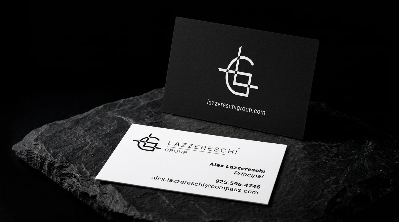
Card for the Lazzereschi Group: a crosshair-style LG monogram and web address in white on matte black, and a white reverse with the monogram, team name and principal's contact details in black.
The idea
The Lazzereschi Group is a real estate team working with Compass. The card shown is for its principal, Alex Lazzereschi.
Two rules
- 01A mark like a sightline. An L and G joined by crosshair lines, like a survey mark.
- 02Black, then white. A black front with the mark in white, and a white back with black type.
Why it works
The front is one mark on black, and the back gives the details. Nothing on either side competes.
Start from these materials
Same paper, foil and finish, locked in — nothing of Lazzereschi Group's artwork comes with it.
Questions
- Can white print on black?
- Yes. White foil gives the cleanest, brightest white on dark stock.
- Should a team card carry the brokerage?
- It can, on the back, while the team mark leads.
- Why duplex black and white?
- Each side keeps its true paper colour.