Case study · Business cards · Marigold & Moss (proof 153071)
Copper, a deboss, and a watercolour that had to survive both
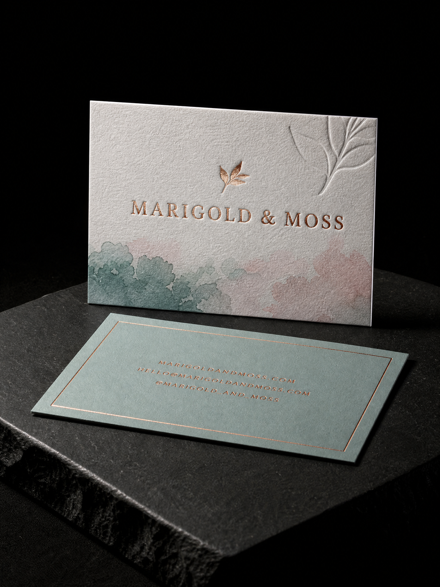
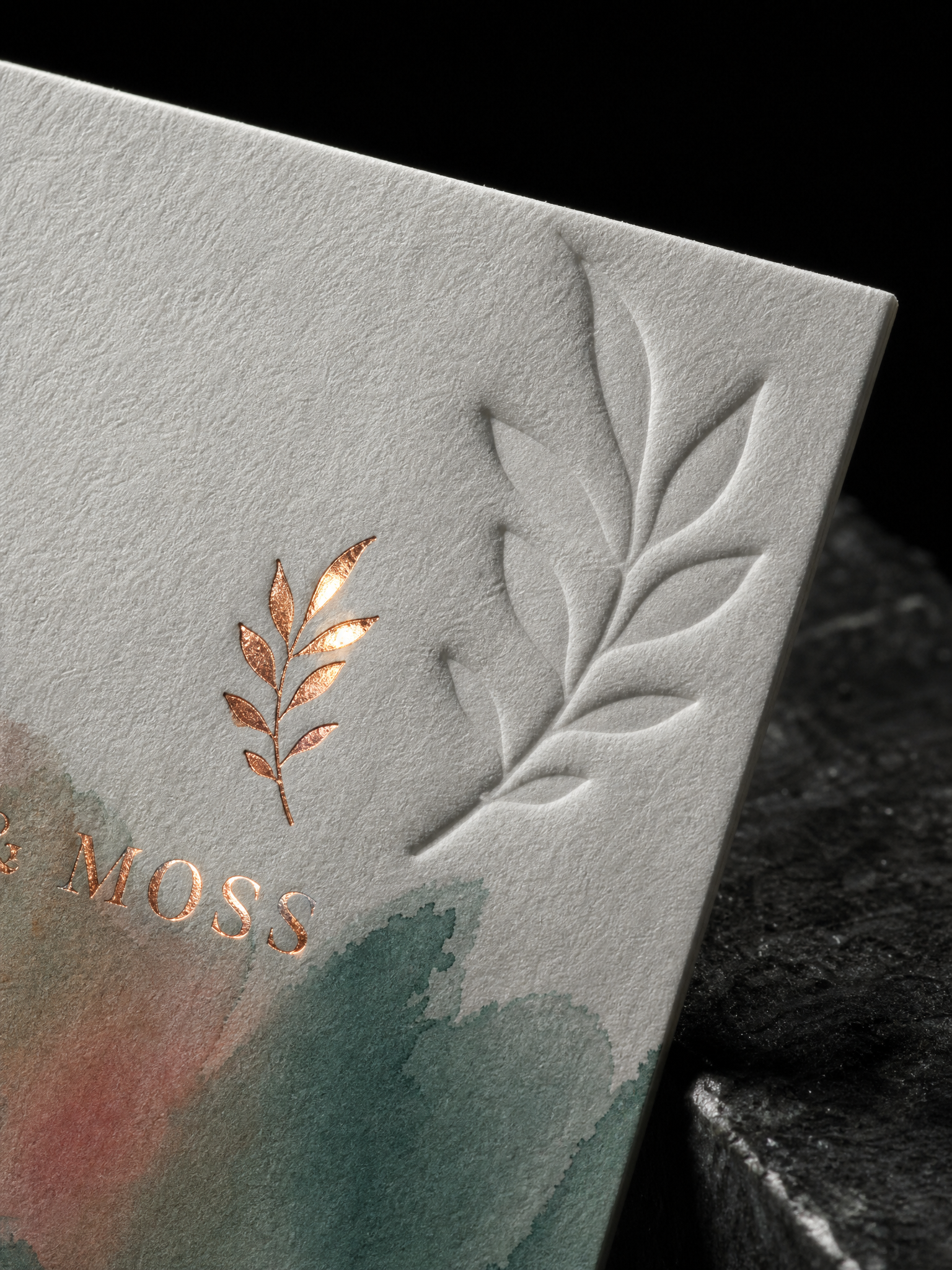
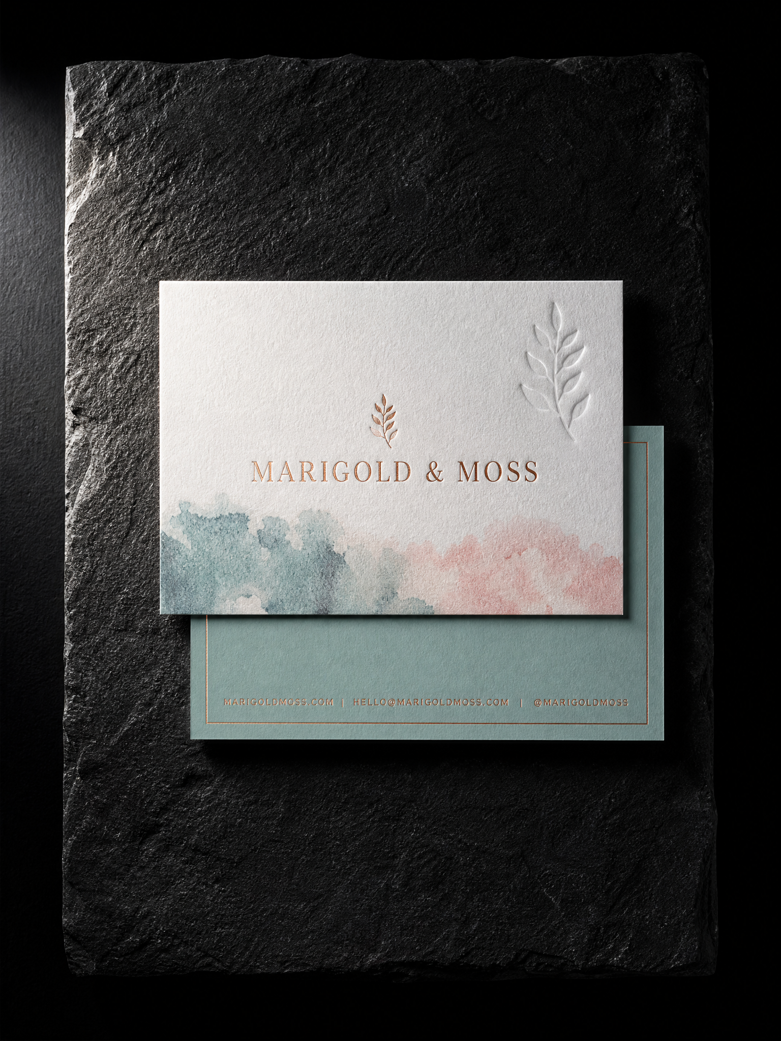
A soft process-printed wash, a copper leaf mark and a deep blind deboss of the same mark, all on Fedrigoni 50pt cotton. The card had to go through the press three times and line up every time.
The idea
A studio card that reads as handmade: soft watercolour colour, a metallic mark, and something to feel. The client sent finished art with three separated layers, which is exactly what a three-process card needs.
Three rules
- 01Order of operations. Process first, then copper foil, then deboss last with a generous relief. The deboss lands in unprinted stock so there is no ink to crack.
- 02Copper on white cotton. A satin copper foil rather than a mirror one, so the leaf mark reads as metal without flashing.
- 03Deboss depth. Depth set so the reverse stays clean under the process flood.
The brief
The question was never whether it could be done. It was the order.
Start from these materials
Same paper, foil and finish, locked in — nothing of Marigold & Moss (proof 153071)'s artwork comes with it.