Case study · Business cards · poco+roo Creative
poco+roo Creative ↗One colour, two tones
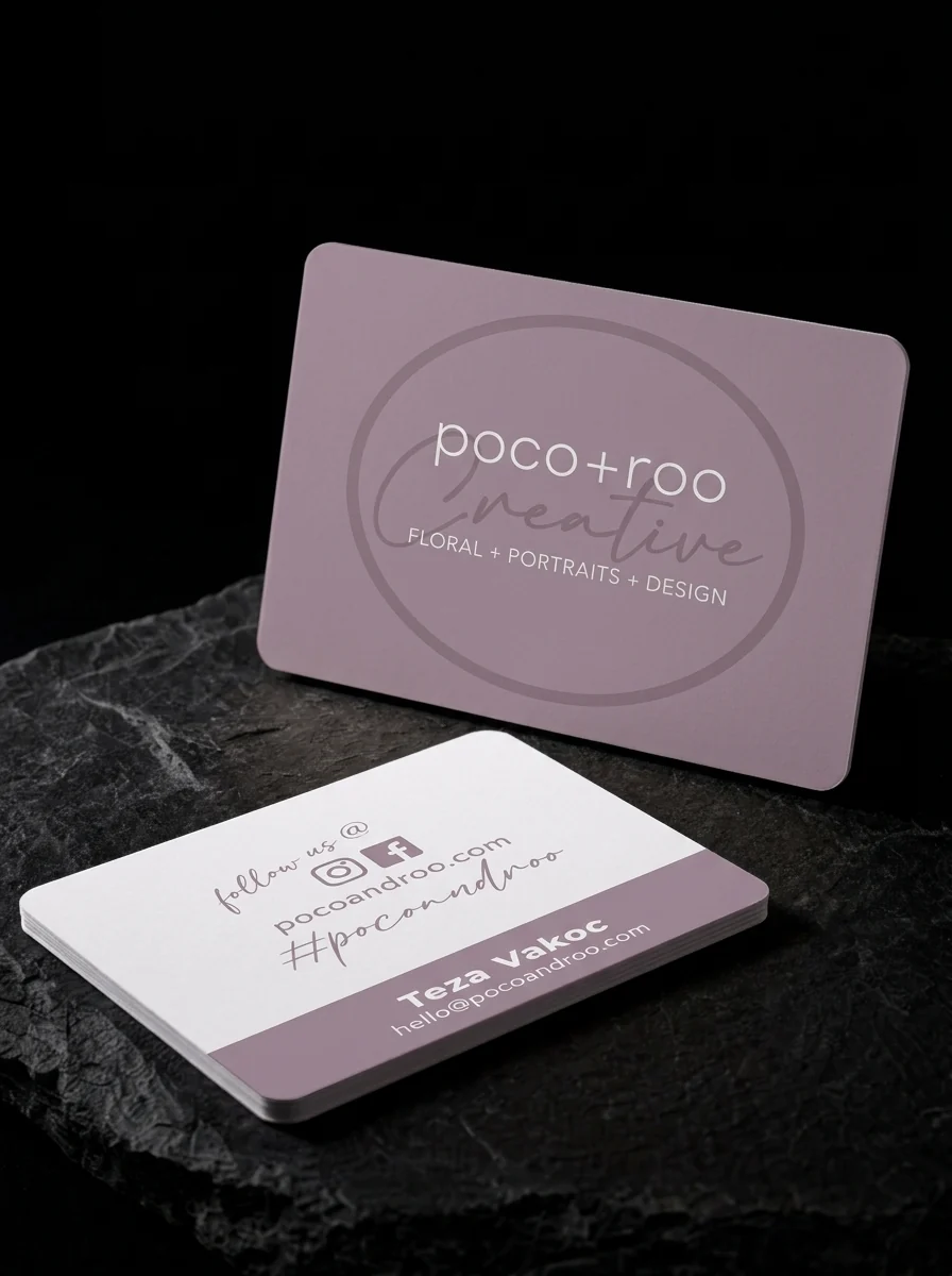
Rounded-corner card for poco+roo Creative: a dusty mauve front with a tone-on-tone script and oval behind the wordmark and 'floral + portraits + design' in white, and a white reverse with social details and a mauve name band.
The idea
poco+roo Creative is a small studio offering floral design, portraits and graphic design, including boutonnières and corsages. The card shown is for Teza Vakoc.
Two rules
- 01Tone-on-tone script. A script and oval in a lighter mauve over the mauve ground, with a pale wordmark on top.
- 02Rounded, soft. Rounded corners on a soft, matte stock.
Why it works
Everything is one colour in two tones plus white, so the card stays calm even with three services listed.
Start from these materials
Same paper, foil and finish, locked in — nothing of poco+roo Creative's artwork comes with it.
Questions
- What is tone-on-tone printing?
- A tone-on-tone mark is only slightly different from the background, so it shows through sheen and shade rather than contrast.
- Do rounded corners cost extra?
- A little. It's a quick finishing step and changes how the card feels in the hand.
- Can one card cover several services?
- Yes. List them in one line, as here, rather than giving each its own logo.