DESIGN
Come progettare biglietti da visita in metallo
Requisiti dei file e consigli di design per biglietti da visita in metallo. Formati vettoriali, separazione dei livelli tra incisione, fori e stampa, dimensioni minime del testo, regole strutturali per i fori e come adattare al metallo un design pensato per la carta.
Di Austin Terrill · Print Peppermint · Lettura di 10 min
In questa pagina
- Dimensioni del biglietto
- Formato file
- Separazione dei livelli: il passaggio cruciale
- Livello incisione
- Livello di ritaglio
- Livello di stampa
- Vincoli di design
- Testo minimo: 6pt
- Spessore minimo linea: 0,3mm
- Regole strutturali per le fustelle
- Sfumature e retini
- Testo in negativo su metalli colorati
- Adattare un biglietto in carta esistente al metallo
- Checklist file
- Errori comuni nel design su metallo
- Consigli di design (cosa funziona meglio)
- Domande frequenti
- Non sono un designer. Potete progettare voi il mio biglietto in metallo?
- Posso vedere una prova prima della produzione?
- Avete un template di design da scaricare?
- E se il mio design non funziona sul metallo?
- Quanto dura la verifica del file?
- Posso mettere una foto su un biglietto in metallo?
Progettare per il metallo non è come progettare per la carta. Le tecniche di produzione sono diverse (laser, non macchine da stampa), i vincoli sono diversi (niente sfumature nell'incisione, regole strutturali per i trafori) e anche la preparazione del file cambia (livelli separati per tecnica, non solo pronti in CMYK).
If you're a designer preparing files for metal business cards, this guide covers everything you need to know. If you're not a designer and you're sending us a logo or an existing paper card design to adapt, skip to the "Adapting an existing design" section — we handle the technical file preparation, and this guide tells you what to expect from that process.
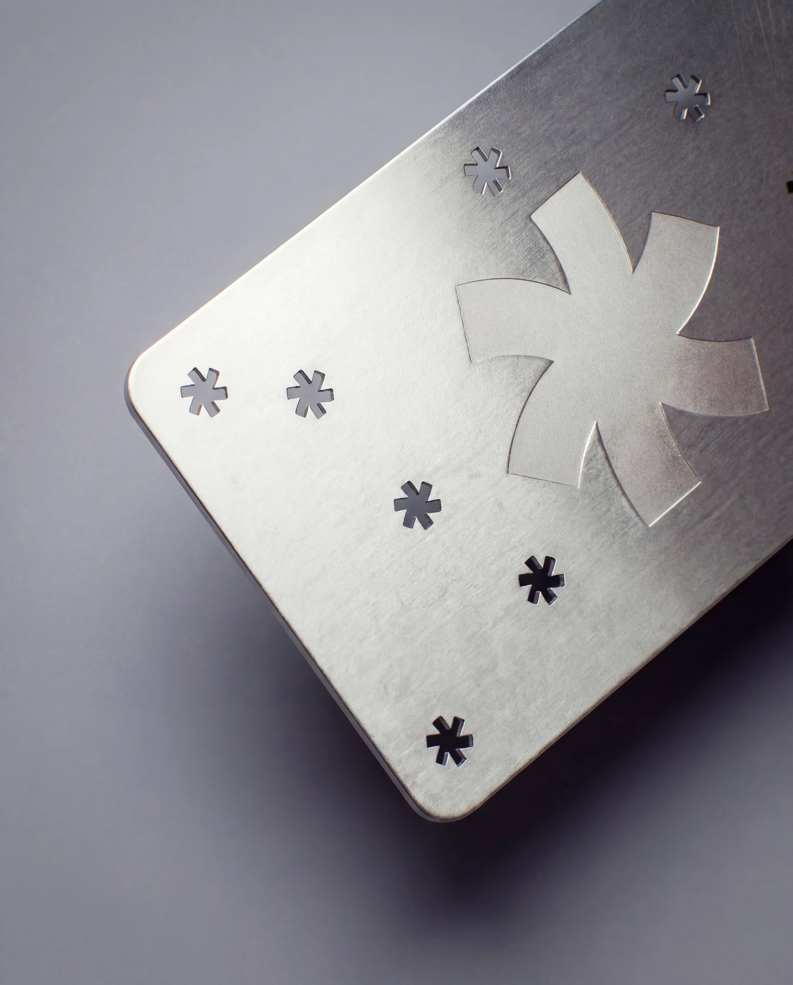
Before you start, read what metal can't do: no foil stamping, letterpress, paper embossing or painted edges.
Dimensioni del biglietto
Metal business cards are credit card size: 3.375" × 2.125" (85.6mm × 54mm). This is the ISO/IEC 7810 ID-1 standard — the same dimensions as a credit card, driver's license, or ID badge.
È leggermente diverso dai biglietti da visita standard USA in carta (3.5" × 2" (88,9 × 50,8 mm)). Il biglietto in metallo è più stretto di 0.125" (3,2 mm) e più alto di 0.125" (3,2 mm). Se adatti un design pensato per la carta, dovrai regolare il layout alle proporzioni leggermente diverse.
Gli angoli sono arrotondati con un raggio standard (circa 3mm). Non è configurabile: tutti i biglietti in metallo hanno lo stesso raggio, conforme allo standard delle carte di credito. Se il tuo biglietto in carta ha angoli vivi, la versione in metallo avrà angoli arrotondati.
Formato file
Submit vector files. Adobe Illustrator (.ai) or PDF with all elements as vector paths. These are the required formats because laser engraving and laser cutting follow vector paths — the laser traces the outlines of your artwork to etch or cut the metal. Raster images (JPG, PNG, TIFF) do not work for engraving or cutting.
Se il tuo design include elementi stampati a colori (fotografie, sfumature, grafiche multicolore), il livello di stampa può contenere immagini raster ad almeno 300 DPI. I livelli di incisione e di intaglio, invece, devono essere vettoriali.
Convert all text to outlines before submitting. This prevents font substitution issues and ensures the laser follows the exact letterforms you intended. In Illustrator: select all text, then Type → Create Outlines.
Se lavori con un programma non vettoriale (Canva, Photoshop, Figma) e non puoi esportare vettori, inviaci ciò che hai: un PNG ad alta risoluzione del tuo design, un link di condivisione Canva, un export da Figma. Ricreeremo il file di produzione in vettoriale durante la revisione dei file. Non c'è alcun costo aggiuntivo. Preferiamo ricevere file imperfetti e sistemarli noi piuttosto che vederti in difficoltà con formati che non conosci bene.
Separazione dei livelli: il passaggio cruciale
Qui la preparazione dei file per il metallo si differenzia davvero da quella per la carta. Nella stampa su carta prepari un unico file pronto per la stampa e lo stampatore si occupa del resto. Nella produzione su metallo, il file deve separare gli elementi in livelli distinti in base alla tecnica di lavorazione applicata a ciascuno.
Three layer types:
Livello incisione
Tutto ciò che verrà inciso al laser NELLA superficie del metallo. Comprende: testo (nomi, titoli, numeri di telefono, indirizzi email, URL), contorni e marchi del logo, disegni al tratto, motivi decorativi, bordi e qualsiasi elemento grafico che vuoi inciso in modo permanente sul biglietto.
Imposta tutti gli elementi da incidere in un colore o livello dedicato: di solito un colore spot Pantone specifico (usiamo "ENGRAVE" come nome del campione) o un livello dedicato in Illustrator chiamato "Engrave".
Engraving is binary. The laser either marks the surface or it doesn't. There is no half-engraving, no gradient engraving, no variable-depth engraving. If your design includes a gradient, that element must move to the color print layer — it cannot be engraved.
Every metal card includes engraving. It's the base production method and is included in the price at every tier. You don't need to do anything special to "enable" engraving — just put the elements on the engrave layer and they'll be etched.
Livello di ritaglio
Tutto ciò che verrà tagliato al laser ATTRAVERSO l'intero spessore del biglietto, rimuovendo completamente il metallo. I ritagli creano spazi aperti: fori, forme, motivi, spazio negativo.
Imposta tutti gli elementi da intagliare su un colore o un livello dedicato, con l'etichetta "CUT" o un colore spot Pantone distinto, separato dal livello di incisione.
Cutout paths must be closed vector shapes. The laser traces the outline of the shape and removes the material inside. Open paths (lines that don't close into a shape) will not produce a cutout.
Cutouts are an add-on. They're not included in the base price. If your design doesn't have any cutout elements, you don't need this layer.
Livello di stampa
Tutto ciò che verrà stampato a colori sulla superficie metallica. Include: loghi a colori, immagini fotografiche, sfondi sfumati, illustrazioni multicolore e qualsiasi elemento che richieda la riproduzione CMYK.
The print layer follows standard print file conventions: CMYK color mode, 300 DPI minimum for raster elements, fonts outlined. This layer is printed via offset onto the metal surface before or after engraving, depending on the design.
Bleed: If any printed elements extend to the card edge, extend them 1mm beyond the trim edge. This is smaller than the typical 3mm bleed for paper cards because metal cards are die-cut to exact size after printing — the tolerance is tighter.
Color printing is an add-on. It's not included in the base price. If your design is engraving-only (text and line art in a single color), you don't need this layer.
Vincoli di design
Testo minimo: 6pt
Il testo sotto i 6pt non si incide in modo affidabile. A dimensioni minori, i tratti sottili e le grazie fini non si incidono completamente: il laser non riesce a mantenere una definizione pulita su elementi così piccoli. Se il tuo attuale biglietto di carta ha testo a 5pt o meno (frequente in note legali, tagline o caratteri piccoli), va ingrandito per il metallo.
For best results, keep body text at 7pt or above and limit 6pt to secondary details only. Headlines, names, and primary text should be 8pt+.
Bold and medium weights engrave better than light weights. A thin-weight sans-serif at 7pt may lose definition in thin strokes, while a medium-weight sans-serif at the same size engraves cleanly. If your brand typeface is a thin or light weight, consider stepping up one weight for the metal version.
Spessore minimo linea: 0,3mm
Le linee incise più sottili di 0.3mm (circa 0.85pt) rischiano di risultare invisibili o irregolari. Il solco del laser (la larghezza del segno che lascia) ha un minimo fisico, e sotto questa soglia le linee possono apparire interrotte, sbiadite o del tutto assenti, a seconda del metallo e della finitura.
Filetti decorativi, bordi sottili e sottolineature fini devono avere uno spessore di almeno 0.3mm. Se il tuo design usa filetti da 0.25pt (frequenti nella tipografia elegante), ispessiscili per il metallo.
Regole strutturali per le fustelle
Questo è il vincolo più importante per i design con intagli laser. Il biglietto deve restare rigido dopo la rimozione del materiale. Un biglietto con troppi intagli, o intagli troppo grandi, diventa fragile, si piega facilmente e può persino rompersi.
Rules:
Edge margin: 2mm minimum. No cutout should come closer than 2mm to the outer edge of the card. The card's perimeter needs a solid frame to maintain rigidity and prevent edge deformation.
Bridge width: 2mm minimum. Between any two adjacent cutouts, there must be at least 2mm of solid metal connecting them. Narrower bridges can bend or snap under normal handling.
Total cutout area: 30-40% maximum. As a general guideline, the total area of all cutouts should not exceed roughly 30-40% of the card face. Beyond that, the card loses structural integrity. This isn't a hard rule — the specific layout matters (a single large cutout centered is different from 50 tiny perforations spread across the entire surface) — but it's a useful planning threshold.
No floating elements. Every piece of the card must connect to the rest of the card. If a cutout would create an isolated metal "island" with no connection to the surrounding card structure, the island falls out during production. Design cutouts so that all remaining metal is one connected piece.
Prima della produzione verifichiamo la solidità strutturale di ogni design con intagli. Se qualcosa non regge, ti suggeriamo modifiche precise (aggiungere ponti, allargare le connessioni, semplificare le forme) prima che tu approvi la bozza. Questa verifica e le modifiche ai file sono gratuite.
Sfumature e retini
Laser engraving cannot reproduce gradients. Engraving is binary: the surface is either marked or it isn't. There's no way to engrave a fade from dark to light, a color gradient, or a halftone dot pattern.
Se il tuo design include sfumature, hai due opzioni:
- Sposta gli elementi sfumati sul livello di stampa a colori. La stampa CMYK su metallo gestisce le sfumature come quella su carta: in modo fluido e preciso. La base metallica traspare leggermente e aggiunge un riflesso cangiante che le sfumature su carta non hanno.
- Semplifica la sfumatura in aree piene. Trasforma la sfumatura in due o tre blocchi pieni con diversa densità di incisione: incisione piena, incisione parziale (tratteggio o puntinato) e nessuna incisione. È un'interpretazione stilistica che alcuni designer preferiscono.
Testo in negativo su metalli colorati
Sui metalli con rivestimento PVD (nero, oro, oro rosa, ecc.), l'incisione scopre l'acciaio argentato sottostante. Il testo inciso appare quindi come linee argento su fondo colorato. È per natura "in negativo": testo chiaro su una superficie scura o colorata.
Se vuoi un testo scuro su un biglietto in metallo colorato (ad esempio testo nero su un biglietto oro), serve la stampa a colori, non l'incisione. L'incisione mette sempre a nudo l'acciaio di base, che è sempre argento. Non è possibile incidere a colori.
Se vuoi testo bianco su metallo scuro (per esempio, testo bianco su acciaio nero), serve anche la stampa a colori, nello specifico la stampa con inchiostro bianco sulla superficie metallica. L'incisione sul nero rivela l'argento, non il bianco.
Pianifica il trattamento del testo all'inizio della progettazione. L'interazione tra la direzione dell'incisione e il colore del metallo determina l'aspetto del testo.
Adattare un biglietto in carta esistente al metallo
Se hai già un biglietto da visita in carta e vuoi una versione in metallo, ecco come si traducono di solito gli elementi del design:
Solid-color backgrounds → the metal surface. A white background on your paper card becomes the metal surface — choose silver or white steel. A black background becomes black PVD-coated steel. A gold background becomes gold steel. The "background" is the material, not a printed layer. This is one of the most effective translations because it eliminates an entire production step (printing the background) and lets the metal itself carry the color.
Foil elements → engraving. If your paper card has gold foil text, the metal equivalent is engraved text on a gold metal card. The metallic effect is inherent to the material instead of applied as a finish. The visual impression is similar — metallic text on a contrasting surface — but the physicality is different.
Full-color graphics → color print layer. Photographs, illustrations, and multi-color logos move to the offset printing layer. The visual result differs from paper printing — the metallic base modifies the color temperature and adds a subtle shimmer — but the reproduction fidelity is high.
Embossing and debossing → not available on metal. There's no equivalent. If your paper card relies on emboss/deboss as a primary design feature, the metal version will need a different approach. Cutouts can create dimensionality, but it's a different kind of dimension — removed material, not deformed material.
Spot UV and matte lamination → surface finish choice. The matte/gloss contrast of spot UV on paper doesn't directly translate. But choosing between matte, brushed, and mirror finish on metal gives you a surface character decision that serves a similar purpose — how does light interact with the card?
Edge painting → not applicable. Metal card edges are raw-cut metal. There's no edge treatment. The edge is part of the material's appeal — you can see the steel cross-section in profile.
Se sembra complicato, non deve esserlo. Inviaci il design del tuo biglietto di carta (o anche solo una foto) e ti diremo esattamente come si traduce in metallo, quali modifiche servono e se il metallo è la scelta giusta per quel design. La valutazione è gratuita.
Checklist file
Prima di inviare la grafica, verifica:
- Format: Vector file — AI or PDF with all elements as vector paths
- Text: All text converted to outlines (Type → Create Outlines in Illustrator)
- Layers separated: Engrave elements on one layer, cutout elements on another, print elements on a third. Each layer clearly labeled.
- Minimum text size: 6pt minimum, 7pt+ preferred. Bold/medium weights preferred over light.
- Minimum line weight: 0.3mm (0.85pt) for all engraved lines
- Cutout margins: No cutout closer than 2mm to card edge
- Cutout bridges: Minimum 2mm solid metal between adjacent cutouts
- No floating islands: All metal areas connected to the main card body
- Print layer (if applicable): CMYK, 300 DPI minimum for raster elements, 1mm bleed
- Card size: 3.375" × 2.125" (85.6mm × 54mm) with rounded corners
- Both sides designed: Front and back included in the file
Manca qualcosa? Hai dubbi su un vincolo? Inviaci ciò che hai. Controlliamo ogni file prima della produzione e gestiamo le modifiche senza costi aggiuntivi. È sempre meglio inviare file imperfetti e lasciare che li sistemiamo noi, piuttosto che rimandare per un dubbio su un requisito tecnico.
Errori comuni nel design su metallo
Questi sono i problemi che vediamo più spesso nei file inviati. Evitarli ti fa risparmiare un giro di revisione.
Text too small. The #1 issue. Designers set email addresses and phone numbers at 5-5.5pt because that's what fits on a paper card at 3.5" × 2". The metal card is slightly smaller (3.375" × 2.125"), the engraving process is less forgiving than offset printing, and those elements need to be bumped to 6-7pt. Resize them before submitting.
Cutouts too close to edges. Designers draw a dramatic cutout pattern that extends to within 1mm of the card edge. It looks great on screen but the card would flex and bend at those thin edges. Pull cutouts inward by at least 2mm.
Gradients on the engrave layer. A subtle gradient behind the logo, a faded line at the bottom of the card. These are invisible on the engrave layer — the laser can't reproduce them. Move them to the print layer or remove them.
Not accounting for engraving direction. On dark metals (black, copper, gold), engraving reveals lighter steel. The design should be conceived with this in mind — your "ink" is light on dark, not dark on light. Designers accustomed to paper (dark ink on light paper) sometimes submit designs that look inverted when engraved.
Over-designing. Metal cards are material-first objects. The metal surface, the weight, the finish — these ARE the design. A card packed edge-to-edge with engraved text, printed imagery, cutout accents, and a QR code leaves no room for the material to speak. The most effective metal card designs are restrained — a logo, a name, minimal contact info, and generous open space where the metal surface is the hero.
Consigli di design (cosa funziona meglio)
Dopo aver prodotto migliaia di biglietti in metallo, questi schemi danno costantemente i risultati migliori:
One side bold, one side functional. Front: logo centered, generous space, maybe one cutout accent. Back: contact details, engraved cleanly, functional layout. This structure gives the card both visual impact (front) and practical value (back).
Use cutouts strategically, not decoratively. A single bold cutout shape (your logo silhouette, a geometric pattern, a meaningful symbol) has more impact than scattered decorative cutouts. Each cutout adds cost and reduces structural integrity — make each one count.
Let the metal color do the work. If you chose black brushed steel, the material itself is dramatic. You don't need to add complexity to make the card impressive. Engraved white logo on black brushed steel with one geometric cutout — that's enough for a card people will keep on their desk for years.
Test legibility at actual size. Design at 100% scale and print a paper test. Hold it in your hand. Can you read the phone number? Is the email address legible? The screen is forgiving — physical size is not.
Consider adding NFC. A QR code engraved on the back is functional but expected. An NFC chip — invisible, embedded in the card — lets the recipient tap their phone and land on your profile or website. It's cleaner than a QR code and creates a second moment of surprise after the initial "is this metal?" reaction. NFC adds 5 €-4 per card. Learn about NFC →
Domande frequenti
Non sono un designer. Potete progettare voi il mio biglietto in metallo?
Non offriamo servizi completi di brand design, ma ci occupiamo di tutta la preparazione dei file e dell'impostazione della grafica pronta per la produzione. Se hai un logo e sai quali informazioni vuoi sul biglietto, inviacele (anche come schizzo o documento Word) e creeremo il file di produzione con livelli separati correttamente, dimensioni e impaginazione. Per lavori di design complessi (creazione del logo, sviluppo dell'identità di marca), possiamo consigliarti designer specializzati in lavori pronti per la stampa.
Posso vedere una prova prima della produzione?
Sempre. Ogni ordine di biglietti in metallo include una bozza digitale che mostra esattamente cosa verrà inciso, tagliato e stampato. Approvi la bozza prima che inizi la produzione. Se non è corretta, la rivediamo. Le revisioni sono illimitate.
Avete un template di design da scaricare?
We can provide an Illustrator template with the correct dimensions (3.375" × 2.125"), corner radius, bleed area, and pre-made layers (Engrave, Cut, Print) labeled and color-coded. Richiedi un preventivo → and mention you'd like the template, or email us at [email protected] and we'll send it over.
E se il mio design non funziona sul metallo?
Te lo diremo. Durante la revisione dei file, se un design presenta problemi di fondo (interamente fotografico senza elementi da incidere, o fustellature che renderebbero il biglietto strutturalmente fragile), ti spiegheremo i limiti e ti suggeriremo alternative. A volte la risposta è "questo design rende meglio su carta con lamina", e in quel caso ti guideremo in quella direzione.
Quanto dura la verifica del file?
In genere 1-2 giorni lavorativi. Se il file è pulito e pronto per la produzione, passa subito alla bozza. Se servono modifiche, le apportiamo e ti inviamo la bozza aggiornata negli stessi tempi.
Posso mettere una foto su un biglietto in metallo?
Sì, tramite il livello di stampa a colori. La fotografia viene stampata direttamente sulla superficie metallica. La base metallica traspare leggermente e conferisce all'immagine un carattere particolare. Per la riproduzione fotografica più nitida, il metallo argento o bianco offre la base più neutra. I metalli scuri (nero, oro) alterano la temperatura colore dell'immagine stampata. Se la riproduzione fotografica è fondamentale, ti consigliamo di inviare un file di prova e di controllare con attenzione la bozza.
Continua a leggere
METAL
Di cosa sono fatti i biglietti in metallo?
Leggi la guida →PRICING
Quanto costano i biglietti da visita in metallo?
Leggi la guida →METAL
Quale colore scegliere per un biglietto da visita in metallo
Leggi la guida →COMPARISON
Biglietti da visita in metallo o in carta: quando il metallo ha davvero senso
Leggi la guida →METAL
Biglietti da visita NFC in metallo: smart card che lasciano il segno
Leggi la guida →Prodotti correlati
Pronto a inviare il tuo design?
Chiedi un preventivo →Carica i tuoi file con la richiesta di preventivo. Li verifichiamo, ti confermiamo cosa funziona su metallo e ti inviamo una bozza: tutto incluso nel prezzo.
Configura e calcola il prezzo →
Prenota una consulenza → · Peppermint Studio → · Guida ai costi dei biglietti in metallo →