Design exploration · What if…? series
Brayden is 7
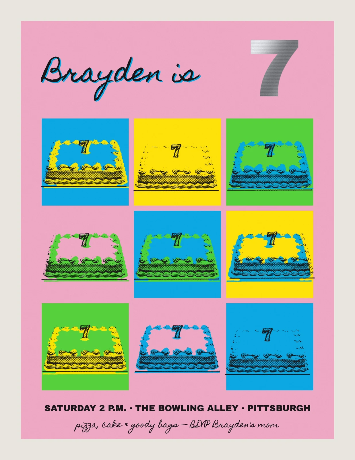
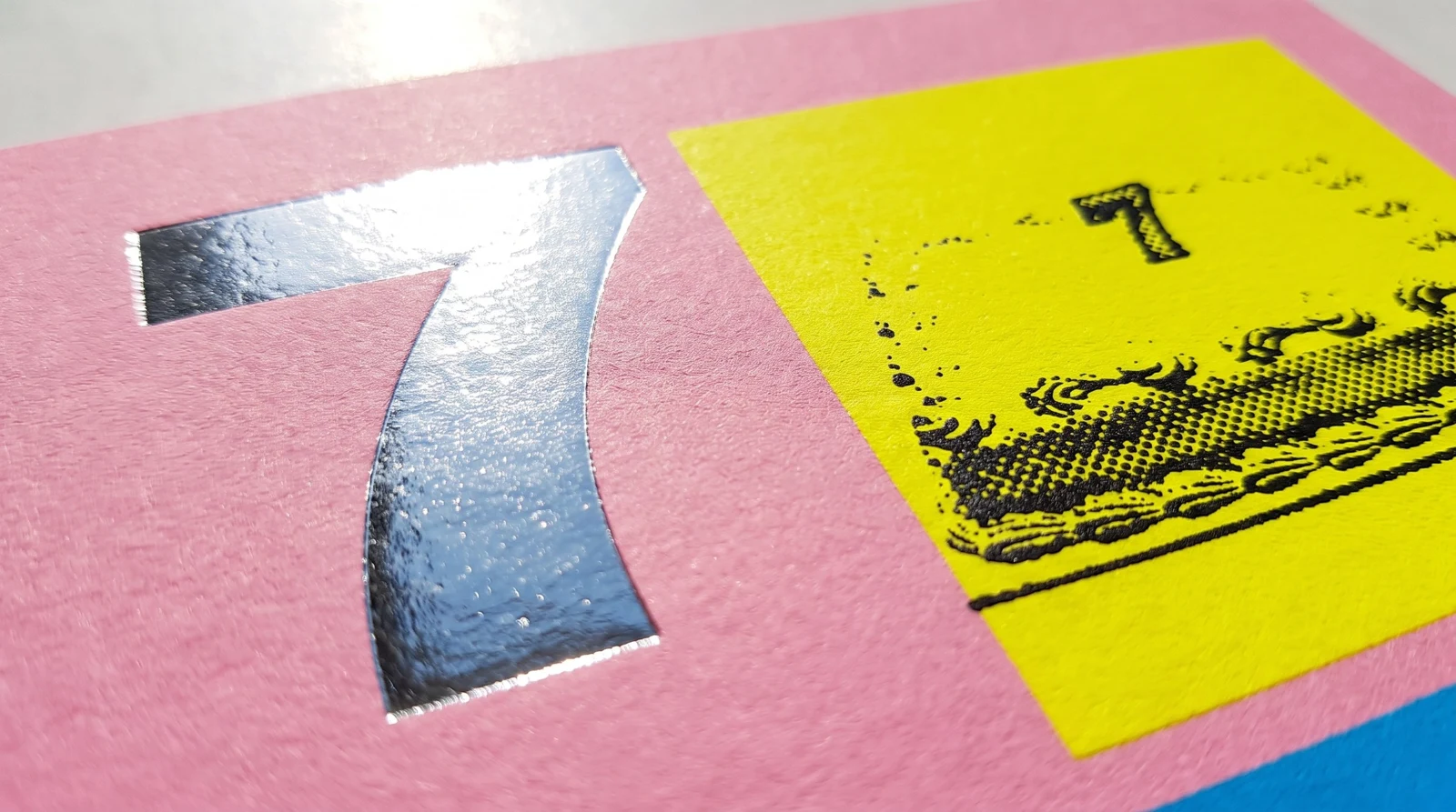
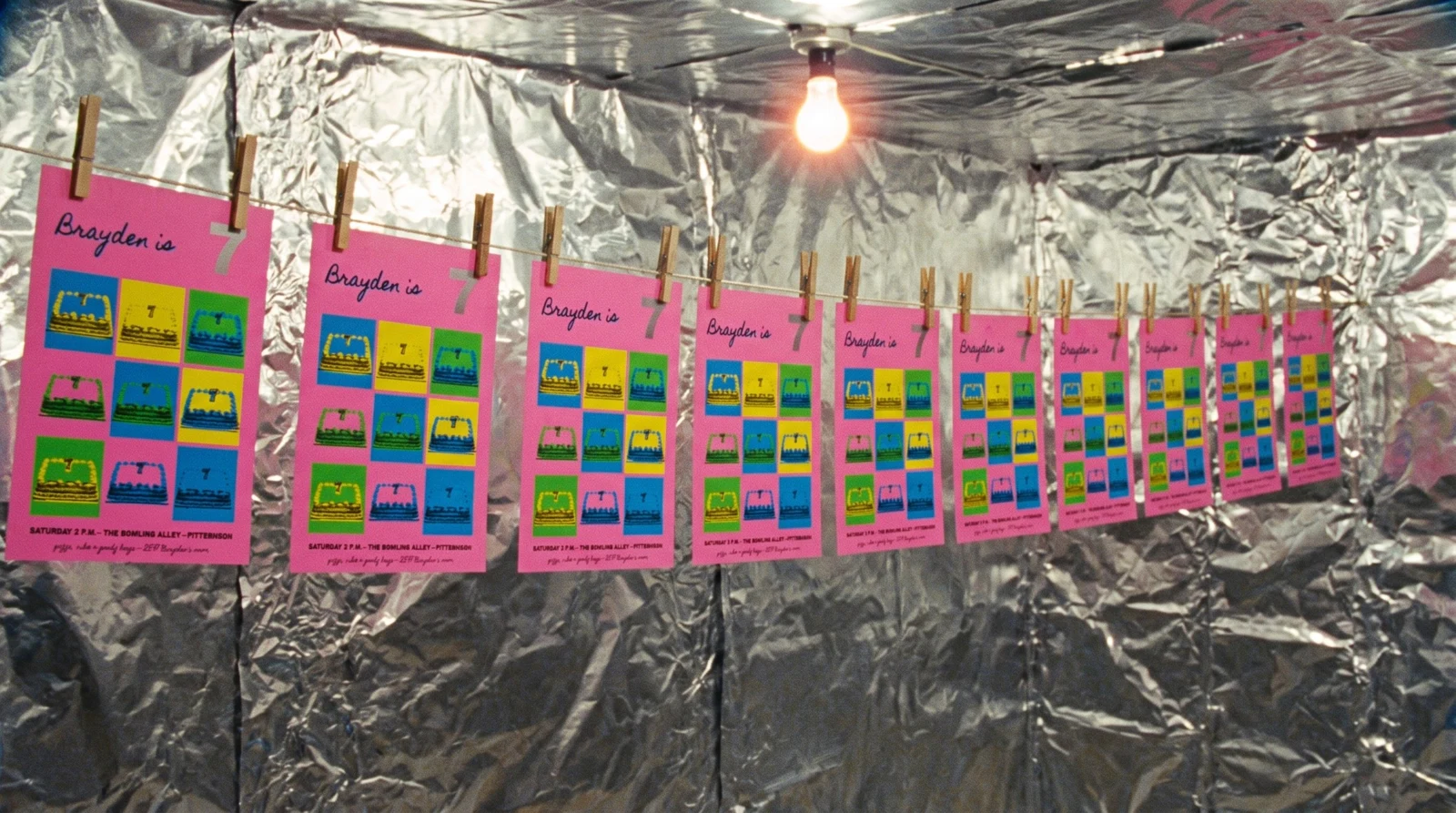
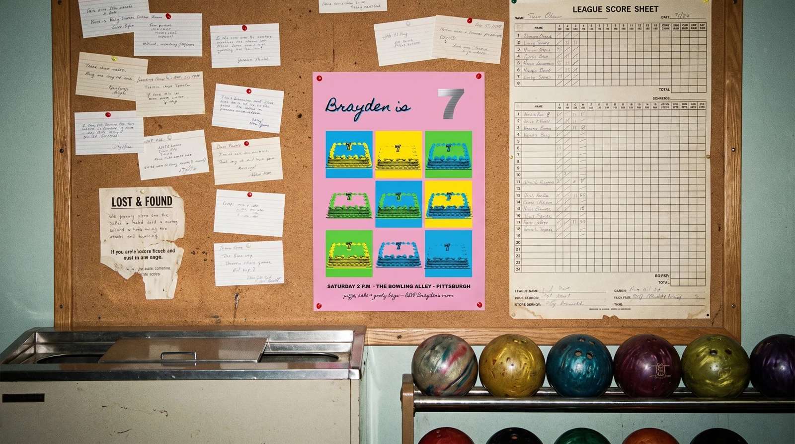
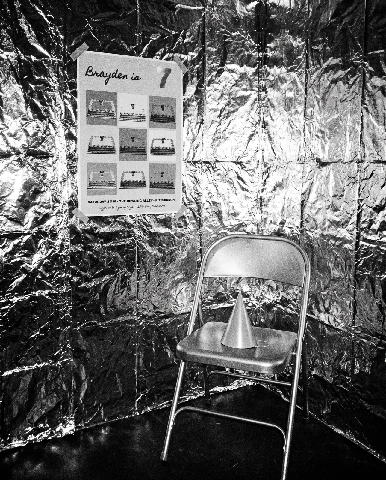
A design exploration: the birthday poster Andy Warhol might have made for a seven-year-old in his hometown. It's an 18 × 24 inch screen print on GF Smith Colorplan Candy Pink, 270 g/m². The same birthday cake is repeated nine times in fluorescent PANTONE 801 C, 802 C and 803 C, with a black key printed slightly off-register so no two squares line up. "Brayden is" is in loopy hand lettering, and the 7 is stamped in mirror-silver foil.
The idea
Treat a seven-year-old's bowling party like a gallery edition: repeat the cake.
Six rules
- 01Beneath him, on purpose. We treated a seven-year-old's bowling party like a gallery edition: screen printed by hand, in fluorescent ink, editioned, with silver.
- 02Repeat the cake. One photograph of a supermarket sheet cake, repeated in a 3×3 grid. Each square gets its own colour pairing, and the black key is printed s…
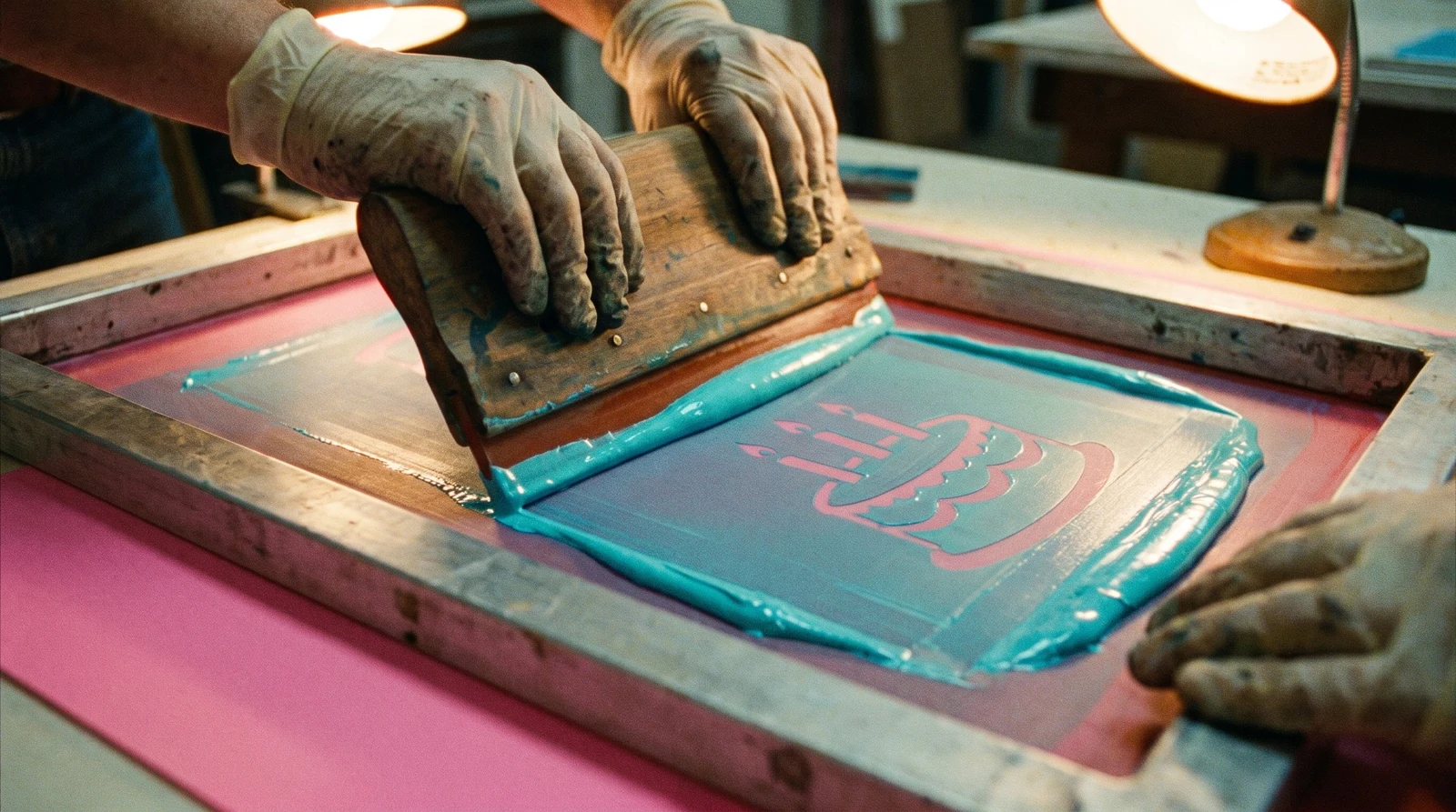
- 03Four screens, three of them fluorescent. Hand-pulled screen printing in PANTONE 801 C (blue), 802 C (green) and 803 C (yellow), plus black. One screen per colour, and a thick layer…
- 04Let the paper be the fourth colour. GF Smith Colorplan Candy Pink at 270 g/m², stiff enough to hang flat. Some squares are left as bare paper, and we tested the ink on the act…
- 05Silver, for the seven. 120 mirror silver foil, stamped on bare pink paper after the inks have cured, so the 7 is the brightest thing on the wall.
- 06His mother's handwriting. Loopy hand lettering for "Brayden is", a nod to the calligraphy by his mother, Julia Warhola, that he used on his 1950s commercial work. It…
The commission
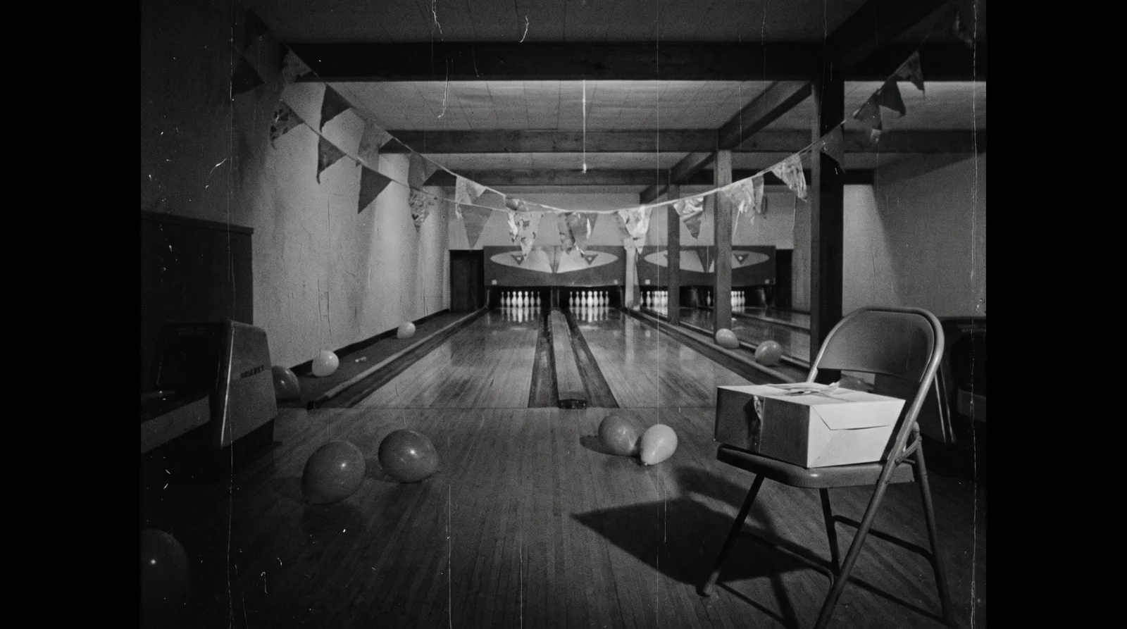
Brayden is turning seven. Saturday at 2 p.m., at the bowling alley, with pizza, cake and goody bags. His mom asked Andy Warhol to do the poster.
Warhol was born in Pittsburgh in 1928, so it's a hometown job, and the funniest thing we could imagine was him taking it completely seriously: screen printing a kid's party poster like a gallery edition, and filming the guests the way he filmed everyone at the Factory.
Where each idea came from
The repetition. Warhol made his name by repeating ordinary things until they became icons. We picked the most ordinary thing at a seven-year-old's party: the cake.
The screen print. He learned silkscreen in the early sixties, and his big silkscreen paintings date from 1962. The off-register black is the part we love most, the place where you can see a human hand pulled it.
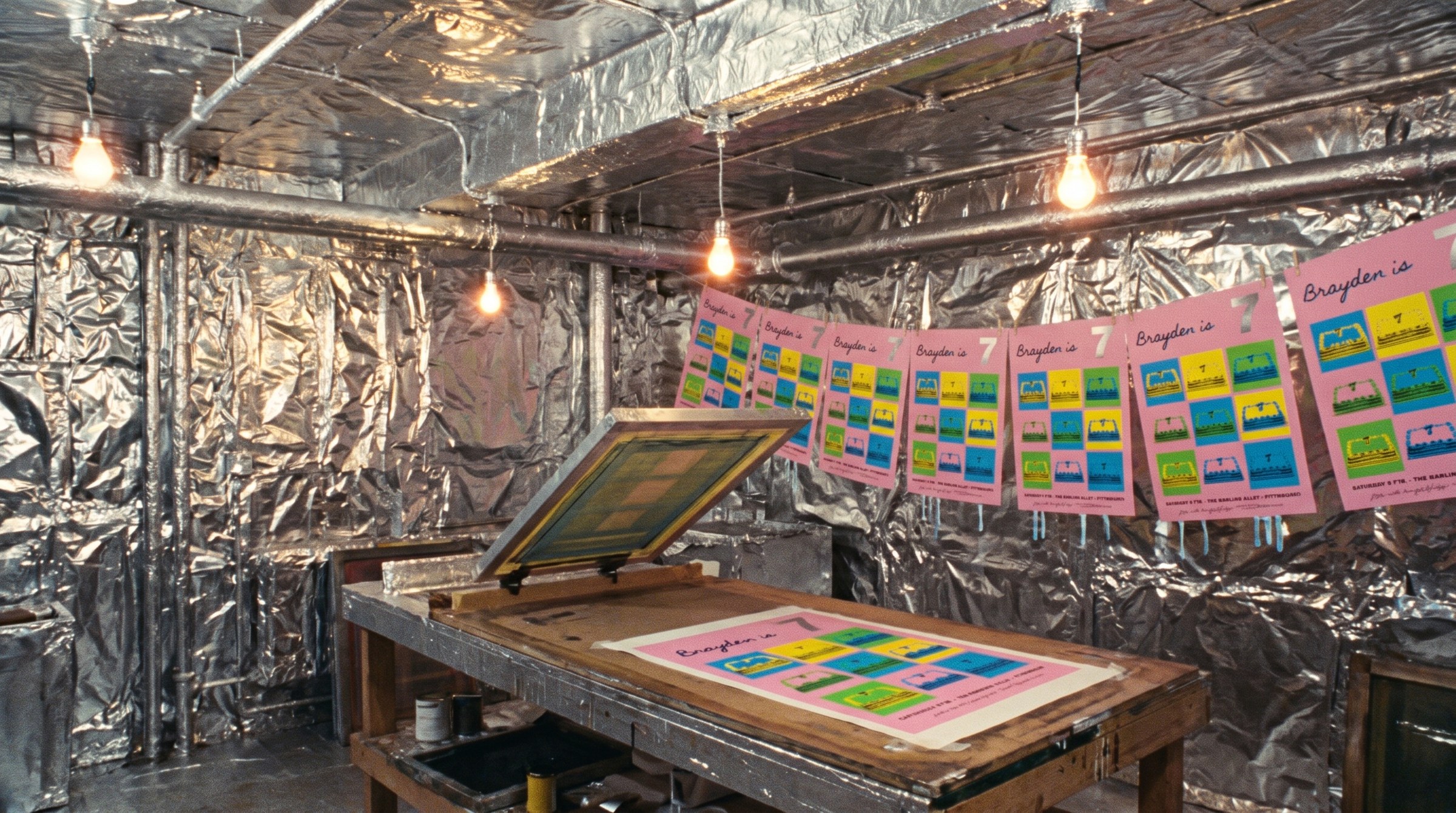
The silver. In 1964 his assistant Billy Name covered the studio, the Factory, in aluminium foil and silver paint. Our 7 is mirror-silver foil.
The lettering. Warhol often used his mother Julia's calligraphy on his commercial drawings. "Brayden is" is our nod to her.
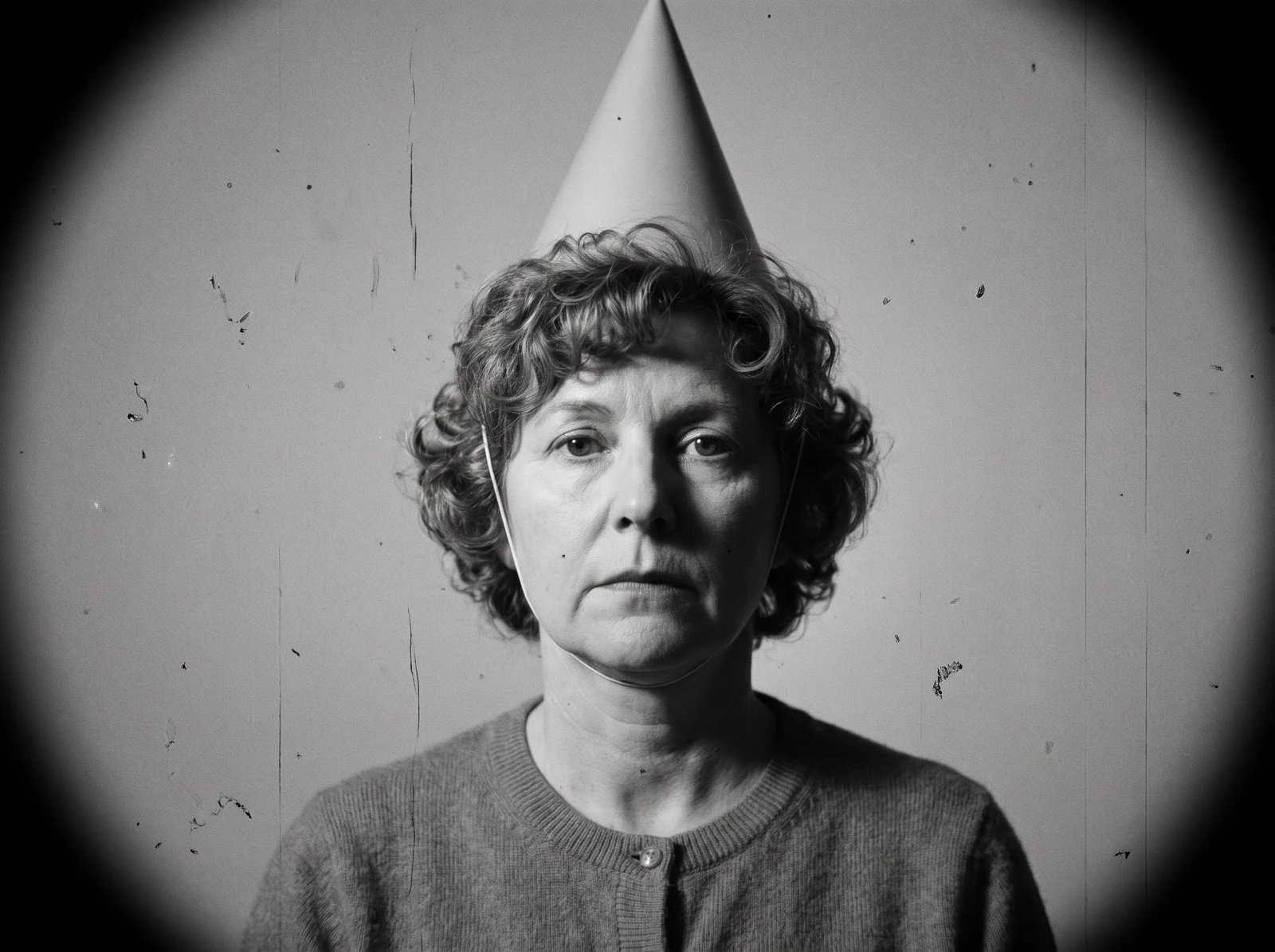
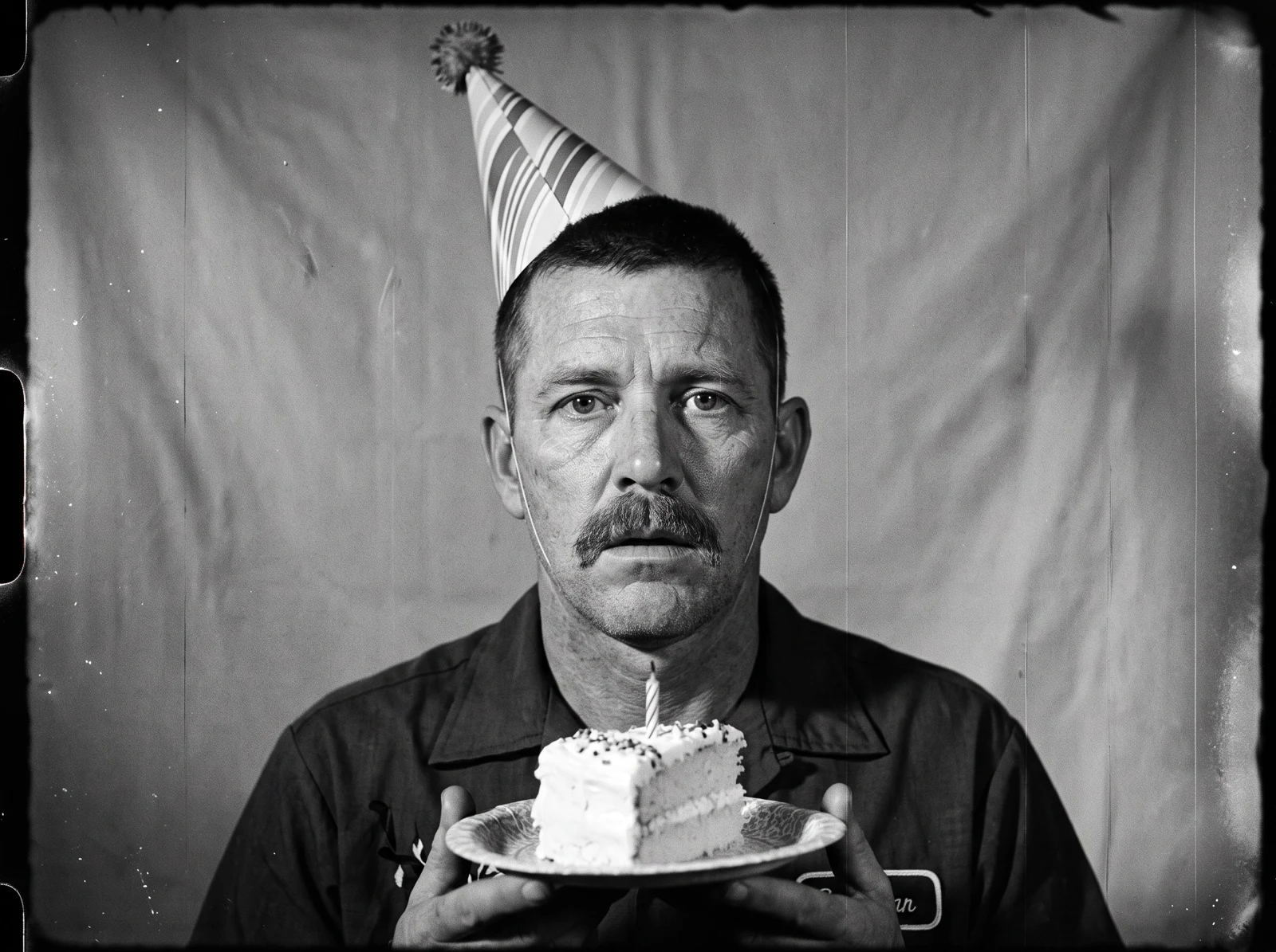
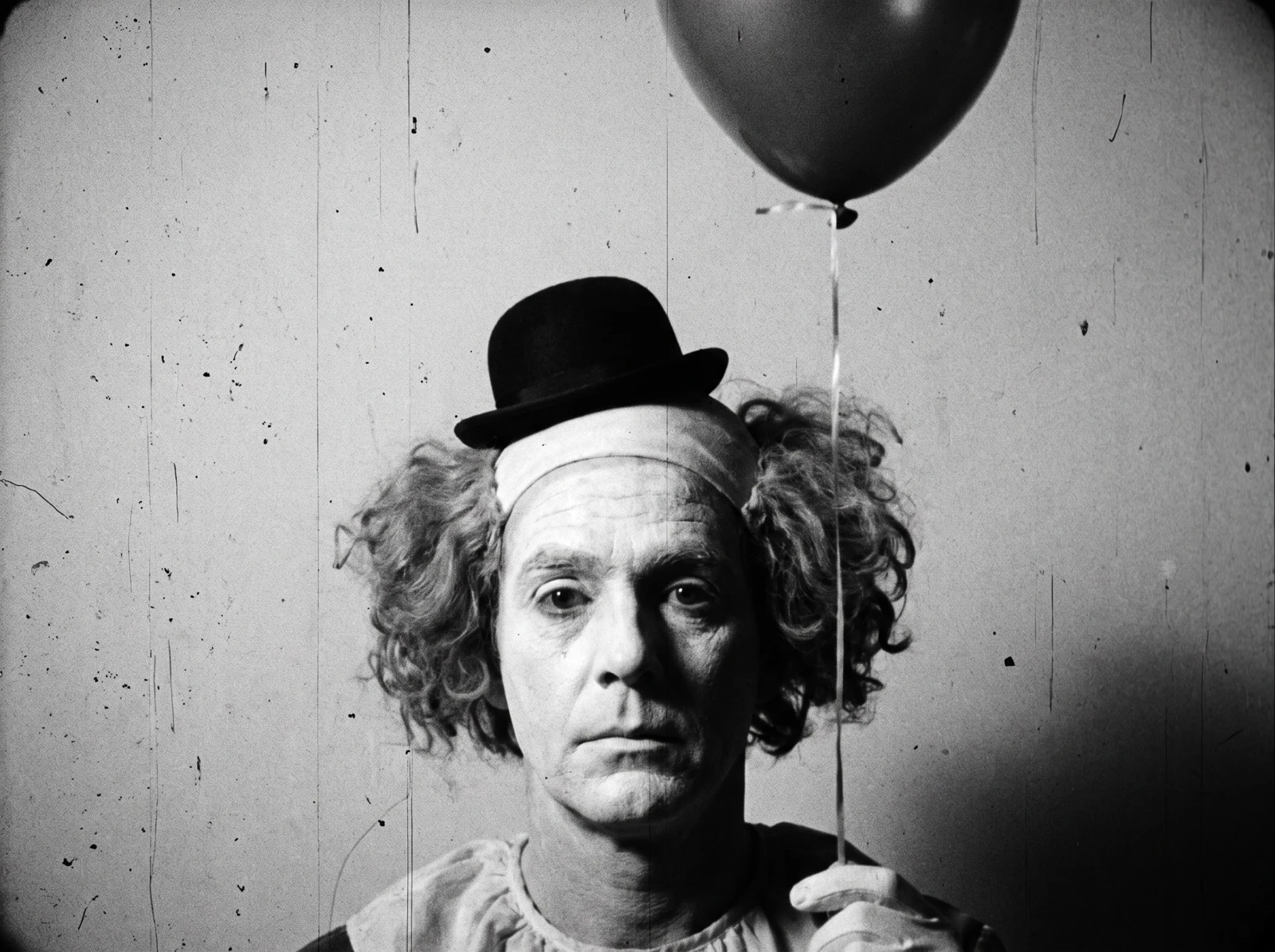
The screen tests. Between 1964 and 1966 he filmed hundreds of silent, black-and-white portraits: a still camera, one roll of film, sitters asked not to move or blink. So we gave the mom, the dad and the clown a screen test each. The dad eats his cake.
The music. A droning, two-chord, mid-sixties New York sound, a nod to the Velvet Underground, the band he managed. Ours is an original track.
How we made the film
Two looks cut together. The guests get silent black-and-white screen tests: locked-off, grainy, flickering, and as uncomfortable as the originals. The poster gets faded 16mm colour, so the fluorescent inks are the only things that really glow.
As always, we started flat: real paper, real ink colours and real foil, and only then built the scenes around the finished poster. Sets, people and motion are AI-assisted.
Make your own
Gig posters, party posters, art prints, editions: we screen print in spot and fluorescent Pantones, on coloured stocks, with foil. Bring us your Brayden.
More from the What if…? series
Our artist homages start with a real paper, ink and foil specification.
What if Hieronymus Bosch designed your wedding invitation? →
What if Alexander McQueen designed your wedding invitation? →
Start from these materials
Same paper, foil and finish, locked in — nothing of this piece artwork comes with it.
Questions
- What is screen printing?
- Ink is pushed through a fine mesh stencil with a squeegee, one colour at a time. It lays down a thicker layer of ink than offset or digital printing, so colours are denser, and fluorescents especially look brighter.
- Can you print fluorescent Pantone colours?
- Yes. Fluorescent Pantones like 801 C, 802 C and 803 C are special inks; they can't be mixed from CMYK. We print them as spot colours, and they glow hardest when screen printed.
- What paper is good for a screen-printed poster?
- A smooth, heavy, uncoated sheet. GF Smith Colorplan at 270 g/m² hangs flat, takes thick ink well, and comes in colours like Candy Pink, so the paper itself can be one of your colours.
- Can you add foil to a poster?
- Yes. We stamp foil on bare paper after the inks have cured. Large shapes need a larger die and more pressure, so we size foil areas with the press in mind.
- Is this an official Andy Warhol work?
- No. It's a design exploration and an homage. The commission and the family are invented, and we're not affiliated with or endorsed by the Andy Warhol Foundation.
- Can I order a poster like this?
- Yes. Every technique here is real: spot and fluorescent screen printing, coloured stocks and foil. Order a sample pack, start a quote, or book a design consultation.
An homage to Andy Warhol (1928–1987). Invented commission and family. Not affiliated with or endorsed by the Andy Warhol Foundation. Art direction by Peppermint. The flat artwork is built on our real paper, ink and foil references; sets, people and motion are AI-assisted.