Case study · Business cards · Property Valuation Inc.
Property Valuation Inc. ↗One mark, one metal
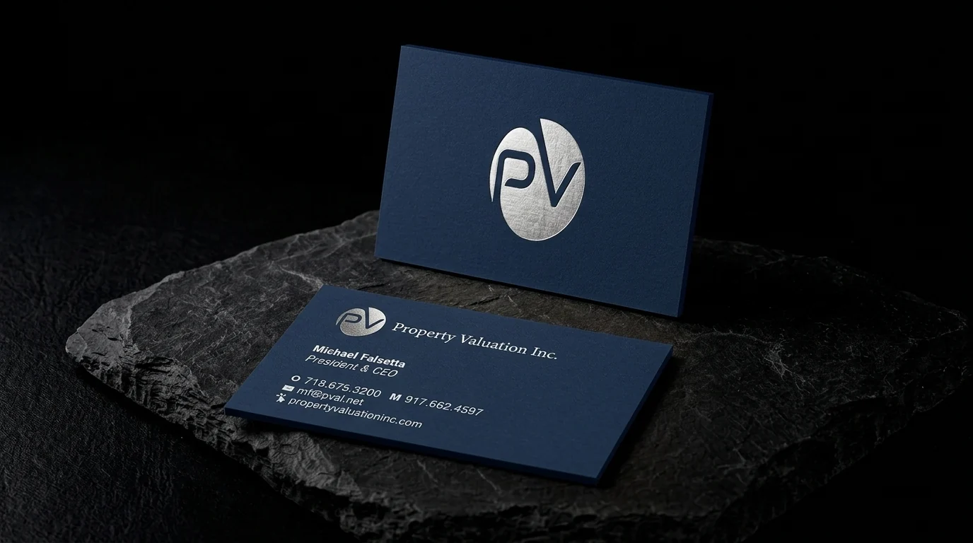
Card for Property Valuation Inc.: a lowercase pV monogram in brushed silver foil centred on deep navy uncoated stock, and a navy reverse with the firm name, the president's details and web addresses in white.
The idea
Property Valuation Inc. provides commercial real estate appraisal and advisory services across the greater New York metro area, including New York City, the Hudson Valley, Long Island and northern New Jersey, and has handled complex deals since 1988. The card shown is for its president and CEO.
Two rules
- 01Monogram only. Only the pV monogram, centred in silver foil.
- 02Navy on both sides. Navy on both faces, with the details in white.
Why it works
The front is almost empty, which is the right tone for a firm clients trust with a valuation.
Start from these materials
Same paper, foil and finish, locked in — nothing of Property Valuation Inc.'s artwork comes with it.
Questions
- Does silver foil work on navy?
- Yes, with crisp contrast and a cool tone.
- Can white print on navy?
- Yes. White foil gives a clean, bright white on navy.
- Why a monogram-only front?
- It's calm and confident, and puts the brand first.