FILE SETUP
Drukafwerkingen combineren: wat samengaat, wat niet en in welke volgorde
De volgorde waarin afwerkingen worden uitgevoerd, de toleranties die zich tussen doorgangen opstapelen, en onze huisregels voor het combineren van folie, letterpress, embossing, spot UV, stansvormen en geverfde randen in één stuk.
Door Austin Terrill · Print Peppermint · 14 min
Op deze pagina
- De volgorde van werken
- Waar de verlijming zit bij een duplex- of triplexkaart
- Elke doorgang is een nieuwe registratie: de opeenstapeling van toleranties
- Ontwerp zo dat de opbouw onzichtbaar blijft
- De compatibiliteitsmatrix
- Folie en preeg in register: de combinatiestempel
- Duplex en triplex: de sleutel
- Een bestand met meerdere afwerkingen aanleveren
- Drie opbouwen, ontleed
- Ontwerp 1: een huwelijksuitnodiging in letterpress, folie en geverfde rand
- Build 2: een visitekaartje met folie en blinde debossing op zwart-wit duplex
- Build 3: een verpakkingshuls in CMYK, spot UV en stansen
- Preflight: checklist voor meerdere afwerkingen
Short answer: most finishes combine well. The ones that fail are fighting over the same surface. Print goes on first, then foil, then emboss or deboss, then the die cut, and edge paint last. Every one of those is a separate pass with its own registration, so never design a hairline fit between two finishes: leave 1 mm of air, or overlap by a set trap. When two finishes want different papers, stop forcing them onto one sheet and build the card in plies.
This guide assumes you know each finish on its own; if not, start with foil artwork preparation, letterpress file setup en emboss and deboss file setup. Here we cover what happens when you stack them: the order, the tolerances between passes, the house compatibility rules, and how to supply the file.
De volgorde van werken
Finishes run in a fixed order: print, foil, emboss or deboss, die cut, edge paint. The order isn't a shop preference. Each step either needs a flat, uncut sheet to register to, or would damage the step before it if it ran later.
- Druk. CMYK in offset of digitaal, of letterpress met één plaat per kleur. De inkt komt op een vlak, open vel en wordt de referentie waarop elke volgende gang wordt gepast. Een eventueel laminaat gaat er direct na het drukken op.
- Folie. Eén gang per foliekleur, op onbedrukt karton, nooit op inkt. Het cliché heeft een vlak oppervlak nodig om tegen te persen.
- Reliëf of blinddruk. Het vel wordt gevormd nadat de folie is aangebracht. Doe je het andersom, dan plet de vlakke foliestempel de vorm. Moeten folie en reliëf exact samenvallen, dan worden ze in één slag gecombineerd met een combinatiestempel.
- Spot UV en verhoogde UV. De coating gaat op het bedrukte of gelamineerde oppervlak, voordat er iets wordt gesneden.
- Stansen. Daarna is er geen drukvel meer om op te registreren, dus elke gepaste afwerking moet er al op zitten.
- Randverf. Als laatste, omdat de gesneden kaarten worden gestapeld, vlak en haaks ingeklemd en op de gestapelde rand geverfd.
Waar de verlijming zit bij een duplex- of triplexkaart
In most builds, each ply is printed and finished on its own before bonding, then cut and edged as one card. That is why a multi-ply file needs one artboard per face and a spec line that says which finish belongs to which ply. A few constructions change the sequence, and we confirm yours at proof.
Elke doorgang is een nieuwe registratie: de opeenstapeling van toleranties
Each finish is positioned independently, and the tolerances between passes add up. A foil die, a letterpress plate and a cutting die each hold their own geometry perfectly. The movement happens between them: where the sheet sits against the guides on each run, how it stretches under heat and pressure, how a stack shifts under the blade.
| Relationship | Tolerance | Wat het betekent in je bestand |
|---|---|---|
| Letterpress kleur op kleur | ±0.3 mm | Laat aangrenzende kleuren 0,3 mm overlappen (trapping), houd ze anders 1 mm uit elkaar |
| Folie op druk | ±0.5 mm | Spaar de inkt onder de folie uit en laat 1 mm ruimte |
| Folie op folie | ±0.25 mm | Laat aangrenzende folies alleen op gedeelde randen 0,3 mm overlappen, houd ze anders 1 mm uit elkaar |
| Embossing of debossing voor print | ±0.5 mm | Gebruik een combinatiestempel als folie en reliëf exact moeten aansluiten |
| Spot UV voor druk | ±0.5 mm | Geen UV-contouren die een nauwere passing vereisen |
| Stansen (stalen mes) | ±0,8 mm over een stapel | 3 mm veilige marge binnen de snijlijn, 3 mm afloop, folie op 3 mm van de snijlijn |
Full per-process minimums live in the minimale lijndikte en lettergrootte matrix.
Opstapeling ontstaat wanneer twee van die verhoudingen samenkomen in één element. Folie past op de druk binnen ±0,5 mm en het snijden binnen ±0,8 mm, dus in het slechtste geval zit de folie 1,3 mm dichter bij een rand dan je hebt getekend. Twee aparte gangen voor folie en reliëf kunnen elk 0,5 mm in tegengestelde richting afwijken en elkaar zo 1 mm missen. De meeste vellen vallen ruim binnen die marge. Ontwerp toch voor het slechtste geval: je houdt elk kaartje uit de oplage vast, niet het gemiddelde.
Ontwerp zo dat de opbouw onzichtbaar blijft
- No hairline fits between finishes. Don't nest foil 0.5 mm inside a printed frame, outline a deboss with a printed keyline, or ask spot UV to land exactly on the edge of a printed shape. Bold UV over a bold printed shape is fine; a UV outline chasing a printed outline is not.
- Separate or overlap, never butt. Where finishes of different kinds meet (foil and ink), separate them by 1 mm. Where two passes of the same kind touch (two foils, two letterpress colors), overlap them by a 0.3 mm trap on the shared edges.
- Keep parallel edges away from the trim. A foil border 1.5 mm from the edge will read 0.7 mm on one card and 2.3 mm on the next. Keep foil and critical art 3 mm inside trim, or bleed it 3 mm past.
- Put exact relationships inside one pass. Anything drawn on the same plate or die holds its geometry perfectly. If two elements must align to the tenth of a millimeter, they belong on the same plate, the same foil die, or one combination die.
De compatibiliteitsmatrix
Most finish combinations fail for one of three reasons: the surface won't take the second finish, the second finish lands on the first, or a physical process (a clamp, a cut, a scanner) can't cope with the result. This table is our house rulebook.
| Combination | Oordeel | Waarom | Doe dit liever |
|---|---|---|---|
| Folie over letterpress of CMYK-inkt | Nee | Folie hecht aan onbedrukt papier, niet aan een inktlaag | Spaar de inkt onder de folie uit; laat een ontworpen tussenruimte van 1 mm |
| Twee folies die elkaar raken | Ja, met een overvulling | Bij ±0.25 mm laat een stompe naad een strookje papier zien | Tweede folie overlapt de eerste met 0.3 mm, alleen op gedeelde randen |
| Twee folies die elkaar niet raken | Ja | Aparte stempels, aparte gangen | Minimaal 1 mm tussenruimte |
| Verhoogde folie en vlakke hotfoil | Niet in dezelfde gang | Aparte processen en registraties | Buren, nooit passend; verhoogde folie is één kleur per ontwerp |
| Folie en embossing exact in register | Ja, op één combinatiestans | Aparte stempels vallen elk binnen ±0,5 mm van de druk | Identieke vormen op de FOIL- en EMBOSS-lagen; één stempel |
| Preeg of deboss op soft-touch- of zijdelaminaat | Nee | De laminering hecht niet strak | Ongestreken of katoen, 16 pt (0,4 mm) of zwaarder |
| Spot UV of verhoogde UV op ongestreken papier of katoen | Nee | De coating trekt in open vezels | Gestreken of gelamineerd papier; op katoen folie of blinddruk |
| Raised UV op soft-touch laminaat | Ja | Verhoogde UV hecht op soft-touch | Onze manier om reliëf te geven aan een gelamineerde kaart |
| Blind deboss op zwart ongecoat | Vermijden voor contrast | Blinddruk wordt leesbaar door schaduw. Op zwart is die nauwelijks zichtbaar. | Voeg folie toe aan de indruk, of gebruik blinddruk op een lichtere laag |
| Vlakke letterpress op katoen | Vermijd meer dan 13 cm² (2 in²) | Grote vlakken vlekken op zachte vezel | Gebruik een gekleurde laag voor het vlak, druk de details in letterpress |
| Debossing aan de ene kant, letterpress aan de andere, één vel | Nee | Elke indruk drukt door | Duplex: elke laag krijgt een eigen indruk |
| Donkere folie op donker papier | Alleen textuur | Oogt als glans, niet als contrast | Contrastfolie voor alles wat leesbaar moet zijn |
| Lichte letterpress-inkt op donker papier; witte inkt op katoen | Niet beschikbaar | Letterpressinkt is transparant | Folie of blinddruk op katoen |
| CMYK op donker doorgekleurd papier | Nee | Procesinkt verdwijnt | Folie of dekkend witte inkt |
| Gekleurde randen met afgeronde hoeken of een gestanste vorm | Nee | De stapel wordt plat en haaks ingeklemd om te verven | Rechte hoeken, rechte sneden. Elke dikte is mogelijk en bepaalt hoe krachtig de lijn oogt |
| Folie naast een geschilderde rand | Ja, 3 mm achterkant | Verf kan licht naar de voorkant trekken | Laat de folie 3 mm eerder stoppen, nooit doorlopen in de verf |
| QR-code of barcode in folie, embossing of UV | Nee | Scanners hebben vlakke modules met veel contrast nodig | Altijd inkt |
| Letterpress, reliëf of blinddruk op kunststof | Nee | Plastic neemt geen indruk aan | Alleen vlakke afwerkingen |
More on pairing foils and substrates in foil combinations en best paper for foil.
De tabel leest eenvoudiger als een lijst van wat elke afwerking eronder nodig heeft. Is de ondergrond verkeerd, dan redt geen enkele bestandsvoorbereiding de combinatie.
| Afwerking | Vereist | Werkt niet op |
|---|---|---|
| Hot foil | Onbedrukt karton zonder inkt | Gedrukte inkt |
| Letterpress | Ongecoat of katoen; vlakken kleiner dan 13 cm² (2 in²) | Lichte inkt op donker papier; witte inkt op katoen |
| Emboss of deboss | Ongestreken of katoen, 16 pt+; 32 pt als het niet mag doorschijnen | Soft-touch- of zijdelaminaat; kunststof |
| Vlakke spot-UV | Gecoat of gelamineerd karton | Ongecoat of katoen |
| Verhoogde spot-UV | Gecoat of gelamineerd papier, inclusief soft-touch | Ongecoat of katoen |
| CMYK | Wit of licht papier | Donker, doorgekleurd papier |
| Randkleur | Elke dikte (geen minimum), rechte hoeken, rechte sneden | Ronde hoeken, vormstansen |
| QR-codes en barcodes | Inkt | Folie, reliëf, blinddruk, UV |
Folie en preeg in register: de combinatiestempel
If the foil has to sit exactly on the raised form, it has to be one die. Run foil and emboss as two passes and each lands at ±0.5 mm to print, so the emboss can shift off the foil by up to 1 mm. What you see is a crescent of flat foil on one side of the shape and a bare, un-foiled shoulder on the other. A combination die is a sculpted, heated die with a matching counter: the foil transfers and the paper takes its form in the same strike, so the foil edge and the emboss edge are one edge.
Duplex en triplex: de sleutel
When two finishes want different surfaces, or would fight through one sheet, give each its own ply. A duplex card is two sheets bonded into one, typically 32 pt (0.8 mm); a triplex is three, typically 48 pt. Because each ply is printed and finished as a separate sheet before bonding, finishes that would fight on a single sheet stop meeting at all. That is the reason most of our multi-finish work is built thick. The plies are the point; the thickness is a side effect (see dikte visitekaartje).
- Front deboss, back letterpress. On one sheet, a deep impression on either face telegraphs through to the other. Split across two plies, the glue line absorbs any bulge. For a deboss that must not show through, 32 pt duplex is our floor.
- Different stocks front and back. A black ply on the front for gold foil and a white cotton ply on the back for letterpress. Letterpress ink is translucent and needs the light sheet; foil is what reads on the dark one.
- A colored ply instead of a flood. Letterpress solids over 13 cm² (2 in²) mottle on cotton. Make the color field a dyed ply and let letterpress carry only the lines and type.
- A colored core as the edge. On a triplex card a colored middle ply shows as a stripe around the edge with no paint at all. Painting the edge covers the core, so choose one: a visible core or a painted edge.
Een bestand met meerdere afwerkingen aanleverenAGENCYNIVEAU
One file, one artboard per side, one layer per operation, and a written spec line. Every finish is a separate physical tool, and we make each tool from its own layer. If two operations share a layer, someone has to guess, and guessing is how finishes end up in the wrong place. The general rules are in drukklare bestanden; these are the multi-finish specifics.
- Eén PDF, bij voorkeur PDF/X-4 (behoudt lagen en steunkleurkanalen).
- Eén tekengebied per zijde, FRONT en BACK. Bij een duplexkaart zijn dit de buitenzijden van de voor- en achterlaag.
- Eén laag per bewerking, vernoemd naar de swatch: ART voor inkten, daarna FOIL-GOLD, DEBOSS, SPOT-UV, CUT. Elke foliekleur heeft een eigen swatch, laag, stempel en gang.
- Elke afwerkingslaag is uitsluitend vector, 100% van één gereserveerde staalkleur, ingesteld op overdrukken. Geen tinten, verlopen of raster.
- Inkt uitgespaard onder elke folie, met de tussenruimte van 1 mm getekend in de ART-laag. Overlappingen zitten in het ontwerp: de tweede folie loopt alleen op de gedeelde rand 0,3 mm onder de eerste door.
- Voor folie en reliëf in register: identieke vormen op de lagen FOIL en EMBOSS, en "combination die" in de specificatieregel.
- Stanslijn op de CUT-staal op 0,25 pt, voorbeeld in 100% magenta, één gesloten pad. Vouwen op CREASE, 100% cyaan.
- Randverf is geen laag: die komt in de specificatieregel met een Pantone U-referentie. QR-codes staan op de ART-laag, in inkt.
Schrijf de opbouw daarna op in één regel: voorkant, achterkant, constructie, rand. Met die specificatieregel controleren we je lagen aan de hand van je bedoeling.
Drie opbouwen, ontleed
Drie veelvoorkomende drukwerken, opgedeeld in lagen en drukgangen, elk met de valkuil die het vaakst misgaat.
Ontwerp 1: een huwelijksuitnodiging in letterpress, folie en geverfde rand
Front: letterpress PMS 7545 U + FOIL-GOLD; Back: letterpress PMS 7545 U; 32 pt duplex cotton; edge painted PMS 7545 U. A 5 × 7 in card (see invitation sizes) with letterpress text, a gold foil monogram and a painted edge that matches the ink.
| Bestelling | Operation | Laag / staal | Geldende regel |
|---|---|---|---|
| 1 | Letterpress, elke laag | ART: PMS 7545 U | Lijnen 0,15 mm+, tekst 7 pt+, geen vlakken groter dan 13 cm² |
| 2 | Folie, voorlaag | FOIL-GOLD | Lijnen 0.15 mm doel / 0.1 mm minimum; tussenruimtes 0.25 mm doel / 0.15 mm minimum, inkt uitgespaard, 1 mm van inkt |
| 3 | Bond | Specificatieregel | 32 pt duplex katoen |
| 4 | Gestanst | CUT | Rechte sneden, rechte hoeken |
| 5 | Randkleur | Specificatieregel | PMS 7545 U; foil stopt 3 mm voor de snijlijn |
The landmine: the flood. The request is usually a colored background with the names knocked out in white. Letterpress floods mottle on cotton, and white letterpress ink on cotton isn't something we offer. Make the colored field a dyed cotton ply, foil the names in white pigment foil or gold, and keep letterpress for the fine type it does best. Second landmine: a gold border drawn close to the painted edge. Foil stops 3 mm inside the trim on any card with a painted edge, and it never bleeds into it.
Build 2: een visitekaartje met folie en blinde debossing op zwart-wit duplex
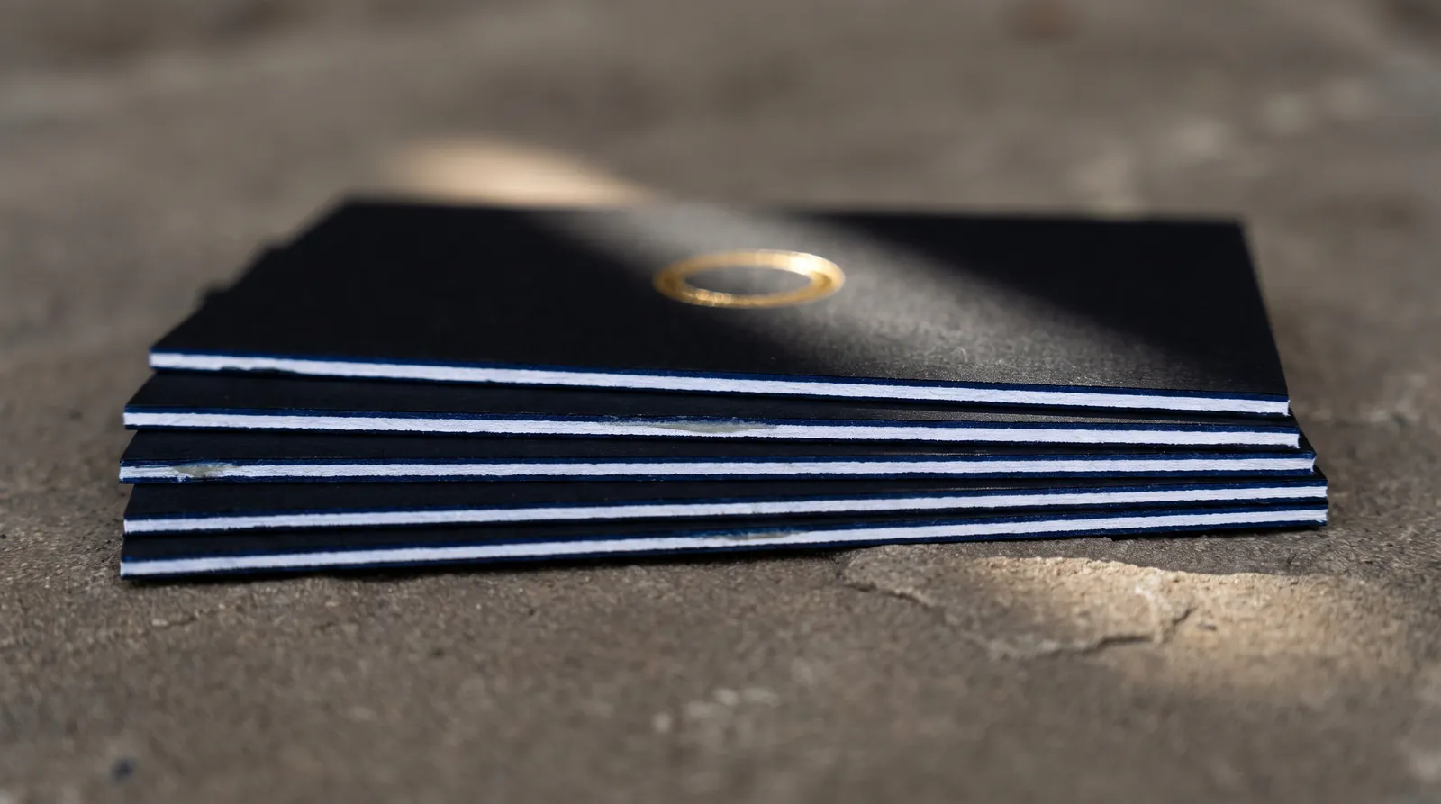
Front: FOIL-GOLD on black ply; Back: blind DEBOSS on white cotton ply; 32 pt duplex, black front ply and white back ply; edge painted. The front is a gold wordmark on black, the back a blind debossed monogram, and the edge shows the build.
| Bestelling | Operation | Laag / staal | Geldende regel |
|---|---|---|---|
| 1 | Folie, zwarte voorlaag | FOIL-GOLD | Lijnen 0.15 mm streefwaarde / 0.1 mm minimum; openingen 0.25 mm streefwaarde / 0.15 mm minimum, positieve tekst 7 pt+, uitgespaard 10 pt+ |
| 2 | Blinde deboss, witte achterlaag | DEBOSS | Lijn 0,5 mm+, tussenruimte 1 mm+, tekst 10 pt+ medium of bold |
| 3 | Bond | Specificatieregel | 32 pt duplex, zodat de debossing niet doordrukt naar de foliezijde |
| 4 | Gestanst | CUT | Rechte sneden, rechte hoeken |
| 5 | Randkleur | Specificatieregel | Pantone U-referentie; folie 3 mm van de snijlijn |
The landmine: the deboss on the black side. A blind deboss reads by the shadow in the impression, and black uncoated stock barely shows a shadow. Put the blind deboss on the white ply and the gold on the black ply, and each finish gets the ground it needs. Two more to watch: a black or dark foil on the black face reads as sheen rather than contrast, so it can't carry the phone number; and if the card needs a QR code, it goes on the white back in ink, never in foil or deboss. The edge crosses a black ply and a white one, so choose the paint color with that in mind; a deep color reads as one continuous edge. On a very dark build we may recommend edge foil instead of paint; that is a case-by-case call we make at quote.
Build 3: een verpakkingshuls in CMYK, spot UV en stansen
Outside: CMYK + SPOT-UV on coated board; CUT and CREASE dieline. A printed sleeve for a box, with gloss UV picking out the logo and a shaped window.
| Bestelling | Operation | Laag / staal | Geldende regel |
|---|---|---|---|
| 1 | CMYK-druk | ART | Maximaal 300% totale inkt; tekst 6 pt+, uitgespaard 8 pt+ |
| 2 | Vlakke spot-UV | SPOT-UV | Lijnen 0,3 mm+, tussenruimtes 0,5 mm+, tekst 8 pt+, ±0,5 mm tot de afdruk |
| 3 | Stansen en rillen | SNIJDEN, RILLEN | Binnenhoeken minimaal 1,3 mm radius, sneden 3 mm uit elkaar, 3 mm afloop voorbij de snede |
| 4 | Vouwen en lijmen | Specificatieregel | Lijmklep vermeld in de specificatie, vrij van UV gehouden |
Bekijk CMYK, rich black en inktlimieten en die cut file setup for the full rules on each layer.
The landmine: the late switch to uncoated board. Somebody wants a more natural, kraft-looking sleeve after the artwork is built, the board changes to uncoated, and the spot UV stops working, because UV soaks into open fiber instead of curing on top. If the board goes uncoated, the UV layer becomes foil or a blind deboss, and the file changes with it. Two quieter rules: keep UV off the glue flap, since adhesive needs bare board to grab, and keep it off the crease lines, where a hard coating cracks when the sleeve folds. Draw the UV layer clear of both and we set the exact hold-back at proof.
Preflight: checklist voor meerdere afwerkingen
- Elke afwerking ligt op een oppervlak dat het aankan.
- Geen folie raakt inkt: uitgespaard, 1 mm tussenruimte. Folies die elkaar raken krijgen 0,3 mm overlap; losse folies liggen 1 mm uit elkaar.
- Niets hangt af van een passing die nauwer is dan de tolerantie tussen de drukgangen.
- Folie en embossing die precies moeten passen, delen één combinatiestempel.
- Folie ligt 3 mm binnen de snijlijn of loopt 3 mm voorbij de snijlijn. Bij een gekleurde rand stopt hij 3 mm ervoor.
- Geverfde randen: rechte hoeken, rechte snedes, geen minimale dikte; de dikte bepaalt hoe zichtbaar de lijn is.
- Indrukken op beide zijden: duplex, één per laag.
- QR-codes en barcodes in inkt.
- Eén laag per bewerking, elk een eigen gereserveerde kleur, en een specificatieregel die ze allemaal benoemt.
If a combination isn't in the matrix, ask before you build the file; a build is cheaper to fix at the sketch stage. Order a samplepakket to see duplex, foil, deboss and painted edges in the hand, or browse the paper library for the stocks each finish needs.
Meer over Bestandsopmaak & prepress
Drukklare bestanden opzetten: de complete checklist voor specialistisch drukwerk
Lees de gids →15 problemen met drukbestanden die we het vaakst oplossen (en hoe je ze voorkomt)
Lees de gids →Van AI-mockup naar drukbestand: een ontwerp uit ChatGPT, Midjourney of Canva laten drukken
Lees de gids →Verder lezen
FILE PREP
Zo bereid je je artwork voor op foliedruk
Lees de gids →FILE SETUP
Bestanden voorbereiden voor letterpress: platen, indruk en inkt
Lees de gids →FILE SETUP
Bestanden opmaken voor embossing en debossing
Lees de gids →FILE SETUP
Een stanslijn opzetten: bestanden voor stanswerk en vormen op maat
Lees de gids →FILE SETUP
Ontwerpen voor geverfde randen: dikte, hoeken en kleur
Lees de gids →FINISHING
Kun je folie combineren met preeg, spot-UV of letterpress?
Lees de gids →PAPER
Dikte van visitekaartjes uitgelegd
Lees de gids →FILE SETUP
Drukklare bestanden opzetten: de complete checklist voor specialistisch drukwerk
Lees de gids →Stuur ons de opbouw voordat je het bestand afmaakt
Vraag een offerte op maat aanVertel ons de afwerkingen, het papier en de opbouw. We toetsen de combinatie aan onze huisregels voordat er iets wordt vastgelegd.