FILE SETUP
Drukklare bestanden opzetten: de complete checklist voor specialistisch drukwerk
Snijmaat, afloop, kleur, lettertypen, afwerkingslagen en exportinstellingen, in de volgorde waarin we ze controleren. Bouw je bestand zo op en het gaat zonder extra ronde naar de pers.
Door Austin Terrill · Print Peppermint · 14 min
Op deze pagina
- Snijlijn, afloop en veilige marge: de drie lijnen die elk bestand nodig heeft
- Uitgewerkt voorbeeld: een kaart van 3.5 × 2 in (88.9 × 50.8 mm) en een kaart van 85 × 55 mm
- Documentinstelling: het tekengebied is het snijformaat, niet de afloop
- Kleurmodus: CMYK voor proceskleuren, benoemde steunkleurstalen voor steunkleurinkt
- Resolutie: 300 ppi op ware grootte, 1200 ppi voor bitmap-lijnwerk
- Lettertypen: zet ze om naar contouren of sluit ze volledig in
- Vector of raster: elke afwerking moet vector zijn
- Afwerkingslagen: één laag per bewerking, 100% van één benoemde steunkleur, overprint
- De gereserveerde staalnamen
- Overprint, uitsparingen en scheidingen
- Eén pad, één staal
- Export: PDF/X-4, steunkleuren intact, afloop aan, geen snijtekens
- Dubbelzijdige bestanden: één PDF, voorkant op pagina 1, achterkant op pagina 2
- Bestandsnamen: wat het is, welk formaat, welke versie
- Wat er gebeurt bij onze proef
- De preflight-checklist
- Welke gids hierna
A print-ready file is a PDF built at the finished size of the piece, with 3 mm (0.125 in) of bleed on every edge that touches art, CMYK for process color, named Pantone swatches for spot ink, images at 300 ppi, fonts outlined, and every finish (foil, emboss, spot UV, cuts) drawn as vector on its own layer in 100% of one named spot swatch, set to overprint. Export it as PDF/X-4. That is the whole job. The rest of this guide is how to do each part, and why the press needs it that way.
Eerst de valkuil. De meeste bestanden die we terugsturen falen niet op kleur of resolutie. Ze falen op afwerkingslagen: een folielogo opgebouwd uit diepzwart, een emboss op dezelfde laag als de inkt, een stanslijn getekend als gevulde vorm. Heb je maar vijf minuten, lees dan het deel over afwerkingslagen en de preflight-checklist aan het eind, in die volgorde.
Snijlijn, afloop en veilige marge: de drie lijnen die elk bestand nodig heeft
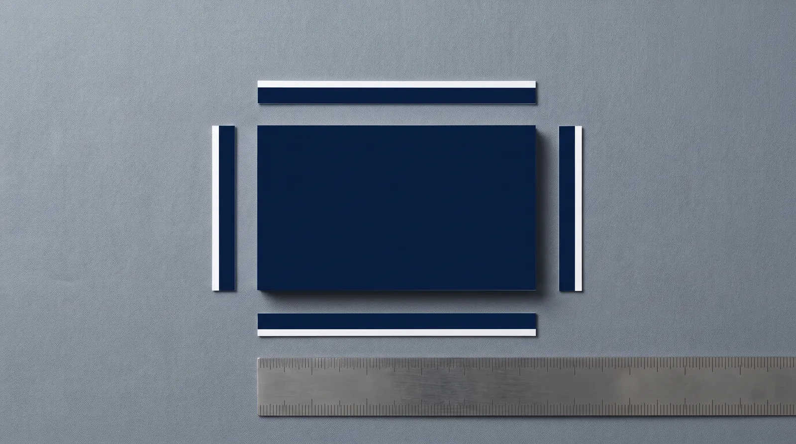
Every file has three boundaries. Trim is where the blade cuts. Bleed is 3 mm (0.125 in) outside trim, and any background, photo or color that touches the edge has to reach it. Safety is 3 mm (0.125 in) inside trim, and every piece of copy, every logo and anything else that must not be clipped stays inside it.
The reason is the stack. We cut stacks of sheets, not single cards, and across a stack the blade lands within ±0.8 mm (±0.03 in) of the trim line. When it lands outside, bleed means the edge still shows art, not a white sliver. When it lands inside, safety means the blade misses your phone number.
| Artikel | Huisspecificatie | Waarom het bestaat |
|---|---|---|
| Afloop, papier en karton | 3 mm (0.125 in) aan elke kant die de rand raakt | Vangt de snijtolerantie op, zodat er geen witte rand zichtbaar is |
| Afloop, metalen kaarten | 1 mm | Metaal, kunststof en hout hebben hun eigen specificaties |
| Veiligheidsmarge | 3 mm (0.125 in) binnen snijlijn | Houdt tekst en logo's weg van het mes |
| Veilige zone, metalen uitsparingen | 2 mm van de buitenrand | Houdt uitsparingen weg van de buitenrand |
| Snijtolerantie | ±0,8 mm (±0,03 in) over een stapel | Waarom afloop en veilige marge bestaan |
Some online printers ask for 1–2 mm of bleed. We ask for 3 mm. More bleed than a printer needs is harmless; less is a reprint. Card and invitation dimensions are in the size guide.
Uitgewerkt voorbeeld: een kaart van 3.5 × 2 in (88.9 × 50.8 mm) en een kaart van 85 × 55 mm
| US-kaart | EU-kaart | |
|---|---|---|
| Tekengebied (= snijformaat) | 3.5 × 2 in (88.9 × 50.8 mm) | 85 × 55 mm |
| Afloop, per zijde | 0.125 in | 3 mm |
| PDF-pagina met afloop | 3.75 × 2.25 in | 91 × 61 mm |
| Veiligheidslijn, binnen de snijlijn | 0.125 in | 3 mm |
| Veilige zone voor tekst | 3.25 × 1.75 in | 79 × 49 mm |
Metalen, kunststof en houten kaarten zijn ISO 7810 ID-1, 85,6 × 53,98 mm, met 1 mm afloop en een hoekradius van 3 mm.
Documentinstelling: het tekengebied is het snijformaat, niet de afloop
Stel het tekengebied of de pagina in op het afgewerkte formaat en voeg de afloop toe in de documentinstellingen. Maak het tekengebied niet groter om ruimte te laten voor afloop.
- Illustrator: File > Document Setup > Bleed, 3 mm (or 0.125 in) on all four sides. The red bleed guide appears outside the artboard.
- InDesign: File > Document Setup > Bleed and Slug, 3 mm on all four sides.
- Affinity Designer and Publisher: Document Setup > Bleed, 3 mm on all four sides.
Waarom dit belangrijk is: een PDF bevat een trim box en een bleed box. Bouw het tekengebied op snijmaat, stel de afloop in het document in, en bij export klopt beide. Bouw je het tekengebied in plaats daarvan op 3.75 × 2.25 in (95,25 × 57,15 mm), dan zegt de PDF dat je kaart 6 mm groter is dan hij is, en begint elke meting die wij doen vanaf de verkeerde rand.
Kleurmodus: CMYK voor proceskleuren, benoemde steunkleurstalen voor steunkleurinkt
Maak full-colour ontwerpen op in CMYK en elke steunkleur als benoemde Pantone-swatch. Geen RGB, geen Lab. Elke conversie verschuift kleur, dus doe het zelf, waar je het resultaat kunt zien.
Pick Pantone references from the right book: Uncoated (U) for uncoated and cotton stock, Coated (C) for coated. C and U are the same ink; uncoated paper absorbs it, so the color reads flatter and darker, and the U swatch is the honest preview. More in spot color and Pantone.
| Element | Opbouwen als | Rule |
|---|---|---|
| Foto's en full-color artwork | CMYK | Totale inkt maximaal 300% |
| Merkkleur op ongestreken of katoen | Benoemde Pantone U-kleur | Eén staal per inkt |
| Merkkleur op gestreken papier | Benoemde Pantone C-kleur | Eén staal per inkt |
| Kleine zwarte tekst en fijne lijnen | K100 only | Nooit rich black |
| Grote zwarte vlakken | Diepzwart C60 M40 Y40 K100 | Alleen voor vlakken van minstens 5 mm breed |
| Tints | CMYK- of steunkleurtint | Lichtste tint 8% |
| Folie, preeg, UV, witte inkt, stansen | Gereserveerd afwerkingsstaal | Zie de staaltabel hieronder |
| Alles op donker, doorgekleurd papier | Folie of witte inkt | CMYK verdwijnt op donker papier |
Why rich black stays out of small type: four plates never land in exactly the same place, and a 7 pt letter built from four inks shows colored fringes when they don't. Details in CMYK, rich black en inktlimieten.
And one distinction that trips up experienced designers: a finish swatch is not a color. FOIL-GOLD isn't a Pantone or a CMYK build that looks gold. It's an instruction to make a die in that shape, and its preview can be any color you can tell apart from the rest of the file.
Resolutie: 300 ppi op ware grootte, 1200 ppi voor bitmap-lijnwerk
Photos and other raster images need 300 ppi at the size they print. Bitmap line art (a scanned signature, a one-color logo that only exists as pixels) needs 1200 ppi, and a vector version is always better.
The phrase that matters is at final size. A 300 ppi image scaled to 200% in your layout is 150 ppi on paper; InDesign shows this as Effective PPI in the Links panel. Upsampling adds pixels, not detail, so the fix is a smaller placement or a better source.
Lettertypen: zet ze om naar contouren of sluit ze volledig in
Elk lettertype is omgezet naar contouren of volledig ingesloten in de PDF. Een ontbrekend lettertype wordt vervangen. Dat verschuift regels en kan tekst over de veiligheidslijn duwen.
- Type on finish layers is always outlined. A foil die or emboss die is made from paths, not from a font.
- Outline last. Keep a live-type master, make an outlined copy for print, and outline after the final text edit.
- Check it. In Illustrator or InDesign, Type > Find Font should list nothing live on the finish layers. In Acrobat, File > Properties > Fonts should show every font as embedded or embedded subset.
Vector of raster: elke afwerking moet vector zijn
Folie, embossing, debossing, spot-UV, letterpressplaten en snijlijnen worden allemaal gemaakt van vectorpaden, dus hun artwork moet vector zijn.
Een foliestempel is een metalen blok met je vorm verhoogd op het oppervlak. Op elk punt van het vel raakt het wel of niet, dus de folie is er wel of niet. Er bestaat geen 60% folie. Een verloop, een schaduw, een gloed of de zachte rand van een JPG zegt een stempel niets. Stuur je rasterbestanden voor de afwerking, dan moet iemand ze hertekenen, en wie hertekent bepaalt waar je rand komt.
Vector art is measured at final size. Foil holds positive lines down to 0.1 mm (0.28 pt). We design to 0.15 mm (0.43 pt, 0.006 in) or thicker for the crispest strike, with gaps at 0.25 mm (0.71 pt); the gap floor is 0.15 mm. Letterpress shares the positive-line target and floor; emboss keeps 0.5 mm strokes. See minimale lijndikte en lettergrootte.
Afwerkingslagen: één laag per bewerking, 100% van één benoemde steunkleur, overprintDE VALKUIL
Elke fysieke bewerking krijgt een eigen laag, gevuld met 100% van één benoemde steunkleur, ingesteld op overdrukken. Een bewerking is alles met een eigen gereedschap of doorgang: elke foliekleur, elke embossing, spot UV, witte inkt, het snijden, het rillen.
- One layer per operation. Gold and copper foil are two dies and two passes, so two layers: FOIL-GOLD and FOIL-COPPER. Emboss is a third, the die line a fourth.
- 100% of one named swatch. Not a tint, not a CMYK mix that looks gold on screen. The die is made from exactly what is filled with that swatch.
- Vector, outlined, no effects. Strokes outlined, type outlined, no transparency, no blend modes, no clipping masks hiding extra art.
- Overprint on, so the finish doesn't punch a hole in the art underneath.
De gereserveerde staalnamen
Geef elk afwerkingsstaal precies de naam die hieronder staat. Elke drukkerij heeft een eigen naam voor een snijlijn (CutContour, Dieline, Artios_Cut). De naam zelf maakt niet uit. Wel dat hij precies overeenkomt met die van de drukker, want zo vertelt het bestand prepress welke plaat welke is.
| Kleurnaam | Operation | Kleur bekijken |
|---|---|---|
| FOIL-<COLOR> (bijv. FOIL-GOLD) | Hot foil, één staal per folie | Elke, duidelijk verschillend |
| BLINDDRUK / PREEG | Blinde of passende preeg | Any |
| SPOT-UV / RELIËF-UV | Vlakke of verhoogde blanke coating | Any |
| WHITE | Dekkende witte inkt | Any |
| CUT | Stans- of lasersnijlijn, lijn 0.25 pt | 100% magenta |
| CREASE | Ril- / vouwlijn | 100% cyan |
| PERF | Perforatie (doorgetrokken; afstand genoteerd) | C100 M60 |
| KISS | Kiss cut (stickers) | C60 M100 |
| ENGRAVE | Lasergraveren (alleen vlakken) | M60 Y100 |
Maak van elke kleur een steunkleurstaal (Illustrator: Staalopties > Kleurtype: Steunkleur), zodat hij als eigen scheiding wordt geëxporteerd. De voorbeeldkleur verandert alleen wat je op het scherm ziet.
- CUT is a 0.25 pt stroke with no fill, on its own layer, as one continuous closed path; never a filled shape. Corners and bridges are in the die cut guide.
- Foil and emboss in register run as one combination die, so the foil art and the emboss art are the same shape. Copy the FOIL paths onto the EMBOSS layer; don't redraw them.
- Multi-level or sculpted emboss needs a grayscale depth reference (white high, black low) as well as the outline.
Overprint, uitsparingen en scheidingenAGENCYNIVEAU
Zet elk afwerkingsobject op overdruk. Standaard spaart een steunkleurstaal uit: het verwijdert alles eronder uit elke andere separatie. Voor een afwerking is dat bijna nooit goed. Een spot-UV-cirkel op uitsparen snijdt een gat in de foto eronder, en de glans komt op kaal papier terecht.
- Set it: Illustrator, Window > Attributes > Overprint Fill (and Overprint Stroke for CUT and CREASE lines). InDesign, Window > Output > Attributes.
- Check it: View > Overprint Preview in either app, or Acrobat's Output Preview, which lets you switch each separation on and off. Every finish swatch should appear as its own plate, and the CMYK plates underneath should be whole.
Foil is the one place you want bare stock underneath. Foil doesn't bond reliably over ink, so the ink under it is knocked out, and where foil meets printed ink you design a deliberate 1 mm gap, not a butt join. Draw that knockout in the art layer yourself, on purpose. Don't leave it to a swatch setting.
| Relationship | Huisspecificatie |
|---|---|
| Folie op drukwerk uitgelijnd | ±0.5 mm |
| Pasvorm folie op folie | ±0.25 mm |
| Twee folies die elkaar raken | Overlap: tweede foil overlapt de eerste 0,3 mm, alleen op gedeelde randen |
| Twee folies die elkaar niet raken | minimaal 1 mm ertussen |
| Folie naast drukinkt | Inkt uitgespaard onder folie; 1 mm ontworpen tussenruimte, geen stootnaad |
| Folie tot de snijlijn | 3 mm binnen de snijlijn, of 3 mm afloop erbuiten. Stop nooit tussen 0 en 3 mm. |
| Embossing-op-drukregister | ±0,5 mm (gebruik een combinatiestempel als folie en preeg exact moeten aansluiten) |
| Letterpress kleur op kleur | ±0.3 mm; trap van 0.3 mm waar kleuren elkaar raken, anders 1 mm tussenruimte |
| Spot UV voor druk | ±0,5 mm; teken geen UV-contouren die een nauwere passing vereisen |
Stacking several finishes on one piece has its own rules; see combining print finishes.
Eén pad, één staal
De rommeligste foliebestanden zijn opgebouwd uit wat het logo toevallig bevatte: een ring in rich black, een letter met K100-lijn, een verloopbalk, een ornament geplakt uit een JPG. Op scherm is het één beeldmerk. Voor de prepress zijn het vier deelplaten en geen folieplaat. Bouw het opnieuw op: zet lijnen om in contouren, teken de pixels na als paden, voeg samen (Pathfinder > Verenigen) en vul met 100% van één afwerkingsstaal.
Export: PDF/X-4, steunkleuren intact, afloop aan, geen snijtekens
Export a PDF/X-4 with document bleed included, spot colors kept as spot colors, and no printer's marks. PDF/X-1a is accepted, and so is a packaged native Illustrator file.
| PDF/X-4 | PDF/X-1a | |
|---|---|---|
| Onze voorkeur | Voorkeur | Accepted |
| Transparency | Live gehouden | Afgevlakt bij export |
| Layers | Behouden, zodat afwerkingslagen gescheiden blijven | Flattened |
| Steunkleuren | Bewaard als benoemde scheidingen | Bewaard als benoemde scheidingen |
| Color | CMYK en steunkleuren, plus ingesloten ICC-profielen | Alleen CMYK en steunkleur |
X-4 behoudt lagen en steunkleurkanalen. Daarom is het onze eerste keuze: we kunnen elke afwerking afzonderlijk controleren zonder het bestand uit elkaar te halen.
- Illustrator: Bestand > Opslaan als > Adobe PDF. InDesign: Bestand > Exporteren > Adobe PDF (afdrukken).
- Kies de preset PDF/X-4:2008.
- Marks and Bleeds: vink Use Document Bleed Settings aan. Laat alle printer's marks uitgevinkt.
- Uitvoer: laat kleurconversie uit, of kies Preserve Numbers als je converteert, zodat je CMYK-waarden niet verschuiven.
- Alleen InDesign: open Uitvoer > Inktbeheer en zorg dat Alle steunkleuren naar proceskleuren uitgevinkt is.
- Open de PDF in Acrobat, gebruik Uitvoervoorbeeld en controleer of elke afwerkingsstaal als eigen scheiding verschijnt.
We don't need crop marks. Leave printer's marks off; the PDF's trim box tells us where to cut. Sending native Illustrator instead? Use File > Package so linked images and fonts travel with it.
Dubbelzijdige bestanden: één PDF, voorkant op pagina 1, achterkant op pagina 2
Stuur beide zijden in één PDF: voorkant op pagina 1, achterkant op pagina 2, met hetzelfde formaat en dezelfde afloop. In Illustrator zijn dat twee tekengebieden in één document.
- Same swatch names on both sides. Foil on the back is still FOIL-GOLD, on its own layer, on page 2.
- Mixed orientation: keep both pages the same size, rotate the artwork on one, and tell us which edge is the top of the back.
- Finishes on both sides are separate dies and passes. Emboss or deboss on both sides needs duplex construction so the impressions don't telegraph through.
- Suites: one PDF per piece (invitation, RSVP, details card), not one for the whole suite.
Bestandsnamen: wat het is, welk formaat, welke versie
Name every file so a stranger knows what it is: client, piece, trim size, sides, version, as in hollis-studio_business-card_85x55_front-back_v3.pdf. Skip final en FINAL-2. Bump the version every time the file changes; when two files share a name, somebody eventually prints the wrong one.
Wat er gebeurt bij onze proef
Een medewerker controleert elk bestand aan de hand van onze specificaties voordat er iets wordt gemaakt, en niets gaat naar de pers voordat je een proef goedkeurt. De digitale proef is gratis.
- We controleren snijlijn, afloop, veilige zone, kleur, stalen, resolutie en lettertypen. Daarna toetsen we elke afwerkingslaag aan de minimale waarden: lijndiktes, tussenruimtes, lettergroottes en afstanden.
- Schiet er iets tekort, dan vertellen we je precies wat en laten we de oplossing zien voordat je iets goedkeurt.
- Je krijgt een digitale proef van het ontwerp met elke afwerking aangegeven. Er wordt niets gemaakt voordat je die goedkeurt.
- Je keurt goed of vraagt om wijzigingen. Goedkeuring van de proef is goedkeuring van het bestand.
Read a proof the way the press will: spelling, phone numbers and email addresses letter by letter, and which elements are foil, ink or blind. More in zo werkt de proef.
De preflight-checklist
Elk punt hier controleren we. Vang je het zelf al op, dan komt je proef schoon terug.
- Artboard or page is the trim size, not the bleed size
- Document bleed set to 3 mm (0.125 in) on every side; background art reaches the bleed edge
- All copy and logos sit at least 3 mm (0.125 in) inside trim
- Process color is CMYK; no RGB or Lab objects or images
- Spot inks are named Pantone swatches, from the U book for uncoated or cotton stock
- Total ink 300% maximum; rich black only on areas at least 5 mm across
- Small black type and fine lines are K100, not a four-color build
- Raster images 300 ppi at final size; bitmap line art 1200 ppi or rebuilt as vector
- Fonts outlined or fully embedded; all type on finish layers outlined
- One layer per finish operation, named for the operation
- Each finish layer filled with 100% of one reserved swatch (FOIL-GOLD, EMBOSS, SPOT-UV, CUT…)
- Finish art is vector: no gradients, shadows, transparency or pasted pixels
- Finish swatches set to overprint; checked in Overprint Preview or Output Preview
- Inkt knocked out under foil, met een 1 mm gap where foil meets printed ink
- Foil lines 0.15 mm target / 0.1 mm floor; gaps 0.25 mm target / 0.15 mm floor; other finishes meet their minimums
- Foil sits 3 mm inside trim or bleeds 3 mm past het
- CUT line is a 0.25 pt stroke, one closed path, on its own layer
- Geen QR-codes of barcodes in folie
- Exported as PDF/X-4 (or X-1a), document bleed on, no crop marks
- Voorkant op pagina 1, achterkant op pagina 2, zelfde paginaformaat
- File named with client, piece, size, sides and version
Welke gids hierna
Elk procedé heeft zijn eigen regels. Ga naar het procedé dat je gebruikt.
- Foil: foil artwork preparation, then minimale lijndikte en lettergrootte for separate line and gap targets and floors.
- Letterpress: letterpress file setup.
- Emboss or deboss: emboss and deboss file setup.
- Die cut or laser cut: die cut file setup en de laser cut file setup guide.
- Painted edges: ontwerp geschilderde rand.
- Spot UV: the spot-UV-gids.
- Pantone inks: spot color and Pantone.
- Four-color work, rich black, ink limits: CMYK, rich black en inktlimieten.
- More than one finish on a piece: combining print finishes.
Meer over Bestandsopmaak & prepress
15 problemen met drukbestanden die we het vaakst oplossen (en hoe je ze voorkomt)
Lees de gids →Van AI-mockup naar drukbestand: een ontwerp uit ChatGPT, Midjourney of Canva laten drukken
Lees de gids →Minimale lijndikte en lettergrootte per drukproces: folie, letterpress, reliëf, UV, CMYK en stansen
Lees de gids →Verder lezen
FILE SETUP
15 problemen met drukbestanden die we het vaakst oplossen (en hoe je ze voorkomt)
Lees de gids →FILE SETUP
Van AI-mockup naar drukbestand: een ontwerp uit ChatGPT, Midjourney of Canva laten drukken
Lees de gids →FILE SETUP
Minimale lijndikte en lettergrootte per drukproces: folie, letterpress, reliëf, UV, CMYK en stansen
Lees de gids →FILE SETUP
Steunkleur en Pantone voor drukwerk: PMS-kleuren kiezen, specificeren en samenstellen
Lees de gids →FILE SETUP
Vierkleurendruk (CMYK): rich black, inktlimieten en waarom je scherm liegt
Lees de gids →FILE PREP
Zo bereid je je artwork voor op foliedruk
Lees de gids →FILE SETUP
Een stanslijn opzetten: bestanden voor stanswerk en vormen op maat
Lees de gids →FILE SETUP
Drukafwerkingen combineren: wat samengaat, wat niet en in welke volgorde
Lees de gids →Gerelateerde producten
Stuur het bestand. We toetsen het aan onze huisspecificaties.
Vraag een offerte op maat aanEen mens controleert elk bestand voordat er een proef wordt gemaakt, en niets gaat naar de pers zonder jouw goedkeuring.
Bestandseisen · Zo werkt de proef · Minimale lijndikte en lettergrootte