Case study · Business cards · Studio Álvarez Interiors
Lograr la A de piedra con cuatro colores
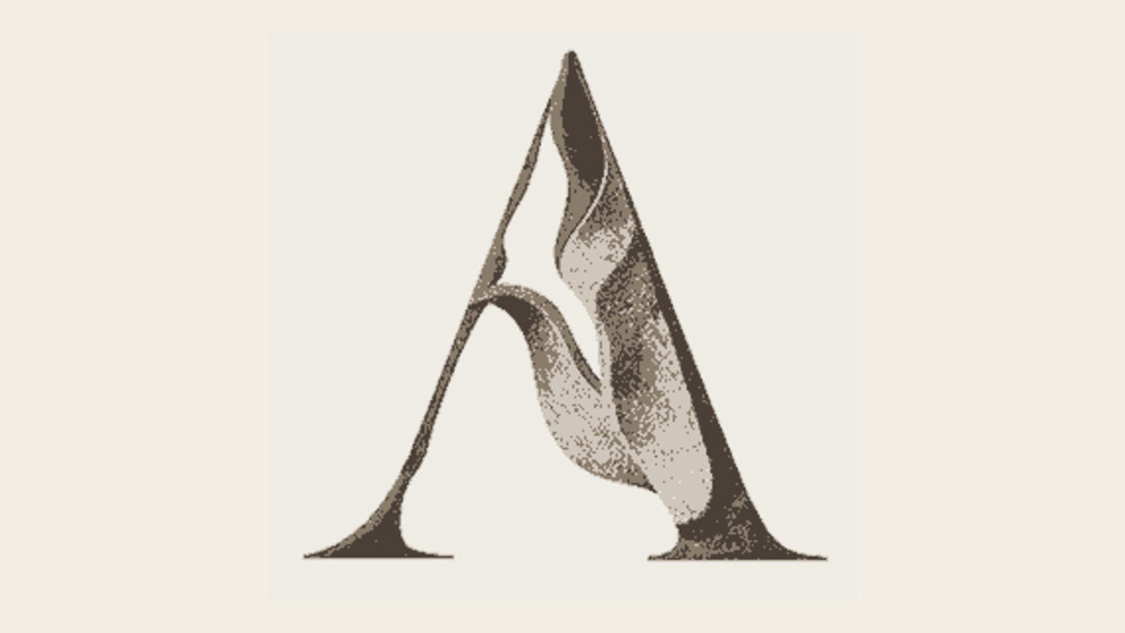
El icono era un relieve en mapa de bits: precioso, pero reproducible solo en cuatricromía CMYK. Ese único hecho descartaba el foil, el letterpress, el relieve en seco, la señalética a una tinta, el bordado y cualquier tamaño inferior a unos 30 píxeles. Sacarlo de las cuatro tintas exigía reconstruirlo en vector y encontrar la forma de transmitir su carácter escultórico con una sola tinta.
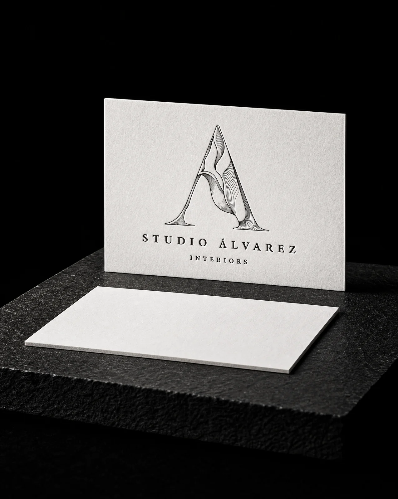
La idea
No fue un rediseño. La marca era correcta. Estaba en el formato equivocado, y ese formato decidía en silencio lo que la marca nunca podría hacer.
Six rules
- 01Diagnose what the file actually forbids. Trace a vector master from the existing artwork rather than redraw it. The mark stays the mark; only its file format changes.
- 02Generate every variant from one outline. All five renderings are generated from the same single outline. The bevel is constructed from that outline's own distance field and lit fro…
- 03Retire the two that describe an edge instead of a mass. Cut both. Kept the flat solid and the simplified silhouette, and developed the fourth idea properly — line weight driven by a light source…
- 04Let the line weight do the shading. Relief rules. Each rule thickens as it enters shadow and thins as it crosses a lit face, so the weight itself describes the form — the ribb…
- 05Quantise the shading rather than gradate it. Incised facets — the shading quantised into three flat planes, the way a V-cut inscription resolves into two walls and a top. Hard edges be…
- 06Keep one version that survives being made in metal. Monumental extrusion — the outline swept back along a fixed axis and closed off. No shading at all; the mass comes from depth. It's the one…
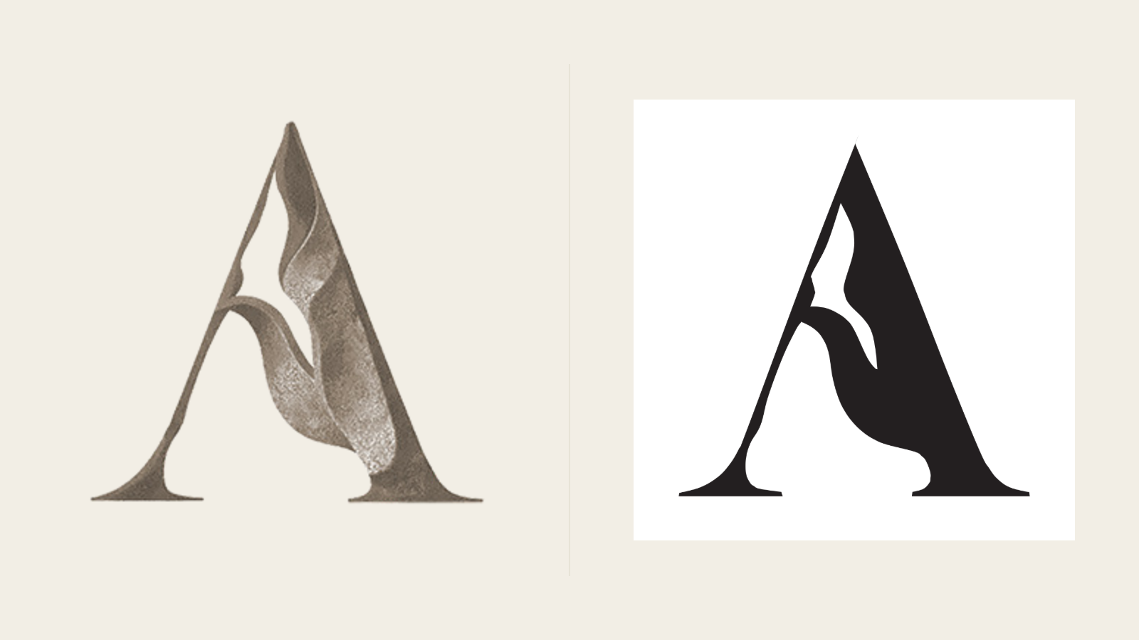
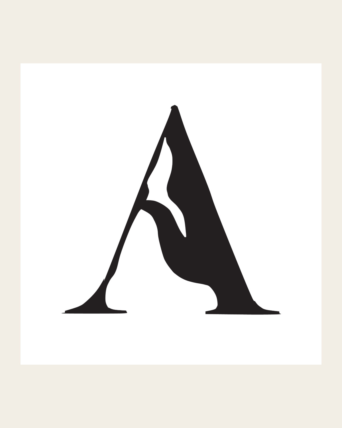
La misma marca, vectorizada en lugar de redibujada. Todo lo que viene después (foil, letterpress, gofrado en seco, señalética, bordado) es posible en cuanto deja de ser un ráster.
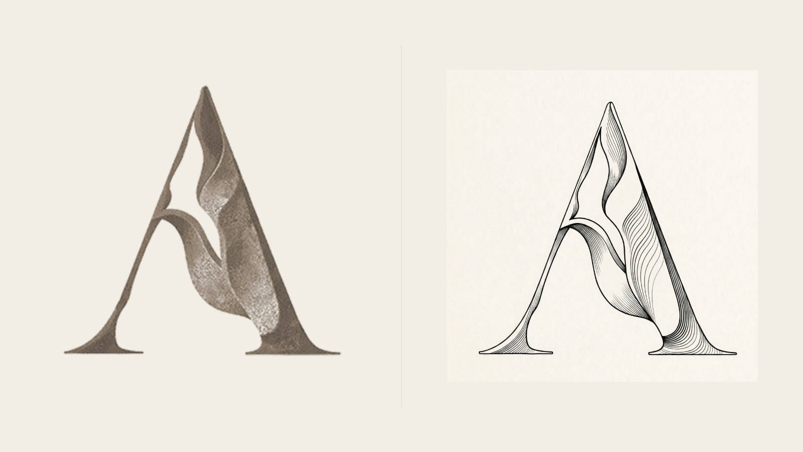
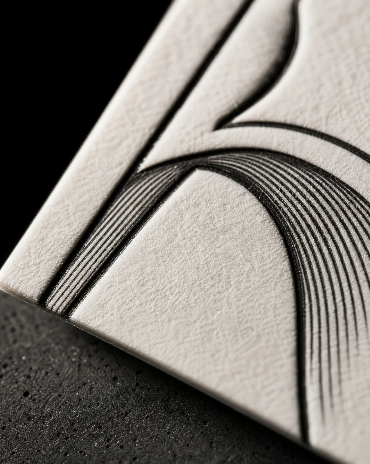
La sensación escultórica la aporta el grosor de línea, no el tono. Cada trazo se engrosa en la sombra y se adelgaza sobre la cara iluminada, de modo que el propio dibujo describe la forma.
Notas de impresión por acabado
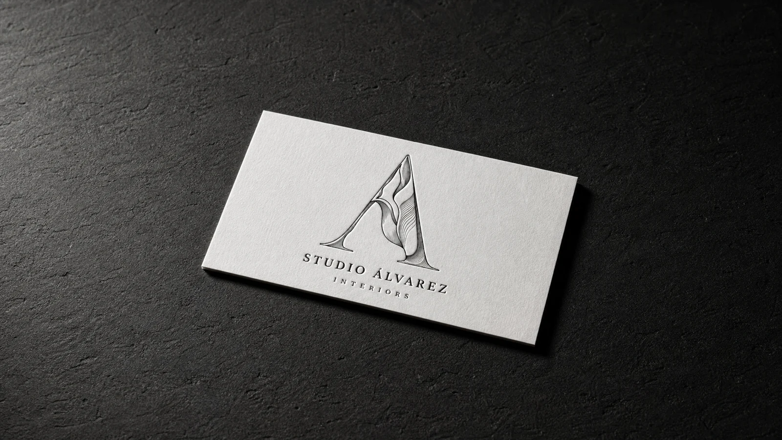
Reglas para relieve: serigrafía, letterpress, offset, grabado y gran formato. Mínimo 64px / 25mm, y la línea más fina debe mantener 0.3pt a tamaño final.
Facetas incisas: una tinta directa más tramas, o tres tintas directas sólidas. Mínimo 48px / 18mm. Las tramas se tramean, así que esto no es letterpress ni foil.
Extrusión monumental: sin ningún sombreado, por eso es el único recurso aquí que funciona tanto impreso en plano como cortado en aluminio.
Empieza con estos materiales
Mismo papel, foil y acabado, ya fijados. Del arte de Studio Álvarez Interiors's no se incluye nada.