Case studies · 148 projects
Every project is a constraint someone had to solve.
Not portfolio shots. The brief, the thing that made it hard, the decisions that resolved it, and the exact stock, foil and ink it was printed on.
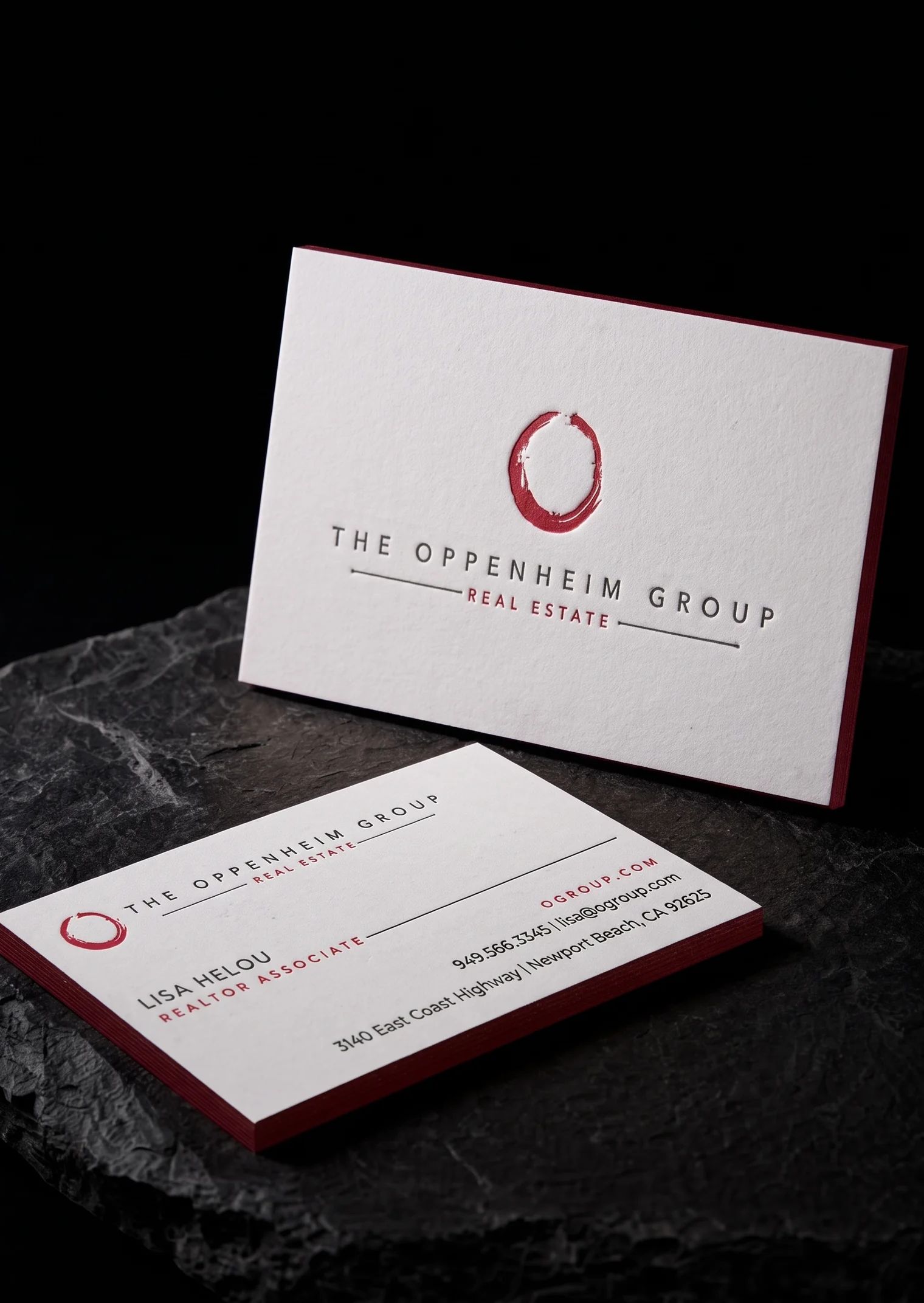

Foil outside, letterpress inside, blind emboss on the back, folded with half-inch side panels. Three finishes, one sheet.

Numerai’s angular glyphs sit on 48pt black uncoated stock under layered black foil and white pigment foil, not spot gloss varnish.

A cream cotton band, gold foil crest, debossed blossom border, sealed with a foil sticker. The band is the packaging.

A lidar company whose logo splits light into colour. White on black, with the I in red, green and blue.
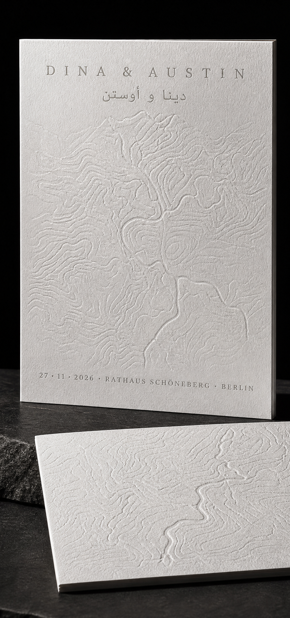
Blind emboss, letterpress and Arabic type on double-thick cotton. The client was us.

A CR80 hybrid card that has to look exactly like the carton, tap to a Spotify playlist, and survive a wallet. Two PMS colours, one illustration, no compromise on either.

Gold foil serpent with fine scale detail on vermilion uncoated stock, folded to 4×7. Fine foil on soft paper.

A belly band that becomes a box sleeve. Four folds, one glue tab, foil on the face only.

Design exploration · Peppermint
One sheet of the loudest paper we stock, a shape nobody asked for, and two holographic foils that refuse to behave. No ink at all.

Design exploration · What if…? series
's-Hertogenbosch, around 1480. The painter Jheronimus van Aken is marrying Aleid van de Meervenne. The invitation has to open like an altarpiece.

Design exploration · What if…? series
Croydon, June. Gary and Linda are getting married at the register office, with a hot buffet at the rugby club after. They've asked Alexander McQueen to do the invitations.

Design exploration · What if…? series
Pittsburgh, Saturday. Brayden is turning seven: bowling, pizza, cake, goody bags. His mom asked Andy Warhol to do the poster.

Design exploration · twelve invented brands
One brief, twelve design movements: the same 24 days, built the way each era would have built them, from papers and foils we actually stock.
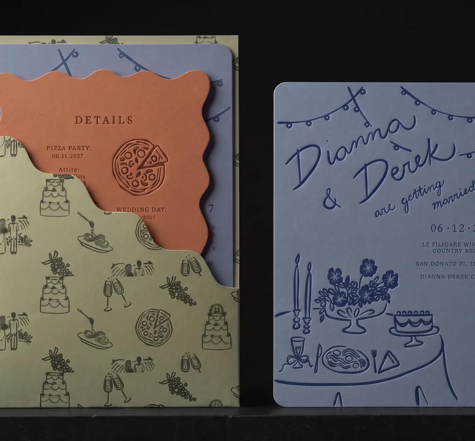
Three colour-drenched pieces, one hand-mixed ink each, and one bold cut. Then the one we would have cut.
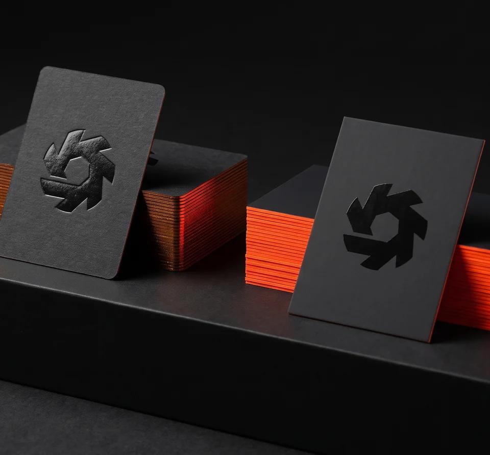
The deboss wanted one paper. The neon edge wanted the other.

A card worth keeping, thin enough to fall out of a vending machine.
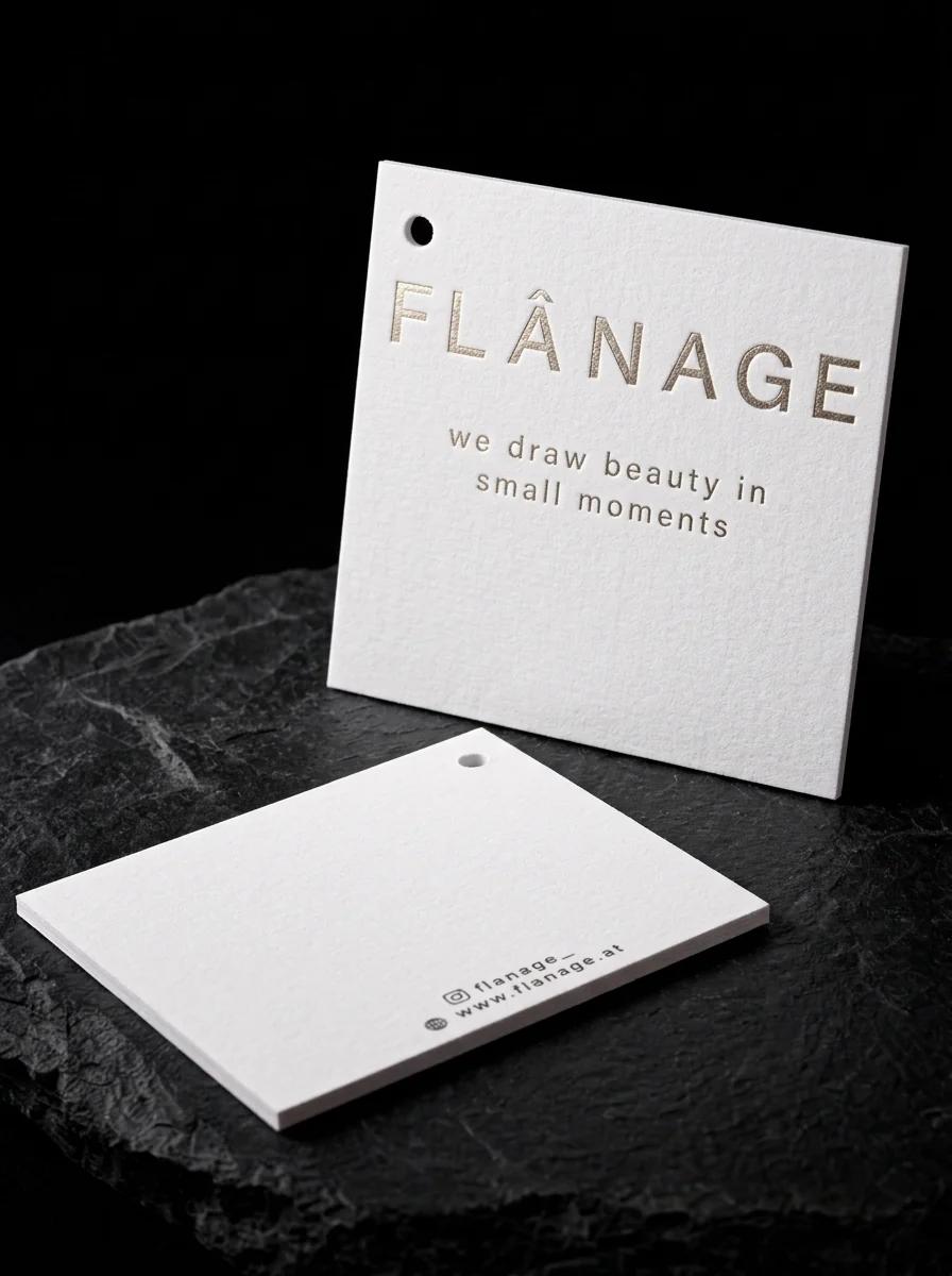
A Salzburg concept store needed a hang tag that felt considered on the product. A drilled hole, 50pt bright white cotton and champagne foil.
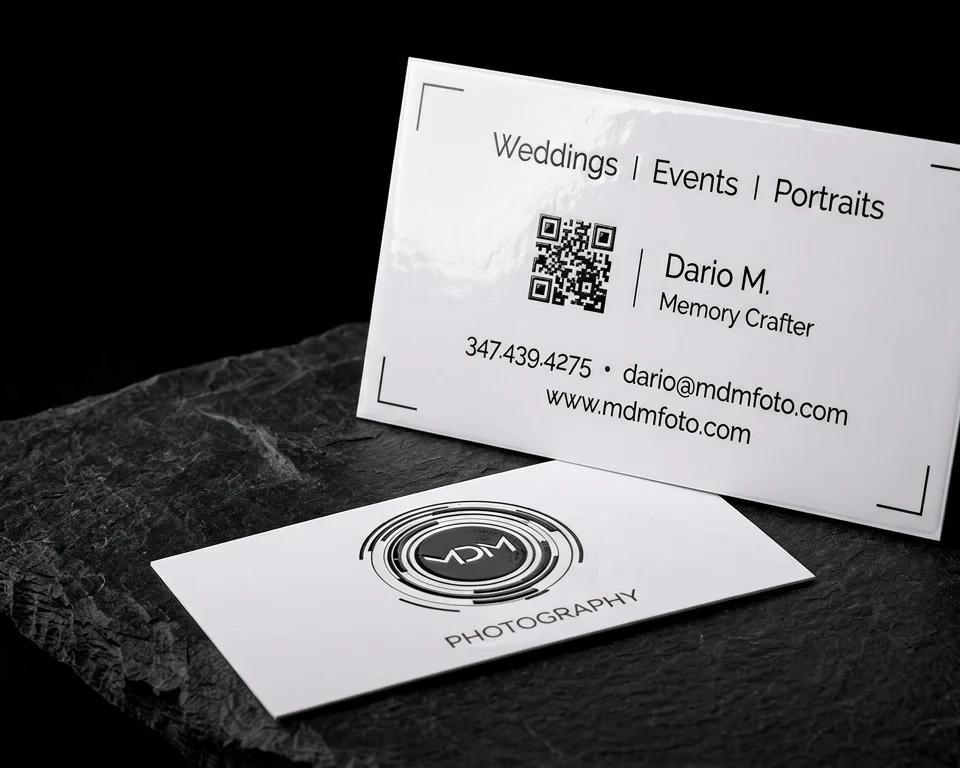
A photographer's card with a lens-ring mark, the centre raised in high gloss so it catches light like glass.

Studio concept
Multi-level emboss on a wine label that has to survive a curved bottle.

A San Francisco design studio drew its whole card by hand and wanted one element to catch the light. Yellow gold foil on 16-point silk matte stock.

Studio concept
Tone-on-tone gloss deboss on matte ivory, over a mirror-copper base.

Studio concept
Blind emboss only, on a 2 mm kraft rigid mailer.

A card that is almost entirely artwork. A red skull-rider illustration on black, with raised gloss over the red.

Studio concept
Copper foil plus pearlescent varnish on oat felt label stock.
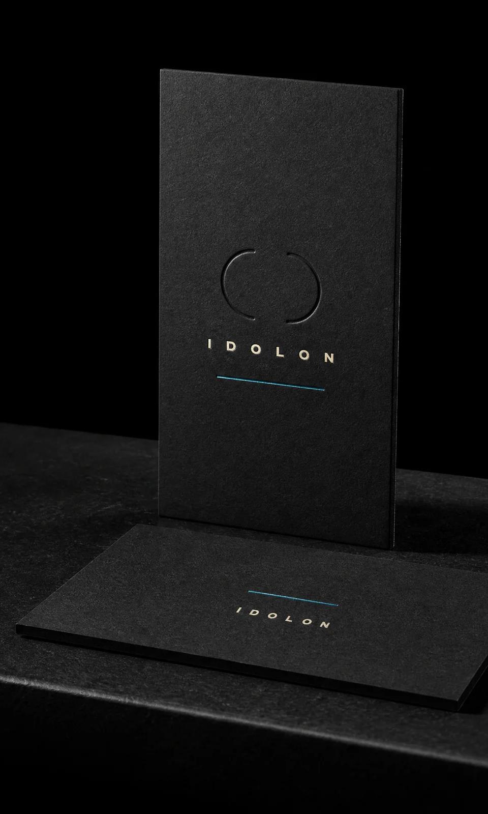
Five dies. No ink at all.
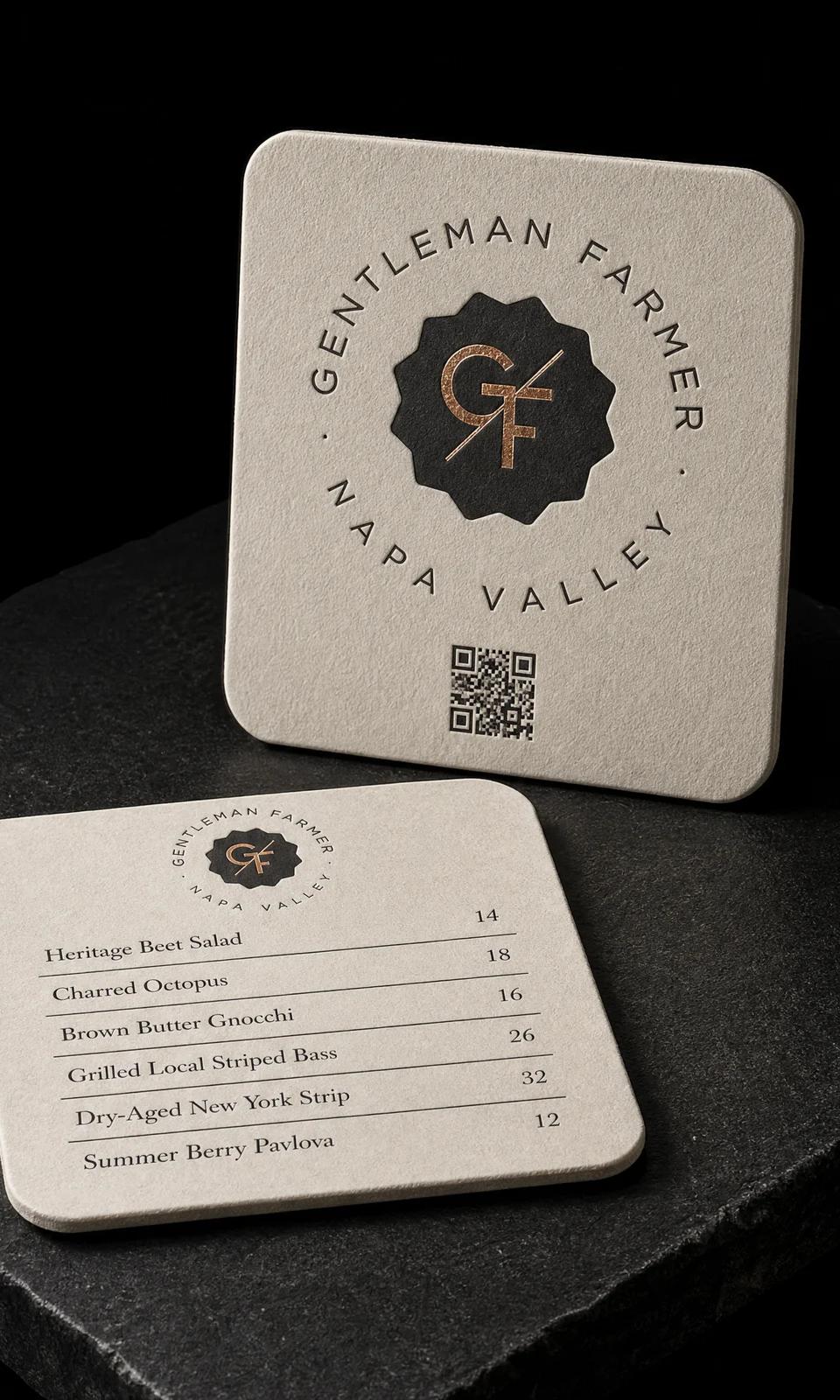
Match a card they already loved. On a different object.

A logo that could only ever be printed one way.
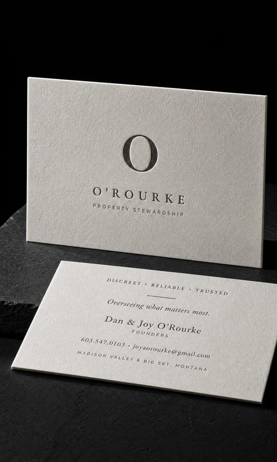
One ink. One card. Nothing to hide behind.
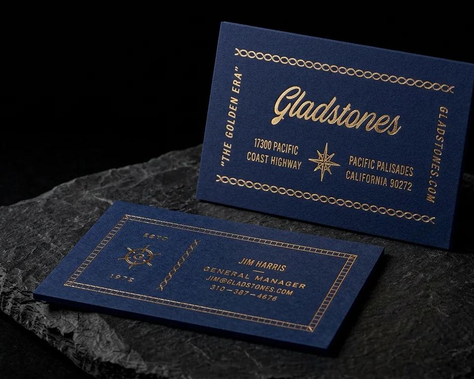
A seafood restaurant on the Pacific Coast Highway, open since 1972. Gold foil rope borders, a compass star and a ship's wheel on navy.

Studio concept
White screen print on cobalt book cloth, face and spine.
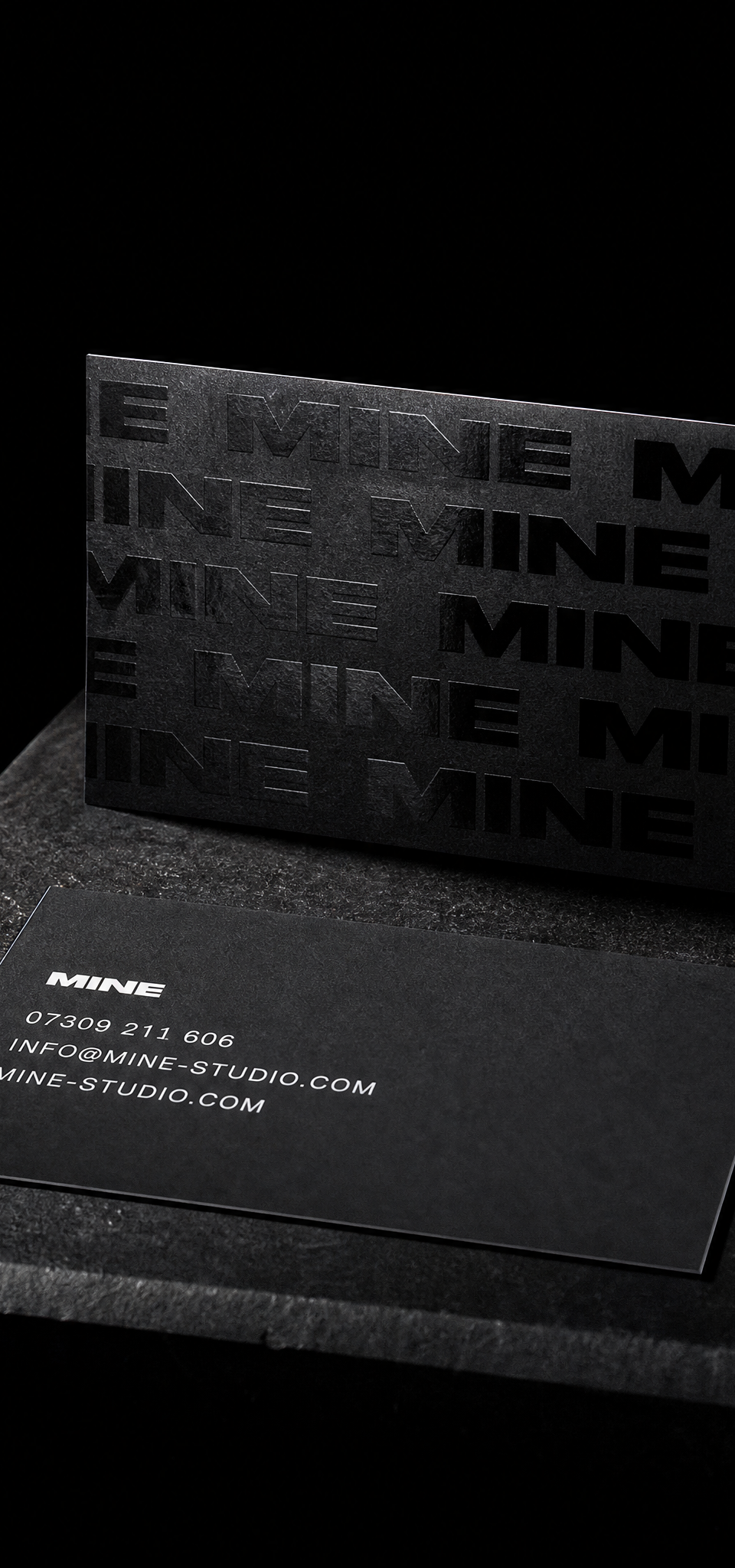
The whole card is the wordmark, repeated in varnish. Invisible flat, visible in the hand.

A studio doing florals, portraits and design needed one card that covers all three. Dusty mauve, a tone-on-tone script and rounded corners.

Studio concept
Four round matte vinyl stickers with a neon spot colour, kiss-cut on one sheet.

A graphic designer’s card carried its type and mark in blue holographic or iridescent foil on black uncoated stock.

Design exercise · Notecards · Peppermint
Twenty-five gilded edges read as one silver bar.
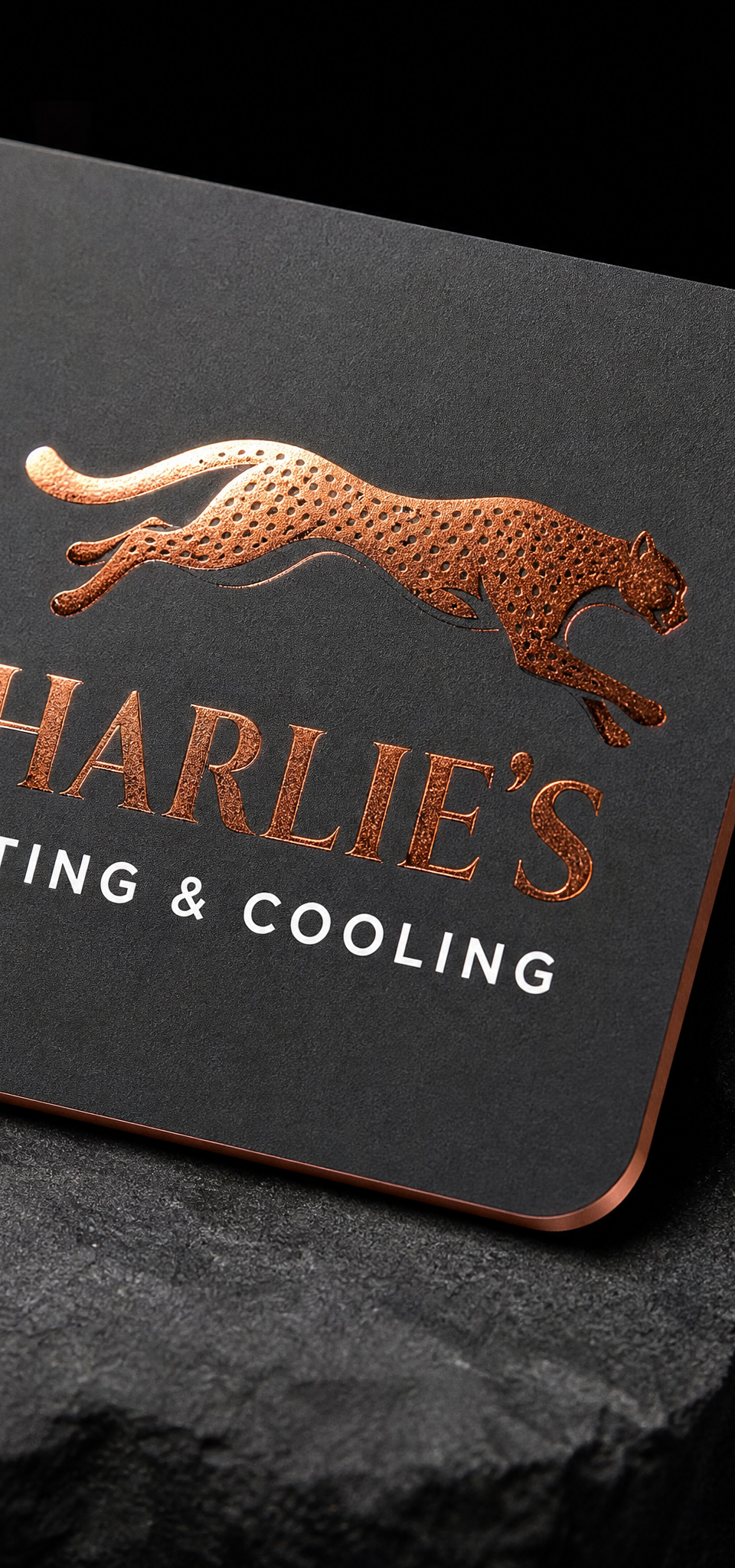
Copper foil and painted edges on soft-touch. Built to be handed over with dirty hands.

Spec brand · Peppermint concept
A five-SKU oat drink series on uncoated board with no gloss, no laminate and no second colour. Cheap to run, expensive to look at.

Design exercise · Business cards · Peppermint
Sixty-eight pieces, one job apiece: prove a single differentiator does what we say it does.

Black uncoated, matte gold, green pigment and a clear foil pass standing in for an emboss. Four passes, one silhouette.

Design exercise · Boxes · Peppermint
The same six structures, asked to serve a perfumer, a pharmacist, a welder and a plant shop.

A brand strategy and identity agency's card with no logo in ink. The name is embossed into white cotton and nothing else is on the front.

Design exercise · Notecards · Peppermint
White line, green field, name on its side.

A Westport salon’s stylists needed personal cards with one shared look. Silver hot foil on black uncoated paper frames the details.

Design exercise · Notecards · Peppermint
Rag paper, one line of gold.

A Michigan hair salon's monogram, set so large it runs off two edges. Mirror rose-gold foil on warm white.
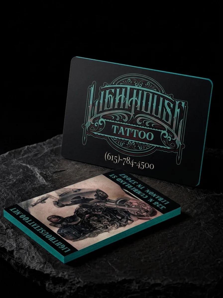
A tattoo studio needed a card that doubles as an appointment reminder and a portfolio sample: four-colour process on silk matte with a PMS-painted edge.

Design exercise · Notecards · Peppermint
A notched frame in gold foil on black cotton, name set vertically.

A yoga and mindfulness coach's name contains her practice. Copper foil hands form the Y of YOGA and hold an Om above.

3D puff embroidery on heather grey. The swirl has to read as blades, not a black blob.

A cryptocurrency and fintech investor wanted a card that feels digital without being gimmicky. A spot gloss halftone on navy and a silver foil mark.

Design exercise · Notecards · Peppermint
Five letters, one word, copper on grey.

A craft chocolate retailer’s card needed to feel like unwrapping a good bar. Gold foil on mid-grey uncoated cardstock.

Four-colour art, copper foil and a blind deboss on one 50pt cotton card. Three processes, three passes, one registration.
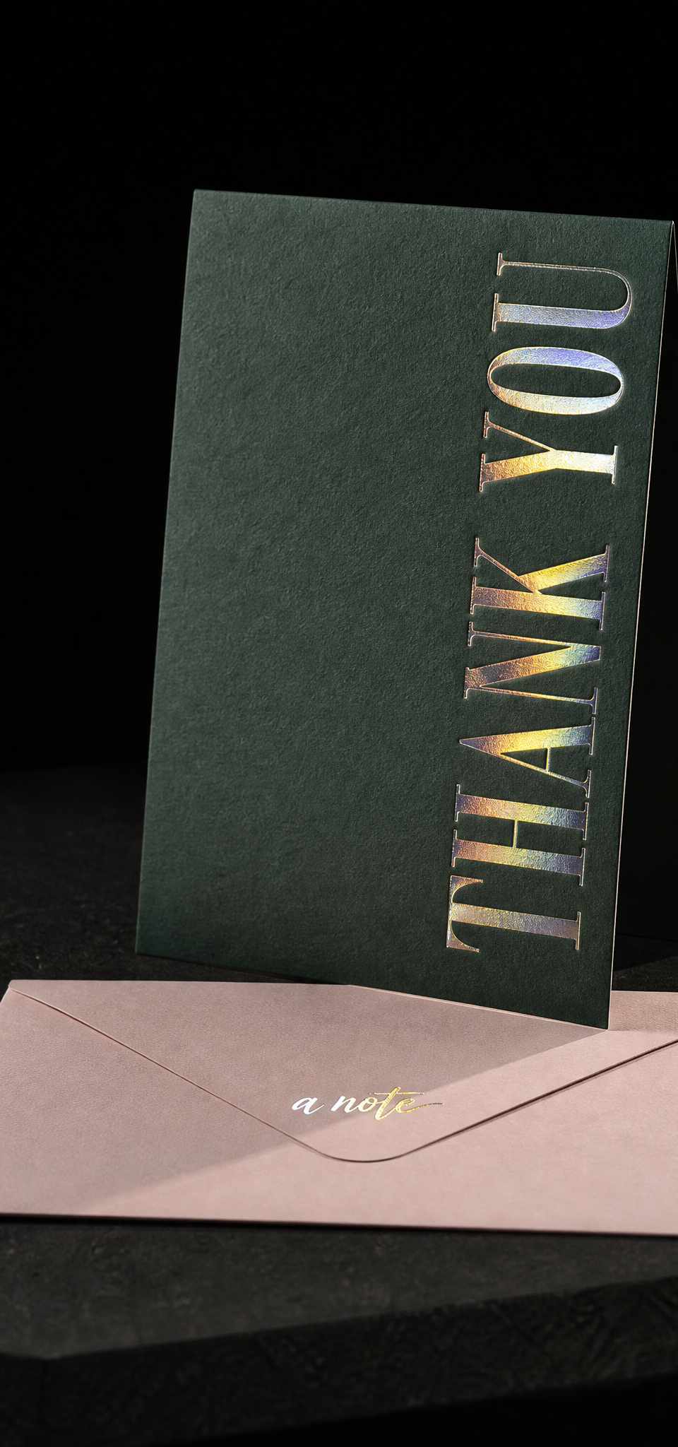
Design exercise · Notecards · Peppermint
One line of rainbow on green.

Design exercise · Business cards · Peppermint
Steel, black steel, brass, copper, rose gold and iridescent. No paper anywhere.

Design exercise · Notecards · Peppermint
One square inch of colour on a white field.

Design exercise · Boxes · Peppermint
Take a finished piece you admire and rebuild the idea in a colourway nobody would mistake for the original.

A resort restaurant's card and coaster from one identity. Letterpress for the pocket, absorbent board for the bar.

A lobster delivery company's creative director wanted the mark on both sides, done two ways. Red-orange foil on navy for the front, and a blind emboss on white for the back.

Design exercise · Wedding invitations · Peppermint
Seventy-six pieces, and the brief on every one was to avoid the default.
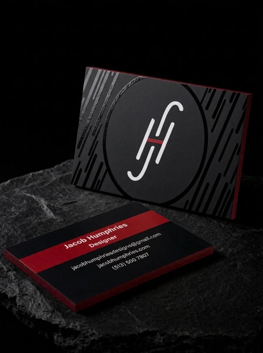
A motion designer's card with a pattern that moves when you tilt it. Diagonal gloss stripes on black, a red painted edge.

Design exercise · Boxes · Peppermint
Answer the category leader without borrowing a single one of its moves.

A card with almost nothing on it. A two-level emboss and a name in grey.

A French curiosity shop wanted its card to feel like one of its objects. Gold beetles and a foil-stamped edge on charcoal grey.

Design exercise · Notecards · Peppermint
A signoff, not a headline.

A designer's card with a blocky monogram that reads best upright. A portrait front and landscape back on deep navy with gold foil.
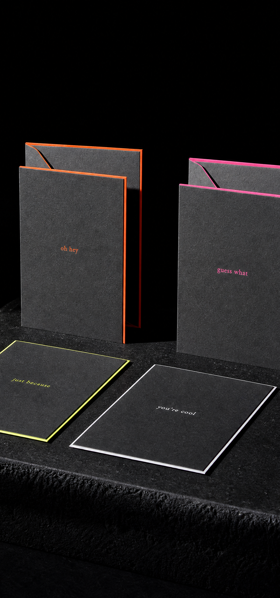
Design exercise · Notecards · Peppermint
Four dark envelopes, four hot edges.

A test card with an outlined die. Prove the notch cuts clean before the run.

Dye sublimation on a 360° curve. No relief, no seam, and the wrap has to land where the handle isn't.
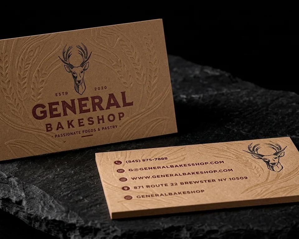
A Hudson Valley bakery wanted a card that feels like its paper bags. Heavy kraft, a blind debossed wheat and wood-grain pattern, and maroon letterpress.

A designer's own card. Her signature as the logo, foiled into a deboss so it reads by touch.

One mark, one foil, no ink. The whole box rests on a colour difference you can barely see.

Design exercise · Notecards · Peppermint
A ring of dots, one letter, nothing else.
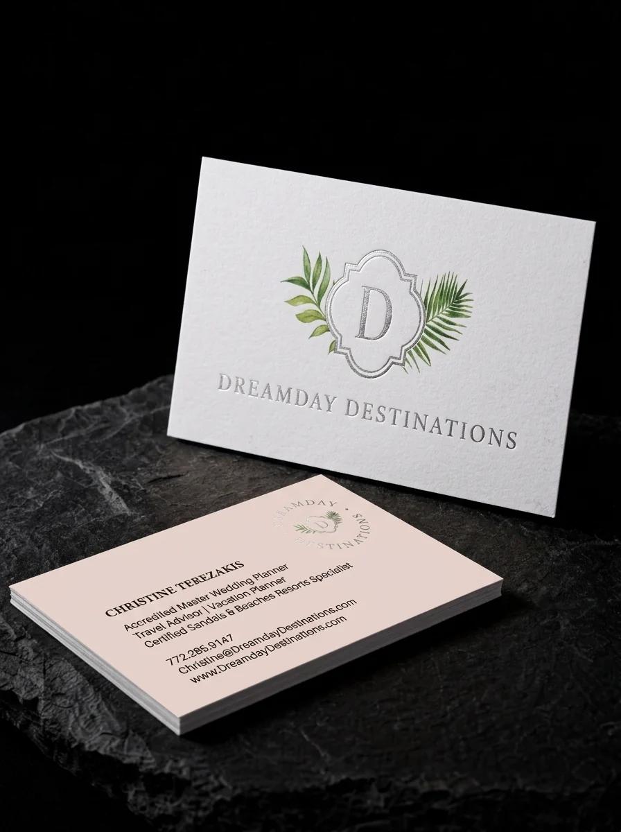
A destination wedding planner's card should feel like the first piece of the wedding stationery. Silver foil, watercolour palms and a blush reverse.

Design exercise · Notecards · Peppermint
Five foils, one black stock.

A mobile sharpening service's card has to be found again in a kitchen drawer. Fluorescent orange stock, with a raised gloss E.

A Corsican jewellery atelier's second brand needed a mark that feels like a found object. One letter C, half in gold foil and half in black ink.

Design exercise · Notecards · Peppermint
A slab of plum, three letters.

A tattoo artist known for dark imagery in bright colour. The front is holographic foil linework on black, and the back is a full-colour painting.
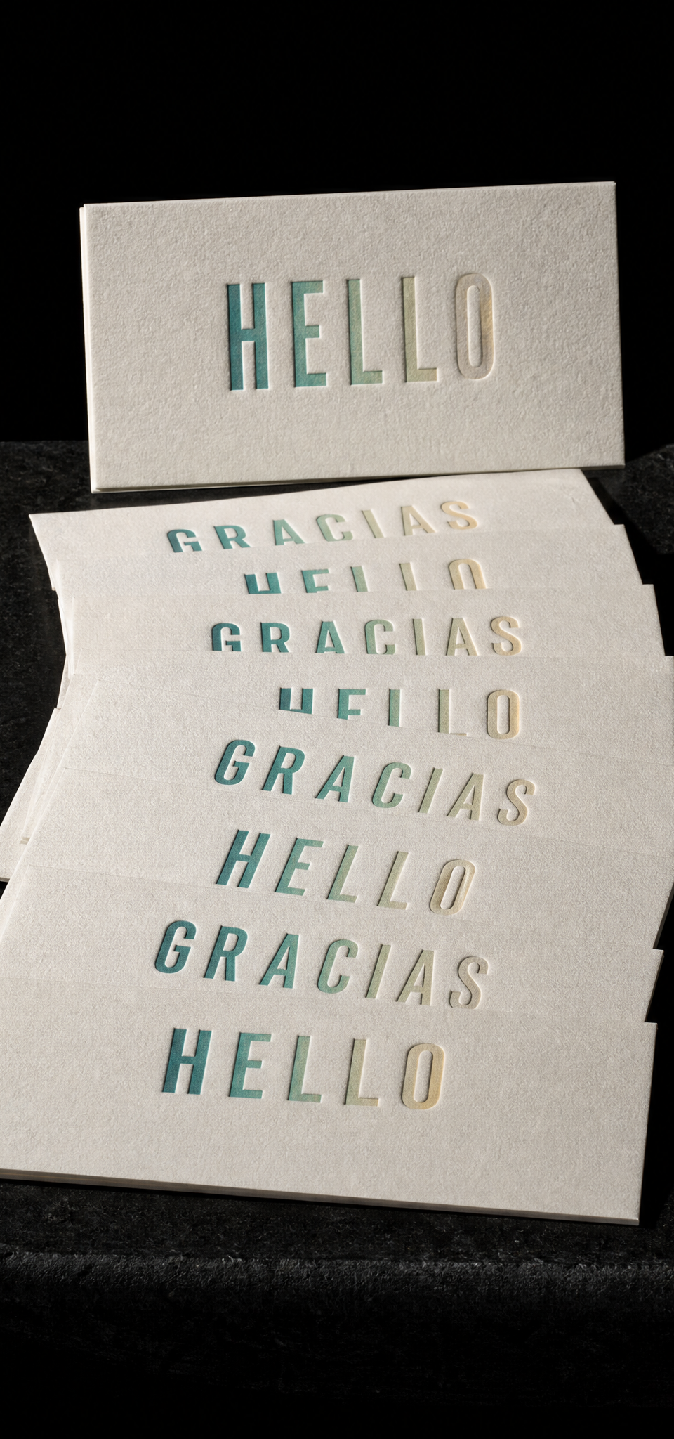
Design exercise · Notecards · Peppermint
Two words, one blend, twelve cards.

The US office of a Japanese fishing-lure brand needed a card that matches its packaging. The wordmark in red foil, and nothing else on the front.

Design exercise · Notecards · Peppermint
One glyph, one colour, one raised shape.

A financial planning firm needed a card that looks trustworthy without looking like a bank. White stock, black type, and copper in two places.

A portrait card with nothing on it but an ornate key. Gunmetal foil on charcoal, so it looks dark straight on and flashes silver at an angle.

Design exercise · Notecards · Peppermint
A sun you can only see by its shadow.

The same engraving on eight species. Each one burns differently, and the artwork had to survive all eight.

Design exercise · Notecards · Peppermint
Six arches, one gradient of stock.

A pipe fitter’s card that has to survive a job site. Three uncoated layers with an orange sheet at the centre.

Design exercise · Notecards · Peppermint
Six cards, one cascade of copper.

An acupuncture and herbal medicine practice wanted a card as calm as the treatment room. Dusty rose stock, with gold foil on both sides.
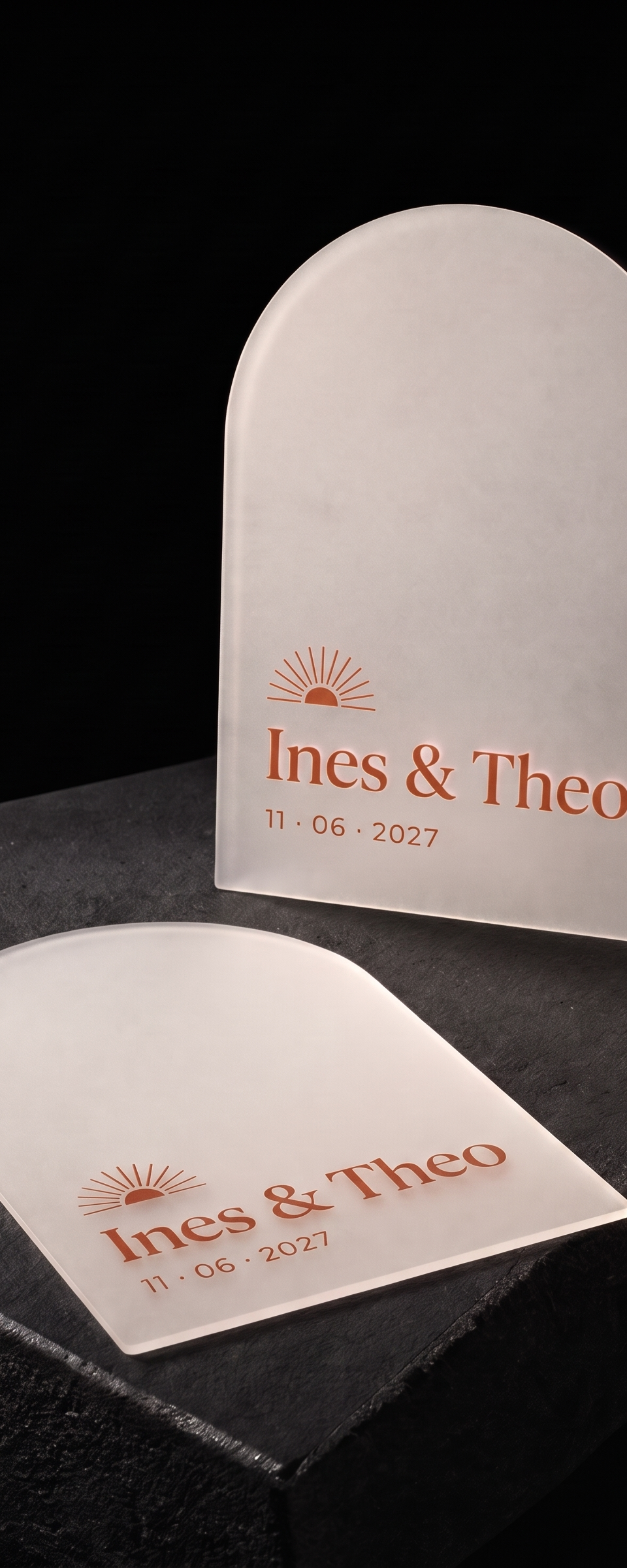
Design exercise · Business cards · Peppermint
Thirty-one pieces in PVC and acrylic, and only three of them are business cards.
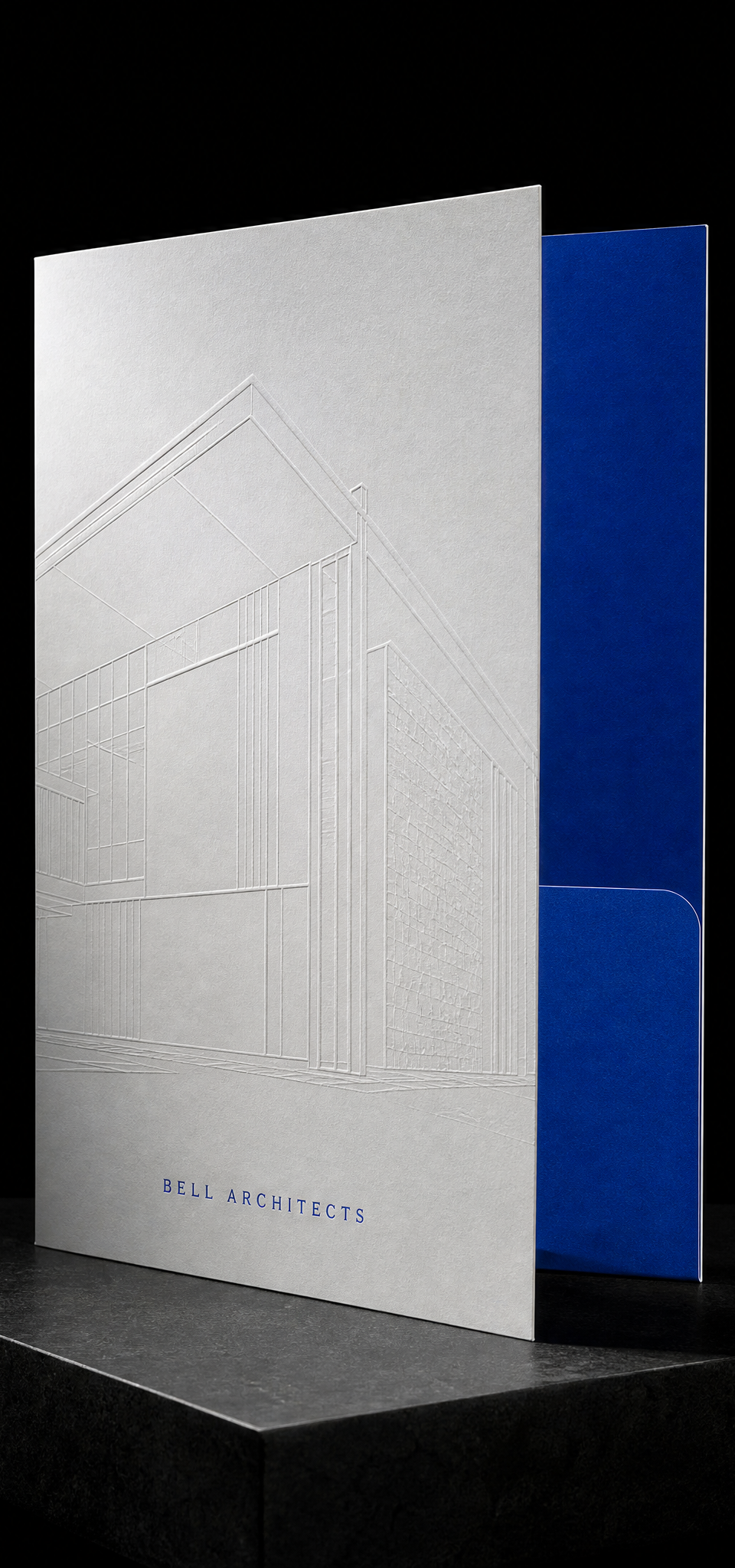
Design exercise · Folders · Peppermint
Folders, hang tags, menus and place cards. Ordered constantly, shown almost never.

A construction services and inspection firm wanted a card that looks like a nameplate. A brushed silver foil badge on charcoal and a grey reverse with green hairlines.

Design exercise · Notecards · Peppermint
A corner of gold flowers on teal.

A realtor's initial hidden in the most real-estate object there is. A gold foil skeleton key whose shaft ends in a lowercase k.
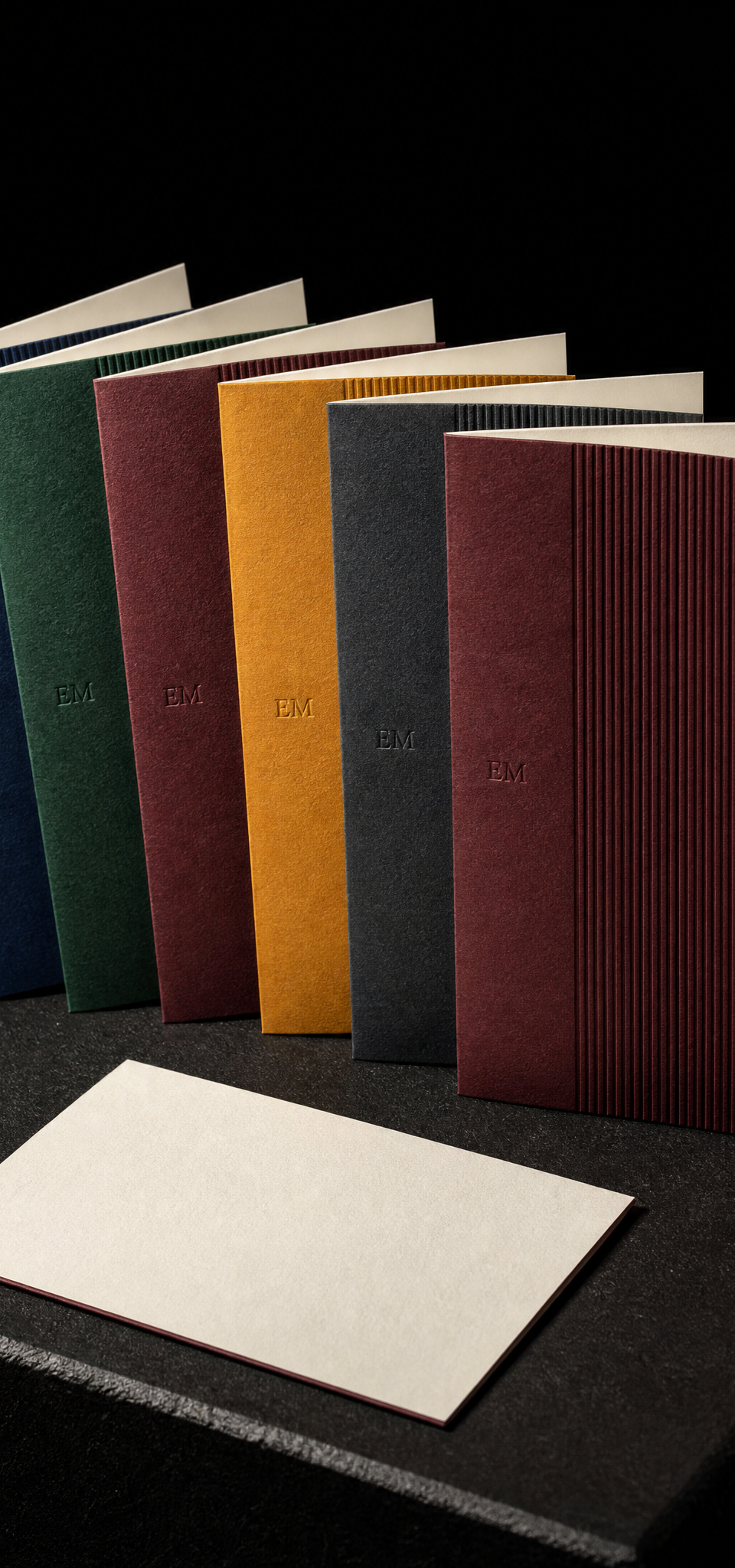
Design exercise · Notecards · Peppermint
Half ribbed, half smooth, six colours.
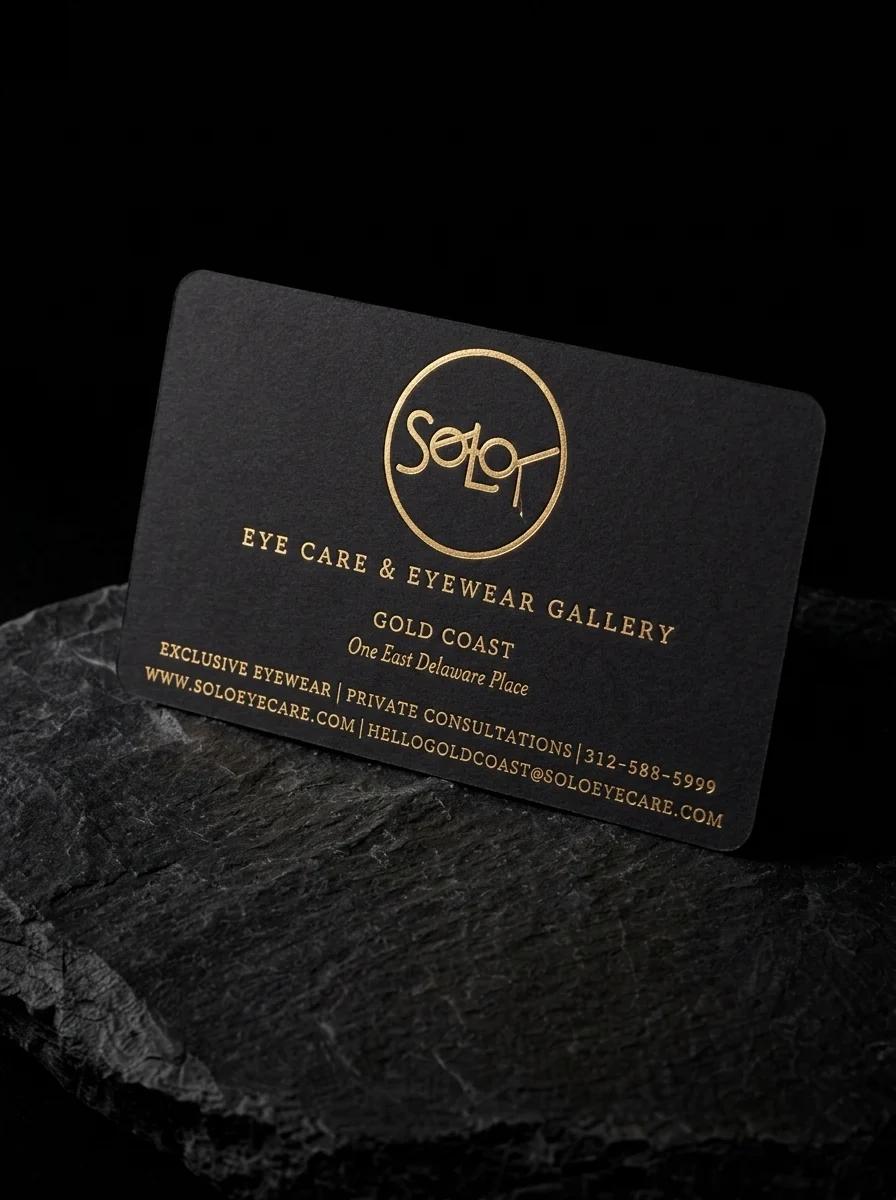
A Chicago eyewear boutique needed one clear face: yellow gold foil stamped on black uncoated stock, with rounded corners.

A Finnish textile-recycling company wanted a card its fashion-industry clients would recognise instantly. Cut as a garment swing tag on 100% recycled cotton, with a red core that shows through the hole and along every edge.

Design exercise · Labels · Peppermint
Same pouch, same hardware, same copy. One direct print, one embossed badge, one full-height banderole.

An advisory firm named after the 'skip intro' button. Gold foil chevrons point forward across the card.
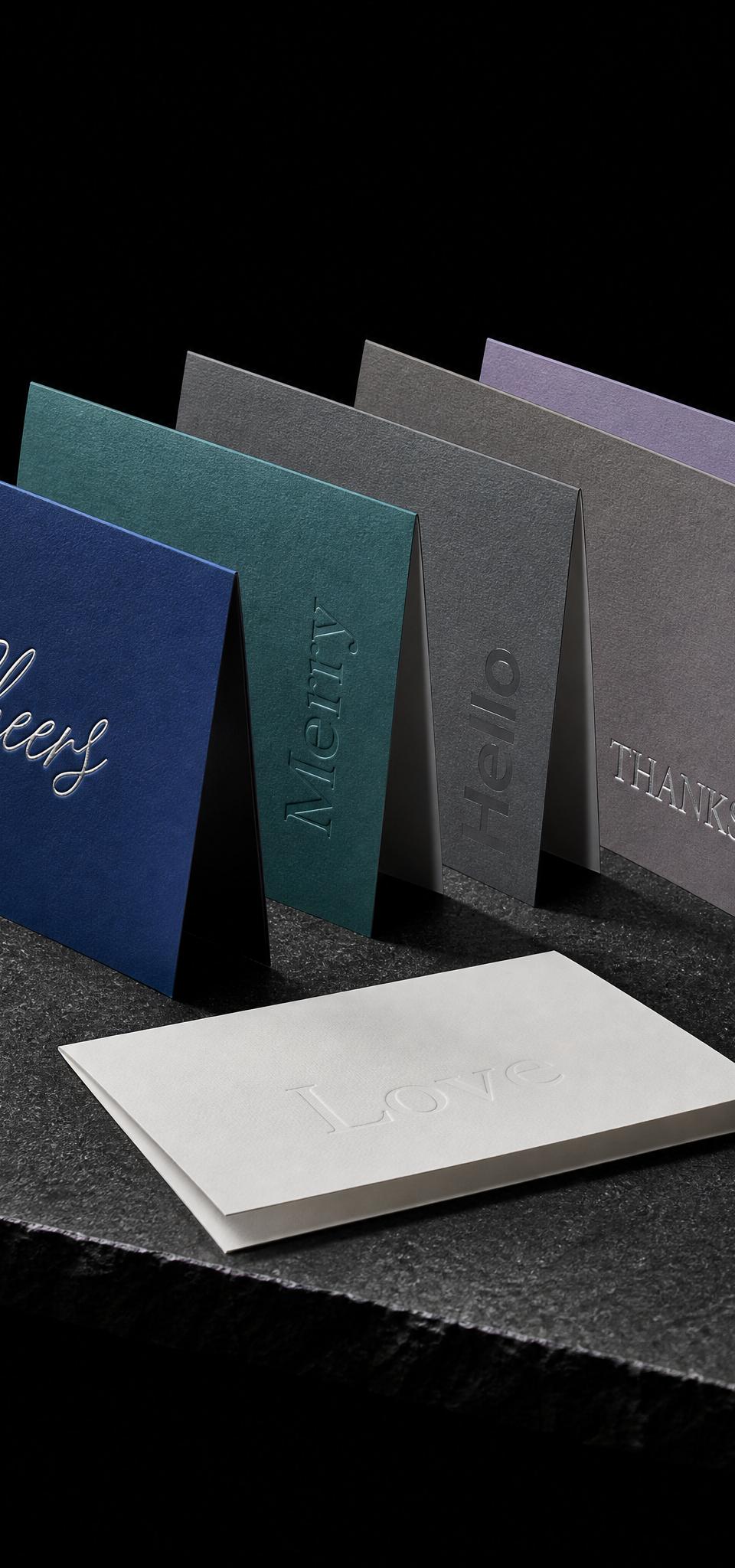
Design exercise · Notecards · Peppermint
One word per card, one finish per card, five cool stocks.

An East Bay real estate team's card that looks like a surveyor's mark. A crosshair LG monogram on black, with details on white.
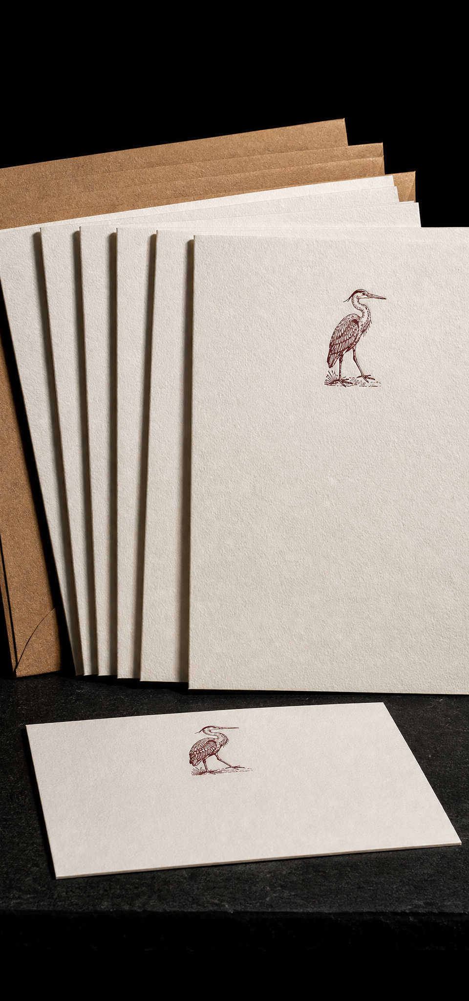
Design exercise · Notecards · Peppermint
One small bird, deep impression.
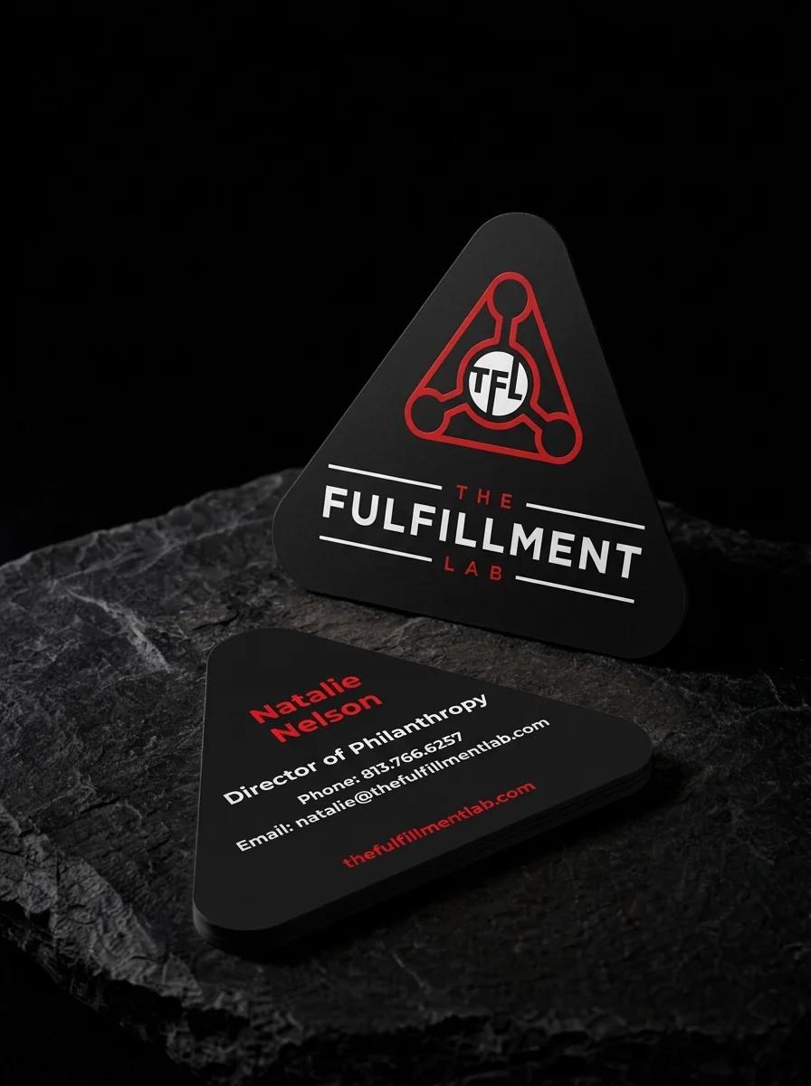
A fulfilment company with a triangular emblem wanted the whole card to take its shape. Rounded triangle, black stock, red and white.

Design exercise · Notecards · Peppermint
A name you find by feel.

Frost the whole card until nothing shows through, then let one shape stay see-through. The mark is the only window.

An 85 mm square that ships inside every box. Gold on black, gilded all four sides.

A Vancouver, Washington beauty collective wanted one card the whole team could hand out. Rose-gold foil logo on the front and every stylist's name in foil script on the back.

A private country club community wanted a staff card as considered as the grounds. Two rounded corners make a leaf shape, with blind-embossed branches on both sides.
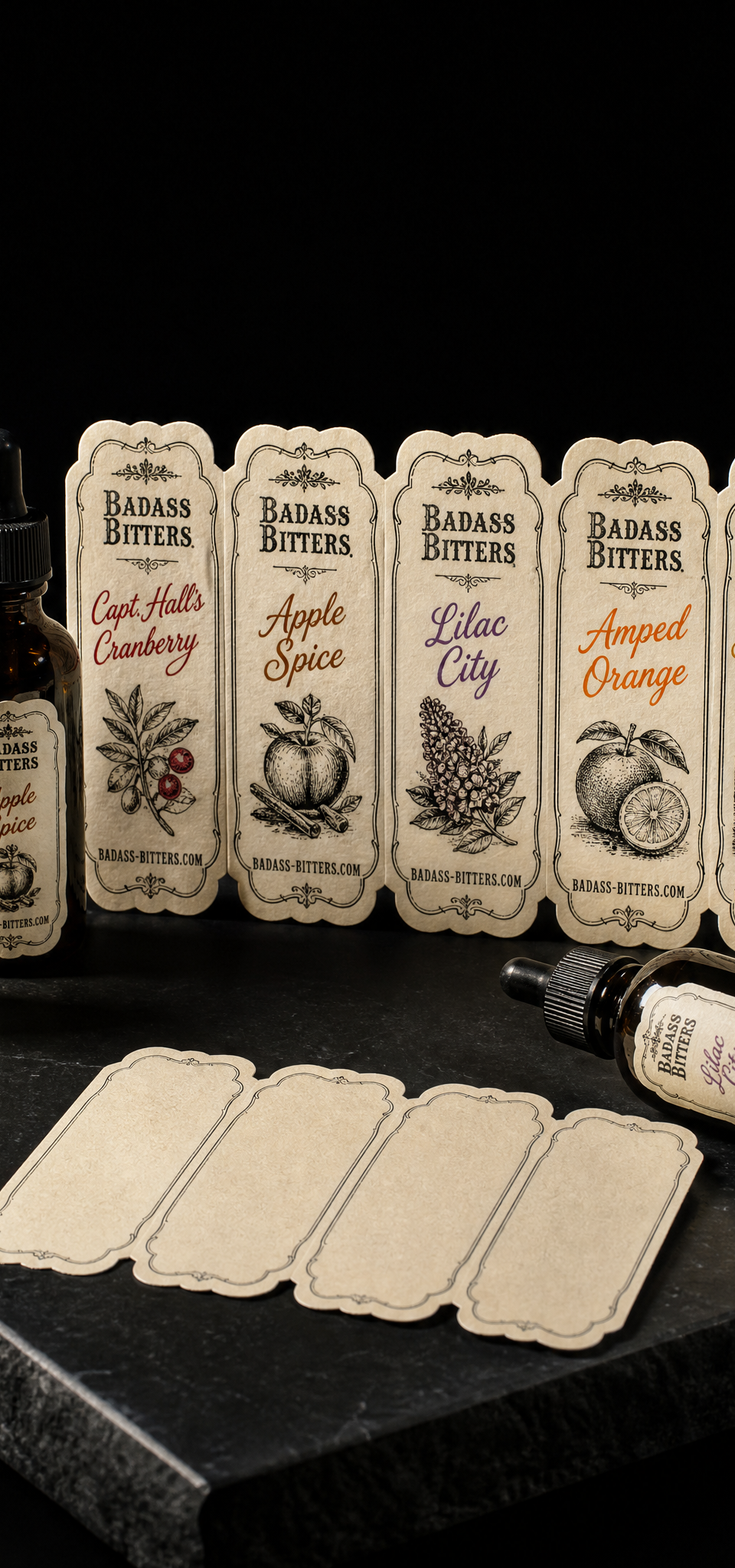
Five flavours, one press run. A black plate shared across the set, an accent colour swapped per label.

A law firm serving charities wanted its card to say trust without a single stock legal image. Two trapeze artists mid-catch, a red-to-silver foil brushstroke and a painted edge.

A gift bag ordered by number. Black on black with one gold mark.

Every line, every dot, one metal. No ink to hide a weak stipple.

A Missouri personal injury firm wanted a card that feels solid, not flashy. A tone-on-tone woven mark on oxblood, with a white reverse and a black edge.

A tattoo studio’s card needed the name carried by a blind impression, with the small details letterpress printed in black on off-white cotton.

A graphic designer turned knife maker needed two cards: one for the brand and one to record each knife. Rust-red letterpress, plus a certificate with fill-in lines.

A three-inch gold foil monogram on navy uncoated cover, and the restraint to leave the rest empty.
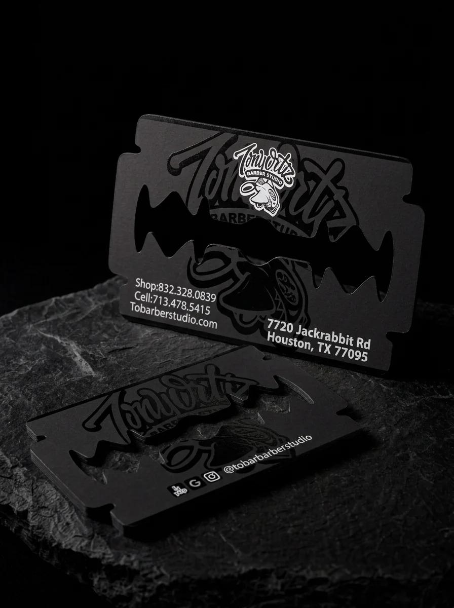
A Houston barber wanted a card that could only belong to a barbershop. The whole card is cut as a double-edged razor blade.

Three tiers, one template. Colour changes the tier; foil marks the top two.

Full-bleed photography on both sides, printed 4-colour on 32pt silk with no lamination. The finish had to stay matte.
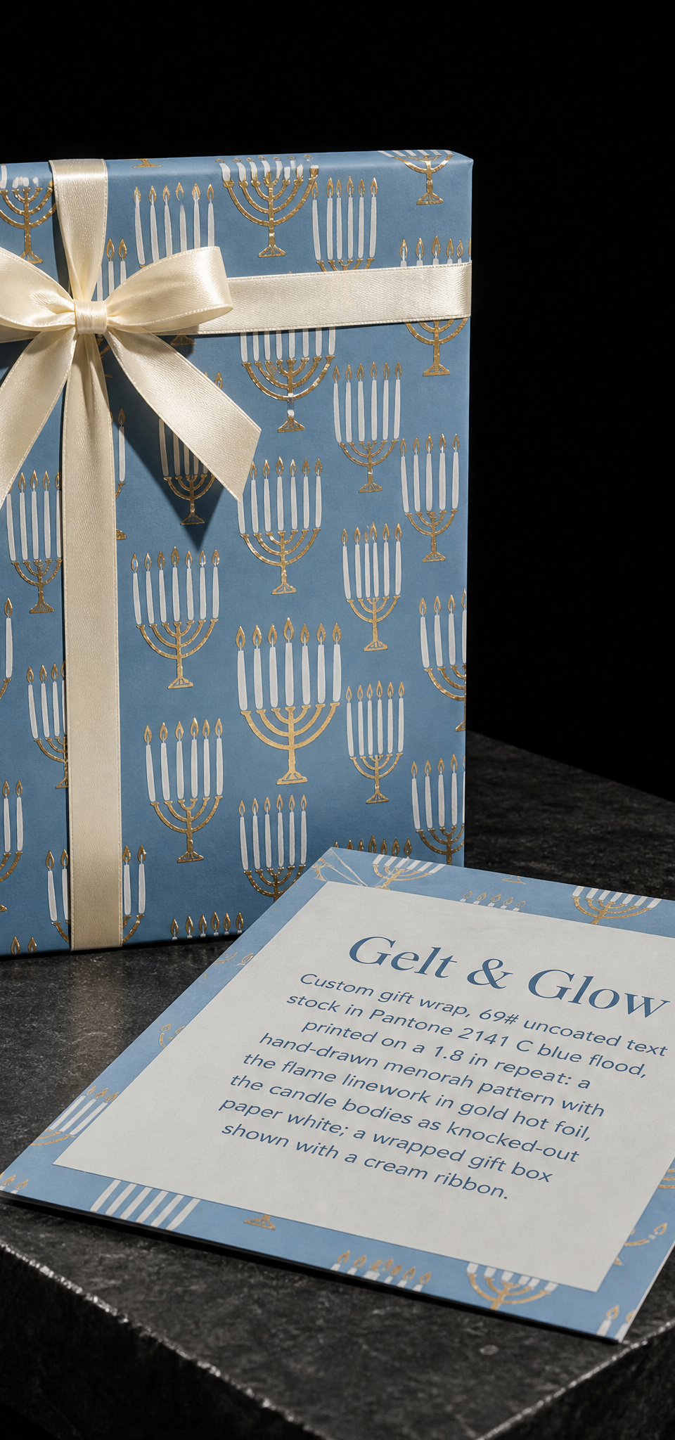
A foil-stamped wrapping paper on a 1.8-inch repeat. Registering gold to a spot blue across a whole roll.

A construction card that survives a job site. 32pt duplex, letterpress on the grey face, and an orange foiled edge you can find in a truck.

A custom tattoo artist whose tagline has a swear word in it. It's printed as ghost text, with a red foil skull and a red reverse with silver foil.

A swing tag spec sheet with five lines on it. Deboss, black, 5 mm hole, 2-inch cord, done.

32pt soft-touch, gold foil both sides, PMS 654 painted edge. Corporate, but felt.

A 9×12×4 rigid box, one foil, one word. The die-line was the whole brief.

An aerospace and defense company that doesn't need to shout. The logo is in black gloss on matte black, visible only when it catches the light.

A welcome-party card that sets the weekend's tone before the invitation does. Two colours, deep impression, beachy edge.

Two risograph drums, one word, deliberate misregistration.

A filmmaker’s card needed a foil image with depth. Purple foil and silver foil were stamped in overlapping layers on black uncoated stock.

Hairline gold foil geometry on uncoated navy. The lines had to hold.

A commercial real estate appraisal firm wanted a front with only its monogram. A silver foil pV on deep navy.

A control panel, letterpressed onto the box it ships in.

A business law firm wanted a card that feels solid and considered. Navy stock with the ZA monogram repeated in clear gloss across the whole face.
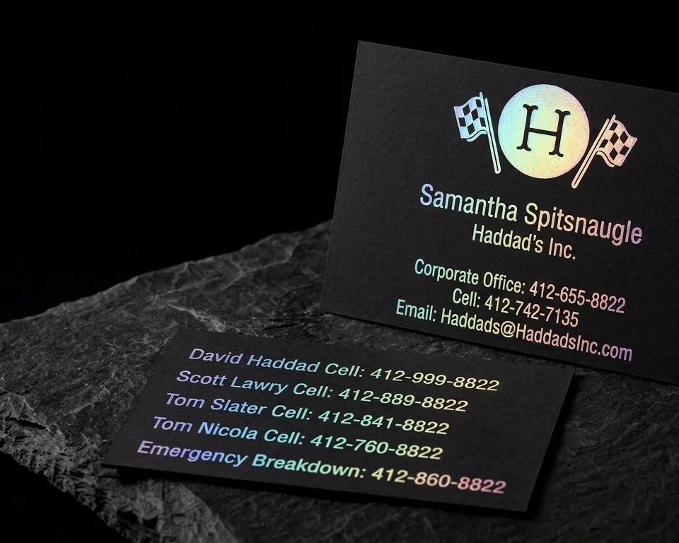
A Pittsburgh film equipment rental company with a crew of phone numbers and an emergency breakdown line wanted a card that stands out. Holographic foil for every line on black.

Kraft, olive, cream, charcoal and a patterned liner, all reading as one brand.

A card with the line “Cultivate Wonder” on the back had to deliver some wonder itself. Geometric-pattern rainbow foil on pearlized paper.

Twenty cards, twenty stones, one deck. Full-colour on soft-touch so the illustrations stay matte in the hand.

A New Orleans wedding videographer and photographer wanted a card with the city in it. A rose-gold foil crawfish and fleur-de-lis on black.
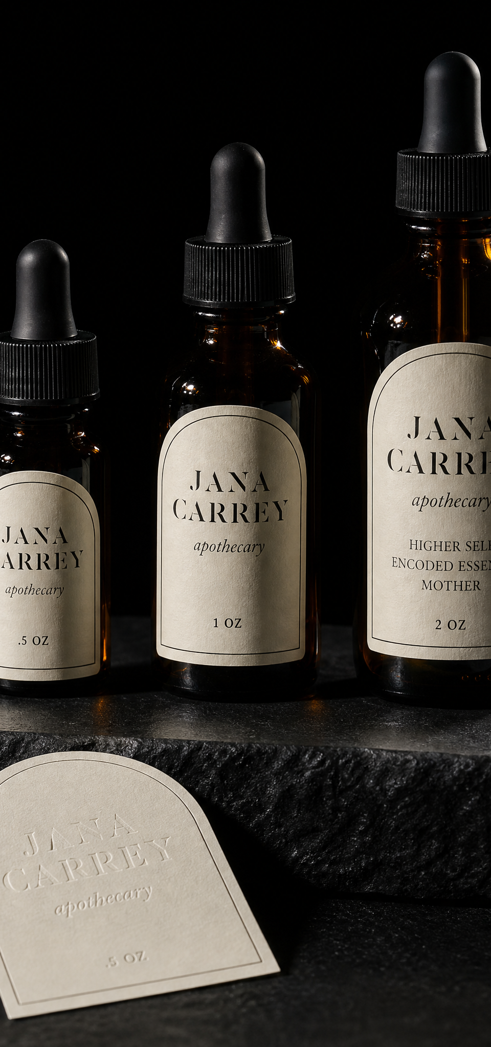
A label family that scales from half an ounce to two without redrawing.

A Charlotte events and consulting brand needed a card as distinctive as its cocktail classes. One custom die shape on two silk matte laminated colourways.

A Bay Ridge brokerage with a signature-script logo needed it to look signed. Rose gold foil on triple-thick black onyx soft-touch paper.

A custom-shaped QR code that still scans, on silk, in one ink.

A Colorado brokerage whose tagline is about unlocking your next move. The card is cut as a house key.
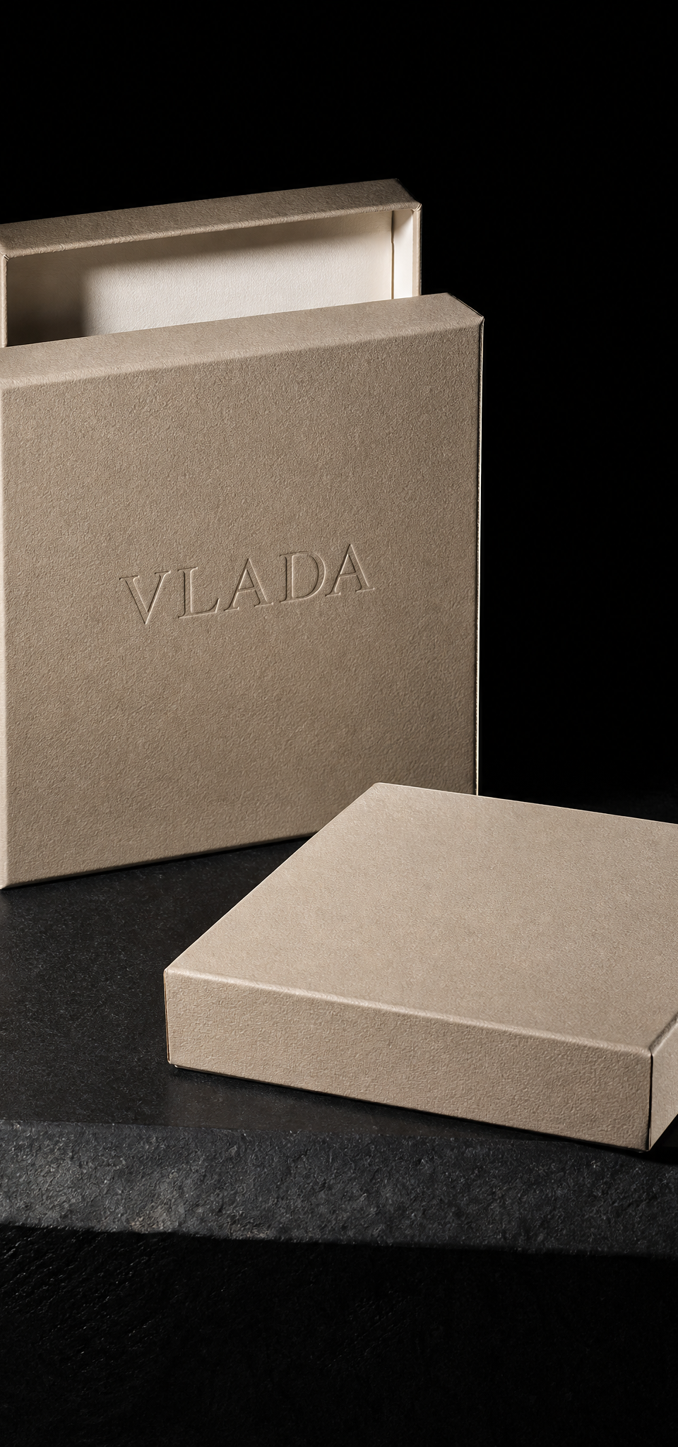
One word, no ink. The box is the colour and the name is texture.

Design exercise · Business cards · Peppermint
An NFC card has a chip and a coil inside it. Every material hides them differently, and one shows them off.

Design exercise · Business cards · Peppermint