Case study · Notecards · Crystal Cards
Crystal Cards — notecards
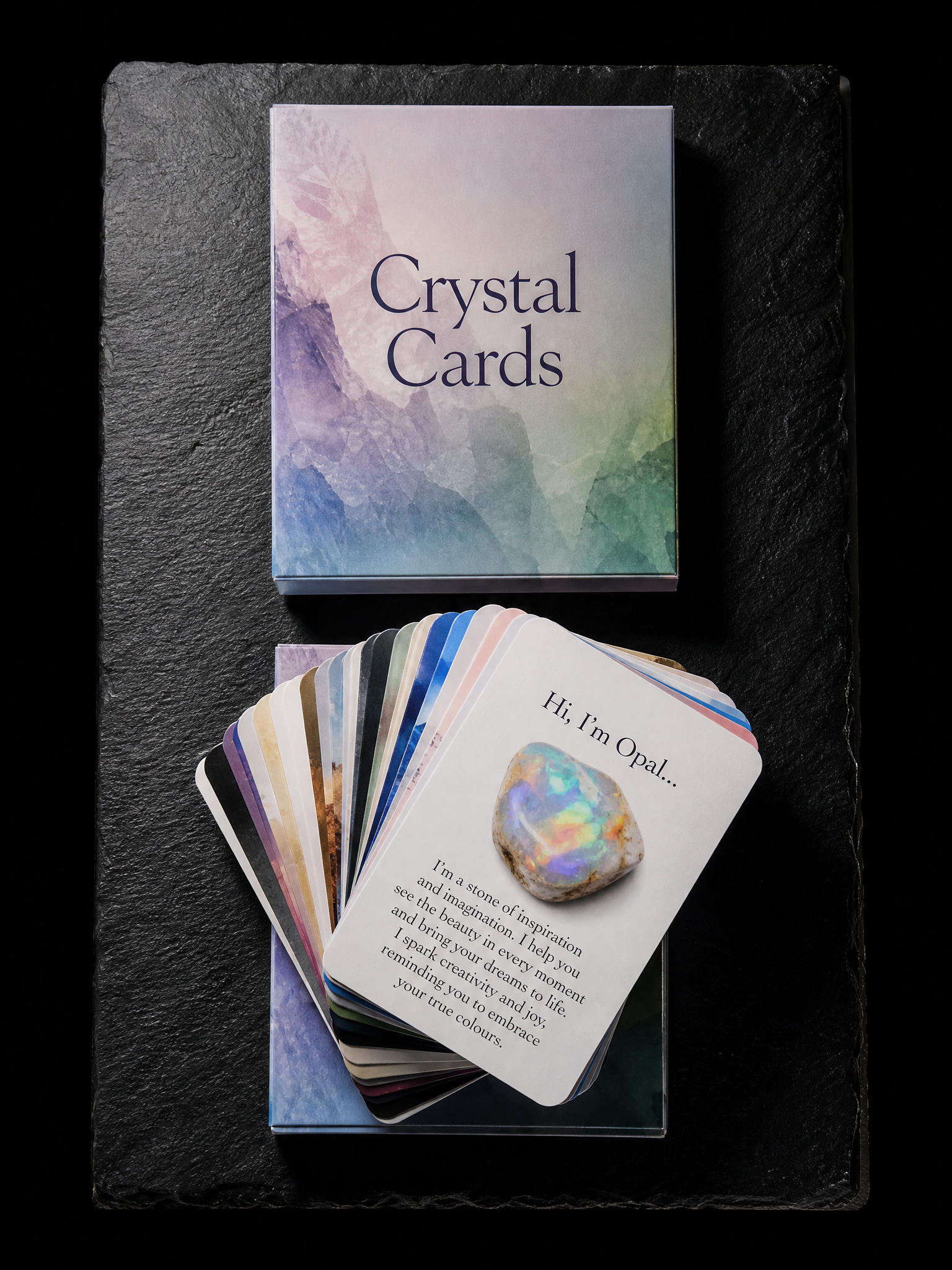
A wellness brand wanted a pocket deck of crystal meanings. Soft-touch keeps the gemstone illustrations from glaring; 16pt keeps the deck thin enough to carry.

Two rules
- 01Soft-touch over full-colour art. Built the separations a step up in saturation to pay for the laminate, and proofed the deck as a set rather than card by card.
- 02Deck thickness before card thickness. Held 16pt silk and put the weight into the laminate and the rounded corner instead of the caliper.
The brief
A 20-card deck of 2.5×3.5 in cards on 16pt silk with soft-touch matte laminate; each card a full-colour 4cp print of a gemstone illustration on the front and a first-person description on the back ("Hi, I'm Opal…"); rounded corners; a fanned stack with Opal on top.

Start from these materials
Same paper, foil and finish, locked in — nothing of Crystal Cards's artwork comes with it.
Questions
- What is the Crystal Cards notecards printed on?
- 16pt silk, Soft-touch matte laminate, 4-colour process both sides, Rounded corners, 20-card deck. Every line of that spec is what actually ran, not a proposal.
- Why soft-touch over full-colour art?
- Soft-touch laminate mutes saturation, and twenty illustrations dropping in chroma together would look muddy. Built the separations a step up in saturation to pay for the laminate, and proofed the deck as a set rather than card by card.
- Can Print Peppermint print this specification again?
- Yes. The materials on this page are live registry items, and the Studio link opens with the same paper, foil and finish locked in for your own artwork.