9 guides
File setup: build artwork that prints the way you drew it
The rules our prepress team checks every file against, with the reasons behind them and diagrams drawn to scale — for first-timers, in-house designers and agencies.
Every specialty process has a physical limit, and your file either respects it or it doesn't. Foil has to shear cleanly off a carrier film. Letterpress ink squashes as it bites into cotton. An emboss can only stretch paper so far. Knowing those limits before you design changes the decisions you make: line weight, spacing, type size, how many colors, which paper. That's the difference between a file we print as supplied and one we have to rebuild.
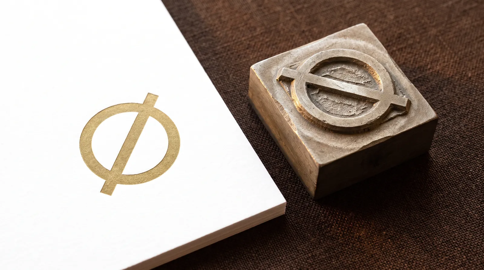
These guides are the rules our prepress team checks every file against, with the reasons behind them and diagrams drawn to scale. They're written for three readers at once: someone setting up their first print file, the in-house designer who knows InDesign but not foil, and the agency art director who wants swatch names, overprint behavior and tolerance stack-ups.
Where to start
| If you're… | Read |
|---|---|
| Setting up any print file for the first time | Print-ready files: the complete checklist |
| Checking whether a detail is too fine | Minimum line weight and type size |
| Choosing or specifying brand colors | Spot color and Pantone |
| Printing photos, gradients or full color | Four-color process (CMYK) |
| Designing for letterpress | How to prepare files for letterpress |
| Adding a blind or registered impression | Embossing and debossing files |
| Cutting a custom shape | How to set up a die line |
| Specifying colored edges | Designing for painted edges |
| Stacking foil, letterpress, emboss, cut and edge on one piece | Combining print finishes |
| Setting up foil artwork | Foil artwork preparation (foil guides) |
Complete Guide
How to Set Up Print-Ready Files: The Complete Checklist for Specialty Print
Trim, bleed, color, fonts, finish layers and export settings, in the order we check them. Build your file this way and it goes to press without a round trip.
All File Setup & Prepress Guides
Combining Print Finishes: What Works Together, What Doesn't, and in What Order
The order finishes run in, the tolerances that stack up between passes, and the house compatibility rules for building foil, letterpress, emboss, spot UV, die cuts and painted edges into one piece.
Designing for Painted Edges: Thickness, Corners and Color
Edge paint needs thick board, square corners and a Pantone U reference, and it changes what your art can do near the trim. The rules, and why the clamped stack sets every one of them.
Four-Color Process (CMYK) for Print: Rich Black, Ink Limits and Why Your Screen Lies
How CMYK actually prints, the 300% ink limit, the one rich black recipe we use and where it never goes, and the type, tint and paper rules that keep four-color work sharp.
How to Prepare Files for Letterpress: Plates, Impression and Ink
One plate per color, solid Pantone U inks, lines built to survive the squash, and the depth your paper can take. The letterpress file rules, with the physics behind each one.
How to Set Up a Die Line: Die-Cut and Custom-Shape Files
The CUT swatch, corner radius, spacing, bleed and bridges that let a steel-rule die cut your shape clean, and how to supply the die line so nothing gets redrawn.
How to Set Up Files for Embossing and Debossing
Stroke, gap, type and depth minimums for blind, registered and combination-die impression, the stocks that take it, and the layer setup that gets through prepress clean.
Minimum Line Weight and Type Size for Every Print Process: Foil, Letterpress, Emboss, UV, CMYK and Die Cut
One table for every process we run, and the physics behind each number: why foil needs 0.6 mm, why reversed type needs more, and how to measure your file.
Spot Color and Pantone for Print: Choosing, Specifying and Curating PMS Colors
What a spot ink physically is, why the U book matters on cotton, how paper color changes translucent ink, and how to build a spot palette that separates into exactly the plates you meant.
The house spec at a glance
These apply to every file, whatever the process. They're from our House Spec (v1 · 30 Sep 2026); the process guides carry the rest.
| Item | Requirement |
|---|---|
| Bleed | 3 mm (0.125 in) on every edge the design touches · 1 mm on metal cards |
| Safety margin | 3 mm inside trim for all copy · 2 mm for metal cutouts |
| Cutting tolerance | ±0.8 mm across a stack |
| File format | PDF/X-4 preferred · PDF/X-1a or native AI accepted |
| Fonts | Outlined or fully embedded |
| Images | 300 ppi at final size · line art 1200 ppi, vector preferred |
| Color | CMYK for process · named Pantone swatches for spot ink · U book for uncoated and cotton |
| Finish artwork | Vector, 100% of one named swatch, own layer, set to overprint · one layer per operation |
Reserved swatch names
| Swatch | Operation | Preview color |
|---|---|---|
| FOIL-<COLOR> | Hot foil — one swatch per foil (FOIL-GOLD, FOIL-COPPER…) | Any distinct color |
| EMBOSS / DEBOSS | Blind or registered impression | Any distinct color |
| SPOT-UV / RAISED-UV | Flat or raised clear coating | Any distinct color |
| WHITE | Opaque white ink | Any distinct color |
| CUT | Die or laser cut, 0.25 pt stroke | 100% magenta |
| CREASE | Score / fold line | 100% cyan |
| PERF | Perforation, drawn solid, spacing noted | C100 M60 |
| KISS | Kiss cut (stickers, labels) | C60 M100 |
| ENGRAVE | Laser engrave, fills only | M60 Y100 |
Not sure your file is there yet? Send it anyway. Every order gets a digital proof, and anything that won't hold at size is flagged on it before a die is cut. See how proofing works or the short file requirements page.