Design exploration · twelve invented brands
Twenty-four drawers, 140 years
Every December a few brands get something no other packaging gets: 24 chances to be opened. We made one calendar for our own wall, navy and copper, 24 drawers, and couldn't stop thinking about it. So our studio set itself a brief: twelve design movements from the 1890s to now, twelve invented brands, and one question for each. Not "what colour would they make it" but "how would they build it". A Deco calendar became a skyscraper. Bauhaus became building blocks. The nineties became a white block you read with your thumb. Every paper and foil is one we actually stock, and the page says plainly what each build costs you in complexity.

The idea
An advent calendar is the strangest box we make. Most packaging gets opened once, photographed once and recycled. A calendar gets opened 24 times, by the same person, in the same spot in their kitchen, through the most sentimental month of the year. For a brand that is 24 mornings of attention. It's the one box worth over-designing.
Six rules
- 01Change the structure, not the colour. Let each movement change the object: a book, an arch, a cube, building blocks, a skyscraper, a turning hatbox, a monolith.
- 02Only materials we stock. Every wrap is a named Colorplan or Gmund paper, every foil a real code from our foil library, every ink a named Pantone.
- 03One star per calendar. One hero finish per calendar: antique gold on green, mirror gold on black, blind deboss on white, a gradient of papers.
- 04Two foils side by side, never stacked. Separate the swirl into two interlocking shapes, metallic pink 137-1 and orange-gold 116, each with its own die, butting up with a hair of…
- 05Deboss on uncoated, foil on soft-touch. Blind deboss on the uncoated white NAMI, holographic foil (no deboss) on the soft-touch PRISMA frame.
- 06Prototype the complex ones first. A plain, unprinted prototype of the structure first, fitted with the real product, then print.
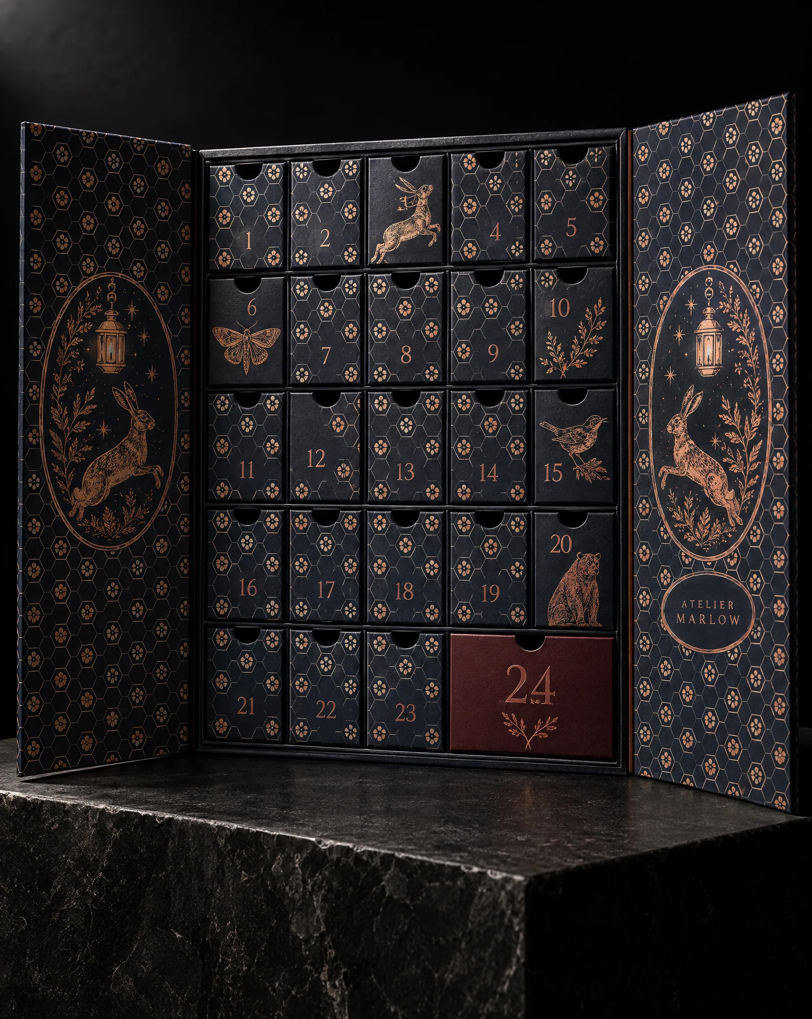
This one started on our own inspiration wall: a navy rigid calendar with cream hexagons, copper foil, a leaping hare on the doors. People kept asking about it. So we asked a bigger question.




The brief: same 24 days, twelve ways to build them
Twelve movements, roughly in order, from the 1890s to today. For each one we asked how its designers would have approached the object itself, not just its surface. The Wiener Werkstätte would have made a perfect cube. The Swiss would have let the numbers do all the work. Memphis would have refused to make a rectangle at all.
Two rules kept it honest. Every material had to come from our own library: Colorplan and Gmund papers, foil colours by their real codes, named Pantones. And every build had to be something a box maker can wrap, glue and fit, from 2 mm greyboard and paper. Some of these are simple. Some need a prototype before anyone prints a thing. We say which.
1890s · Arts & Crafts: a garden you open like a book
William Morris's people believed ordinary objects deserved real craft, and that pattern should feel grown, not drawn. So this one is a book: a triptych case that opens on two doors, dense bramble and thrush repeat on the outside, 24 drawers inside, the 24th wrapped in oxblood.
Colorplan Racing Green wrap with the bramble printed tone-on-tone in PANTONE 5535 C, so you feel the pattern before you see it. Rules, numerals and the ribbon banner in 176-2M, our matte antique gold, with a light registered deboss under the foil. Drawers in Colorplan Natural.
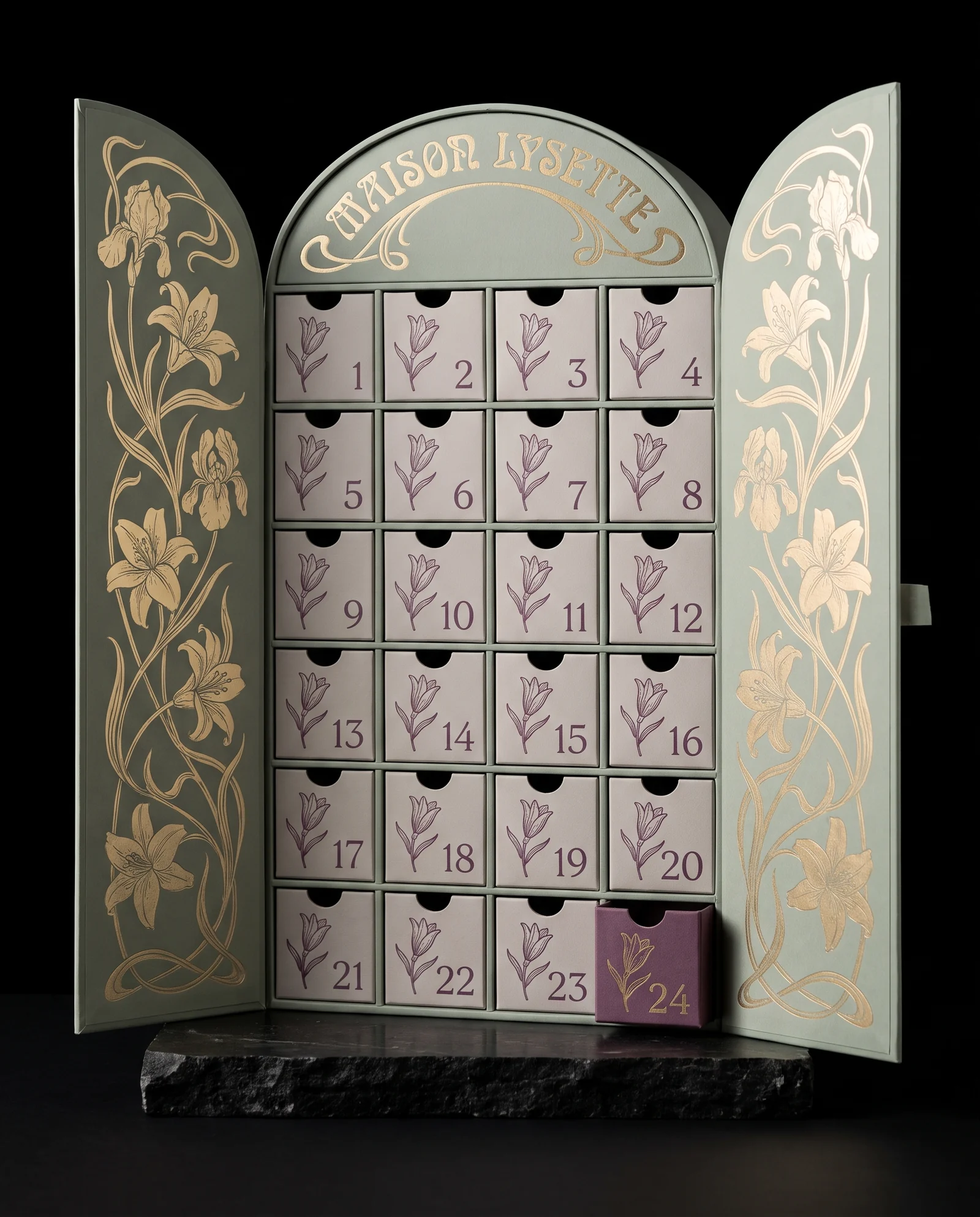
1900s · Art Nouveau: the doors close into an arch
Art Nouveau hated the straight line. The doors here are die-cut so they meet in a rounded arch when closed, like a Paris Métro entrance, and whiplash lily stems climb both of them.
Sage green wrap (Gmund Colors Matt Sage) with the lilies and the lettering in 171M, our favourite matte gold. Drawer fronts in a warm pale grey with a single lily bud and numeral in plum, PANTONE 5125 C. Drawer 24 is the plum one.
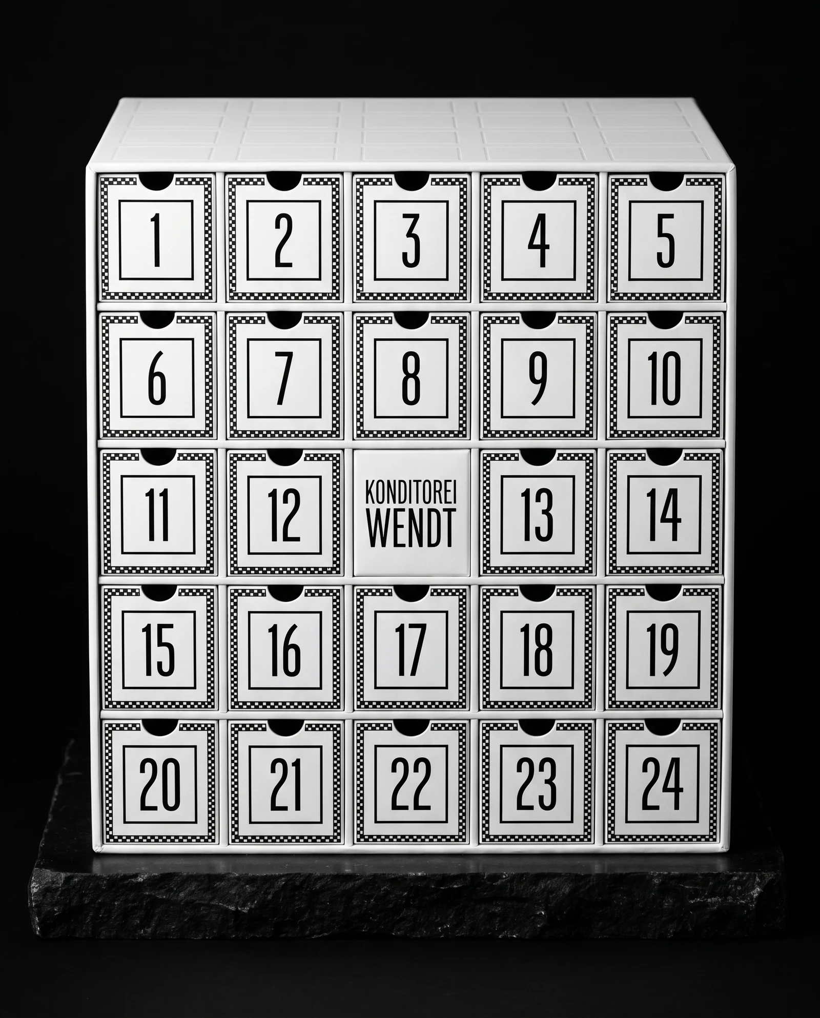
1910s · Wiener Werkstätte: 25 squares, one of them is the brand
Vienna answered Art Nouveau's curves with the square. A perfect cube, five by five: 24 drawers and, in the centre, the brand plate. Nothing on it is decorative that isn't also structural.
Colorplan Pristine White wrap. Checkerboard borders and tall narrow numerals in PY96M, a flat black pigment foil, which prints a deeper, crisper black on white uncoated stock than ink does. A blind debossed grid on the lid.
1920s · Bauhaus: 24 blocks instead of one box
The Bauhaus would have asked why the drawers have to live in a box at all. So these are 24 separate small rigid boxes in primary colours, stacked on a white tray. Take one out on the day, and the tower changes shape all month.
Colorplan Bright Red, Citrine, Royal Blue, Ebony and Pristine White. Big geometric numerals in black ink on the light blocks and P92 white pigment foil on the dark ones. Honest note: 24 separate boxes is the most labour-heavy build on this page.
1930s · Art Deco: a skyscraper of drawers
Deco was the architecture of the setback skyscraper, so the calendar steps back as it rises: six drawers at the base, then five, five, four, three, and a single tall drawer for the 24th at the crown, with a debossed sunburst behind it.
Colorplan Ebony wrap. Sunburst rays, chevrons, numerals and the name in 101, a bright mirror gold. Black and one gold, nothing else. Restraint is what makes Deco look expensive and not like a costume party.
1950s · Mid-century modern: a storage unit for small rituals
Mid-century designers built modular storage furniture with coloured panels set in a timber frame. This is that idea at kitchen-counter scale: a low landscape cabinet, six across, four high, with atomic starbursts.
Colorplan Nubuck Brown frame, drawer fronts in Marrs Green, Harvest, Mandarin and Natural. Starbursts printed in a dark brown, PANTONE 7533 C, numerals in 172-1M matte soft gold, and a small gold foil plate for the name.
1960s · Swiss style: slide off the sleeve and let the grid talk
Swiss designers trusted the grid and a single grotesque typeface to do everything. A red slipcase carries one enormous 24. Slide it off and the inner cabinet is pure white with red numerals, flush left, on a strict grid.
Colorplan Scarlet slipcase with the type in P92 white pigment foil. Inner drawers in Pristine White, numerals in PANTONE 485 C. The easiest build here to produce, and maybe the most confident.
Late 1960s · Psychedelic: a calendar you turn, not open
The concert-poster artists of the late sixties made type melt. Here the whole calendar melts into a round hatbox. The lid is a disc with one die-cut window; turn it each morning and the next day's compartment comes round.
Gmund Colors Matt Hot Pink lid and Tangerine sides, with two foils side by side, never stacked: 137-1, a metallic pink, and 116, a warm orange-gold. Purple compartments inside (Colorplan Purple). A rotating lid is real engineering, so this one is prototype first.
1970s · Supergraphics: every drawer is a piece of one sunrise
Seventies interiors painted giant stripes across walls, doors and furniture alike. So the 24 drawer fronts form one sunrise when they're closed, and the picture breaks apart as the month goes on. Generous rounded corners on the cabinet.
A cream cabinet in Colorplan Natural, the stripes in PANTONE 1675 C, 7409 C, 4625 C and 7579 C, knocked out under the numerals, which are in 115-1 copper. The trick in production is registration: the stripes have to meet across the seams.
1980s · Memphis: a pile of shapes that refuses to be a rectangle
Memphis was a rebellion against good taste, which takes a lot of taste to do well. A squiggle cube holds days 1 to 9, a yellow block holds 10 to 17, a turquoise wedge holds 18 to 23, and day 24 lives in a pink tube with a lift-off lid.
Colorplan Candy Pink, Marrs Green, Factory Yellow and Pristine White printed with black squiggles. Numerals in black ink and P92 white pigment foil. Four structures in one calendar means four prototypes' worth of fit-checking.
1990s · Minimalism: you read this one with your thumb
Nineties minimalism took everything away until only proportion was left. A white monolith, 24 flush drawers, and no print at all. The numerals are blind debossed, so you find them in the shadow, or with your thumb.
Colorplan Ice White wrap, blind deboss throughout, and one tiny word in 123M matte silver. Deboss needs an uncoated wrap like this one; it won't seat in a laminate. The cheapest finish on the page, and it looks like the most expensive.
Now · The material is the message
Today's best packaging doesn't pretend to be from another era; it shows you what it's made of. PRISMA is 24 drawers, 24 different paper colours, stepped into one gradient, in a slim black frame. A calendar that is also a paper library.
The frame is wrapped in a printed soft-touch laminate with the name in a holographic foil. Foil bonds well to soft-touch; deboss doesn't, so there is none on the frame. Each drawer front is its own Colorplan or Gmund Colors shade, numerals in P92 white or PY96M black pigment foil depending on the colour underneath.
What actually drives the cost of a custom advent calendar
A 24-drawer calendar is really 25 rigid boxes: one case and 24 drawers, each wrapped and fitted by hand. So the price moves with the drawer count first, then the structure (a book or a cabinet is simpler than a tower, a round box or a pile of shapes), then the number of different papers, then the number of foil colours and finishes.
The good news is in the numbers themselves. All 24 drawer fronts are laid out on one sheet before they're wrapped, so one foil die strikes all 24 numerals in a single pass. Twenty-four different numbers don't cost 24 times as much.
What goes in the drawers
Tell us the product, its size and its weight before anything else, because the drawers are built around it. Tea sachets, chocolates, skincare minis, a key ring: each needs a different drawer depth and fit. Unwrapped chocolate wants a food-safe liner or tray inside each drawer; individually wrapped pieces don't.
Heavy items need heavier board and a tighter fit so the drawers don't sag or rattle. That's what the plain prototype is for: you hold the structure, open every drawer, and only then do we print.
Plan it backward from December
Rigid calendars are made to order. Production takes about three weeks after you approve the proof, and there's a prototype before that, so start about eight weeks before you need them in hand, longer for the complex structures. Timelines are estimates, never guarantees, and December carriers are December carriers.
Want your own?
Send us your brand, the product going into the drawers and how many calendars you need. Pick an era from this page if one feels like you, or tell us the one we missed. We'll tell you which build fits your quantity and timing, and show you a render before anything gets made.
Start from these materials
Same paper, foil and finish, locked in — nothing of this piece artwork comes with it.
Questions
- How much does a custom advent calendar cost?
- It depends on four things, in this order: how many drawers, how complex the structure is, how many different papers it uses, and how many foil colours and finishes. A 24-drawer calendar is really 25 rigid boxes, each wrapped and fitted by hand. Send us the quantity and the product going inside and we'll price two or three builds side by side.
- What is the minimum order for a custom advent calendar?
- Once a foil or deboss die is involved, runs usually make sense from about 100 calendars, the same as our rigid boxes. Shorter pilot runs are quoted on request.
- How long does a custom advent calendar take to make?
- About three weeks of production after you approve the proof, with a plain prototype of the structure before that. For December, start about eight weeks before you need them in hand, longer for round, stepped or modular structures. Timelines are estimates, not guarantees.
- Can you foil stamp and deboss an advent calendar?
- Yes. Hot foil works on uncoated papers and on soft-touch laminate. Deboss and emboss need an uncoated wrap; they won't seat in soft-touch. On an uncoated wrap, foil and a light registered deboss can go on together in one pass.
- Can an advent calendar hold chocolate or food?
- Yes. The drawers are paperboard, so unwrapped chocolate goes into a food-safe liner or tray inside each drawer, while individually wrapped pieces can go straight in. Tell us the product size and weight first; the drawer depth and the board weight are built around it.
- Do I need a dieline for a custom advent calendar?
- No. Send the product's dimensions and weight, or the product itself, and we draw the structure and the dieline. You check the fit on a plain prototype before anything is printed.
- Can you make a calendar with 12 or 25 doors instead of 24?
- Yes. Twelve days, 24, 25, a countdown to a launch: the drawer count is just part of the structure. Fewer drawers usually means a simpler, less expensive build.
- Are these real client calendars?
- No. These twelve are design explorations by our studio for invented brands, shown as photographic renders. The papers, foil codes and structures are real and orderable; the brands are not.