Case study · Business cards · Soundtoys
Soundtoys ↗Two ways to print one card
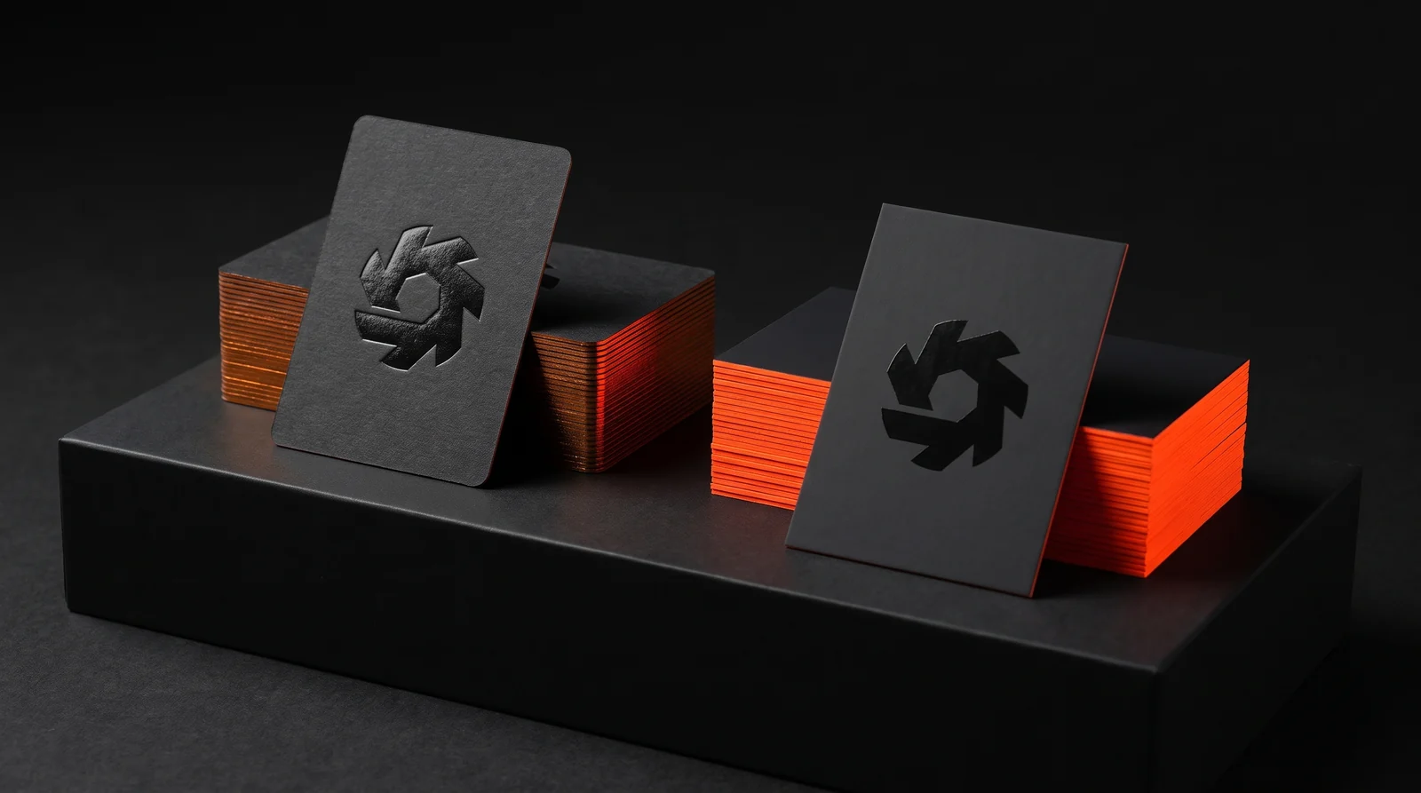
Soundtoys, the Vermont plug-in company behind Decapitator and EchoBoy, wanted a premium card for NAMM: 32pt, a debossed logo with gloss on it, white contact text and a painted orange edge. The brief quietly asked for two things that don't live on the same paper. Instead of forcing one spec, we quoted two complete production directions at the same price and built production simulations of both, so the choice could be made on brand rather than budget.
The idea
Most printers would sell this card as soft-touch with spot gloss. It's quick, it's cheap, it runs digitally, and it would look fine.
Seven rules
- 01The deboss decides the paper. Two complete production directions instead of one spec forced to do everything, and the same price for both.
- 02Direction A: foil and deboss in one hit. Dyed-through black uncoated 32pt. One die stamps gloss black foil and debosses in the same pass, so the gloss sits exactly in the recess.
- 03Contact text in foil, not ink. Light matte silver foil. Fully opaque, and crisper at small sizes than non-metallic pigment white foil.
- 04Direction B: white board, two blacks. Start white, print a rich black under the logo and a black 5 to 10% softer for the field. The tonal step carries the edge.
- 05Flat gloss, not raised. Flat spot UV on both sides. Sharp beats dimensional for a brand this particular about its mark.
- 06The edge picks the orange. Direction A gets a metallic orange foil edge. Direction B gets true neon, PANTONE 804, painted by hand.
- 0732pt, not 48pt. 32pt, double thick: about as rigid as a bank card, and plenty of edge for the orange to show.
The client
Soundtoys makes audio plug-ins in Vermont: Decapitator, EchoBoy, Little AlterBoy and the rest. The company is software, but the interfaces look like vintage rack gear. The card had to sit somewhere between those two.
Fourteen people, 1,100 cards, handed out at NAMM and shows like it. Their existing cards were standard stock and nobody liked them. The design came from Daniel Munzing, who sent a clean mockup and a detailed spec.
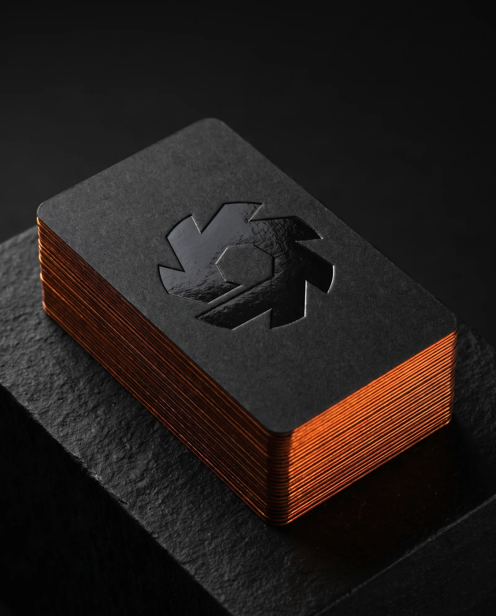
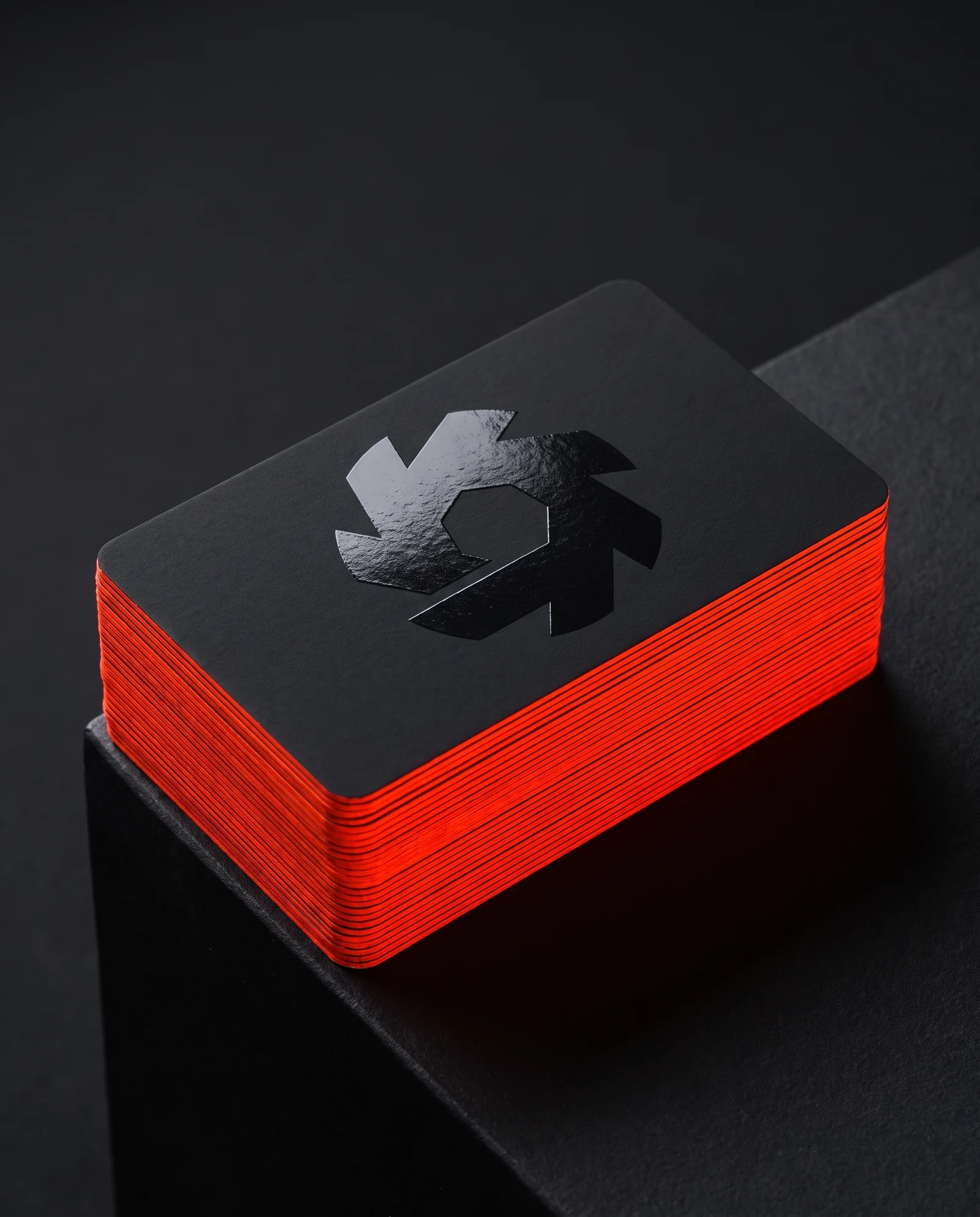
Same design, same price. A is the precious object: gloss black pressed into soft black fibre, with a metallic orange edge. B is the tougher card: velvet laminate, a razor-flat gloss logo and a true neon edge.
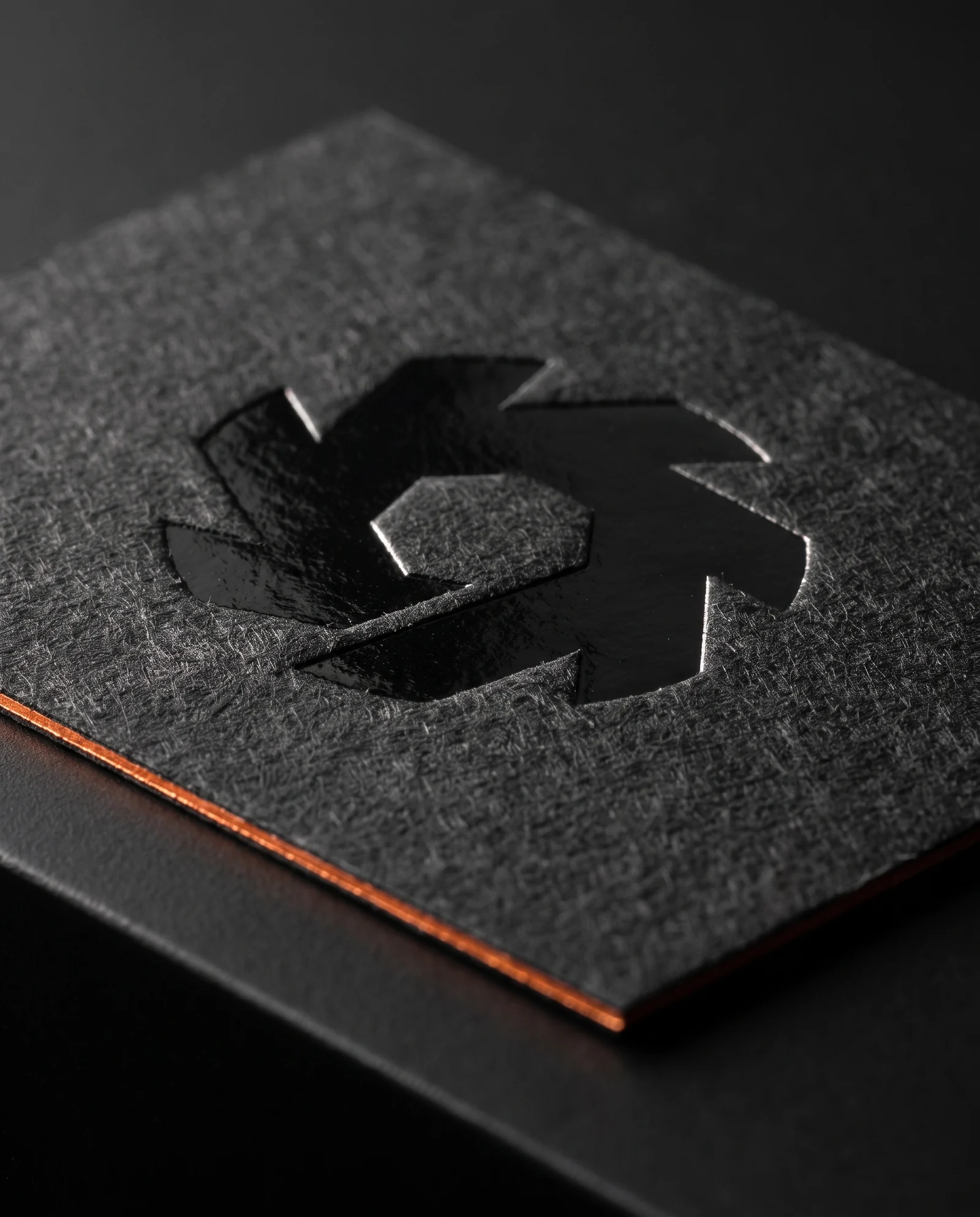
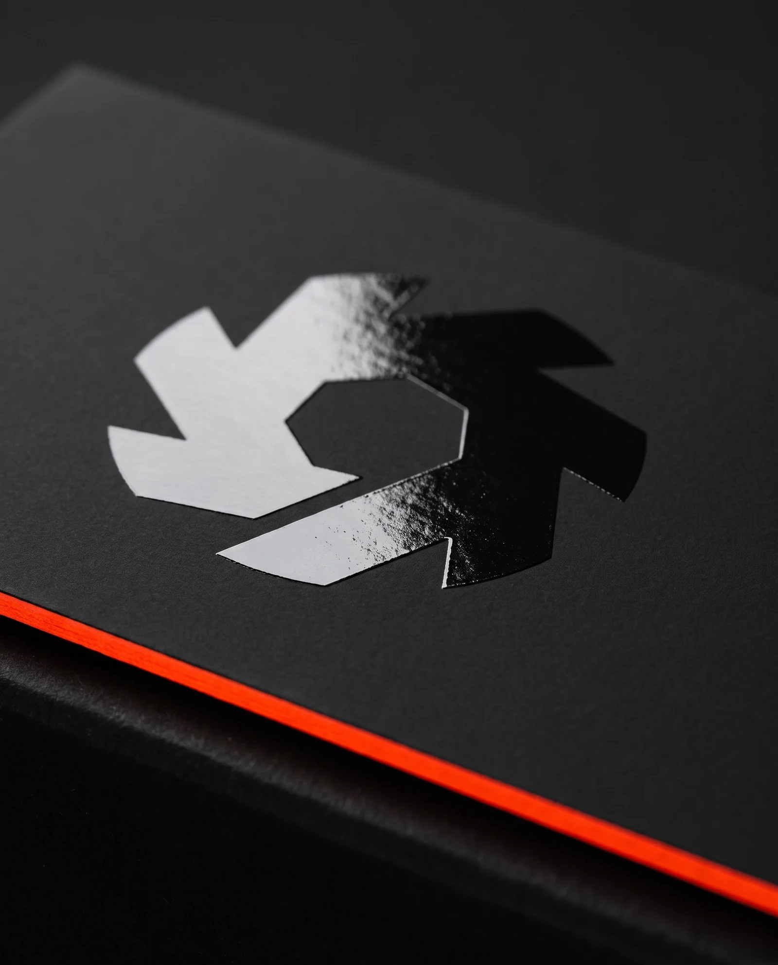
Up close the difference is texture. In A the foil crushes the paper fibres flat inside the mark and leaves them standing everywhere else. In B the whole card is smooth, and the gloss is the only thing that changes.
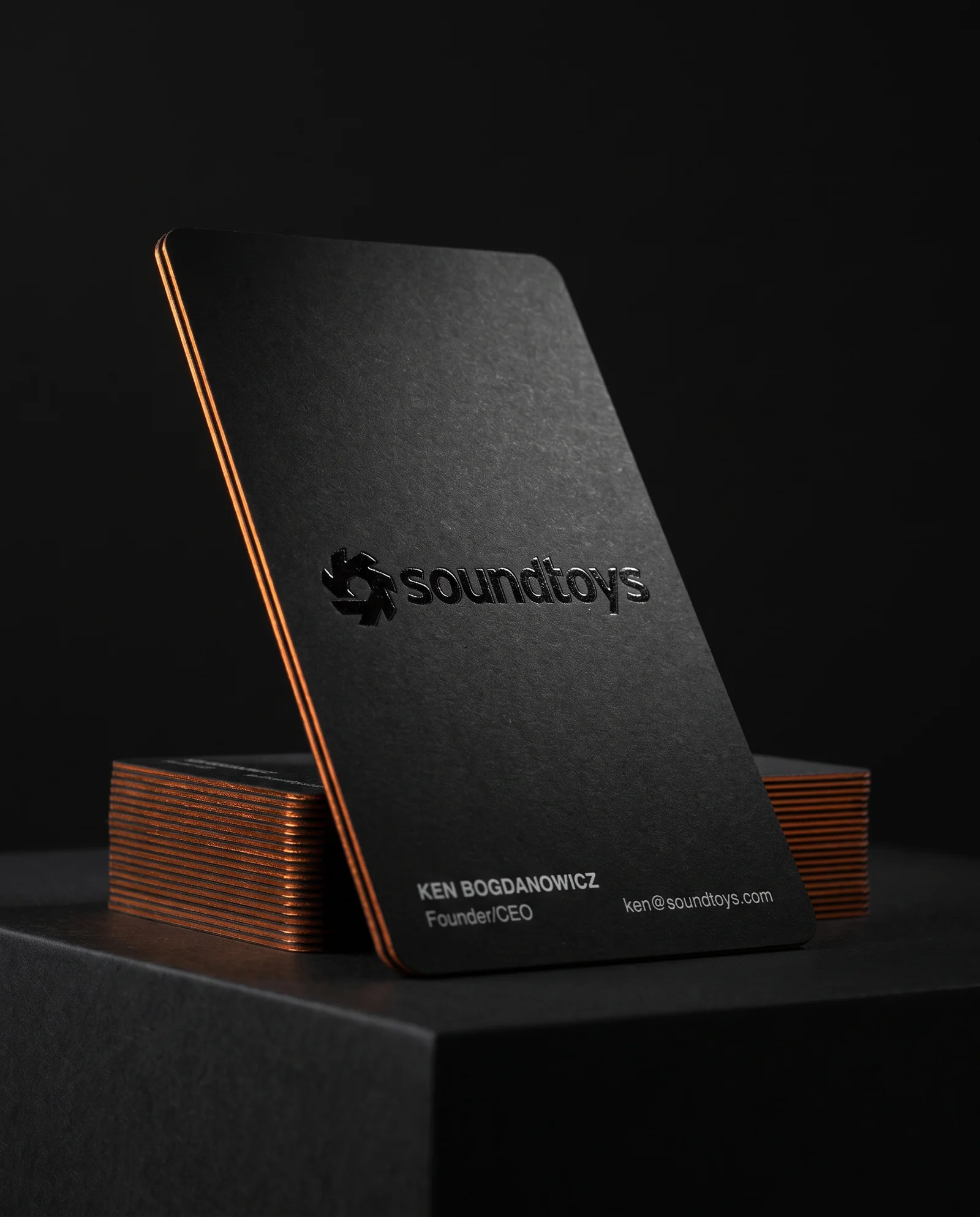
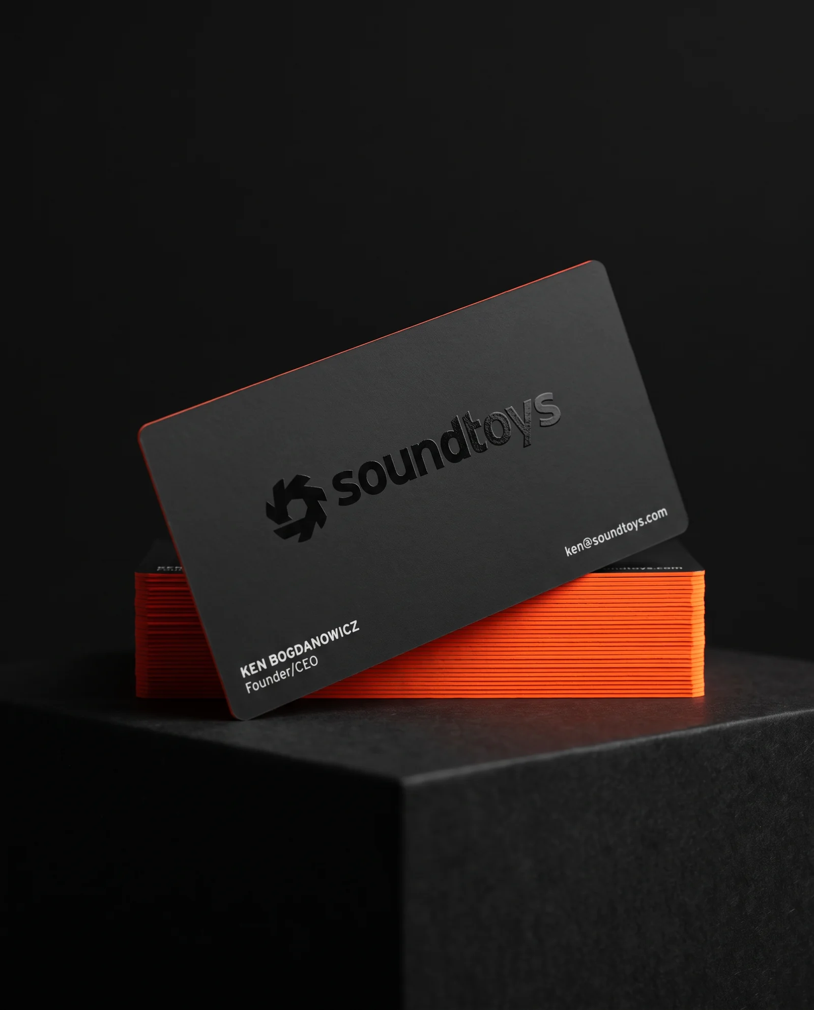
On black stock the contact details have to be foil to stay opaque. On the white-board build they're simply left unprinted, so the paper itself is the white.
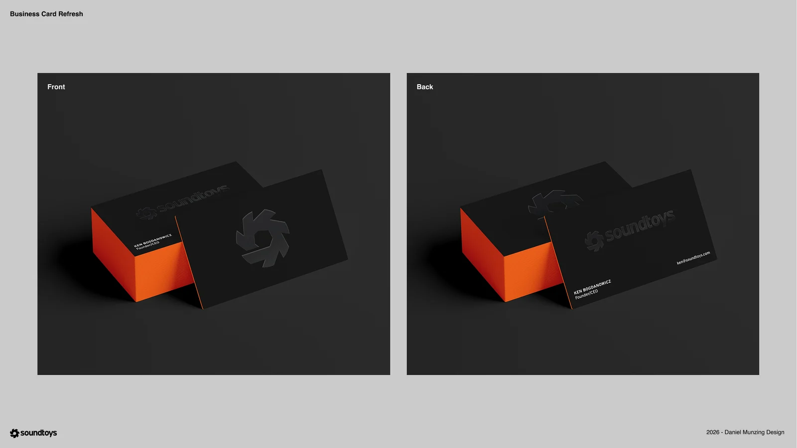
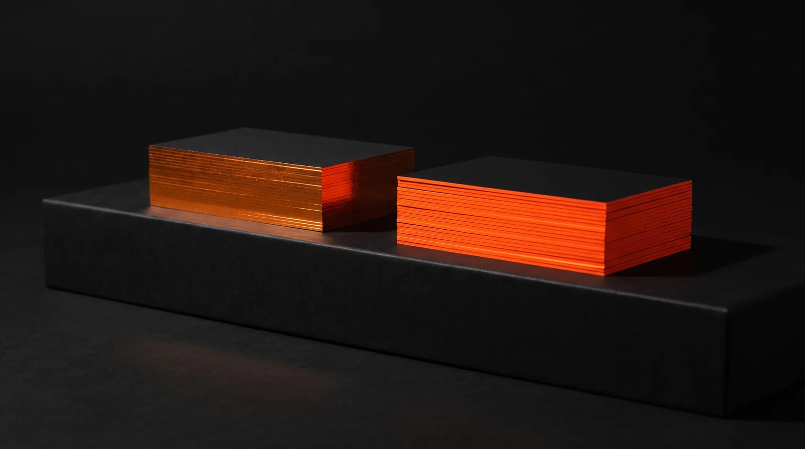
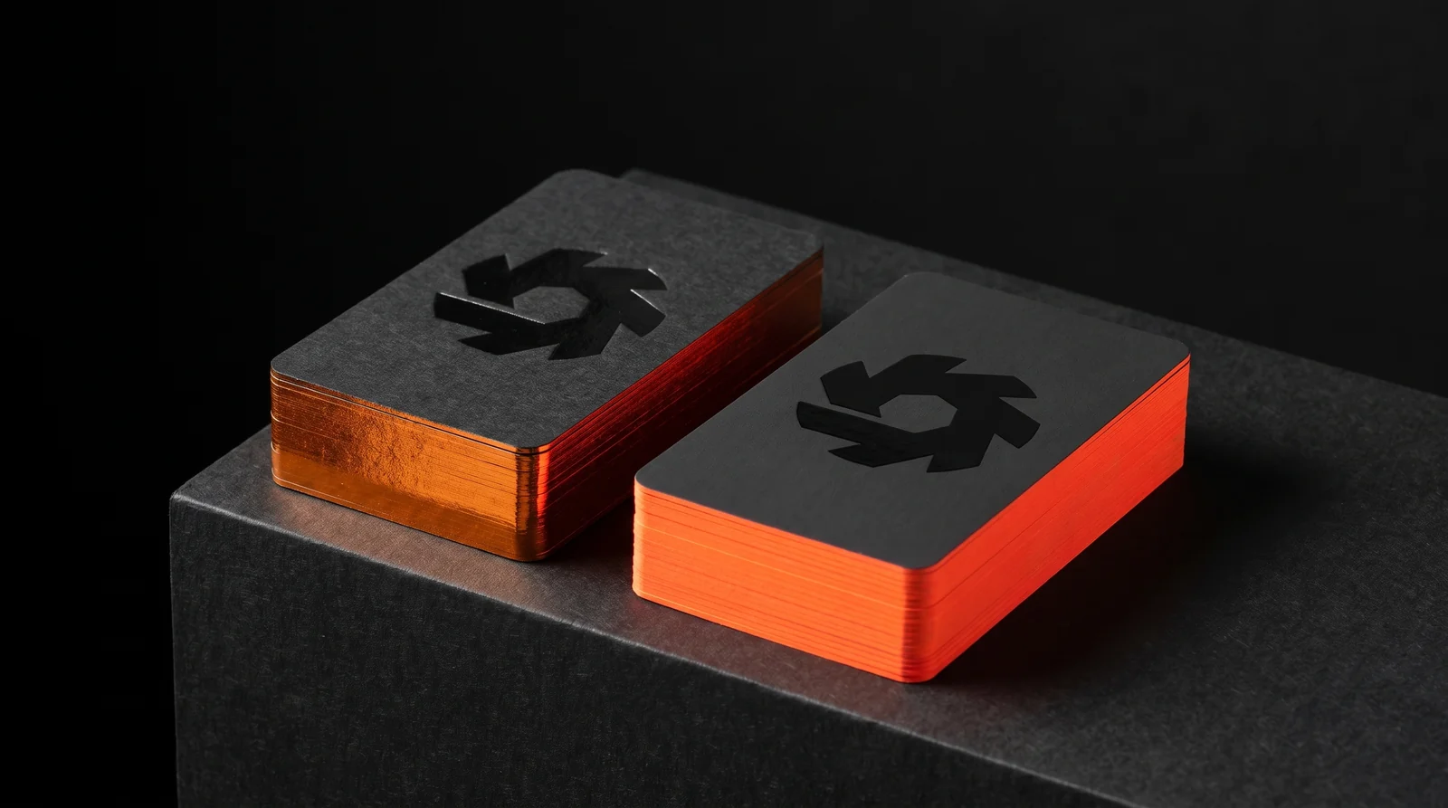
What each direction is better at
Direction A is the more luxurious object. Three contrasts stack up in the logo: depth, because it's pressed in; tone, because gloss black sits in matte black; and texture, because the foil flattens the paper fibres where it lands and leaves the rest of the card soft. It's a more precious card, and it asks to be carried in a card case rather than a back pocket.
Direction B is the tougher card and the brighter one. The laminate shrugs off sweat, spilled beer and a week in a wallet at a trade show, and the laminated corners won't show white if they get knocked. It's also the only way to get a true fluorescent edge.
At 32pt the durability gap is smaller than it sounds. Double-thick board is rigid either way. The real deciders are the deboss and the orange.
Why 50 cards cost the same as 100
The order was eight people at 100 cards and six at 50. On a multi-name job, the cost sits in setup, not paper: every name is its own foil die or its own printing plate, and once the press is running, fifty more sheets are nearly free.
So the 50-card sets were priced the same as the 100s, and the advice was to take the 100.
Why simulate before quoting
A designer's mockup shows intent. It can't show you the difference between foil and spot UV, or between a deboss you can see and one you can only feel, because on a screen they're all the same pixel.
Searching images for foil versus spot UV doesn't settle it either. Everyone shoots their own work under their own light, and lighting flatters everything. So we put both directions on the same plinth under the same light, with the client's real mark, and let the materials argue for themselves.
Every image on this page is a production simulation made before press. When the cards run, the real photographs replace them.
Where it stands
The order is with Soundtoys. Both directions are quoted at the same price, and either one is in hand two to three weeks after proof approval.
Whichever they choose, the card is covered by our quality guarantee: if it isn't right, we reproduce it under a new production plan.
Start from these materials
Same paper, foil and finish, locked in — nothing of Soundtoys's artwork comes with it.
Questions
- Is foil or spot UV sharper on a business card logo?
- Foil, usually. A foil die cuts a clean perimeter, while spot UV is a liquid coating that cures with a slightly softer edge. On tight lettering, foil holds the gaps better. Spot UV can be made to read sharper by printing a darker black under the logo so the tonal step carries the edge.
- Can you deboss soft-touch business cards?
- Yes, but the effect is subtle. Soft-touch is a plastic laminate on coated board, which is hard and dense, so the impression springs back. You feel it more than you see it. For a visible deboss, use a soft uncoated stock.
- Why can't you put spot UV on uncoated black paper?
- Spot UV needs a sealed, coated or laminated surface to sit on and cure. Uncoated paper absorbs it. On uncoated stock, a gloss foil or a clear foil stamp gives the same glossy look.
- What is two-tone black printing?
- Printing two blacks on the same card: a rich, deep black under the logo and type, and a black about 5 to 10% softer for the background. It creates tone-on-tone contrast, so a gloss coating on the logo doesn't have to do all the work of defining the edge.
- Is 32pt or 48pt better for business cards?
- 32pt suits most premium cards. It's about as rigid as a bank card and shows a painted or foil edge clearly. 48pt makes a bolder edge, but it's bulky in a wallet and some people find it too much.
- Does ordering 50 cards instead of 100 save money on a multi-name order?
- Rarely. On foil or spot-colour jobs each name needs its own die or plate, and that setup is most of the cost. Extra sheets once the press is running cost very little.