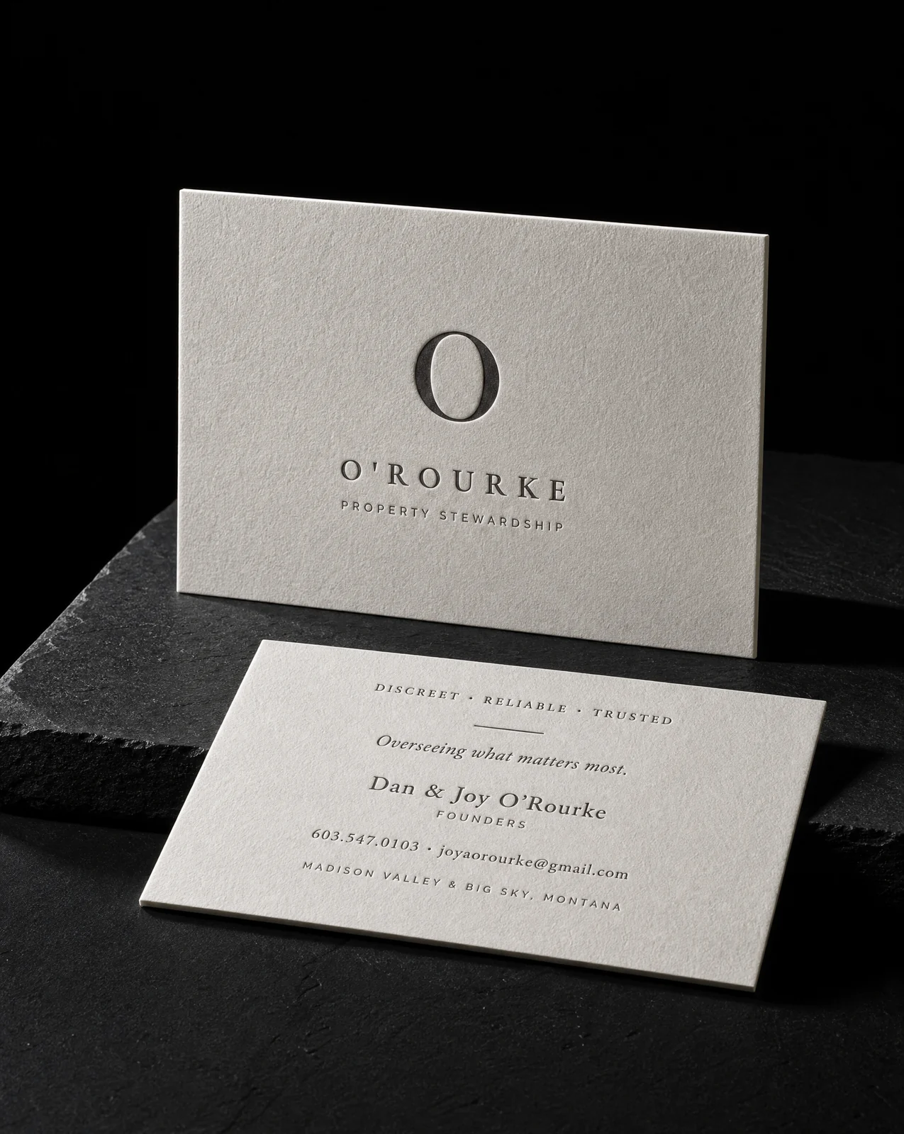
Case study · Business cards · Studio Álvarez Interiors
Getting the stone A out of four colours
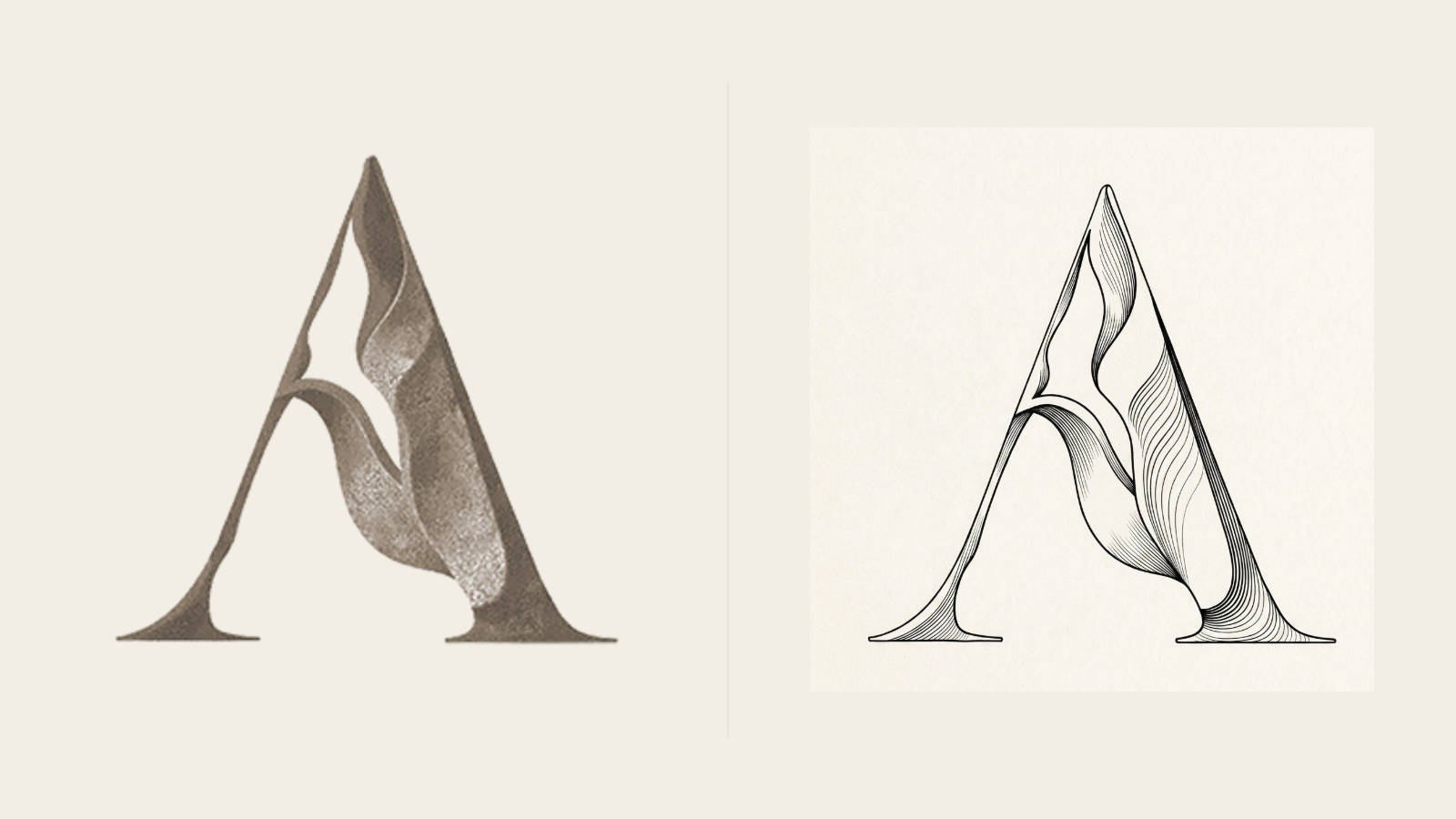
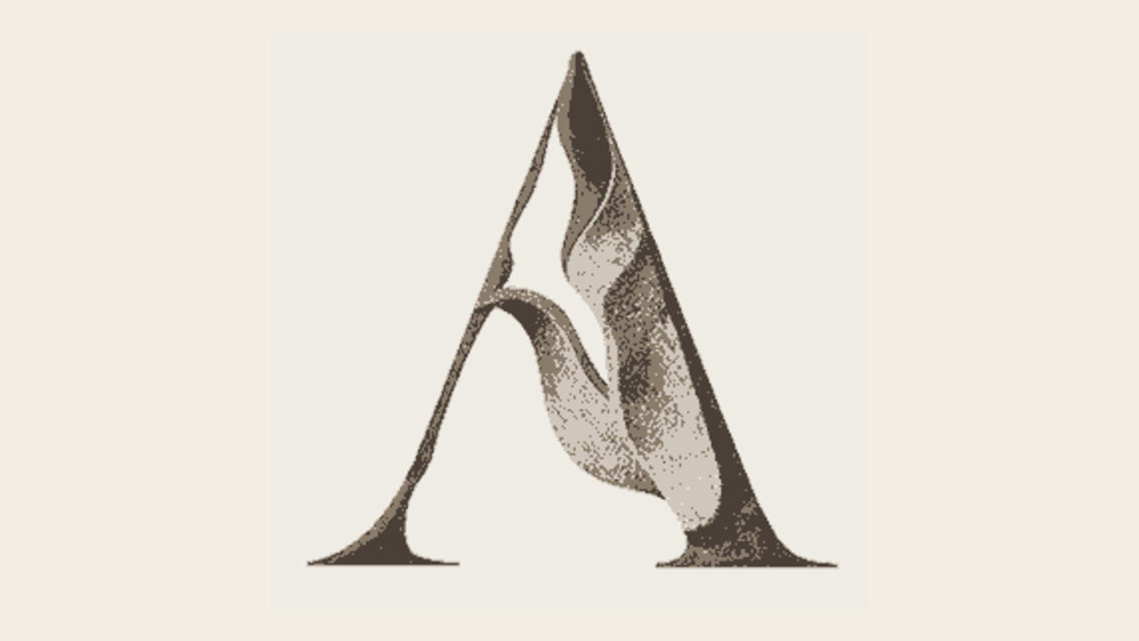
The icon was a raster relief — beautiful, and reproducible only as CMYK process. That single fact ruled out foil, letterpress, blind emboss, single-colour signage, embroidery, and anything under about 30 pixels. Getting it out of four colours meant rebuilding it as vector and finding a way to carry the sculptural feeling in one ink.
The idea
This wasn't a redesign. The mark was right. It was in the wrong format, and the wrong format was quietly deciding what the brand could never do.
Six rules
- 01Diagnose what the file actually forbids. Trace a vector master from the existing artwork rather than redraw it. The mark stays the mark; only its file format changes.
- 02Generate every variant from one outline. All five renderings are generated from the same single outline. The bevel is constructed from that outline's own distance field and lit fro…
- 03Retire the two that describe an edge instead of a mass. Cut both. Kept the flat solid and the simplified silhouette, and developed the fourth idea properly — line weight driven by a light source…
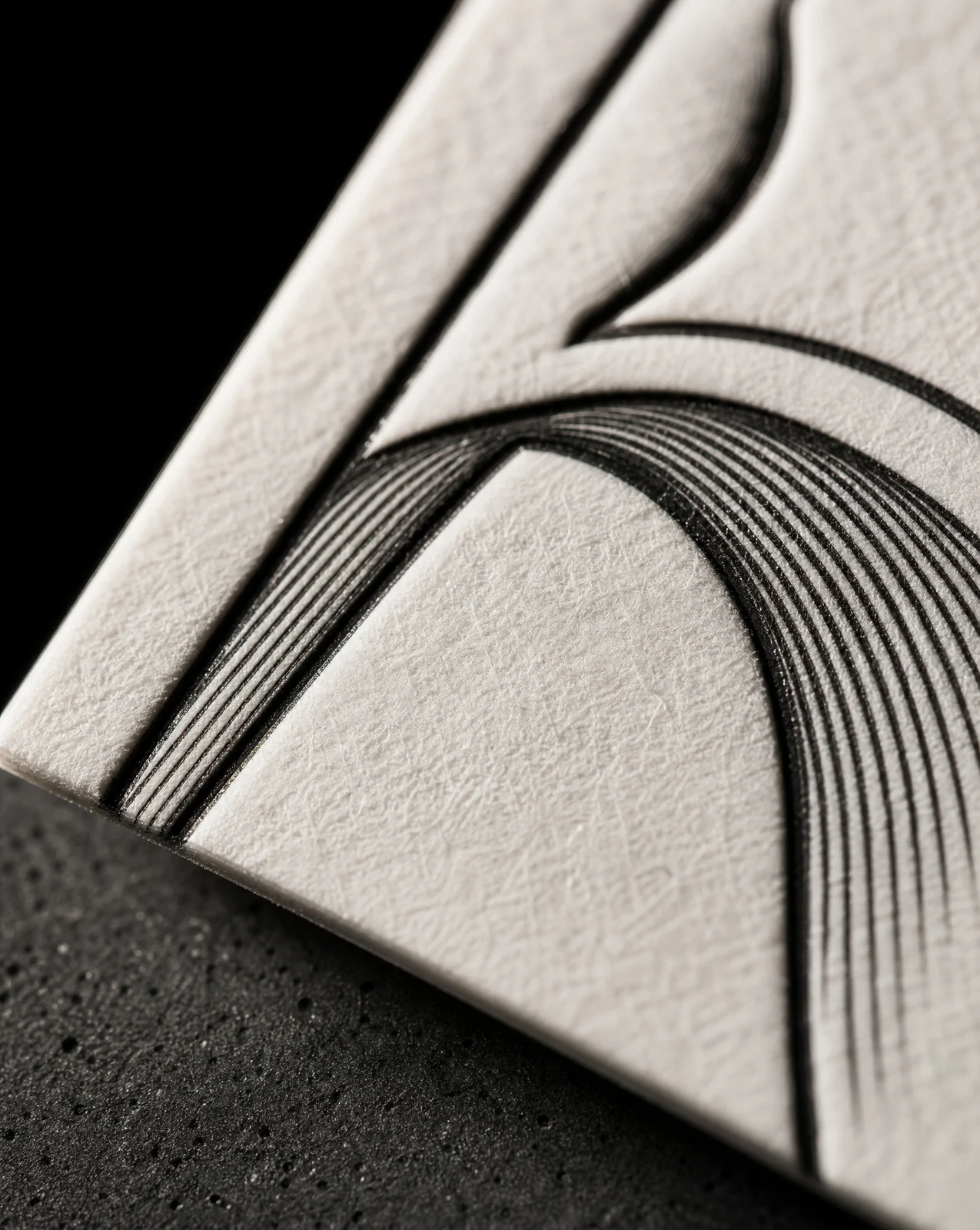
- 04Let the line weight do the shading. Relief rules. Each rule thickens as it enters shadow and thins as it crosses a lit face, so the weight itself describes the form — the ribb…
- 05Quantise the shading rather than gradate it. Incised facets — the shading quantised into three flat planes, the way a V-cut inscription resolves into two walls and a top. Hard edges be…
- 06Keep one version that survives being made in metal. Monumental extrusion — the outline swept back along a fixed axis and closed off. No shading at all; the mass comes from depth. It's the one…
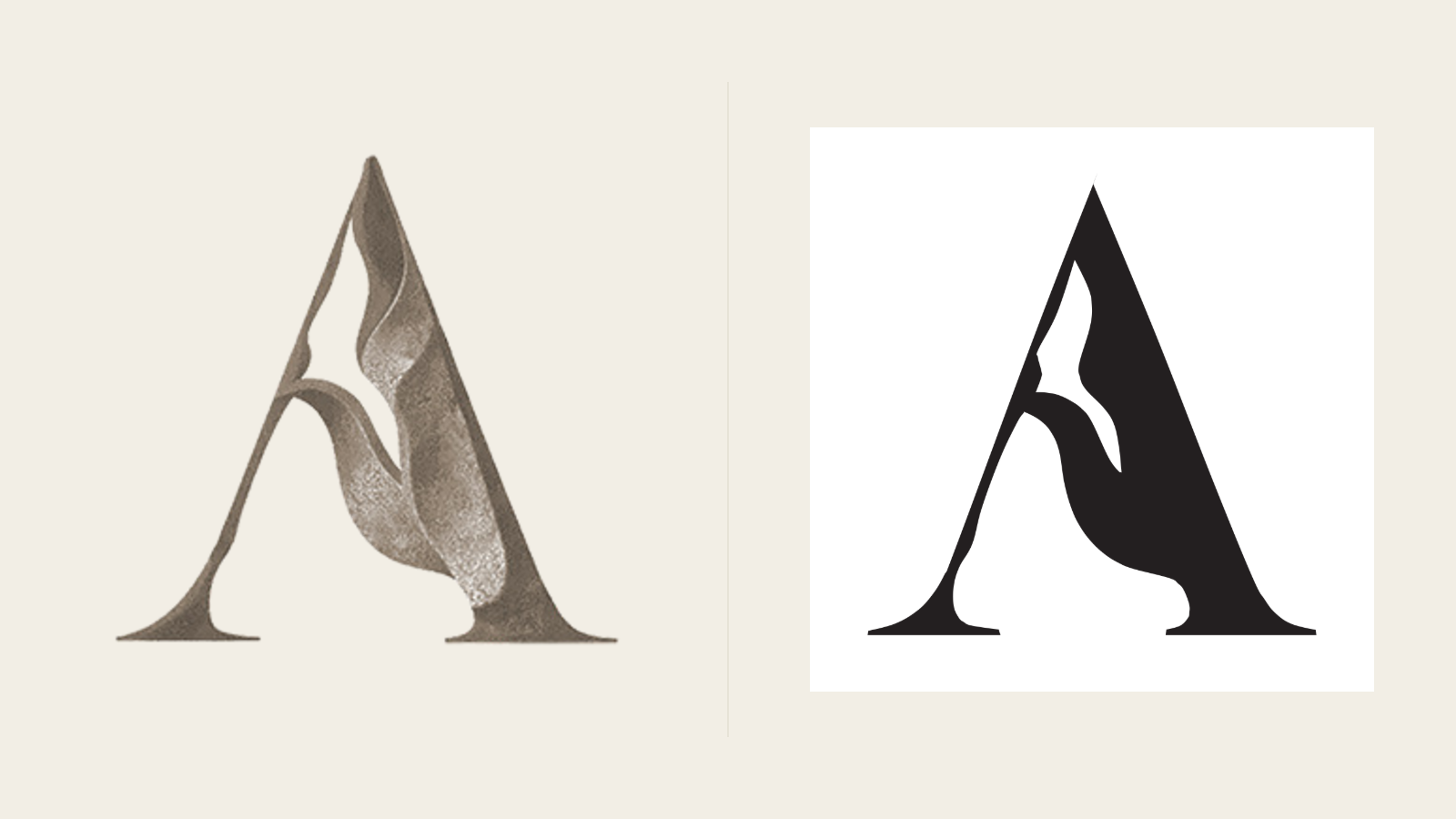
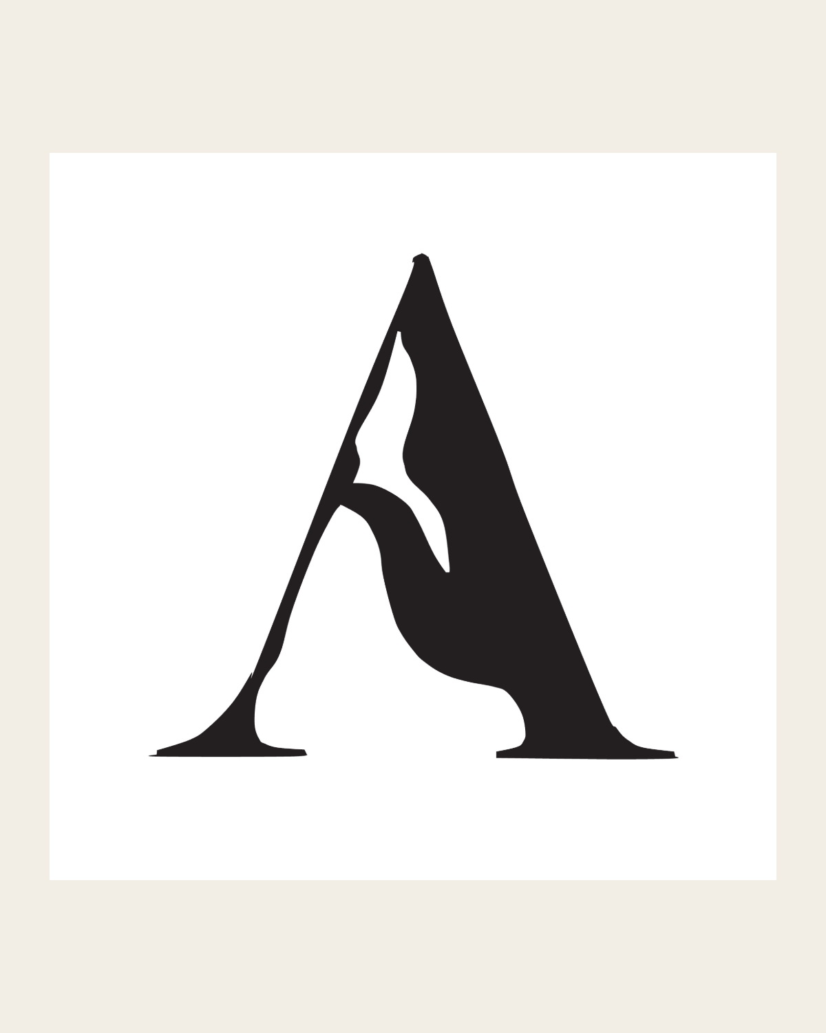
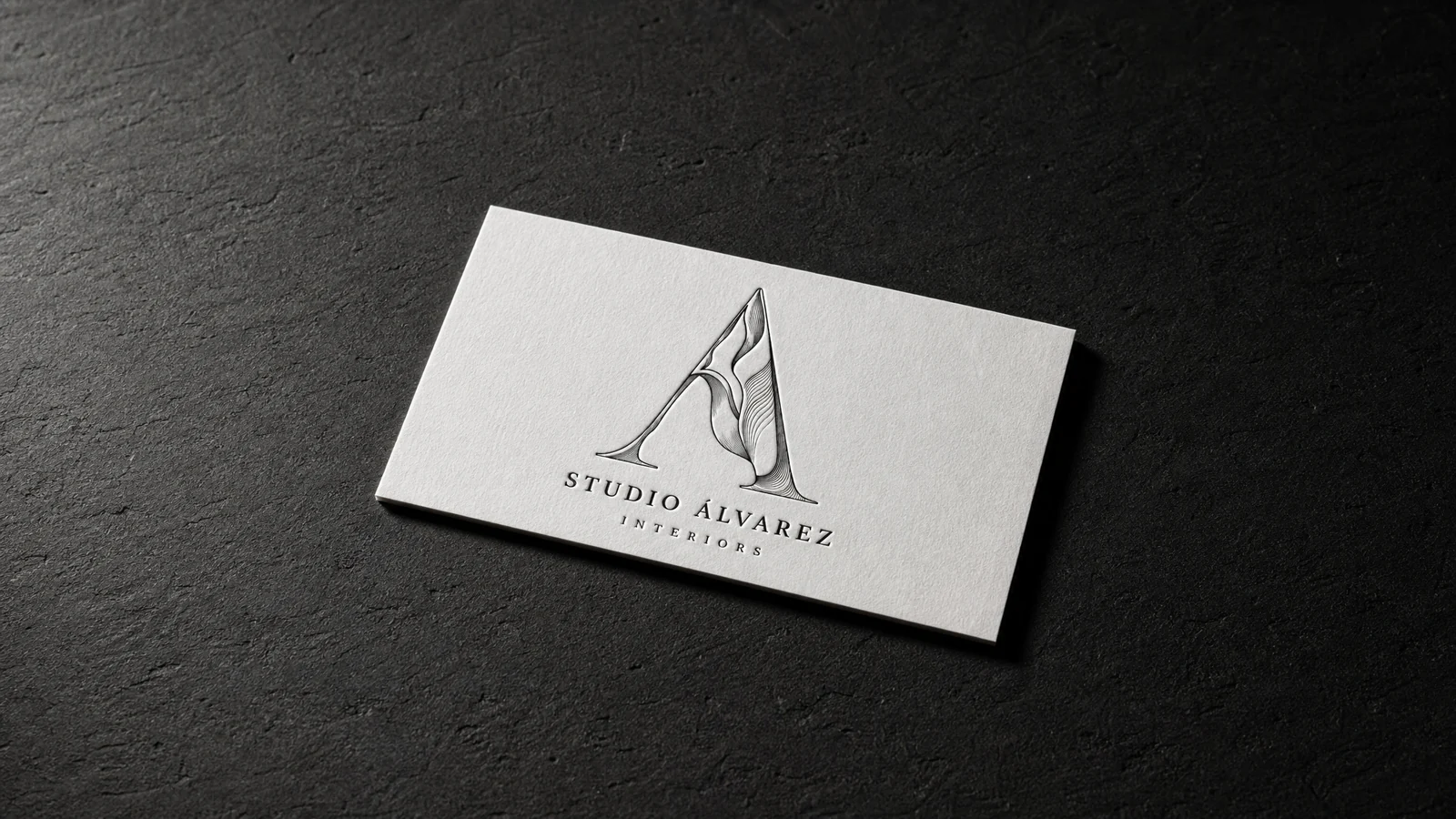
Same mark, traced rather than redrawn. Everything downstream — foil, letterpress, blind emboss, signage, embroidery — becomes possible the moment it stops being a raster.
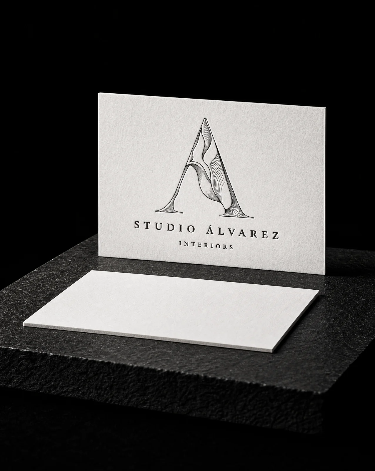
The sculptural feeling carried by line weight instead of by tone. Each rule thickens into shadow and thins across a lit face, so the drawing itself describes the form.
Press notes, per treatment
Relief rules: screen, letterpress, offset, engraving and large format. Minimum 64px / 25mm, and the thinnest rule has to hold 0.3pt at final size.
Incised facets: one spot plus tints, or three solid spots. Minimum 48px / 18mm. Tints screen, so this one is not a letterpress or a foil.
Monumental extrusion: no shading at all, so it's the one device here that survives being printed flat and being cut in aluminium.
Start from these materials
Same paper, foil and finish, locked in — nothing of Studio Álvarez Interiors's artwork comes with it.
Designed by Austin Terrill, founder.