Case study · Business cards · IDOLON
How a five-die card went from a client PDF to production files
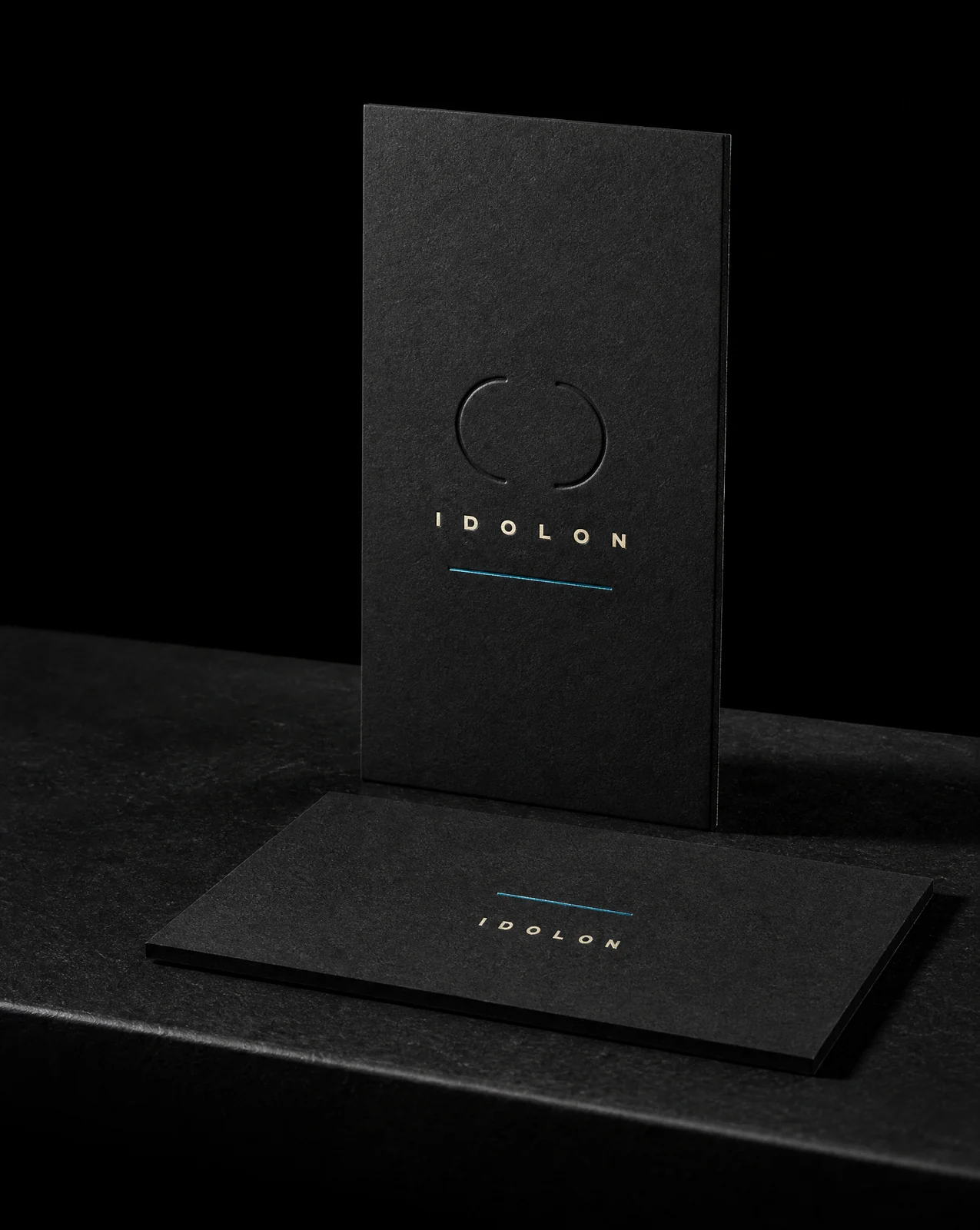
Christopher Eldridge sent a ten-page PDF and a hard constraint: nothing on the card could be printed. Everything visible had to be foil or an impression. What followed was five dies, three proof revisions, four caught mistakes, and a set of measurements that would have killed the job on press if nobody had taken them.
The idea
A card with no ink on it is not a style choice you can add at the end. It decides the stock, the dies, the type sizes and the file structure, all at once, before anything gets designed.
Eight rules
- 01No ink anywhere. Blind deboss for the type, two foil passes per side, on Colorplan Ebony duplexed — two dyed-through black sheets bonded, so each face takes…
- 02Name every pass before designing anything. Listed the five passes first. That put the entire risk in stroke weights, letter gaps and registration — and put zero of it in colour.
- 03Measure at 100%, in millimetres
- 04Use his outlines, never re-type his text. Pulled Christopher's own outlined lettering out of the PDF and transformed that, glyph by glyph. Nothing was ever re-typed.
- 05Solve the type size against the material, not by eye. Solved each line for the largest cap height that still holds the approved quiet zone and a minimum letter gap. Three lines broke across two…
- 06Group by meaning, then derive the spacing. Regrouped by meaning — the work, the invitation, the person — then replaced hand-picked gaps with a system: every vertical gap a multiple o…
- 07Offer options that differ on one axis. Three backs with identical wording, identical type sizes, identical quiet zone and identical foil clearance. The only variable was where th…
- 08Ship a package the die house can't misread

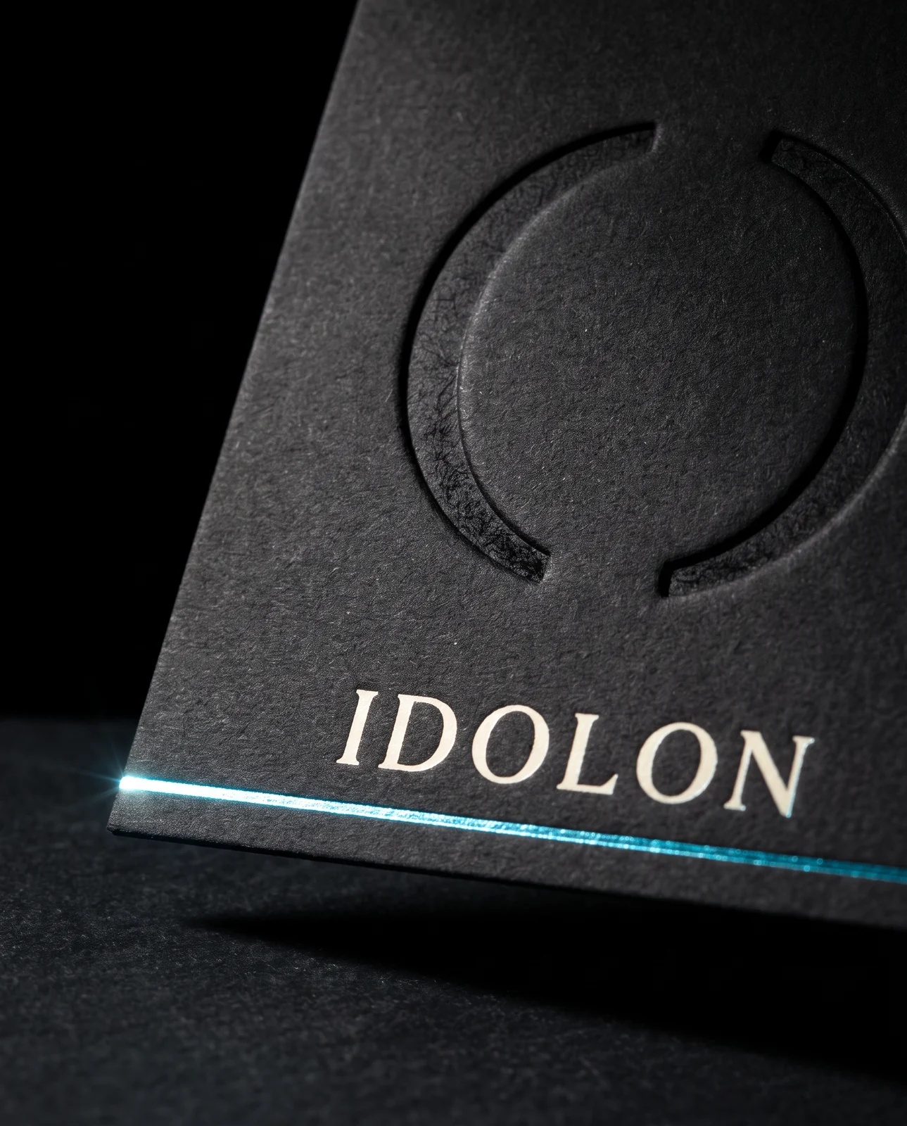
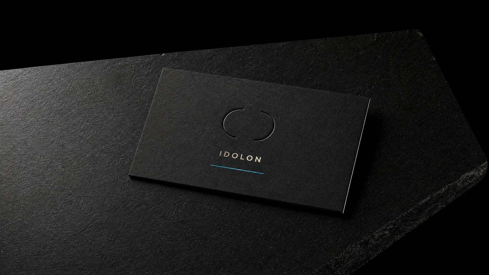
A blind deboss reads only as light. These are the two halves that make the impression visible on a flat proof — and neither is ink.
The four mistakes
None of the four were caught by getting it right the first time. All four were caught by rechecking, by the pressman, or by me.
A revision sheet compared against a depth figure that was never on the previous proof. Type shipped under any safe foil floor. Every line maximised independently until the role line came out larger than the client's own name. And an options sheet whose banner claimed everything cleared minimums while its own table showed two lines under floor.
That third one is the one worth sitting with. The technical solve produced a card where a job title outranked the man's name. It was correct by every number and wrong to anyone looking at it.
The method, in one line
Taste decides what the piece should be. Measurement decides whether it can exist. Do them in that order, and never let the second one quietly overrule the first.
Start from these materials
Same paper, foil and finish, locked in — nothing of IDOLON's artwork comes with it.
Designed by Austin Terrill, founder.