Case study · coasters · Gentleman Farmer Wines
Designing a coaster to sit beside a business card
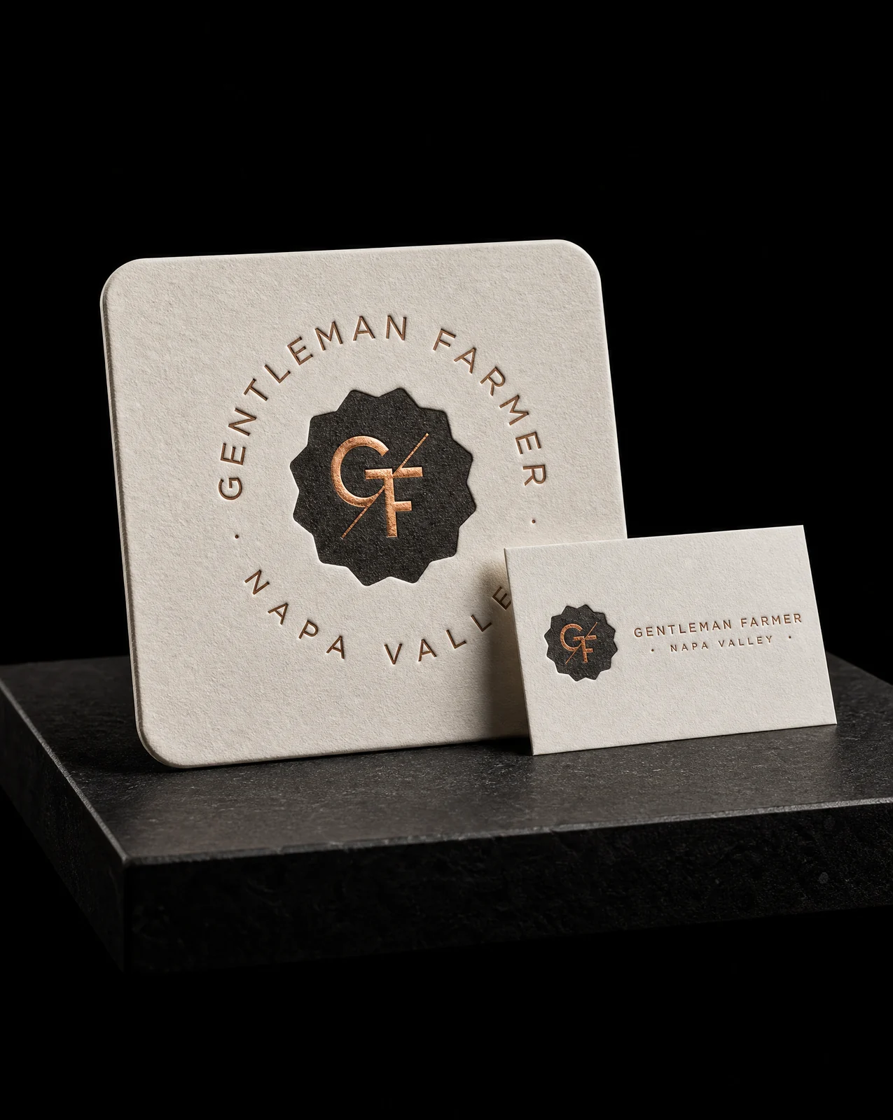
Gentleman Farmer had already printed a card with us and loved it. The ask was a coaster in the same voice — same stock family, same finishes, same restraint — carrying a six-item wine-snacks menu on one side and a QR to the shop on the other. Matching an existing piece is a harder brief than starting fresh, because every decision is measured against something the client can hold.
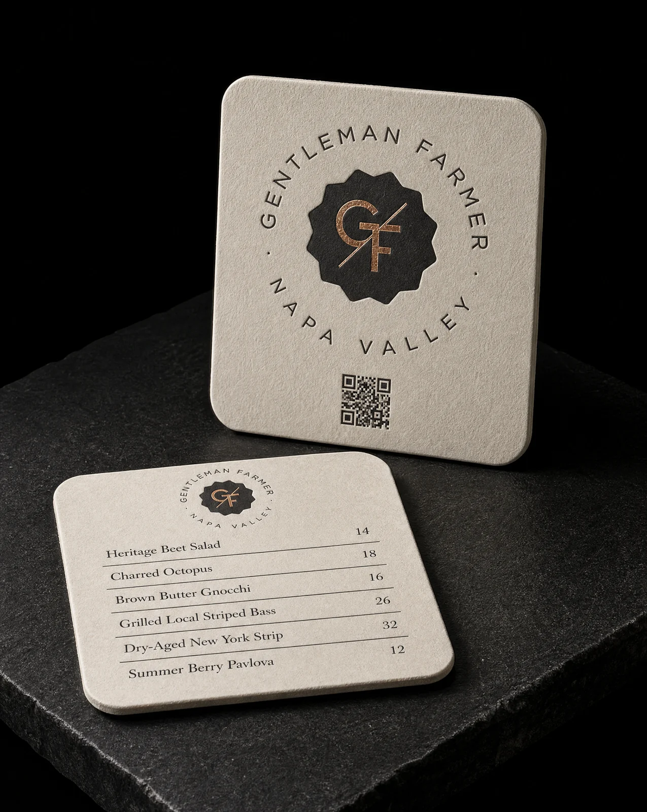
The idea
Most printers would have copied the card's layout onto a square and called it a set. The decision here was to carry the materials across and let the object decide the composition.
Four rules
- 01Take the spec as given, and the copy too
- 02Match the finishes, not the layout
- 03Spend the copper deliberately. Decided by what each face is for — the menu side is read at a table, the back is the brand moment with the logo and the QR. Foil earns its…
- 04530gsm, and let it be thick. Gmund Heidi at 530gsm, which is roughly double a heavy business card. It also takes a deep letterpress bite without the impression showing…
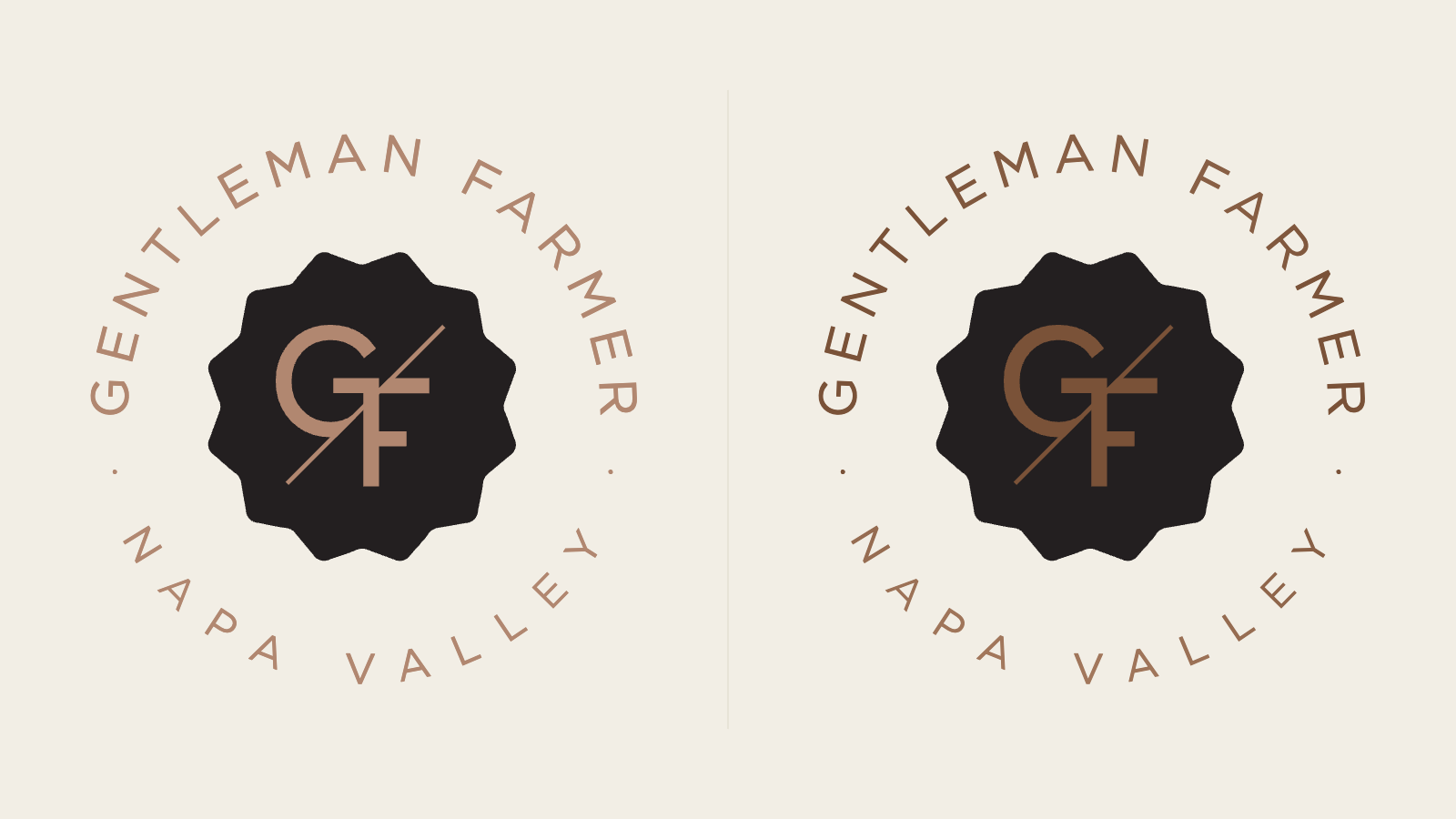
The same artwork, one pass apart. On a dark ground the flat version reads as printed; the foil version catches the light of the room it's sitting in.
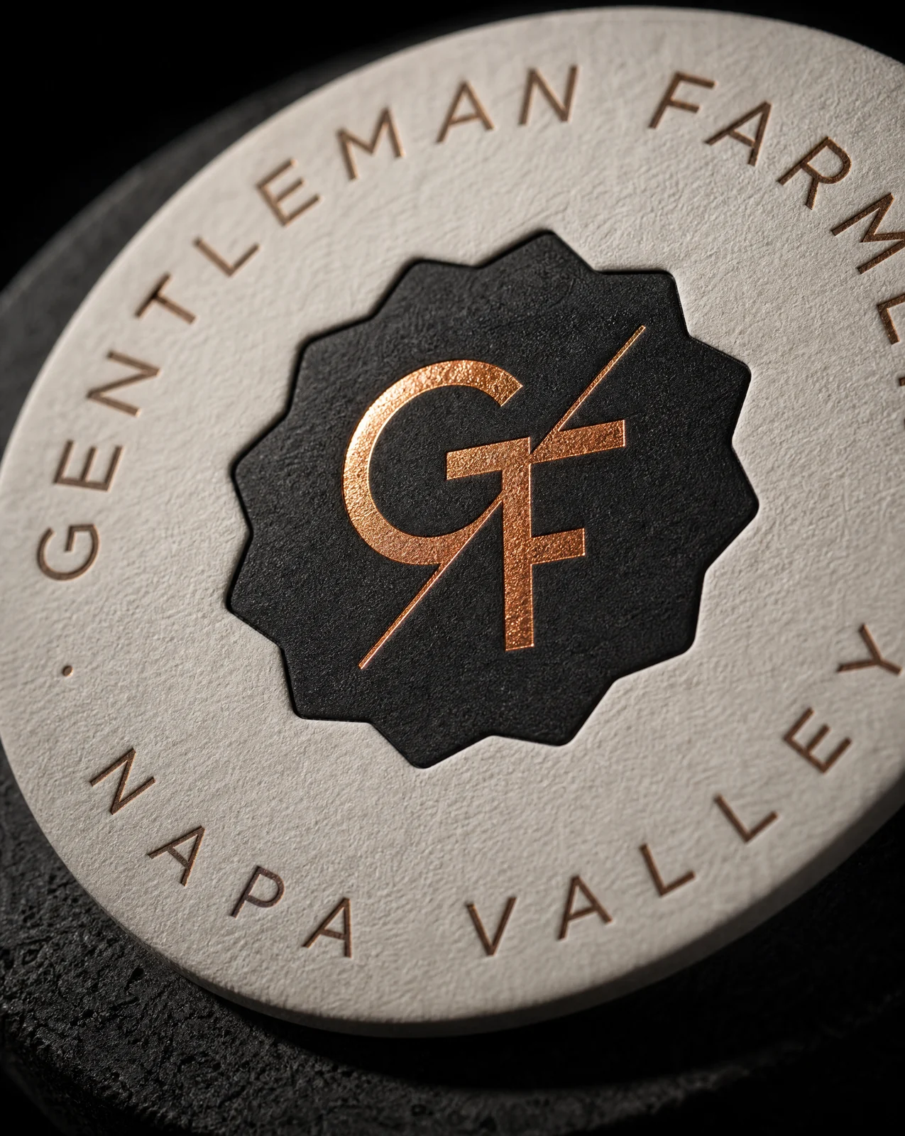
Start from these materials
Same paper, foil and finish, locked in — nothing of Gentleman Farmer Wines's artwork comes with it.
Designed by Austin Terrill, founder.