Case study · Wedding invitations · Dianna & Derek
Keep it simple, and let the paper show
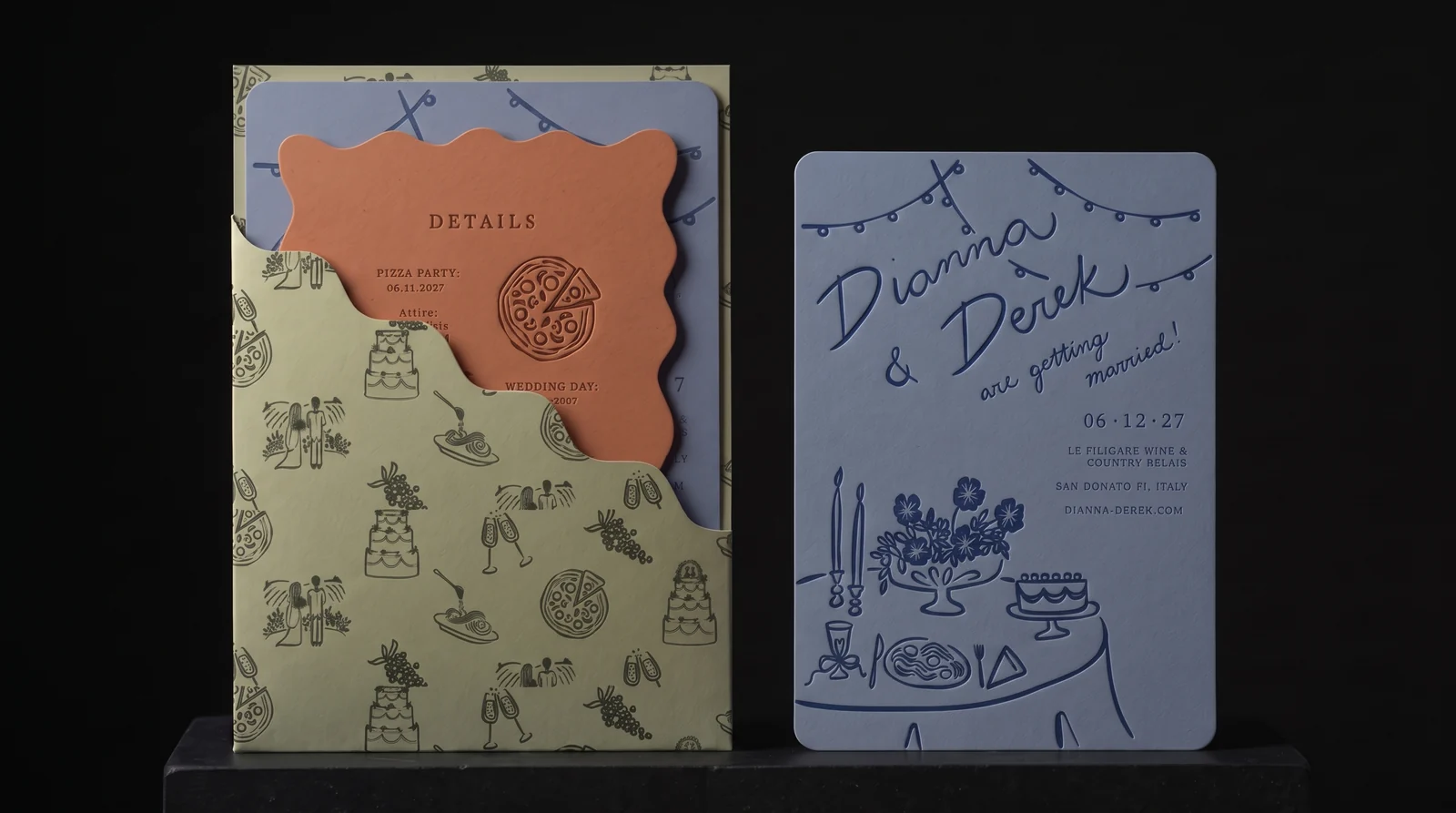
For a three-day wine-estate wedding near Florence — pizza party, wedding and pool party — Dianna and Derek brought artwork from their own designer and a simple brief: let the quality show. After one long video call and three concept rounds with our designer Bailey, the suite settled on a dusty-blue letterpress invitation, terracotta details card and sage wave-cut pocket. The couple chose rounded corners on the details card; this page shows their choice and the squiggly version we'd have cut.
The idea
Dianna's brief was to ‘go simple so that we can go and show quality’. The colour could live in the paper; the printing could be one assured impression rather than a stack of effects.
Seven rules
- 01Sixty, not a hundred. Sixty invitations, sixty details cards and sixty pockets, with any extras decided against the guest list.
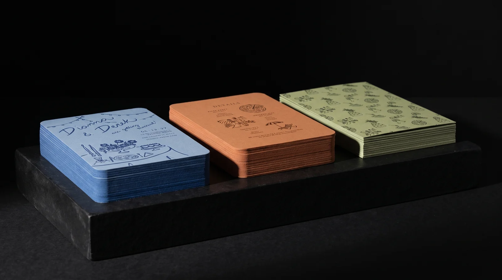
- 02Shape from one die. Round the invitation and details card; give the sage pocket one wave-cut diagonal.
- 03Colour drenched, not printed. Use dyed-through stocks and one hand-mixed ink per piece; final stock selection remains open.
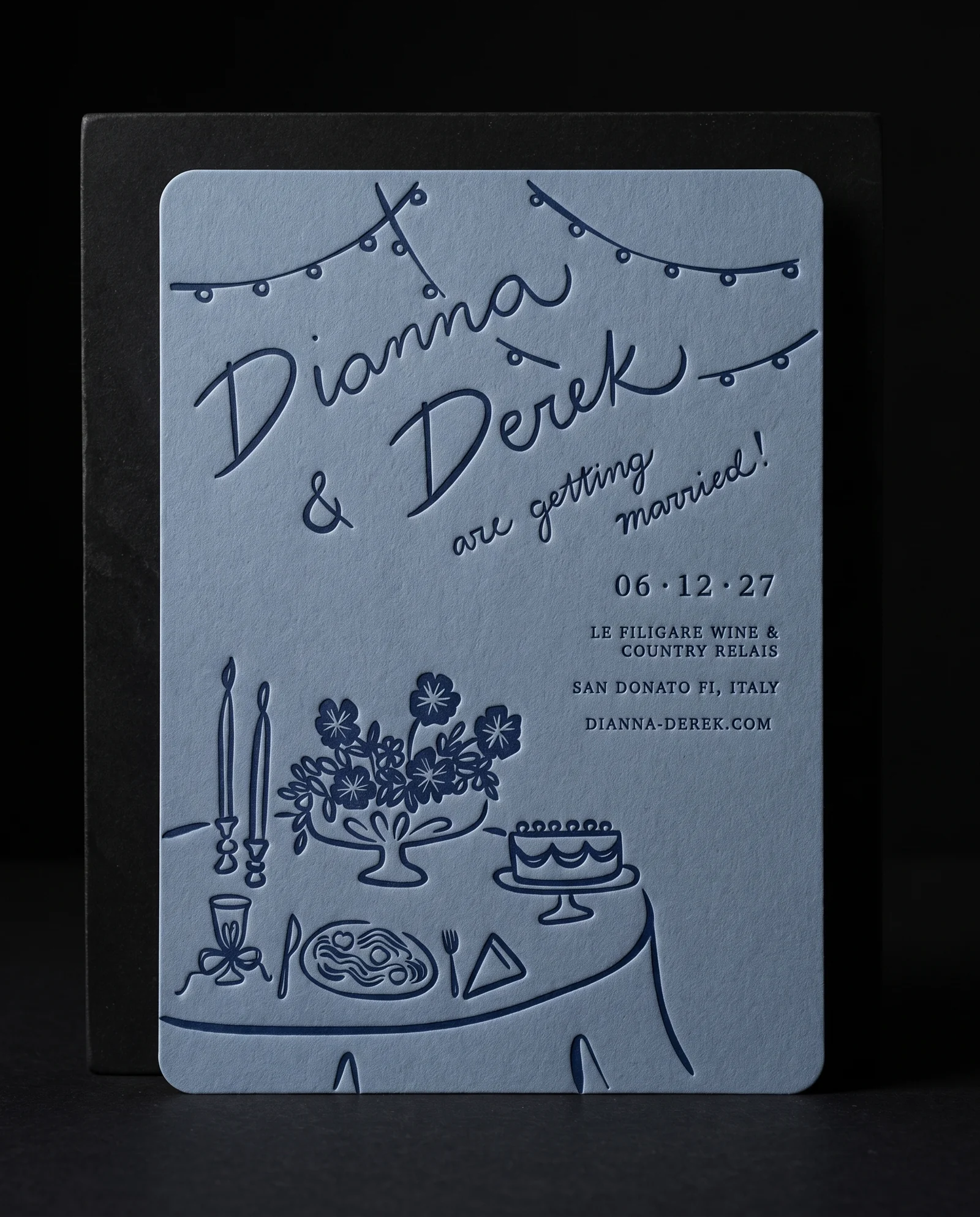
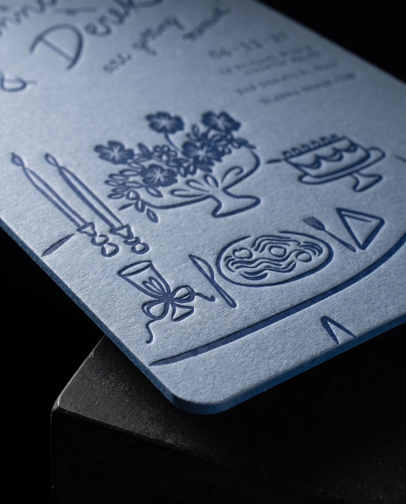
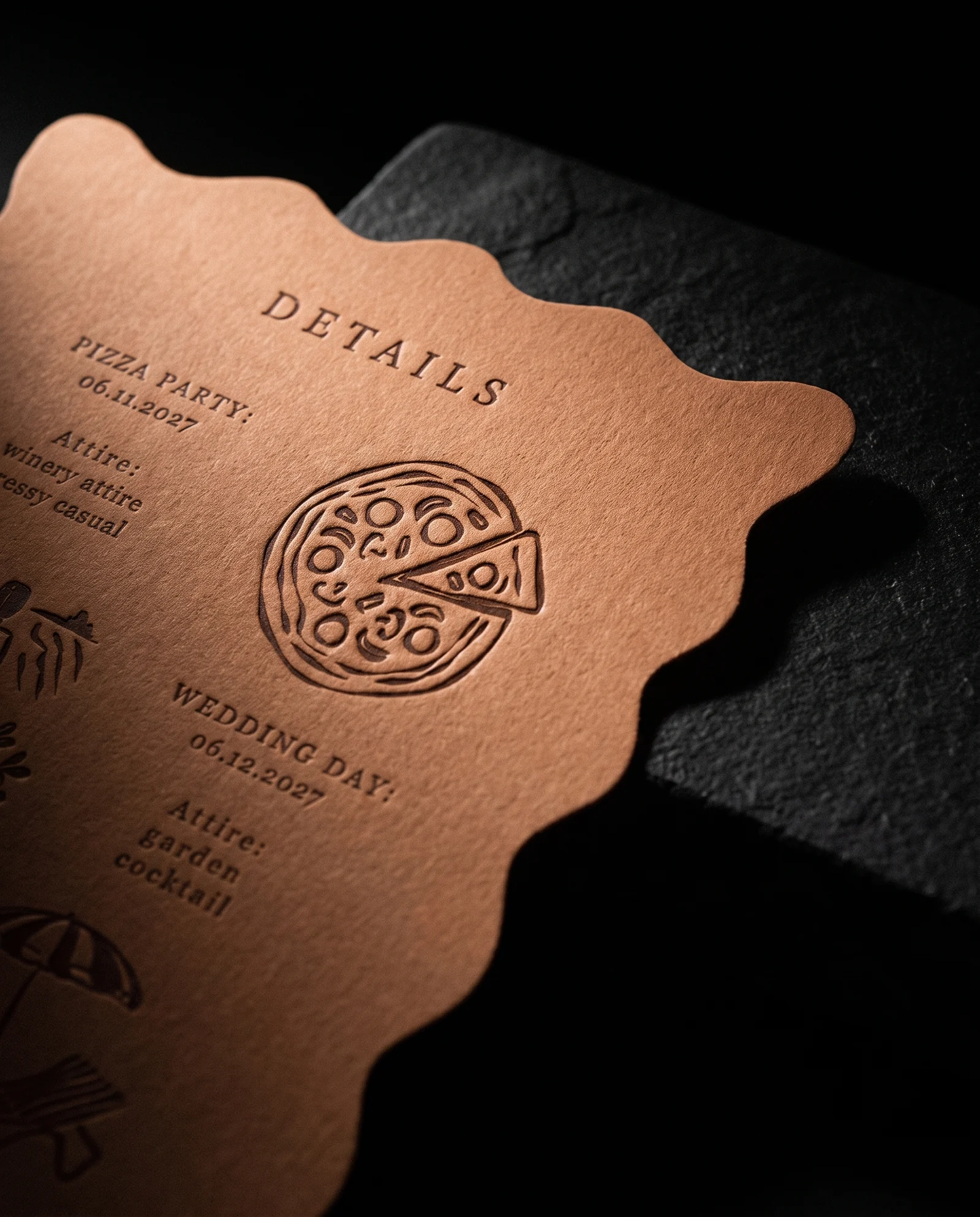
- 04Letterpress, one side. One hand-mixed navy PMS letterpress impression on the invitation front only.
- 05Cut what doesn't carry the story. Leave out both; move the doodles onto the pocket back, where they hold the suite together.
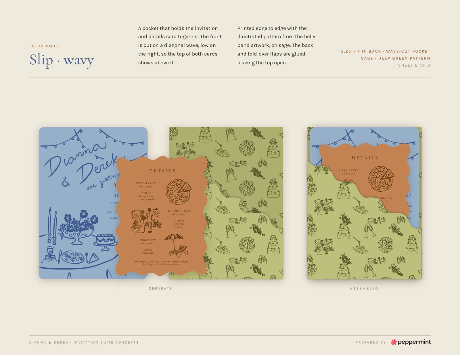
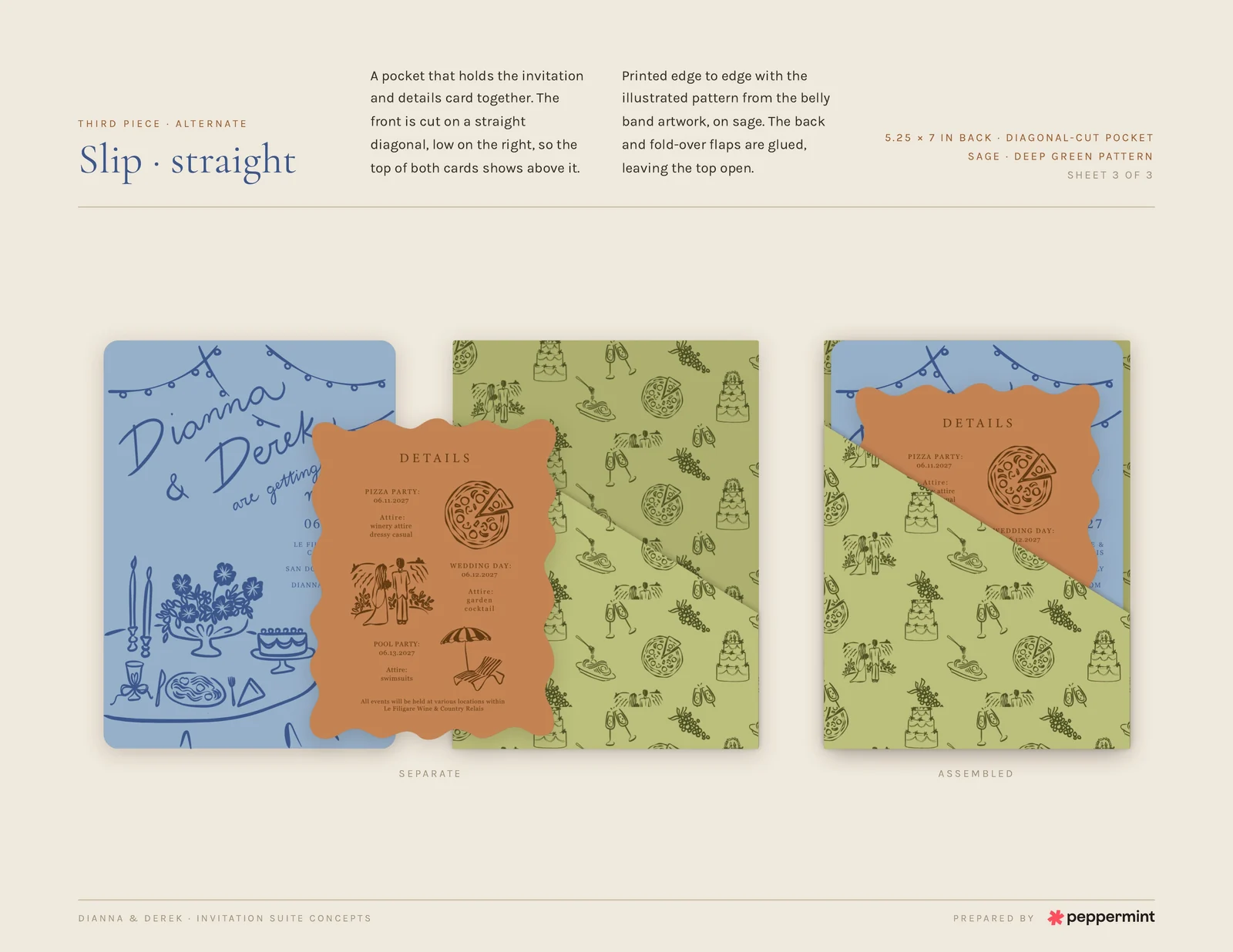
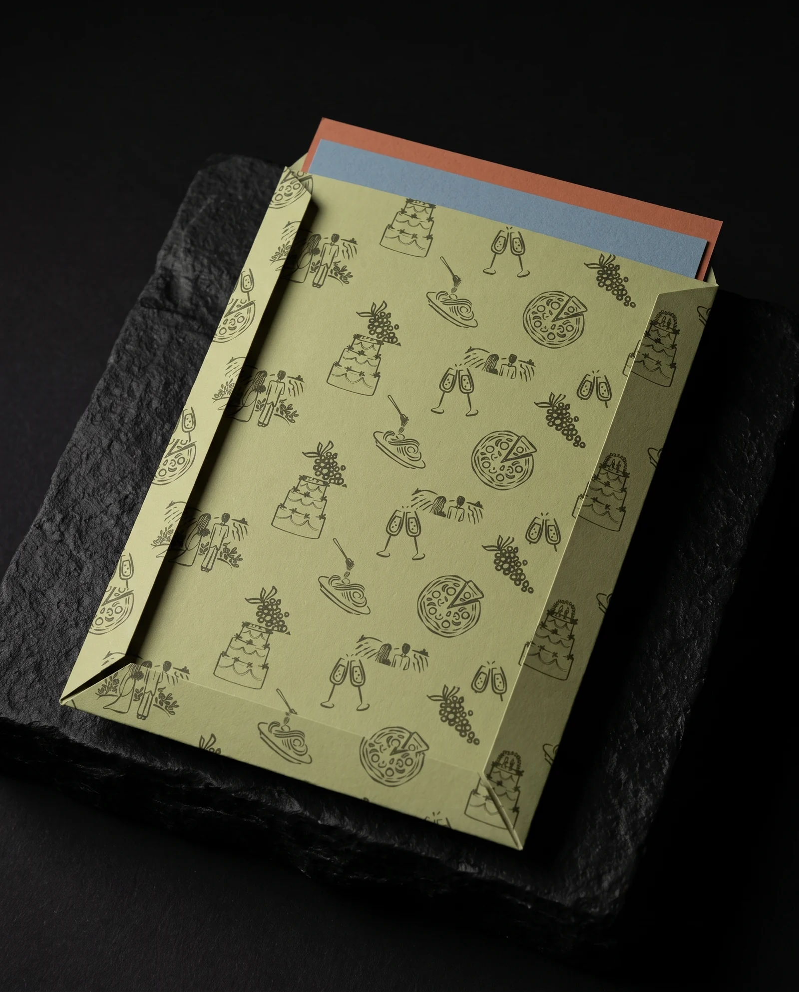
- 06A pocket instead of a third card. A sage 5.25 × 7 in pocket, doodles edge to edge on the back and a low diagonal front with an open top.
- 07One wave, or two. The couple chose rounded corners for the details card. We kept our squiggly alternative as a simulation, not their order.
The harder half was topping the compliments on the save-the-dates. The invitation needed to feel like the next chapter of the same celebration, not a new mood invented for its own sake.
The client
Dianna and Derek are bringing their guests to Le Filigare in San Donato near Florence in June 2027. The weekend moves from a pizza party to the wedding and then a pool party, and the stationery has to hold all three without reading like a schedule.
Their own designer drew the artwork: string lights above a set table, a loose doodle of cakes, pizzas, grapes and champagne, and their dog. Whimsical garden-party marks gave Bailey something personal to build around; colour-drenched papers would make the separate pieces feel related.
Starting from files that wouldn't open
Four locked Illustrator files and a failed upload could have stopped the conversation before it began. We switched to a screen share, then ZIPs by email, and worked through the artwork together.
The call booked for twenty minutes ran an hour. It gave us the real brief: sixty of every piece, a clean shape language, and permission to explore what the third piece might be before committing to a cut.
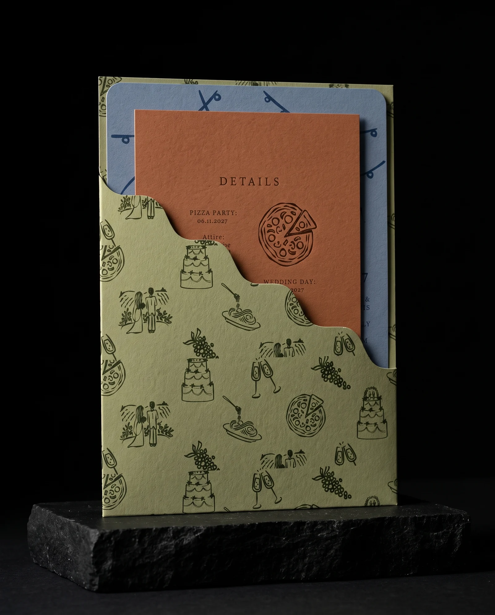
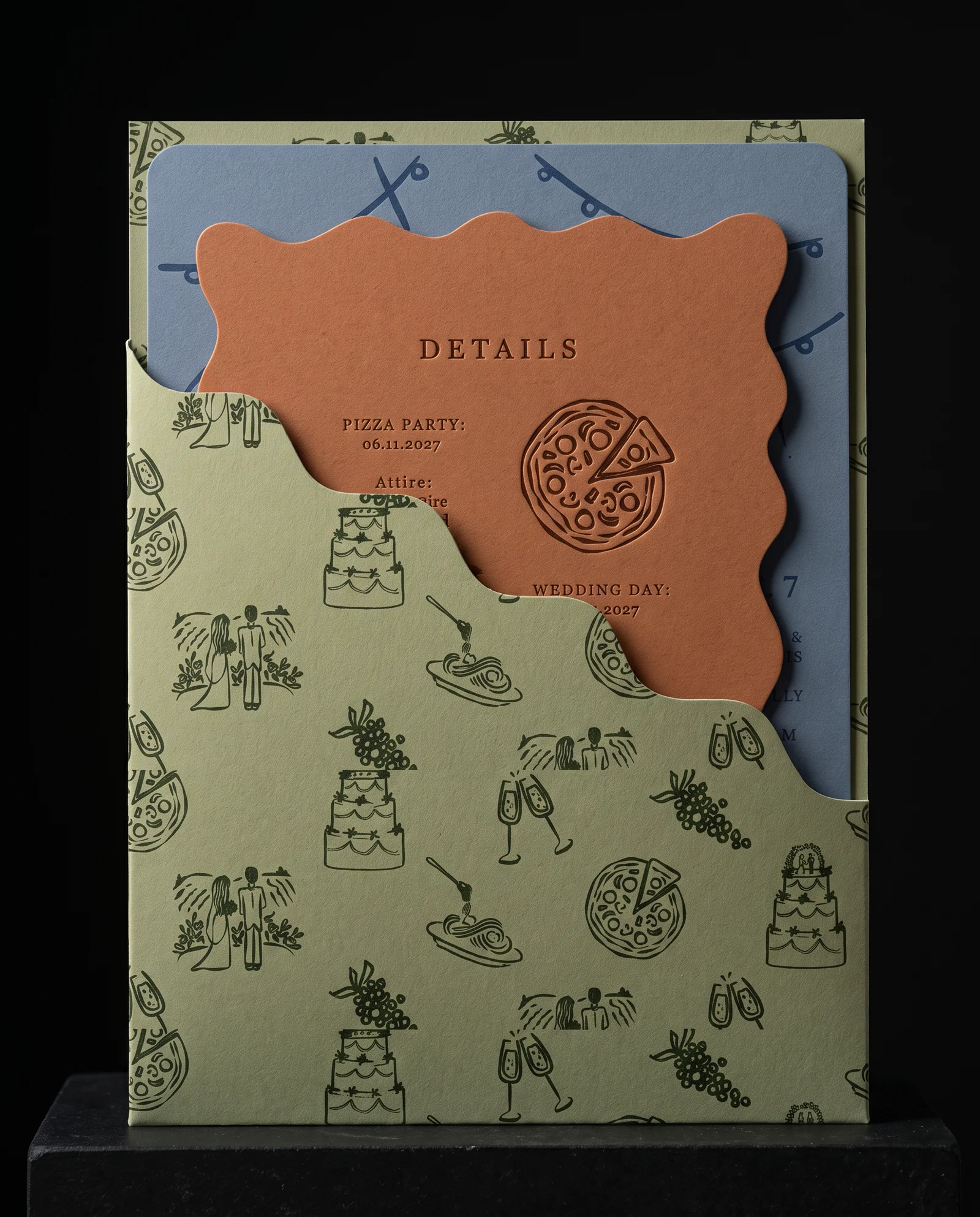
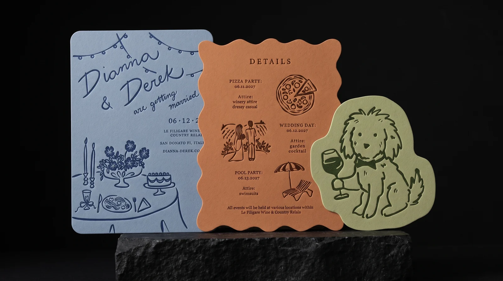
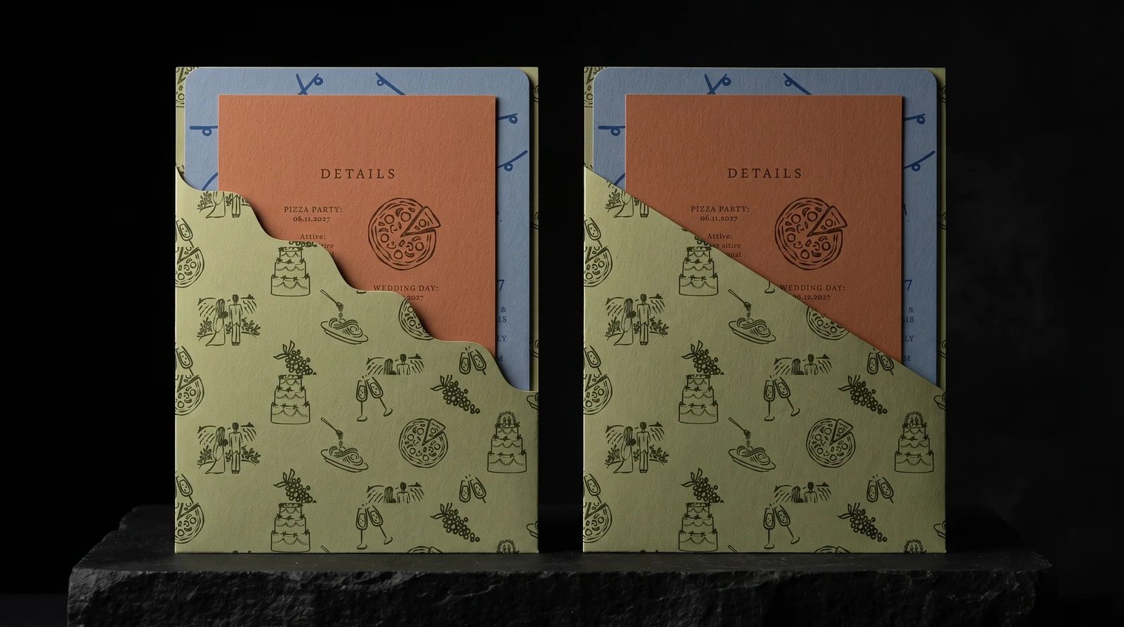
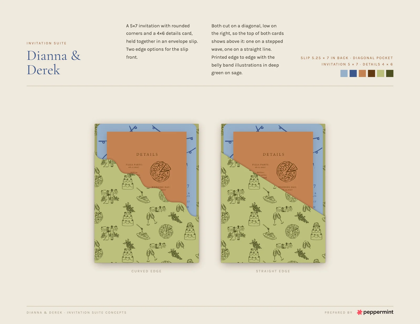
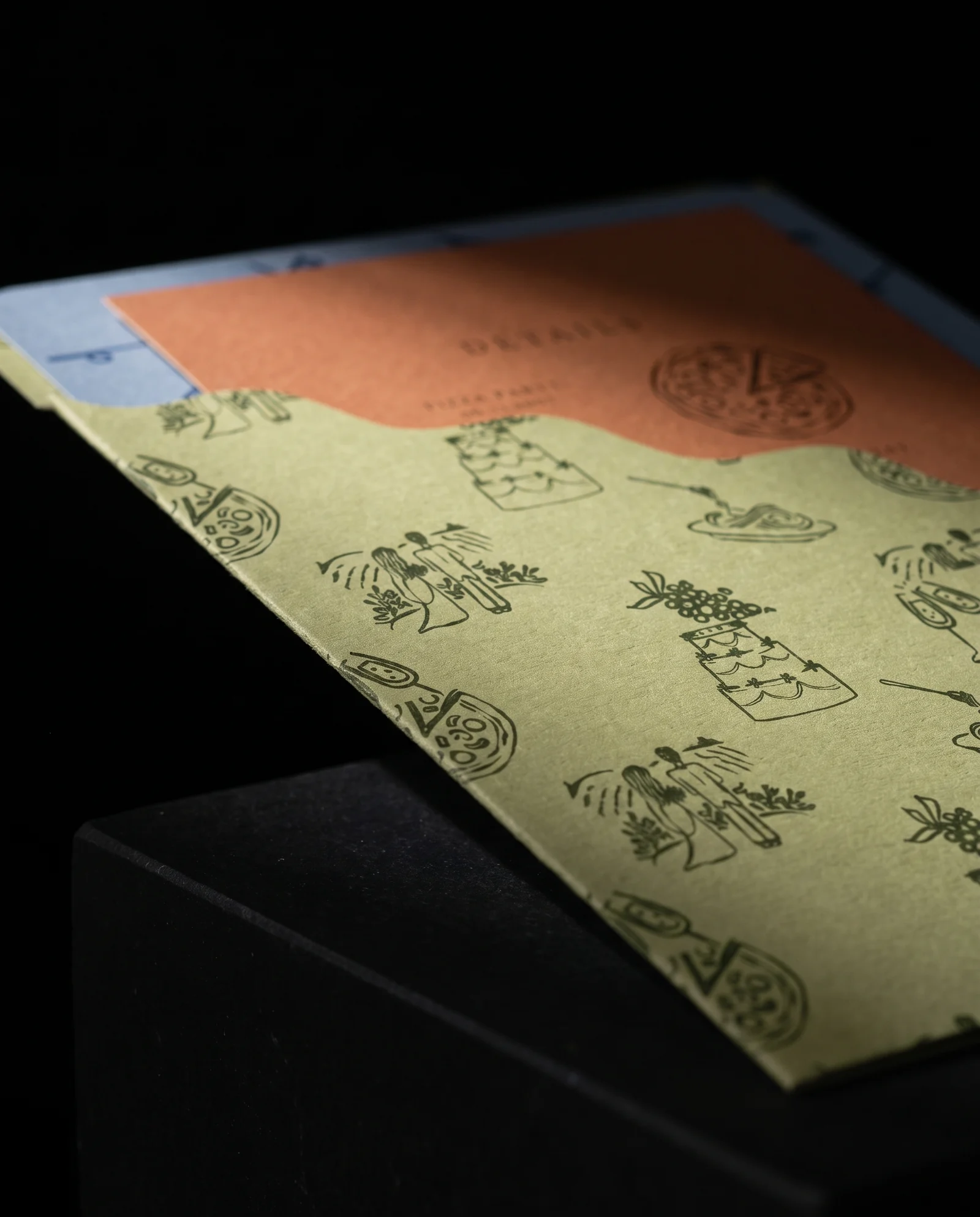
Same pocket, invitation and inks; only the card changes. Rounded corners make the family calm. The squiggle echoes the wave and the couple's doodles. It uses the same die throughout a run — a question of taste, not a claim that our version was chosen. Both are production simulations before press.
Colour in the paper, one ink on top
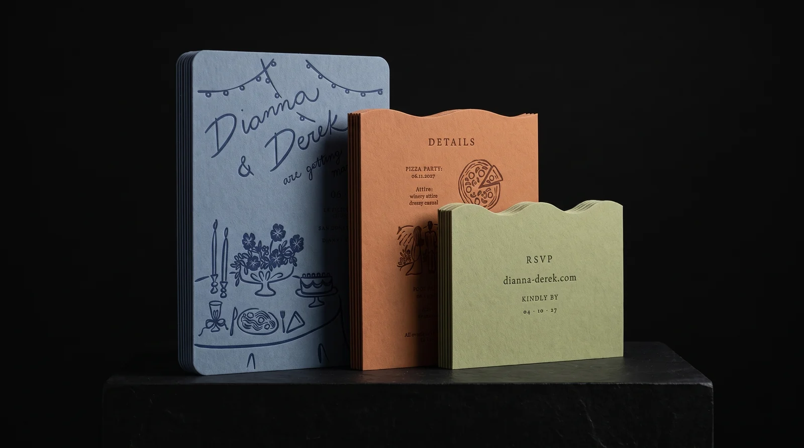
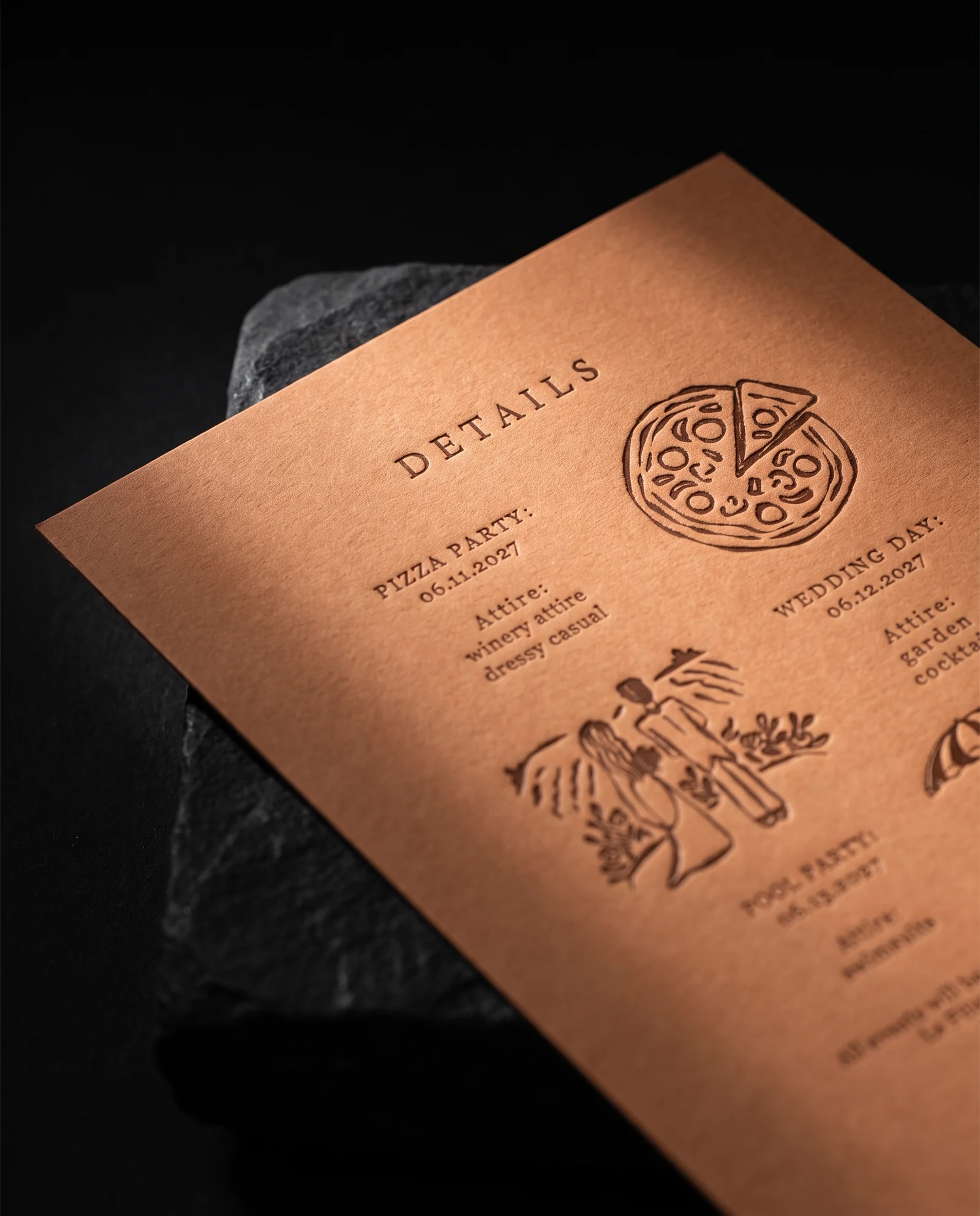
The invitation is a medium dusty blue with a darker blue illustration. Rather than flood white stock to imitate it, the plan is dyed-through paper and one hand-mixed navy letterpress ink on the front. The terracotta card and sage pocket follow the same principle, each with one hand-mixed ink.
We looked across premium European colour ranges from southern Germany, northern Italy and the UK. The exact papers and the invitation's thickness for mailing are still open; these are colour and process directions, not a claim that the stock has been ordered.
Round one: what should the third piece be?
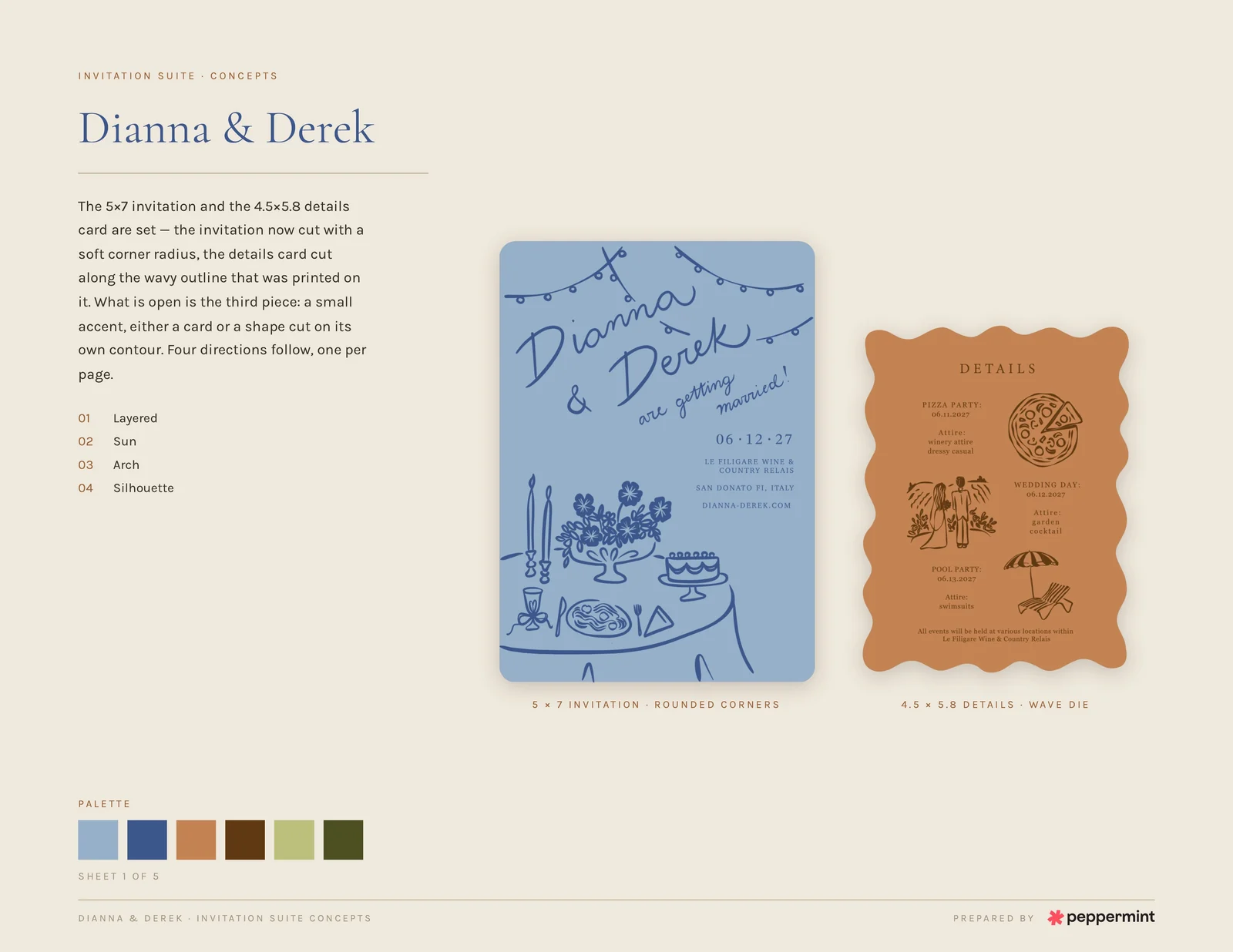
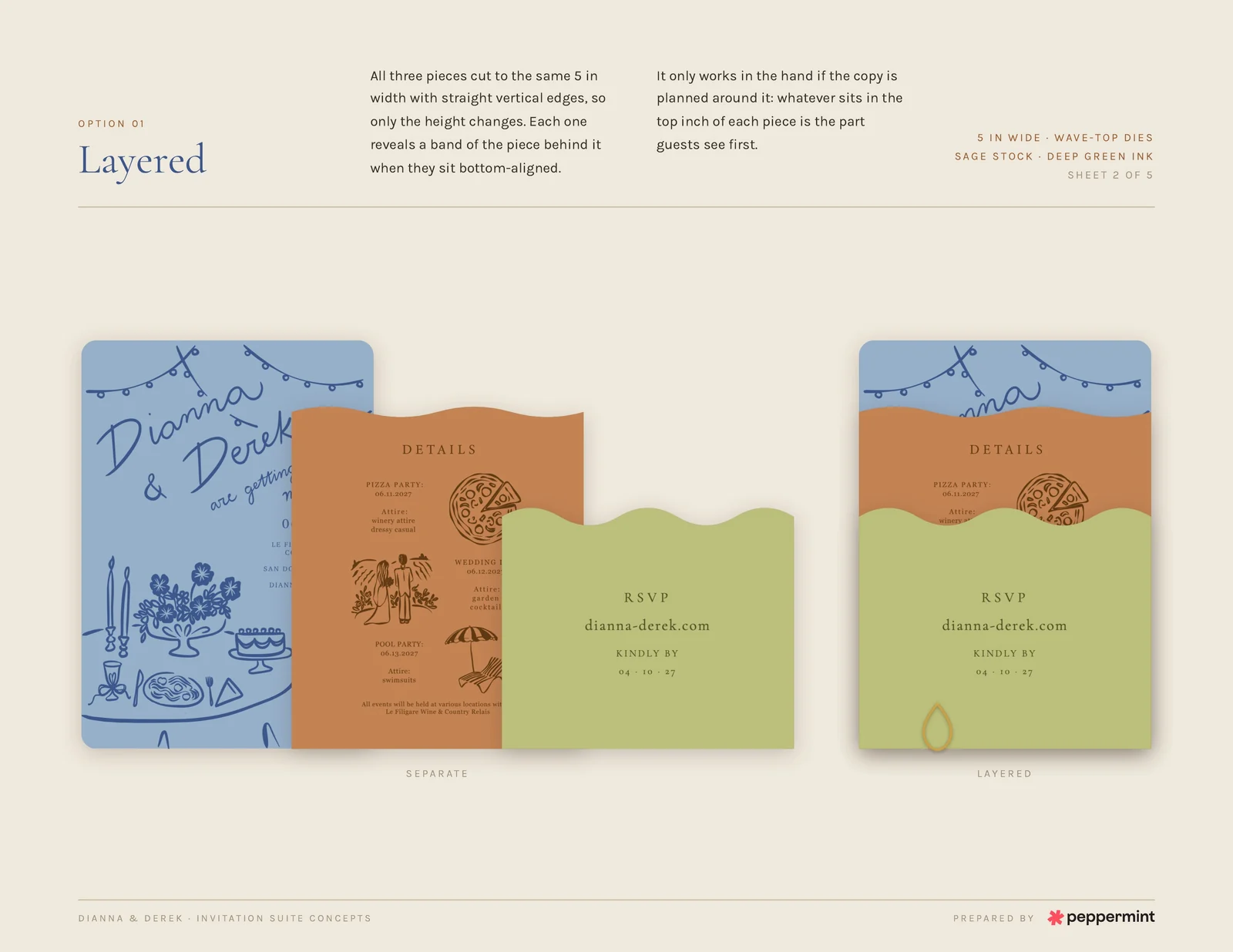
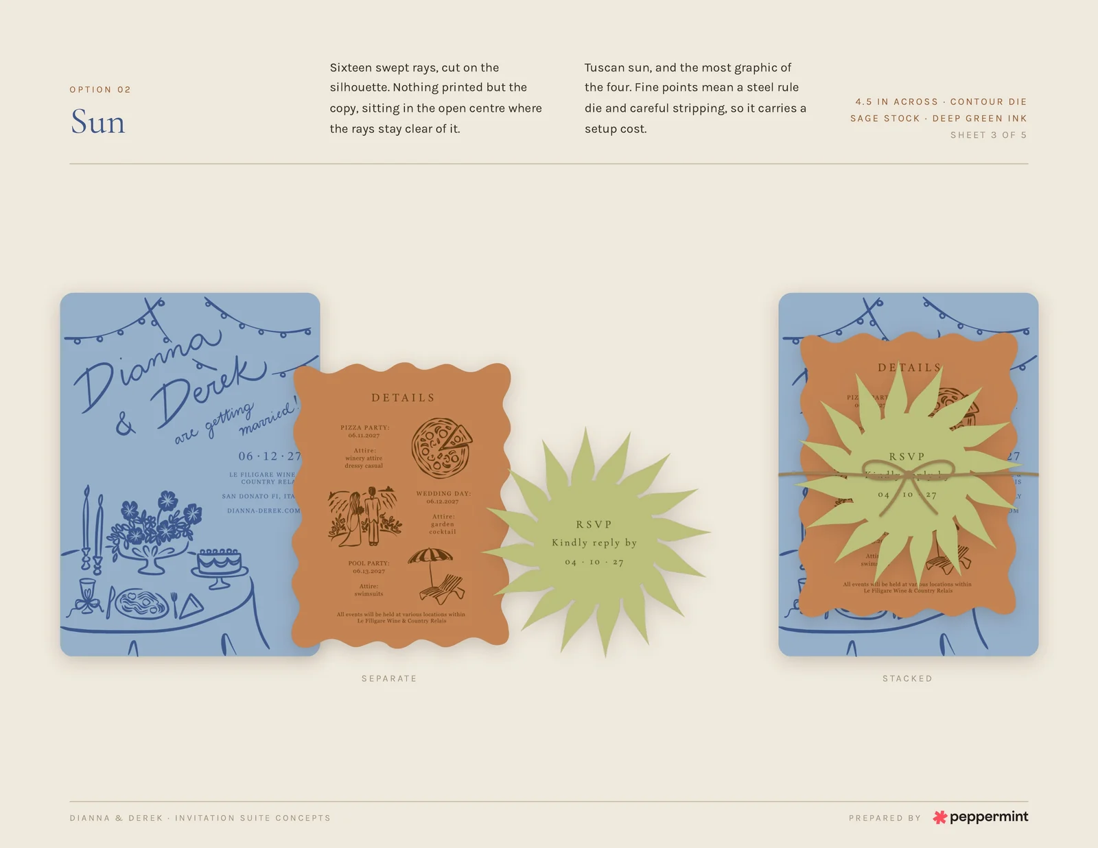
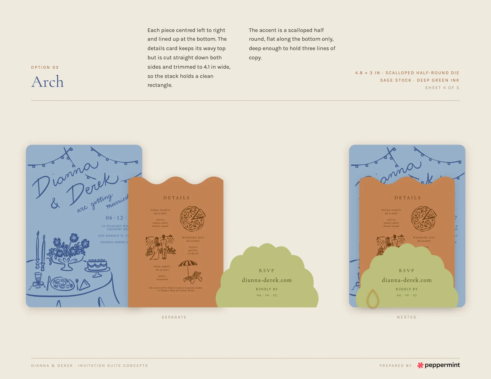
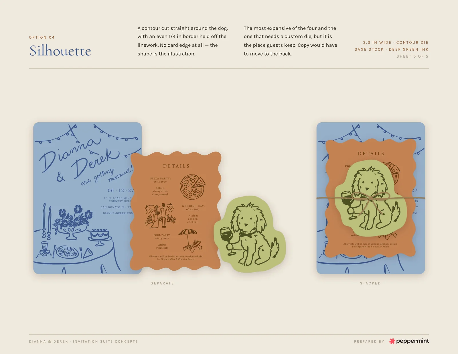
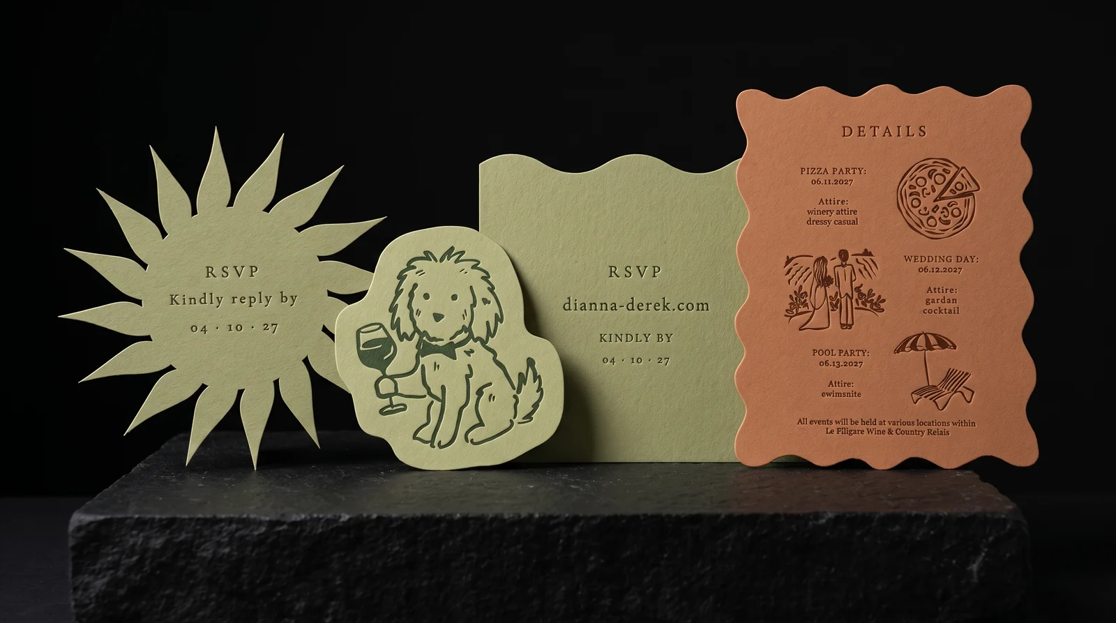
A belly band and a coaster fell away. Dianna floated a small card, so Bailey drew four ways to make it belong: Layered, Sun, Arch and Silhouette. The RSVP on these working boards is placeholder copy, not a final instruction to guests.
Silhouette, with their dog cut into the outline, was the most involved and the one a guest might keep. The other three tested different kinds of restraint before anyone committed to a pocket.
Our favourite, for the record
We would have picked Option 04, Silhouette. It was the most playful and the most expensive to make, and it's still the one Austin likes best: their dog makes the cut feel like it could belong only to them.
Layered and Sun were close behind. Every direction was one we'd have been proud to print. The couple's decision to take the suite toward a pocket was a different, equally deliberate answer to the brief.
Round two: a pocket instead of a card
Dianna sent a pocket she loved and asked if the belly band's doodles could move onto it. They could: a sage back measuring 5.25 × 7 in, with the doodles running edge to edge, glued flaps and an open top.
The front cuts diagonally, low on the right, so the invitation can be seen before the pocket is opened. Bailey showed one wave and one straight diagonal. The shape was no longer a third card; it became the thing that held the whole weekend together.
Round three: the couple's cut
‘Love it! We like the slip wavy but can we change the details card to rounded corners?’ That was the decision: keep the wave on the sage pocket, make the terracotta details card round-cornered, and let the three pieces read as one calm family.
And the one we'd have cut
We would have kept a squiggly edge on the terracotta card, echoing the wave of the pocket and the doodles on its back. So we made a simulation of that version too. It is our preferred build, not the cut Dianna and Derek approved.
Only the details-card silhouette changes between the two images below. Same invitation, pocket and inks; calm rounded corners on theirs, another playful line on ours.
About the images
The eight light-ground boards are Bailey's concept sheets exactly as she presented them. All images on the black plinth are production simulations made before press, not photographs of printed pieces. We'll replace them with real photographs once the suite is printed.
The table scene, doodles and dog came from the couple's own designer. The squiggly details card in the hero and some simulations is our preferred build; Dianna and Derek chose rounded corners instead.
Where it stands
Dianna and Derek approved the direction on 27 September 2026, after three concept rounds in a week. Quote QR-2026-1026 records the job, but the suite was not yet in production at the time of writing.
The last things to settle are invitation thickness for mailing and the exact papers. When the order runs, this record and the images should be updated with the finished pieces.
Start from these materials
Same paper, foil and finish, locked in — nothing of Dianna & Derek's artwork comes with it.
Questions
- How many extra wedding invitations should I order?
- Start with the number of households, not guests, then allow a few complete suites for late additions, keepsakes and addressing mistakes. Dianna and Derek planned sixty of each piece; the right extra quantity depends on their final list.
- What is colour drenching in wedding stationery?
- Here it means choosing paper dyed through its thickness rather than printing a solid colour onto white paper. The cut edge stays coloured, and one carefully mixed ink can sit on top.
- What is an invitation pocket?
- A folded and glued piece that holds the invitation and details together. This one has a 5.25 × 7 in sage back, an open top and a wave-cut diagonal front that leaves the invitation visible.
- Is letterpress worth it for wedding invitations?
- If you want the impression to be part of the design, yes. One ink pressed into a suitable uncoated paper has a physical depth flat print cannot reproduce; thickness and the final paper still need to be chosen with mailing in mind.
- Does a die-cut shape cost more than a plain wedding invitation?
- A custom silhouette needs a cutting die and a separate setup. Dianna and Derek chose to put the bold wave on the pocket, while the invitation and details card keep rounded corners.
- Should a wavy card go inside a wave pocket?
- It can: the repeated line ties the pieces together. But a rounded-corner card lets the pocket's wave do all the talking. The couple chose the calmer version; the studio's squiggly alternative is shown as a simulation.
- Does thick letterpress paper cost more to mail?
- It can, depending on the full suite's weight and thickness once assembled. The invitation's paper and thickness were still open when this direction was approved, so the finished mailer should be weighed before postage is set.