Yellows · spot ink
PMS 1235 U
Pantone® 1235 Uncoated — PANTONE 1235 on uncoated stock
Translucent — will not cover dark stock. Printers write it PMS 1235 U; brand guidelines usually write it Pantone® 1235 Uncoated. Same ink, same plate — the letter is the paper it lands on. On coated stock the same colour is PMS 1235 C, and it does not look the same.
On-screen approximation — not a colour-accurate reference. Match to a physical PANTONE® chip before you sign off.
Coated vs uncoated, honestly
See 1235 C and 1235 U side by sideThe same ink is not the same colour on the two stocks. On coated sheets the ink sits on a sealed surface: denser, brighter, sharper edges. On uncoated the fibres absorb it: softer, duller, slightly lighter, and warm colours lose the most punch. Some colours change character outright — brights go chalky, deep navies go grey-blue.
| Stock | Reference | What you get |
|---|---|---|
| Coated | 1235 C | Denser and brighter. Ink sits on a sealed surface, edges stay sharp. |
| Uncoated | 1235 U | Softer and less saturated. Fibres absorb the ink; expect a step down in punch. |
How it behaves in production
- A warm golden yellow that is often specified as a stand-in for gold. It is not gold — if the brand wants metal, foil it.
On dark stock
Offset and letterpress inks are translucent. On a dark or coloured stock a light ink will not cover — it sinks into the sheet and reads tone-on-tone. For light colour on dark paper the answer is foil stamping or an opaque screen pass, never a straight PMS hit.
See the foil directoryThe paper matters as much as the ink
A CMYK build of a spot colour is an approximation, not the colour. It matters most on large flat solids, on brand-critical marks, and in the brights and deep blues where process simply cannot reach. It matters least in small type and inside photography.
Browse the paper directoryCommon questions
- What does PANTONE 1235 look like on uncoated paper?
- Softer, duller and a touch lighter than the coated chip. Uncoated fibres absorb the ink instead of letting it sit on a sealed surface, so saturation drops across the board. The uncoated swatch here is modelled from the coated approximation — order a printed sample before you sign off.
- Can you print PANTONE 1235 on dark or coloured stock?
- Not as a standard ink hit. PANTONE 1235 is translucent, so on dark stock the paper colour comes through and the result is tone-on-tone. For this colour on dark paper we foil stamp or run an opaque screen instead.
- Can PANTONE 1235 be matched in CMYK?
- Sometimes. A process build is usually acceptable inside imagery or small type and usually visible on a large flat solid or a brand mark. If this is your brand colour, keep it a spot.
PANTONE® is a registered trademark of Pantone LLC. Print Peppermint is not affiliated with or endorsed by Pantone LLC. Codes are referenced to identify the inks we print.
Pairs beautifully with
Three combinations that hold up on press. Open one and the Studio starts with the stock, the foil and the ink already locked in.

PANTONE 1235 on Colorplan Bright White
PANTONE 1235 on Colorplan Bright White. Uncoated fibres drink the ink, so expect it a step softer than the coated chip — that softness is the reason to do it.
Compatibility matrix
Start this combination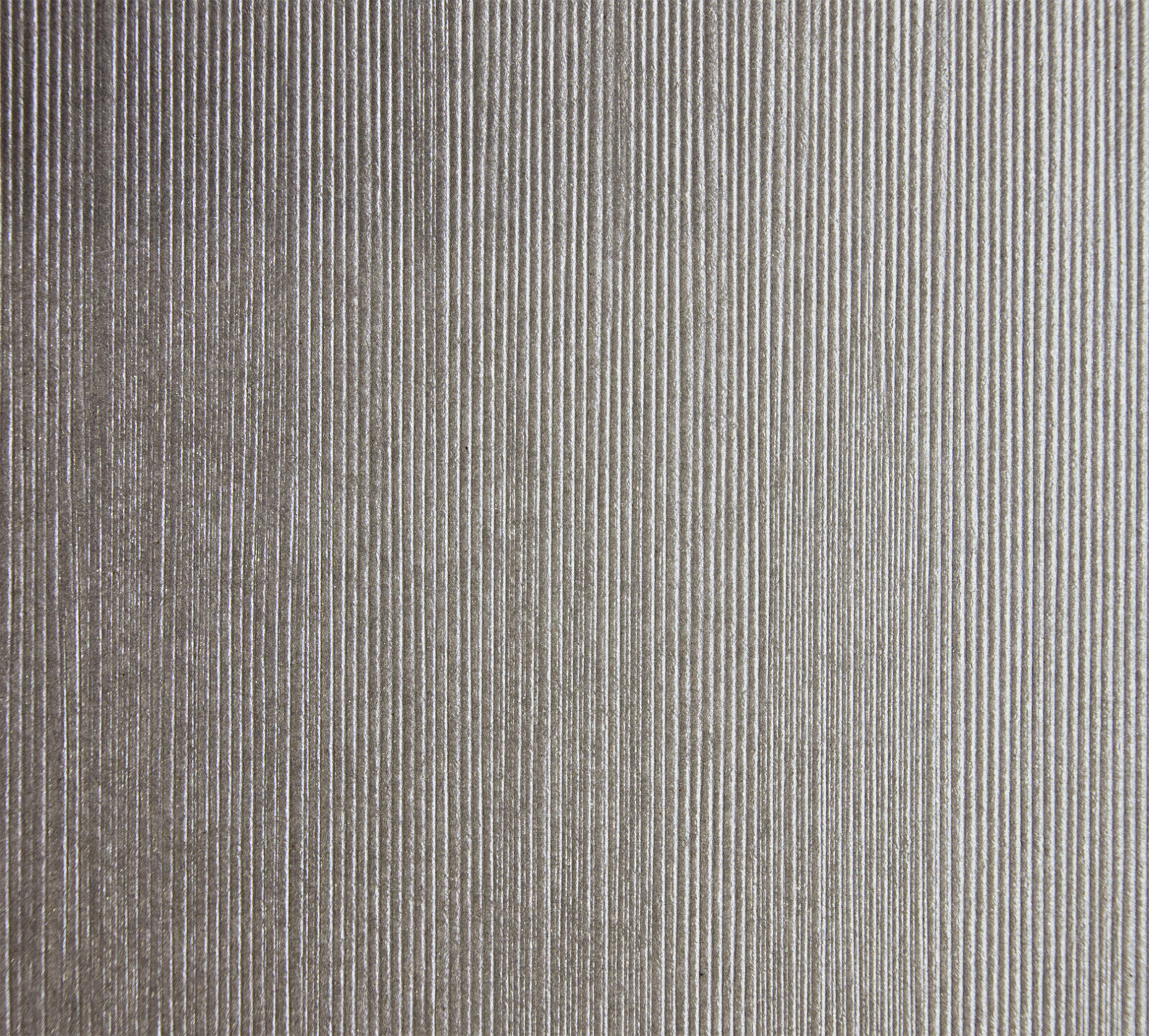
PANTONE 1235 on Constellation Jade E21 Silk emboss
PANTONE 1235 on Constellation Jade E21 Silk emboss. Uncoated fibres drink the ink, so expect it a step softer than the coated chip — that softness is the reason to do it.
Compatibility matrix
Start this combinationPANTONE 1235 on 16pt
PANTONE 1235 on 16pt. Uncoated fibres drink the ink, so expect it a step softer than the coated chip — that softness is the reason to do it.
Compatibility matrix
Start this combination