Case study · Labels · Badass Bitters
Badass Bitters — labels
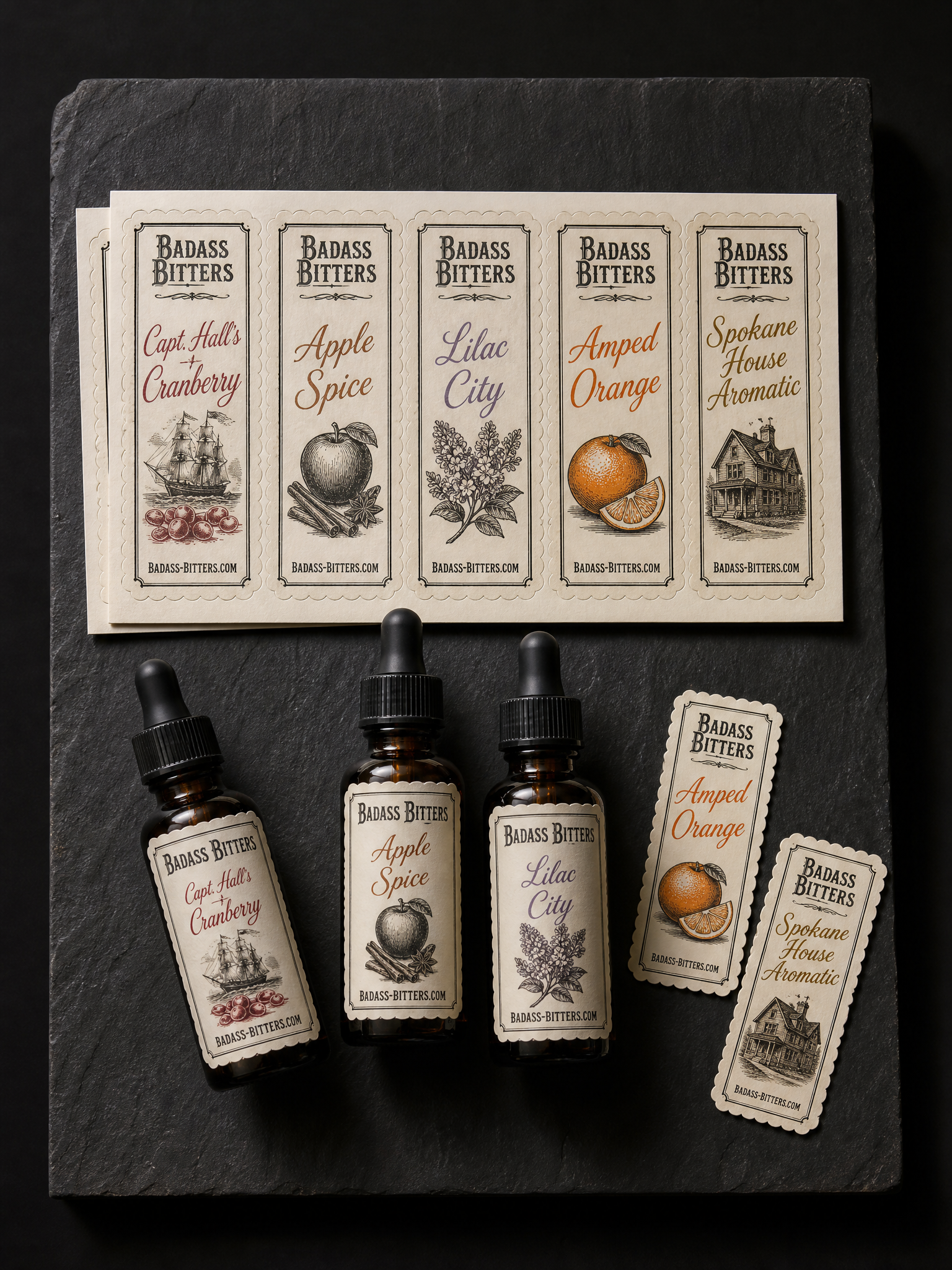
A Spokane bitters maker needed a label family that read as one brand on a shelf while each flavour kept its own colour. The black plate carries the structure; the accent plate changes five times.
Two rules
- 01One black plate, five accents. Held the black structure plate on press across the set and changed only the accent plate. Five labels, one makeready for the shared plate.
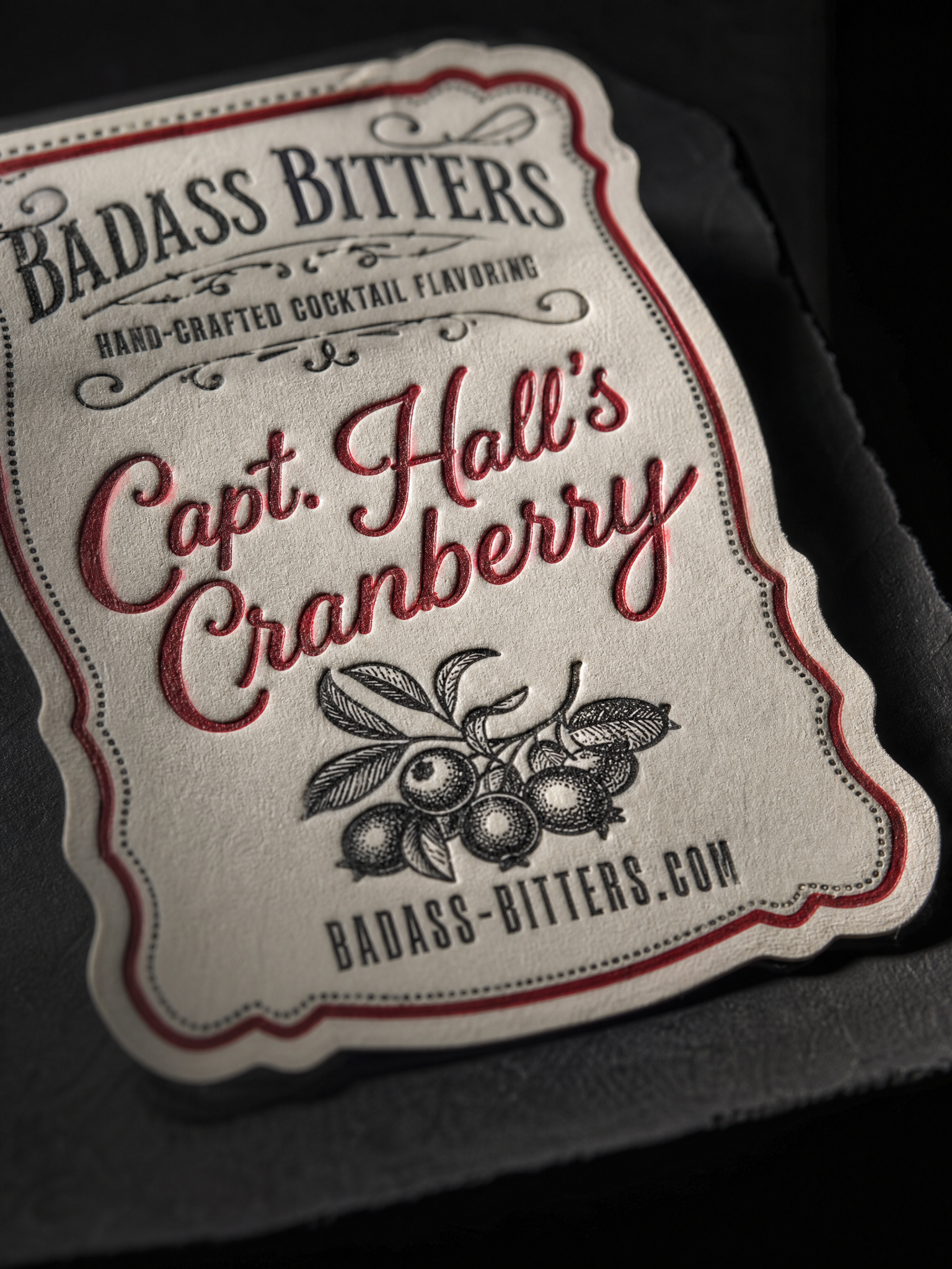
- 02Scalloped kiss-cut on letterpress stock. Printed and impressed first, then kiss-cut with a fresh die and a light strike so the backing sheet stays intact.
The brief
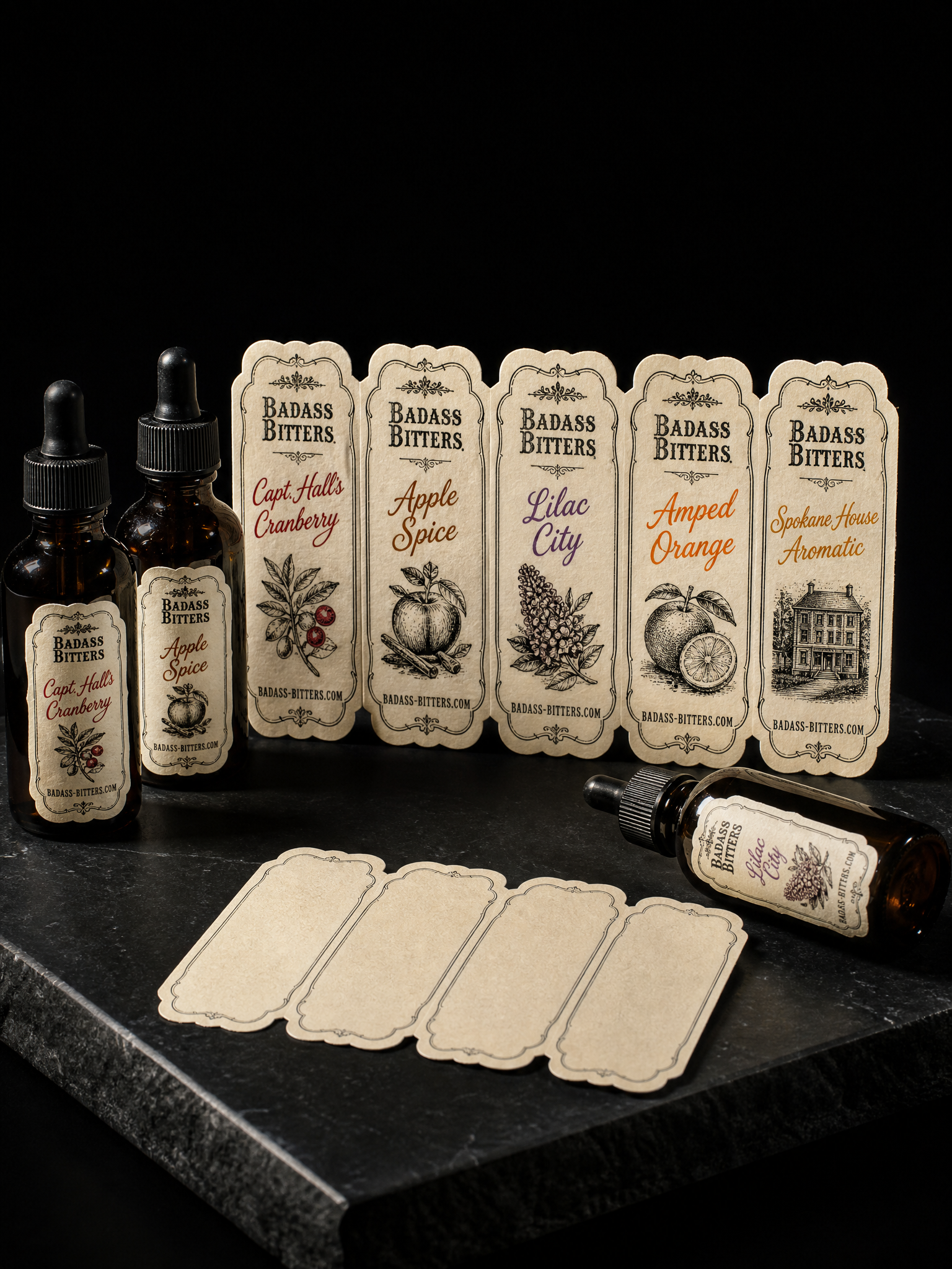
Set of five 2×4 in bottle labels on 60# uncoated cream label stock, each a different flavour: "Capt. Hall's Cranberry", "Apple Spice", "Lilac City", "Amped Orange", "Spokane House Aromatic"; vintage apothecary layout with a hand-lettered flavour name, a small engraved illustration and "BADASS-BITTERS.COM" in a condensed serif at the foot; two-colour letterpress in black and one accent Pantone per flavour (cranberry red, cinnamon, lilac, orange, amber); kiss-cut with a scalloped edge; three labels applied to small amber dropper bottles, two lying flat.
Start from these materials
Same paper, foil and finish, locked in — nothing of Badass Bitters's artwork comes with it.
Questions
- What is the Badass Bitters labels printed on?
- 60# uncoated cream label stock, 2-colour letterpress, 5 Pantone accents, Scalloped kiss-cut. Every line of that spec is what actually ran, not a proposal.
- Why one black plate, five accents?
- Five separate two-colour runs would drift in impression and cost five makereadies. Held the black structure plate on press across the set and changed only the accent plate. Five labels, one makeready for the shared plate.
- Can Print Peppermint print this specification again?
- Yes. The materials on this page are live registry items, and the Studio link opens with the same paper, foil and finish locked in for your own artwork.