METAL
Which Metal Business Card Color to Choose
Comparing all 8 metal business card colors: silver, black, gold, rose gold, copper, brass, iridescent, and white stainless steel. Which one fits your brand — and which ones to avoid.
By Austin Terrill · Print Peppermint · 14 min read
On this page
- The eight metals
- Silver (natural stainless steel)
- Black
- Gold
- Rose gold
- Copper
- Brass
- Iridescent
- White
- How to narrow down your choice
- Surface finish: how it interacts with color
- Pricing differences between colors
- Common questions
- Can I see the metals before ordering?
- Which metal color is most popular?
- Can I combine two metal colors on one card?
- Which color hides fingerprints best?
- Is the gold coating real gold?
- Which metal works best with NFC?
We offer metal business cards in eight stainless steel colors: silver, black, gold, rose gold, copper, brass, iridescent, and white. They are not interchangeable. Each one creates a different first impression, works better in certain industries, and pairs differently with design techniques and surface finishes.
This guide goes through all eight with honest opinions on what works, what doesn't, and who each color is actually for. If you're deciding between two or three options, this should settle it. If you're not sure where to start, read the silver and black sections first — those two cover the majority of metal card orders.
The eight metals
Silver (natural stainless steel)
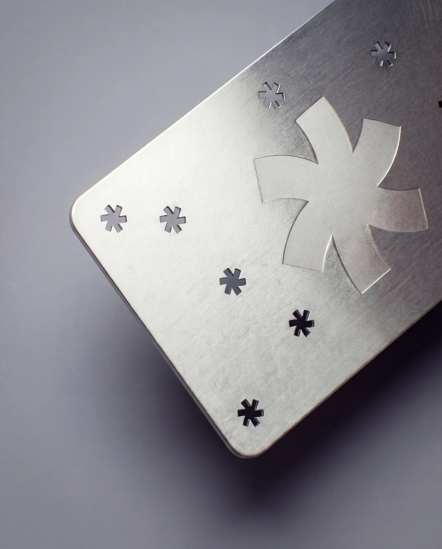
Silver isn't a coating — it's the actual color of the base stainless steel. That's part of what makes it appealing: there's no surface treatment to overthink. What you see is the raw material.
In brushed finish, silver is the most visually recognizable as metal. The grain catches light and creates that shifting highlight band that makes people look twice. In matte, silver is quieter — still clearly metal by weight, but visually understated. In mirror, silver becomes a literal reflector — dramatic but fingerprint-prone.
Silver is the most versatile metal color because it carries no strong associations beyond "modern" and "industrial." It doesn't say luxury, it doesn't say fashion, it doesn't say conservative. It says: this is a well-made object. That neutrality is a strength — it works across virtually every industry and design style.
Laser engraving on silver creates subtle, refined contrast. The engraved marks appear slightly darker than the surrounding surface — not a dramatic pop, but a distinguished, readable distinction. If you want high contrast on silver, add cutouts — the open space and shadow play create more visual drama than the engraving alone.
Silver is also the least expensive option because no PVD coating is required.
Best for: Technology, architecture, consulting, any brand with a modern or minimalist identity. Also the right choice if you're trying metal for the first time and want a safe starting point.
Be cautious if: Your brand identity relies on warm tones or rich color — silver is cool-toned and industrial. Pair it with a warm surface (light wood desk, kraft paper, warm lighting) to soften the effect if needed.
Black
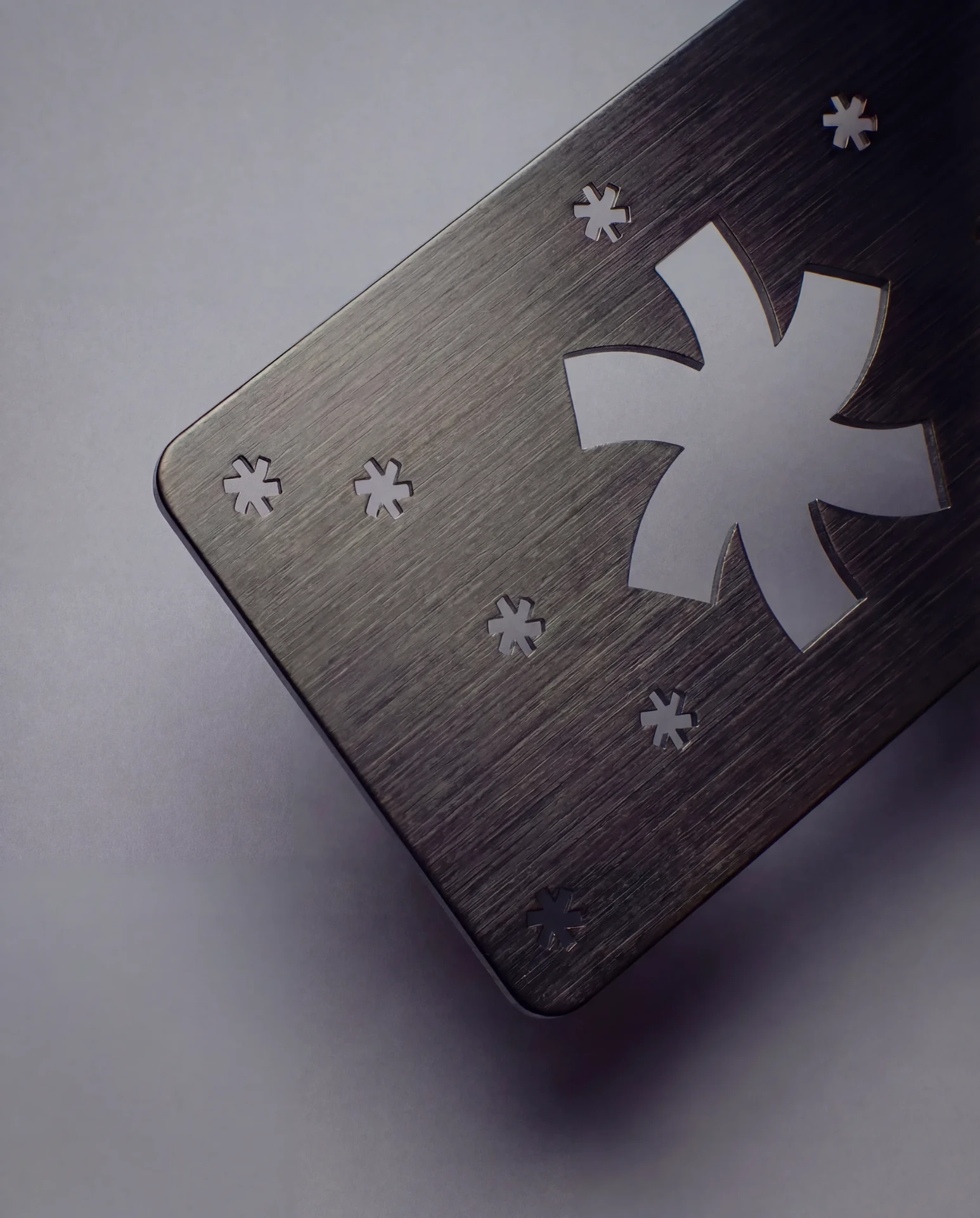
Black is our most ordered metal color, and it's easy to see why. When the laser engraves through the black PVD coating, it reveals the bright silver stainless steel underneath. This creates the highest-contrast design effect of any metal color — silver lines against a black surface. Text is legible. Logos pop. Details read cleanly even at small sizes.
The black coating itself has metallic depth — it's not flat matte black like paint or powder coat. Under direct light, you can sense the metal underneath. In brushed finish, the linear grain shows through the black coating as subtle lighter streaks. This gives the surface dimension that pure-black surfaces lack.
Black metal cards have a striking quality that reads across almost any industry. They feel premium without feeling flashy. The weight says serious. The surface says deliberate. The contrast says professional.
Laser engraving on black is the strongest engraving combination available — it's effectively silver-on-black, the same color logic as a tuxedo or a Rolex Submariner dial. Every line, letter, and shape reads with confidence.
Color printing on black is worth considering for brands with specific color requirements. The CMYK colors sit on top of the dark PVD surface, which gives them a deeper, richer quality than printing on silver — similar to how printing on black paper with white ink creates a different mood than printing on white paper with black ink.
Best for: Real estate agents (the #1 category for black metal), creative directors, luxury services, legal and financial professionals, anyone who wants the card to feel authoritative. Black is the metal equivalent of a dark suit — appropriate almost everywhere, immediately credible.
Be cautious if: Your brand identity is light, airy, or pastel-toned. A black metal card would clash with a brand that uses soft pinks, whites, and light blues. In that case, silver, white, or rose gold is a better material match.
Gold
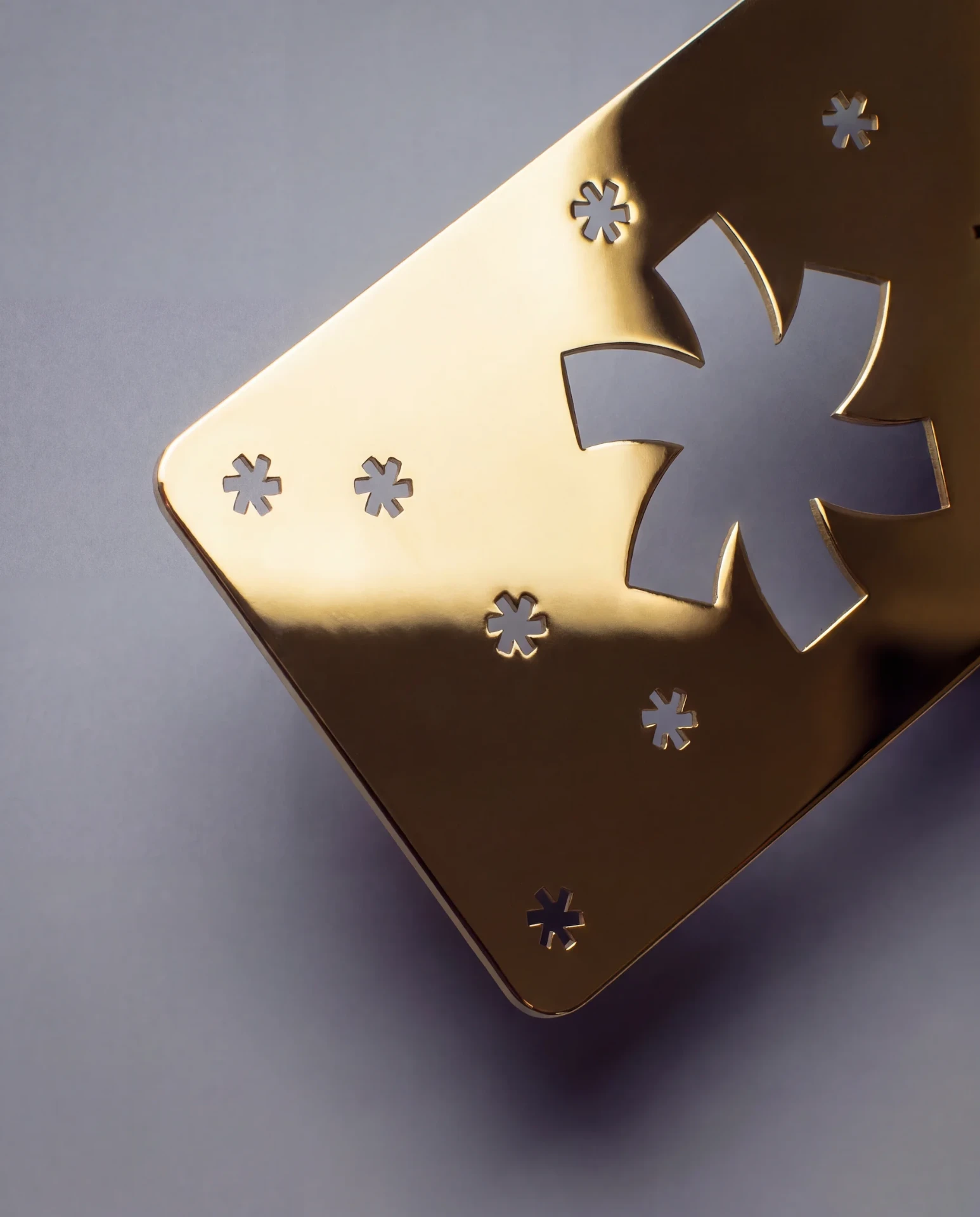
A gold metal card is a statement. It says something before the other person even reads your name. Whether that's the right thing depends entirely on your brand.
Gold works when it's consistent with the rest of your brand material language. If your logo uses gold accents, your website has gold elements, your packaging has gold foil — then a gold metal card is the physical extension of an established identity. It feels coherent and intentional.
Gold fails when it's an isolated flourish — when the gold card exists in a brand that otherwise uses no gold. In that case, it reads as overreaching. Like wearing a gold watch with sweatpants. The disconnect undermines the impression.
The PVD gold coating is a warm, rich 18K gold tone — genuine gold warmth with metallic depth. Not brass (which is greener), not yellow (which is flatter), not orange (which is wrong). In brushed finish, the gold surface has beautiful variation as light moves across the grain. In matte, it's more even and restrained. In mirror, it's opulent — and demanding of a confident design to match.
Laser engraving on gold reveals steel underneath — creating a silver-on-gold contrast. Subtle and elegant. For higher contrast, consider printing dark text/logos rather than engraving.
Best for: Jewelers, luxury real estate developers, high-end hospitality, fashion brands, event invitations, VIP cards. Industries where gold is an expected material signal.
Be cautious if: You work in technology, healthcare, education, non-profit, or any field where gold might read as excessive. A tech founder handing out a gold metal card at a startup meetup will get a reaction — but not the right one.
Rose gold
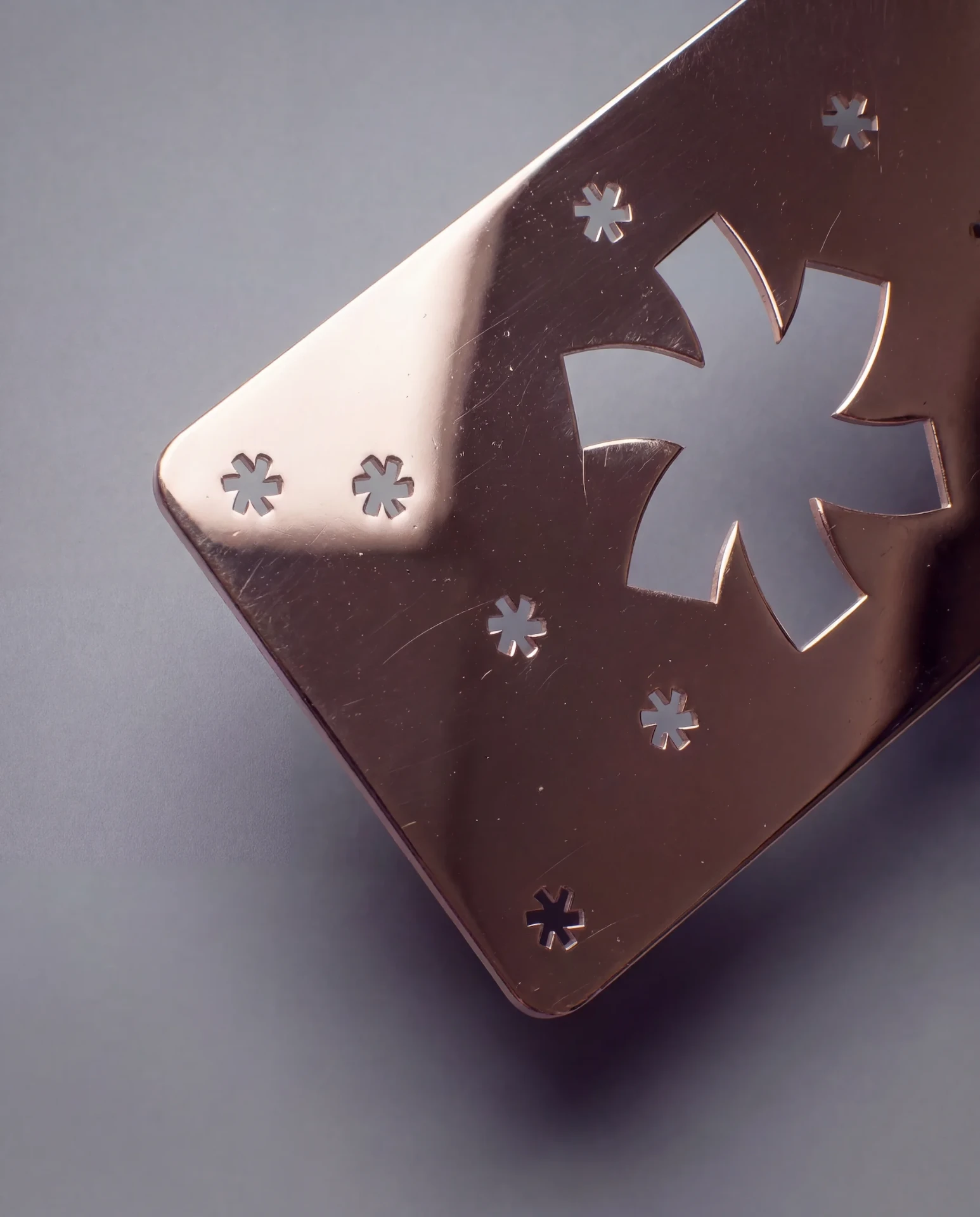
Rose gold occupies a specific niche: modern, warm, and gendered-neutral despite early associations with feminine aesthetics. The color — a soft pink-copper metallic — became mainstream through consumer electronics (Apple's rose gold iPhone) and has settled into a stable position in the design vocabulary.
On a metal card, rose gold is warmer than silver, pinker than gold, and cooler than copper. It's the most "contemporary" of the warm metallics — it signals 2020s design sensibility more than timeless tradition. That's both its strength (it feels current and considered) and its limitation (it may eventually feel dated in a way that silver and black won't).
In brushed finish, rose gold has a delicate shimmer — the pink-gold tone shifts gently across the grain. In matte, it's softer and more understated. Mirror is available but rarely ordered — the pink-gold tone in mirror finish can appear too saturated.
Laser engraving on rose gold reveals cool silver steel underneath, creating a warm-to-cool contrast that's distinctive and refined.
Best for: Beauty and cosmetics brands, wedding planners, interior designers, photographers, wellness practitioners, boutique retail. Brands with aesthetic sensitivity and warmth.
Be cautious if: Your industry is conservative (finance, law, government) or your personal brand is masculine-leaning. Rose gold is broadly versatile but not universally so — know your audience.
Copper
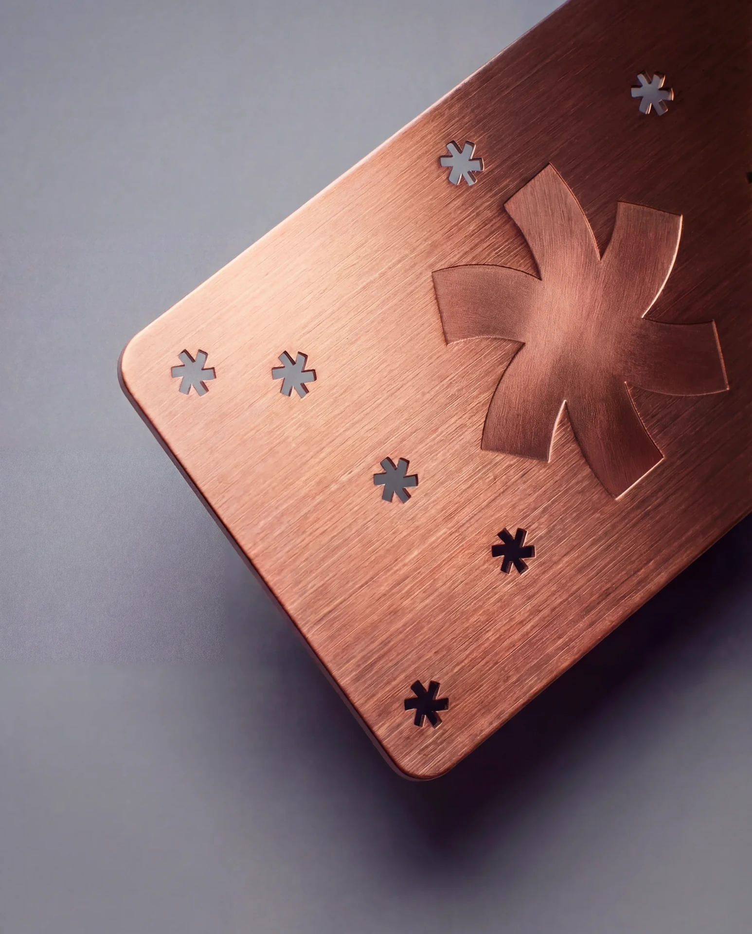
Copper is the earthiest of the warm metals — reddish-brown, almost antique-looking, with a natural warmth that gold and rose gold don't quite achieve. Think new copper pipe, a polished copper kettle, the patina of an old coin. It's warmth rooted in materiality rather than fashion.
Copper is underappreciated. It gets overlooked in favor of gold and rose gold, but in the right context, it creates an impression neither of those can: established, crafted, grounded. A copper card on a dark wood desk looks like it's been there for decades, even though it was made three weeks ago.
Laser engraving on copper reveals silver steel through reddish-brown — an unusual, earthy contrast that's hard to replicate with any other material.
Best for: Hospitality and restaurants (especially those with craft or artisanal positioning), whiskey brands, architecture firms with heritage buildings, furniture makers, boutique coffee roasters. Industries where warmth, craftsmanship, and material honesty are valued.
Be cautious if: Your brand is sleek, digital, or futuristic. Copper has an analog quality that clashes with high-tech aesthetics.
Brass
Brass is similar to gold but tells a different story. Where gold reads as luxury and status, brass reads as industrial and vintage. The PVD brass coating is slightly warmer and more yellow-green than gold — closer to old hardware, musical instruments, and workshop tools.
Brass appeals to a specific sensibility: people who value craft, patina, and the look of things that have been used and maintained. It's less common than gold, which works in its favor — a brass metal card is unusual enough to generate curiosity.
Best for: Hardware and industrial design brands, music industry professionals, craft distilleries and breweries, vintage-inspired retail. Brands with a tactile, analog identity.
Be cautious if: You want the card to read as conventionally "premium." Gold does that. Brass does something different — it reads as characterful, not polished.
Iridescent
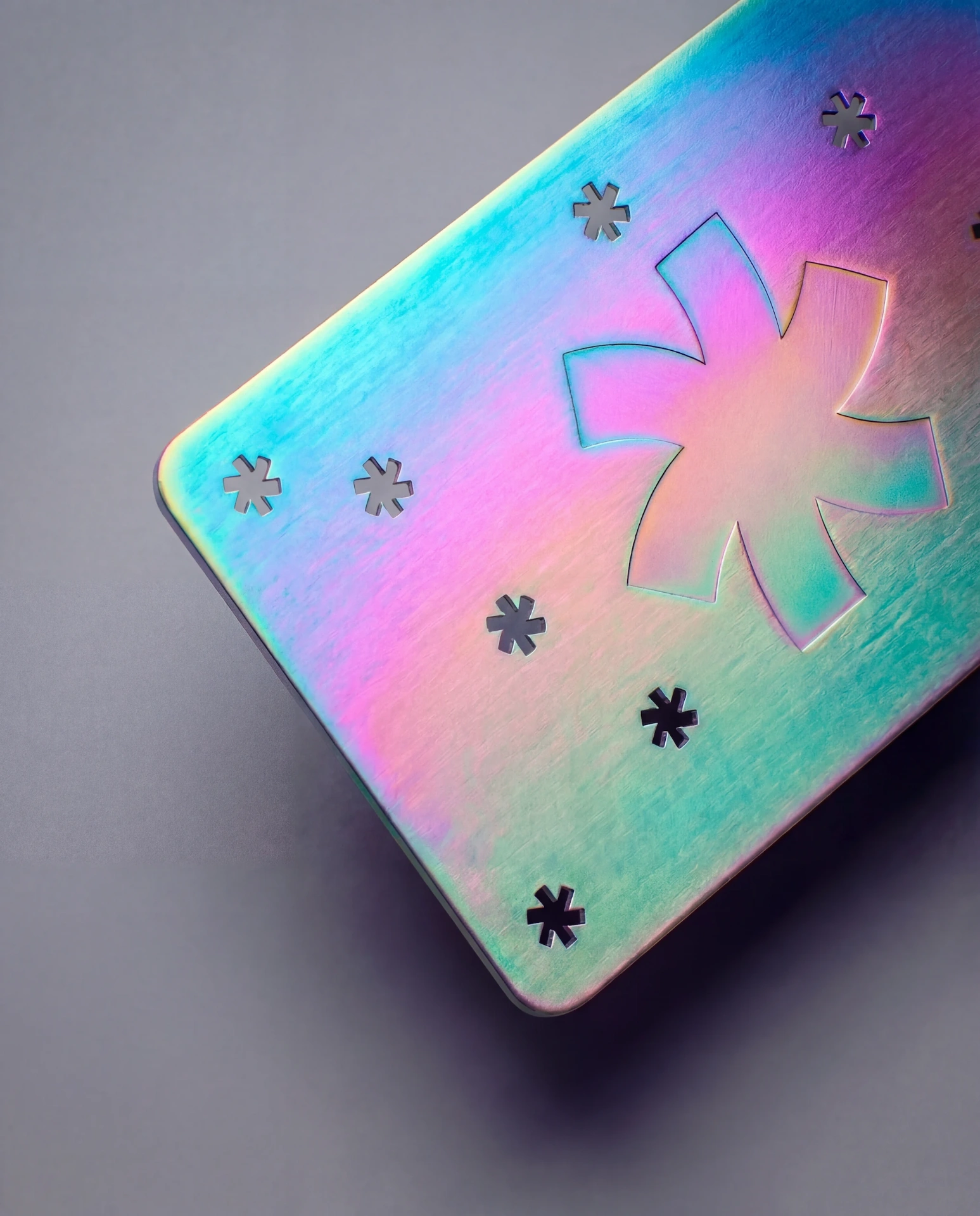
Iridescent is the only metal color that actively changes appearance. The multi-layer PVD coating creates a prismatic surface that shifts between purple, blue, green, and gold as the viewing angle changes. Under different lighting, the card looks like a different color entirely.
This is a polarizing choice. Some people find iridescent metal cards breathtaking — the color shift is genuinely beautiful under natural light, and the combination of physical metal weight plus visual color-shifting creates a strong sensory experience. Other people find it too much — a business card that looks like a soap bubble is not for everyone.
Iridescent works when the card's job is to be MEMORABLE above all else. Not professional, not conservative, not refined — memorable. If someone is going to receive 30 cards at an event, the iridescent one is the one they'll show to a friend.
Best for: Creative agencies, event promoters, DJs, fashion designers, tech startups that want to signal "we're different." Brands where standing out aggressively is a feature, not a risk.
Do not use if: You work in law, finance, healthcare, government, or any field where unusual = unprofessional. A mediator handing out a rainbow-shifting metal card would undermine their credibility.
White
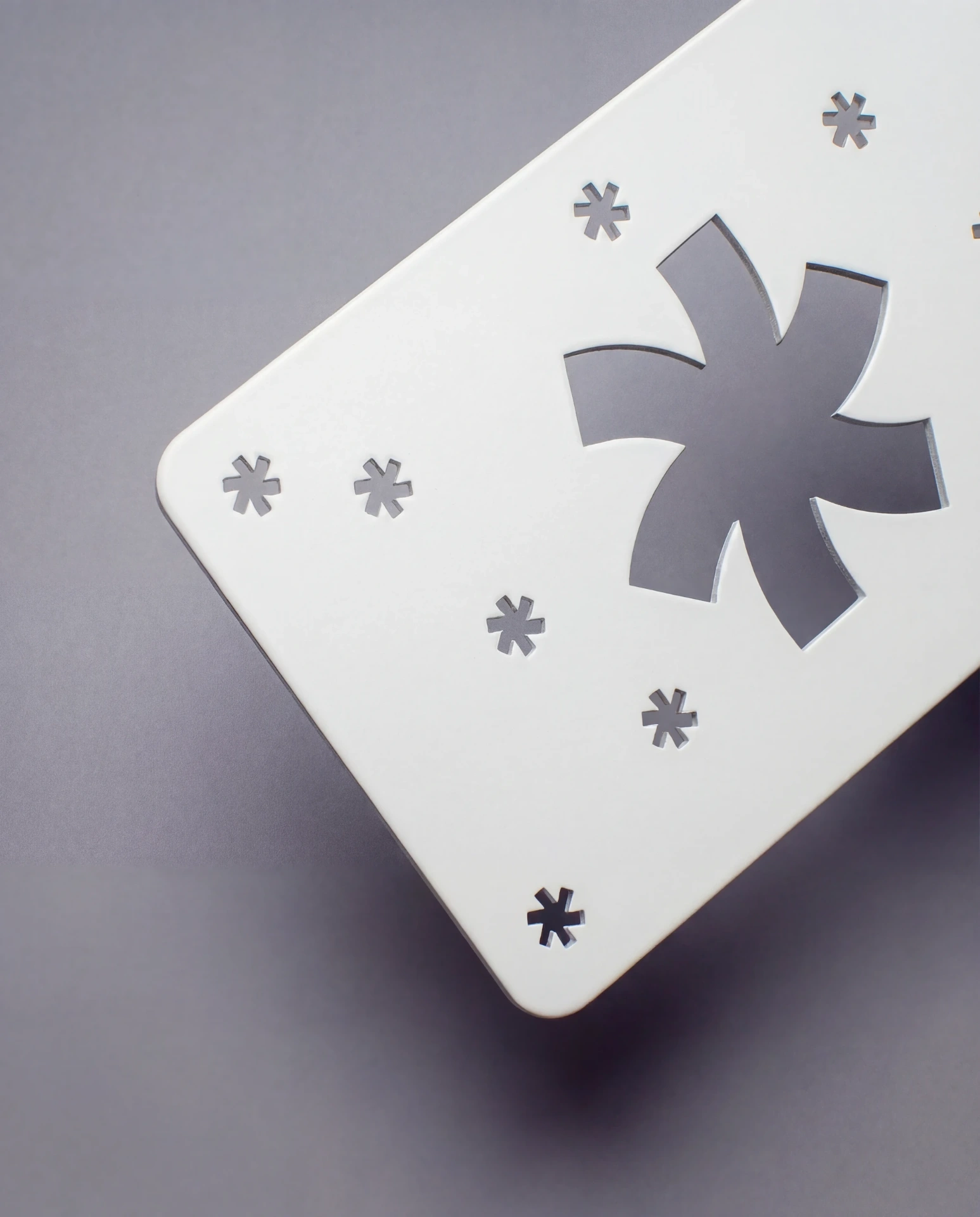
White is the quietest metal color and the newest in our range. The white PVD coating creates a clean, almost ceramic appearance — if you set a white metal card on a white table, you might not realize it's metal until you pick it up and feel the weight.
That stealth quality is the appeal. White metal cards are for people who want the material experience (weight, temperature, durability) without the visual loudness of reflective metal. The card looks like a premium object — like a well-designed piece of electronics packaging — without screaming "I AM METAL."
Laser engraving on white reveals silver steel through the white surface — a subtle, sophisticated contrast. The effect is similar to embossed text on a white paper card, but permanent and precise.
Best for: Minimalist brands, architecture studios, design agencies, tech companies with clean visual identities. Anyone who wants metal's physical properties without its visual aggression.
Be cautious if: You want the card to immediately read as metal on sight. White metal cards surprise people when they pick them up — the weight reveals the material. If you need the "this is obviously metal" reaction from across a table, silver or black is more immediate.
How to narrow down your choice
If you've read all eight descriptions and still can't decide, here's a decision framework:
Start with your brand's existing material language. Look at your website, your packaging, your other printed materials. What metals appear? Gold accents → gold metal card. Black and white palette → black or silver metal card. Warm, earthy tones → copper. No metallic elements at all → silver (the neutral default that adds metal without committing to a color statement).
Consider your industry norms. Some industries have implicit material expectations. Legal and finance → conservative choices (silver, black). Creative and fashion → expressive choices (gold, iridescent, rose gold). Real estate → high contrast (black is dominant). If you match industry expectations, the card feels professional. If you break them, the card feels either bold or inappropriate — and that's a judgment call only you can make.
Think about the design technique. Not all colors pair equally well with all techniques:
- If your design relies on laser engraving (text and line work), black gives you the highest contrast. Silver, white, and gold also engrave well. Iridescent engraving is visible but competes with the color-shifting surface.
- If you're adding color printing, silver and white provide the cleanest canvas — printed colors appear most true on neutral bases. Color printing on gold or copper shifts the printed colors warmer. Color printing on black creates a darker, moodier palette.
- If cutouts are a major design element, silver and black show the shadow play most clearly. On lighter metals (white, aluminum), the cutout shadows are softer and subtler.
For detailed guidance on designing with each technique, see our design tips for metal cards →.
When in doubt, order a sample pack. Seeing all eight metals side by side in your hand settles the question faster than any guide can. The PVD colors look different in person than on any screen — the weight, the temperature, the way light moves across the surface. These are physical properties that screens can't communicate. Order a sample pack →
Surface finish: how it interacts with color
Each metal color is available in matte, brushed, and mirror. The finish changes how the color presents:
Matte makes every color appear more even, more controlled, more understated. Matte black is the darkest, most light-absorbing configuration. Matte gold is the most restrained gold option. If your brand leans minimal, matte is your finish.
Brushed adds dimension to every color. The grain catches light and creates directional variation — the color appears lighter on one side and deeper on the other. This is our most-recommended finish because it adds visual interest without overwhelming the design, and it's the most forgiving for fingerprints and light wear.
Mirror intensifies every color. Mirror gold is aggressively gold. Mirror black is dramatically reflective. Mirror silver is a literal mirror. Use with bold, simple designs — fine details get lost in the reflections. Not available on aluminum.
A safe default for any metal color: brushed. It works with every color and every design technique. Start there and only switch to matte or mirror if you have a specific aesthetic reason.
Pricing differences between colors
Metal color is the largest single price factor. The three cost tiers:
Tier A (least expensive): Silver and Aluminum — no PVD coating required.
Tier B (mid): Gold, Rose Gold, Copper — standard PVD coatings.
Tier C (premium): Black, White, Iridescent — more complex PVD chemistry.
The actual dollar difference between tiers is moderate. At 100 cards, the gap between the cheapest silver configuration and the most expensive iridescent configuration is roughly $60 to $150. It's meaningful but shouldn't override the aesthetic decision. Choose the right metal for your brand, then optimize other variables (finish, technique, quantity) if you need to adjust the budget.
See full pricing for every metal × finish × technique combination →
Common questions
Can I see the metals before ordering?
Yes. Our sample pack includes samples in all available metal colors so you can compare them side by side in person. The difference between screen and real life is significant — PVD coatings interact with light in ways a monitor can't reproduce. Order a sample pack →
Which metal color is most popular?
Black stainless steel, by a significant margin. It accounts for roughly 35-40% of our metal card orders. Silver is second at about 25%. Gold is third. The remaining five colors split the rest.
Can I combine two metal colors on one card?
Not in a single production run. PVD coating is applied as a uniform layer — the entire card surface receives the same color. To achieve a two-tone effect, you'd use one metal color as the base and create contrast through engraving (which reveals the silver steel underneath the coating) or color printing (which applies different colors on top of the coating).
Which color hides fingerprints best?
Brushed finish in any color hides fingerprints better than matte or mirror. Among colors, silver and copper show fingerprints least because the natural tonal variation masks oils. Black mirror is the worst — fingerprints are immediately visible. If fingerprint resistance matters (display cards, cards that get passed around a table), choose brushed.
Is the gold coating real gold?
The PVD gold coating is not actual gold — it's titanium nitride or similar compounds engineered to match the color and reflective properties of 18K gold. It's more durable than actual gold plating (which can wear and tarnish) and significantly less expensive. The visual and tactile result is indistinguishable from gold plating in normal use.
Which metal works best with NFC?
All of them. The NFC chip is embedded inside the card and works regardless of the metal color or surface finish. The chip's functionality is not affected by PVD coating. More about NFC metal cards →
Continue reading
METAL
Metal Business Cards: The Complete Guide
Read guide →PRICING
How Much Do Metal Business Cards Cost?
Read guide →COMPARISON
Metal Business Cards vs Paper — When Metal Actually Makes Sense
Read guide →DESIGN
How to Design for Metal Business Cards
Read guide →METAL
NFC Metal Business Cards — Smart Cards That Make an Impression
Read guide →Know which metal you want?
Request a Custom Quote →Describe your brand and project. We'll confirm the right metal and finish — and send you pricing within a few hours.
Configure and price your cards now →
Order a sample pack → · Peppermint Studio → · Book a consultation →