Blind deboss: letterpress with no ink at all
A plate pressed hard into thick cotton, and nothing else. The quietest thing we make and, on the right brand, the loudest — confidence without literally saying anything.
Ballpark pricing — blind deboss on 32pt cotton
| Quantity | Per card | Total | |
|---|---|---|---|
| 100 cards | $2.10 | $210 | |
| 200 cards | $1.35 | $270 | Recommended |
| 400 cards | $1.02 | $410 |
Exact quote confirmed by a human before you pay anything.
Blind deboss: letterpress with no ink at all
Blind deboss is letterpress with the ink removed from the equation — a plate pressed hard into thick cotton, leaving a sculpted impression and nothing else. It's the quietest thing we make and, on the right brand, the loudest. A blind-debossed logo says the recipient will notice; the sender didn't need to shout. It reads as confidence without literally saying anything.
Because there's no ink, every element of the physical process matters more: stock choice, impression depth, and where the deboss sits on the card. We recommend 32pt cotton minimum — thinner stock can't hold the depth, and the back of a thin card will show a mirror impression ("punch-through") that looks like a mistake. On 48pt cotton, blind deboss is at its best; the impression can be deep enough to catch a shadow at a glance.
Design specifically for the absence of ink: high-contrast type shapes with generous counters and open forms will read; delicate script with fine terminals will disappear into the impression itself. Blind deboss loves a strong logotype, a single powerful monogram, or a bold sans-serif brand mark. It doesn't love body copy. Pair blind deboss on the front with a small letterpress ink pass on the back and the card becomes a two-sided study in restraint — this is the specification we recommend for architects, fashion houses, and anyone who wants their card to be an object first and a business card second.
Common questions
- Will the deboss show through to the back of the card?
- On 32pt cotton, a deep deboss can create a slight mirror impression on the reverse — often intentional, sometimes not. On 48pt cotton the back stays clean. We spec impression depth based on the stock thickness and confirm with a proof.
- What kind of artwork works for blind deboss?
- Strong logotypes, powerful monograms, bold sans-serif marks — anything with generous counters and open forms. Delicate script with fine terminals disappears into the impression. Design for silhouette, not for detail.
- Can blind deboss be combined with foil or ink on the same card?
- Yes — blind deboss on the front and a small letterpress ink pass or foil accent on the back is a specification we recommend often. Two-sided restraint. The card becomes an object study rather than a business card.
The next step
Not sure this is the exact spec you want?
Show our AI what you're picturing and it'll return three production-real directions in about two minutes — with paper, ink, and finish options. Every result is reviewed by a human designer before you approve anything.
We've printed this
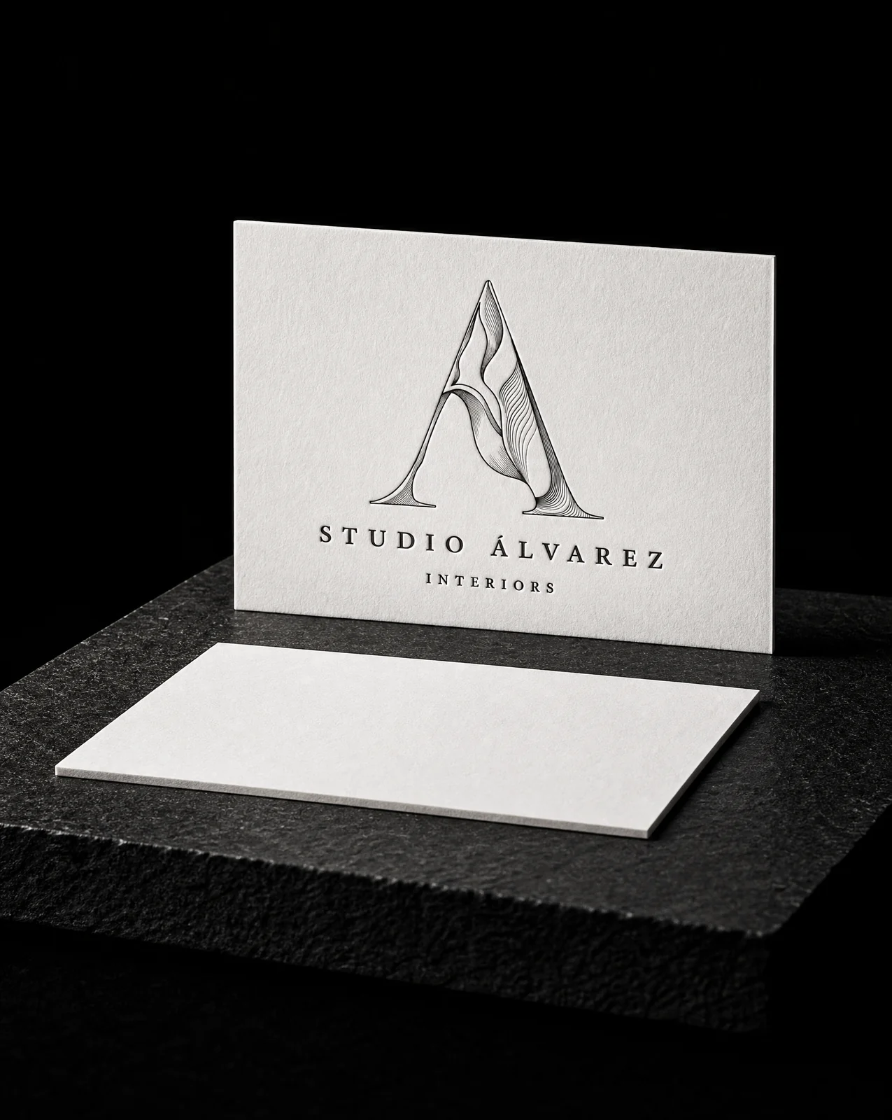
Studio Álvarez Interiors
A logo that could only ever be printed one way.
Read the project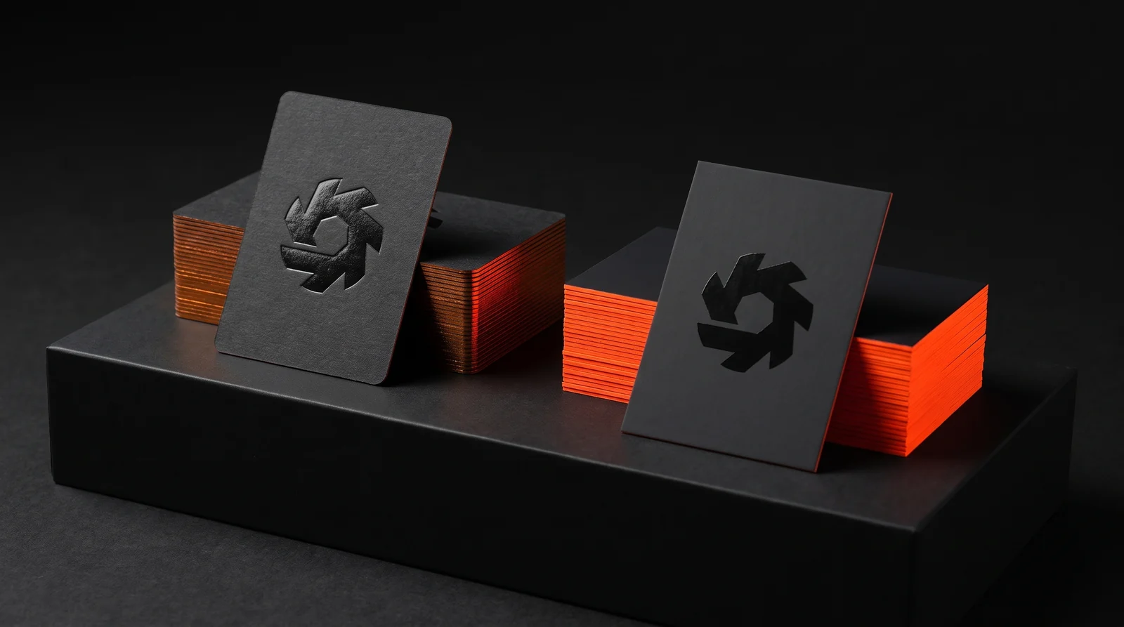
Soundtoys
The deboss wanted one paper. The neon edge wanted the other.
Read the project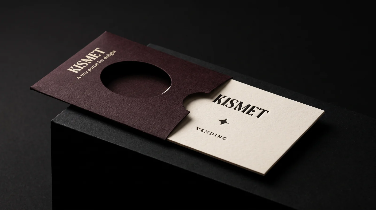
Kismet Vending
A card worth keeping, thin enough to fall out of a vending machine.
Read the project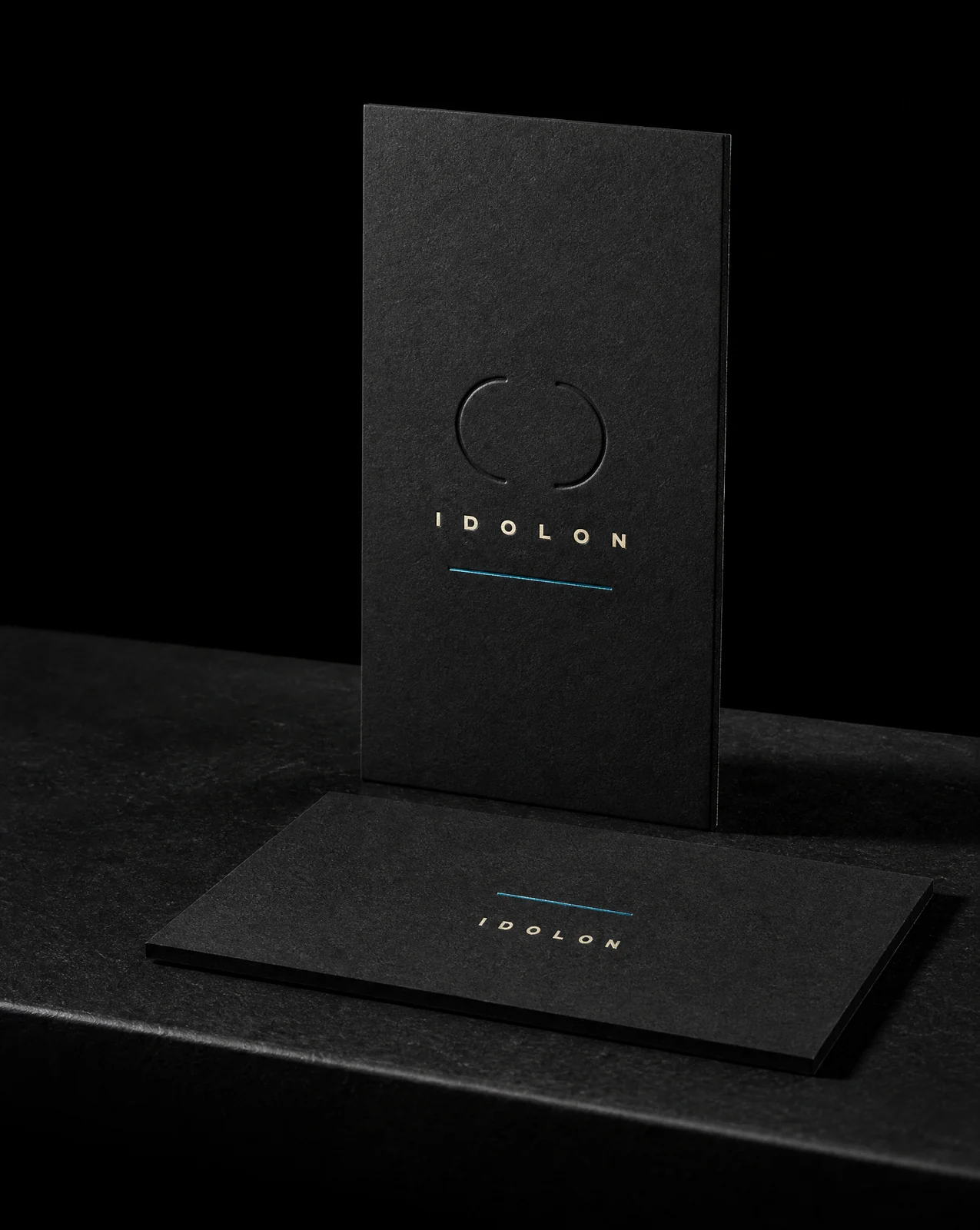
IDOLON
Five dies. No ink at all.
Read the project