Case study · Business cards · JB Design Studio
A mark that stands up
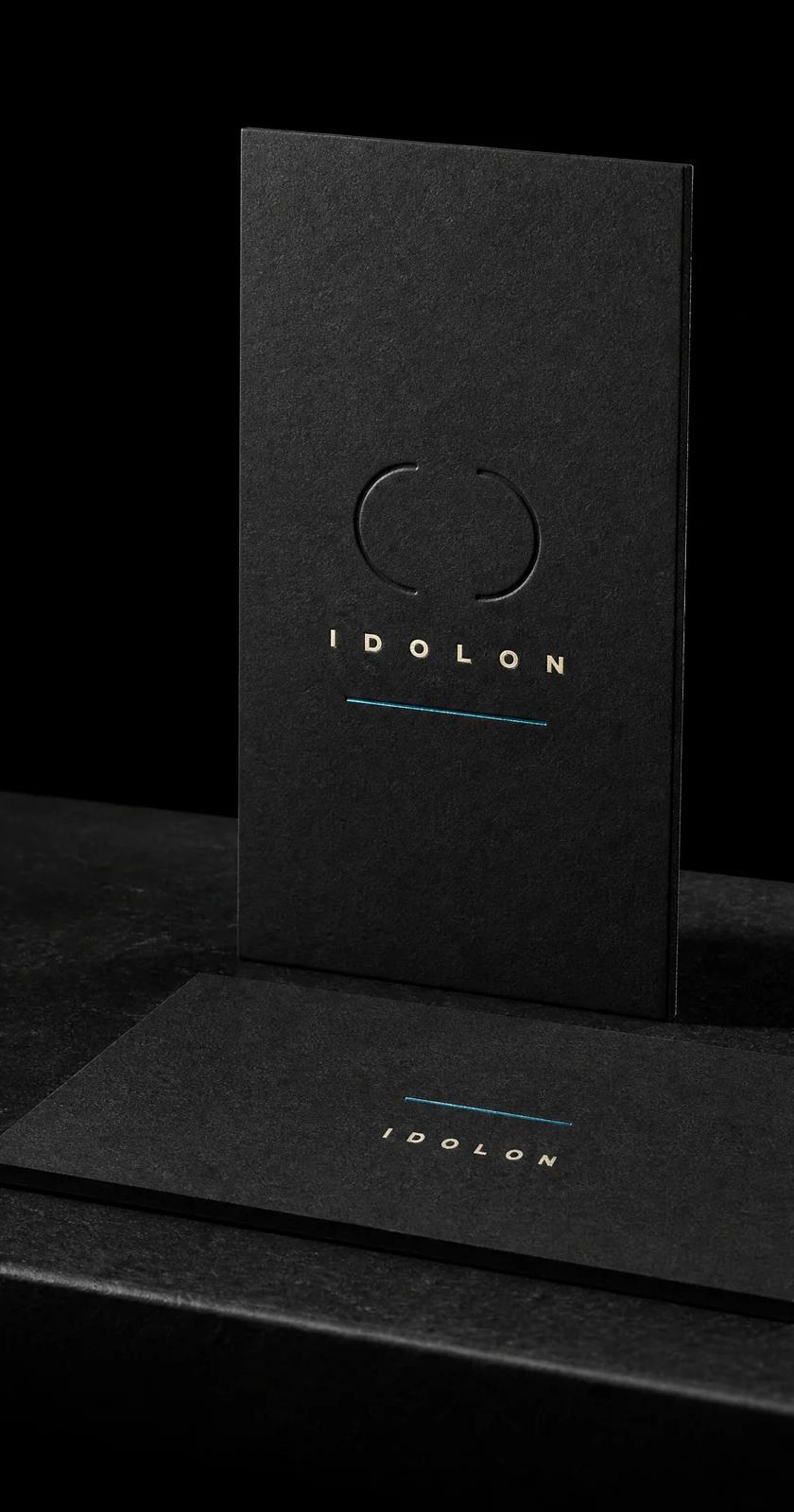
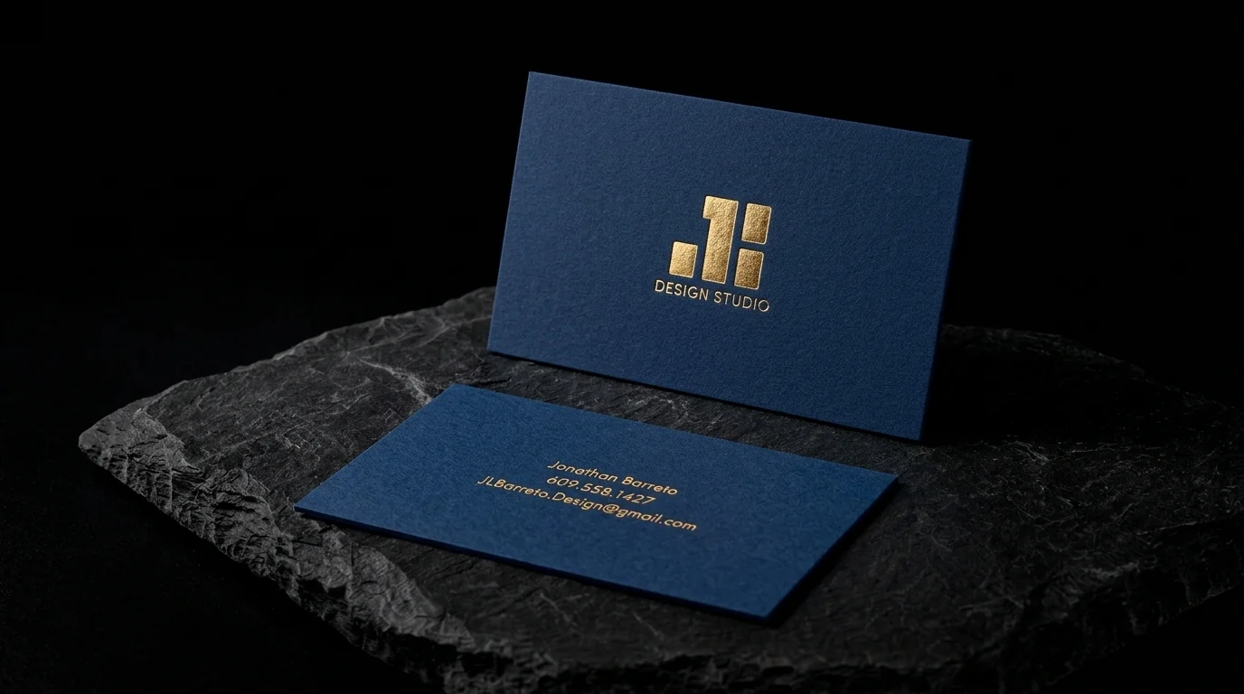
Card for Jonathan Barreto's JB Design Studio: a stepped block monogram and 'Design Studio' in gold foil on a portrait navy face, with name, phone and email in gold foil on a landscape reverse.
The idea
JB Design Studio is the design practice of Jonathan Barreto.
Two rules
- 01Two orientations. The front set in portrait orientation with the monogram centred, and the reverse in landscape for the contact lines.
- 02Gold on navy, nothing else. Gold foil only, on both sides.
Why it works
The navy felt and bright gold are a classic pairing, and turning the card for the back makes you look at it twice.
Start from these materials
Same paper, foil and finish, locked in — nothing of JB Design Studio's artwork comes with it.
Questions
- Can one card be portrait on one side and landscape on the other?
- Yes. The card is the same shape, and the artwork is just rotated 90° on one side.
- Why does gold look good on navy?
- Navy is dark enough for strong contrast and warmer than black, so gold reads rich rather than harsh.
- Is uncoated stock good for foil?
- Yes. Felt or smooth uncoated stock gives a crisp, slightly pressed foil.