Case study · Business cards · Well-Told
Well-Told ↗White on white
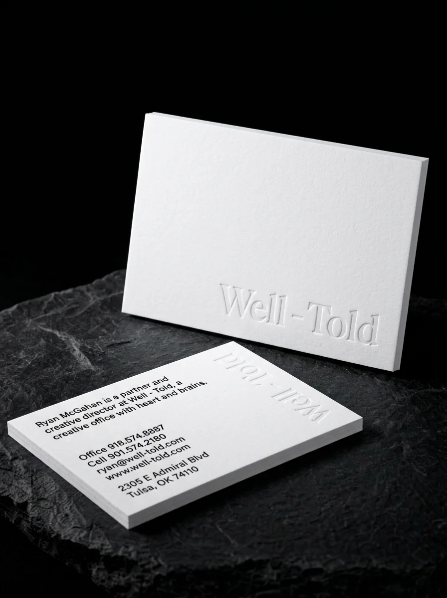
Card for Well-Told in Tulsa, Oklahoma: the agency name blind embossed vertically on an otherwise blank white face, and a reverse with a one-sentence introduction, contact details in black, and the name embossed again along the edge.
The idea
Well-Told is a brand strategy and identity agency at 2305 East Admiral Boulevard, in Tulsa's historic Kendall-Whittier neighbourhood. It calls itself a flyover-country creative office with a global outlook.
Two rules
- 01No ink on the front. A blind emboss of the name, set vertically near the bottom edge. It shows only when light rakes across it.
- 02A sentence, not a title. A single sentence of introduction in small black type, with the contacts set in two columns beneath.
The client
The card shown is for Ryan McGahan, a partner and creative director. It introduces him in one sentence: a creative office with heart and brains.
Why it works
An identity agency's own card uses almost nothing: one impression and one sentence. That's the kind of judgement clients hire it for.
Start from these materials
Same paper, foil and finish, locked in — nothing of Well-Told's artwork comes with it.
Questions
- What is a blind emboss?
- A raised impression pressed into the paper with no ink or foil, so it shows only as highlight and shadow.
- Does a blind emboss show on the back?
- On a single sheet, a raised impression can appear on the reverse of the emboss. Keep reverse text clear of that area, or duplex two sheets.
- What paper is best for blind embossing?
- Soft, heavy cotton or felt-finish stock. It stretches without cracking and holds a crisp edge.