Letterpress on Colorplan: the sheet that lets the color do the work
Colorplan is through-dyed — the color goes all the way through the sheet. Press a deep impression in and you reveal only more of the same color. The result looks less like printing and more like the card was carved.
Ballpark pricing — letterpress on Colorplan cover
| Quantity | Per card | Total | |
|---|---|---|---|
| 100 cards | $2.45 | $245 | |
| 200 cards | $1.52 | $305 | Recommended |
| 400 cards | $1.16 | $465 |
Exact quote confirmed by a human before you pay anything.
Letterpress on Colorplan: the sheet that lets color do the work
Colorplan is a British-made cover stock available in about 50 colors, all through-dyed — the color goes all the way through the sheet, so a debossed impression reveals only more of the same color. That through-dyed quality is why Colorplan and letterpress belong together: when you press a deep impression into a saturated Colorplan, you get sculpted depth without a color edge, and the effect looks less like printing and more like the card was carved.
The stock does the heavy lifting so the ink can do less. On a bold Colorplan — Ebony, Cobalt, Bright Red, Citrine — we often recommend blind deboss (no ink at all) or a single white ink pass; the color of the paper is already the loudest thing on the card. On a subtle Colorplan (Vellum White, Pristine White, Mist) traditional dark inks read beautifully.
The honest constraints: Colorplan is heavier than most stocks — 350gsm is standard, and we can duplex two sheets to get to 700gsm cotton-thick weight — but it isn't cotton, so the impression sits a little differently. Letterpress on Colorplan will feel firmer and more architectural; letterpress on cotton feels softer and more organic. Both are correct; they're different products. And translucent inks on the darkest Colorplans will disappear — spec opaque inks or move to foil for those.
Common questions
- How is Colorplan different from cotton?
- Colorplan is a firmer, more architectural cover stock — it holds impression cleanly but the impression sits differently than in cotton. Cotton feels softer and organic; Colorplan feels crisp and engineered. Both are correct; they're different products.
- Which Colorplan colors work best for letterpress?
- The through-dyed nature is the whole point, so lean into it. On bold Colorplans (Ebony, Cobalt, Bright Red, Citrine) we often recommend blind deboss or a single white-ink pass — the paper is already the loudest thing. On subtle Colorplans (Vellum White, Pristine, Mist) traditional dark inks read beautifully.
- Can Colorplan be duplexed to feel like 700gsm?
- Yes — we can laminate two sheets to reach cotton-thick weight, which gives you the color depth of Colorplan with the impression tolerance of thicker stock. This is a common upgrade for founder cards and premium runs.
The next step
Not sure this is the exact spec you want?
Show our AI what you're picturing and it'll return three production-real directions in about two minutes — with paper, ink, and finish options. Every result is reviewed by a human designer before you approve anything.
We've printed this
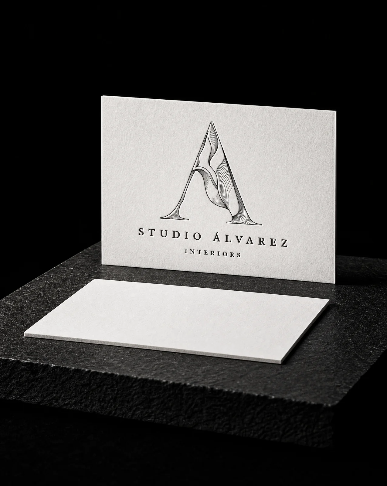
Studio Álvarez Interiors
A logo that could only ever be printed one way.
Read the project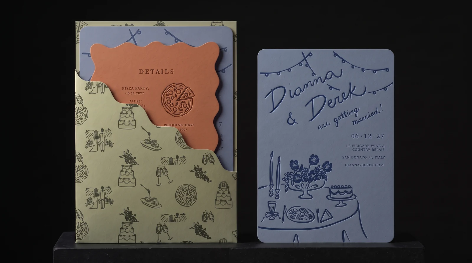
Dianna & Derek
Three colour-drenched pieces, one hand-mixed ink each, and one bold cut. Then the one we would have cut.
Read the project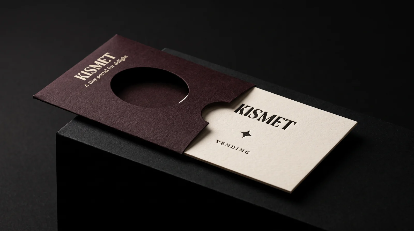
Kismet Vending
A card worth keeping, thin enough to fall out of a vending machine.
Read the project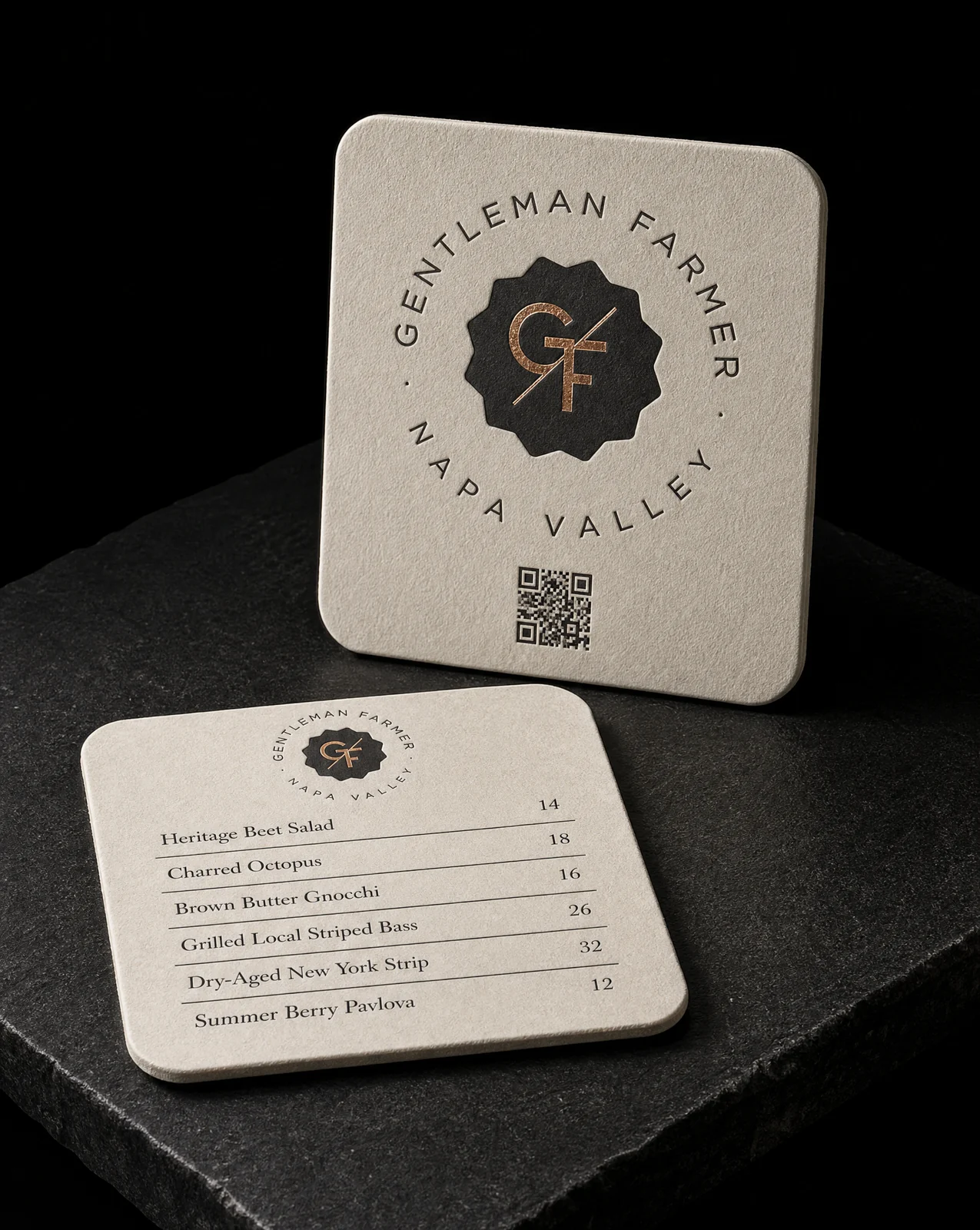
Gentleman Farmer Wines
Match a card they already loved. On a different object.
Read the project