FILE SETUP
Combining Print Finishes: What Works Together, What Doesn't, and in What Order
The order finishes run in, the tolerances that stack up between passes, and the house compatibility rules for building foil, letterpress, emboss, spot UV, die cuts and painted edges into one piece.
By Austin Terrill · Print Peppermint · 14 min
On this page
- The order of operations
- Where the bond goes on a duplex or triplex card
- Every pass is a new registration: the tolerance stack-up
- Design so the stack-up can't show
- The compatibility matrix
- Foil and emboss in register: the combination die
- Duplex and triplex: the master key
- How to supply a multi-finish file
- Three builds, taken apart
- Build 1: a wedding invitation in letterpress, foil and painted edge
- Build 2: a business card in foil and blind deboss on black and white duplex
- Build 3: a packaging sleeve in CMYK, spot UV and a die cut
- Preflight: the multi-finish checklist
Short answer: most finishes combine well. The ones that fail are fighting over the same surface. Print goes on first, then foil, then emboss or deboss, then the die cut, and edge paint last. Every one of those is a separate pass with its own registration, so never design a hairline fit between two finishes: leave 1 mm of air, or overlap by a set trap. When two finishes want different papers, stop forcing them onto one sheet and build the card in plies.
This guide assumes you know each finish on its own; if not, start with foil artwork preparation, letterpress file setup and emboss and deboss file setup. Here we cover what happens when you stack them: the order, the tolerances between passes, the house compatibility rules, and how to supply the file.
The order of operations
Finishes run in a fixed order: print, foil, emboss or deboss, die cut, edge paint. The order isn't a shop preference. Each step either needs a flat, uncut sheet to register to, or would damage the step before it if it ran later.
- Print. CMYK by offset or digital, or letterpress, one plate per color. Ink goes down on a flat, open sheet and becomes the reference every later pass registers to. Any laminate goes on straight after print.
- Foil. One pass per foil color, on bare stock, never on ink. The die needs a flat face to press against.
- Emboss or deboss. The sheet is shaped after the foil is down; run it the other way and the flat foil die crushes the form. When foil and emboss must align exactly, they merge into one strike on a combination die.
- Spot UV and raised UV. Coating passes on the printed or laminated surface, before anything is cut.
- Die cut. After this there is no press sheet left to register to, so every registered finish must already be on.
- Edge paint. Last, because the cut cards are stacked, clamped flat and square, and painted on the stacked edge.
Where the bond goes on a duplex or triplex card
In most builds, each ply is printed and finished on its own before bonding, then cut and edged as one card. That is why a multi-ply file needs one artboard per face and a spec line that says which finish belongs to which ply. A few constructions change the sequence, and we confirm yours at proof.
Every pass is a new registration: the tolerance stack-up
Each finish is positioned independently, and the tolerances between passes add up. A foil die, a letterpress plate and a cutting die each hold their own geometry perfectly. The movement happens between them: where the sheet sits against the guides on each run, how it stretches under heat and pressure, how a stack shifts under the blade.
| Relationship | Tolerance | What it means in your file |
|---|---|---|
| Letterpress color to color | ±0.3 mm | Trap touching colors by 0.3 mm; otherwise keep them 1 mm apart |
| Foil to print | ±0.5 mm | Knock the ink out under the foil and leave a 1 mm gap |
| Foil to foil | ±0.25 mm | Trap touching foils by 0.3 mm on shared edges only; otherwise 1 mm apart |
| Emboss or deboss to print | ±0.5 mm | Use a combination die when foil and emboss must align exactly |
| Spot UV to print | ±0.5 mm | No UV outlines that depend on a tighter fit |
| Die cut (steel rule) | ±0.8 mm across a stack | 3 mm safety inside trim, 3 mm bleed, foil 3 mm from trim |
Full per-process minimums live in the minimum line weight and type size matrix.
Stack-up is what happens when two of those relationships meet on one element. Foil registers to the print at ±0.5 mm and the cut registers to the print at ±0.8 mm, so in the worst case the foil can sit 1.3 mm closer to one edge of the card than you drew it. Two separate passes of foil and emboss can each miss the print by 0.5 mm in opposite directions and miss each other by 1 mm. Most sheets land well inside that. Design for the worst case anyway: you will hold every card in the run, not the average one.
Design so the stack-up can't show
- No hairline fits between finishes. Don't nest foil 0.5 mm inside a printed frame, outline a deboss with a printed keyline, or ask spot UV to land exactly on the edge of a printed shape. Bold UV over a bold printed shape is fine; a UV outline chasing a printed outline is not.
- Separate or overlap, never butt. Where finishes of different kinds meet (foil and ink), separate them by 1 mm. Where two passes of the same kind touch (two foils, two letterpress colors), overlap them by a 0.3 mm trap on the shared edges.
- Keep parallel edges away from the trim. A foil border 1.5 mm from the edge will read 0.7 mm on one card and 2.3 mm on the next. Keep foil and critical art 3 mm inside trim, or bleed it 3 mm past.
- Put exact relationships inside one pass. Anything drawn on the same plate or die holds its geometry perfectly. If two elements must align to the tenth of a millimeter, they belong on the same plate, the same foil die, or one combination die.
The compatibility matrix
Most finish combinations fail for one of three reasons: the surface won't take the second finish, the second finish lands on the first, or a physical process (a clamp, a cut, a scanner) can't cope with the result. This table is our house rulebook.
| Combination | Verdict | Why | Do this instead |
|---|---|---|---|
| Foil over letterpress or CMYK ink | No | Foil bonds to bare stock, not to an ink film | Knock the ink out under the foil; leave a 1 mm designed gap |
| Two foils that touch | Yes, with a trap | At ±0.25 mm a butt join opens a paper sliver | Second foil overlaps the first by 0.3 mm on shared edges only |
| Two foils that don't touch | Yes | Separate dies, separate passes | Keep them 1 mm apart minimum |
| Raised foil and flat hot foil | Not in the same pass | Separate processes and registrations | Neighbors, never a fit; raised foil is one color per design |
| Foil and emboss in exact register | Yes, on one combination die | Separate dies each land ±0.5 mm to print | Identical shapes on FOIL and EMBOSS layers; one die |
| Emboss or deboss on soft-touch or silk laminate | No | The laminate won't seat cleanly | Uncoated or cotton, 16 pt (0.4 mm) or heavier |
| Spot UV or raised UV on uncoated or cotton | No | The coating soaks into open fiber | Coated or laminated stock; on cotton use foil or a blind deboss |
| Raised UV on soft-touch laminate | Yes | Raised UV bonds to soft-touch | Our route to dimension on a laminated card |
| Blind deboss on black uncoated | Avoid for contrast | Blind impressions read by shadow; black shows almost none | Add foil to the impression, or deboss a lighter ply |
| Flood letterpress on cotton | Avoid over 13 cm² (2 in²) | Large solids mottle in soft fiber | Use a colored ply for the field; letterpress the detail |
| Deboss one side, letterpress the other, one sheet | No | Each impression telegraphs through | Duplex: each ply carries its own impression |
| Dark foil on dark stock | Texture only | Reads as sheen, not contrast | Contrast foil for anything that must be read |
| Light letterpress ink on dark stock; white ink on cotton | Not offered | Letterpress ink is translucent | Foil, or a blind deboss on cotton |
| CMYK on dark dyed-through stock | No | Process ink disappears | Foil or opaque white ink |
| Edge paint with rounded corners or a shaped die | No | The stack is clamped flat and square to paint | Square corners, straight cuts, 32 pt (0.8 mm) or thicker |
| Foil next to a painted edge | Yes, 3 mm back | Paint can wick slightly onto the face | Stop foil 3 mm short; never bleed into the paint |
| QR code or barcode in foil, emboss or UV | No | Scanners need flat, high-contrast modules | Always ink |
| Letterpress, emboss or deboss on plastic | No | Plastic takes no impression | Flat finishes only |
More on pairing foils and substrates in foil combinations and best paper for foil.
The table reads more simply as a list of what each finish needs underneath it. If the surface is wrong, no amount of file prep saves the combination.
| Finish | Needs | Won't work on |
|---|---|---|
| Hot foil | Bare stock with no ink under it | Printed ink |
| Letterpress | Uncoated or cotton; solids under 13 cm² (2 in²) | Light ink on dark stock; white ink on cotton |
| Emboss or deboss | Uncoated or cotton, 16 pt+; 32 pt if it must not show through | Soft-touch or silk laminate; plastic |
| Flat spot UV | Coated or laminated stock | Uncoated or cotton |
| Raised spot UV | Coated or laminated stock, including soft-touch | Uncoated or cotton |
| CMYK | White or light stock | Dark dyed-through stock |
| Edge paint | 32 pt (0.8 mm)+, square corners, straight cuts | Rounded corners, shaped dies |
| QR codes and barcodes | Ink | Foil, emboss, deboss, UV |
Foil and emboss in register: the combination die
If the foil has to sit exactly on the raised form, it has to be one die. Run foil and emboss as two passes and each lands at ±0.5 mm to print, so the emboss can shift off the foil by up to 1 mm. What you see is a crescent of flat foil on one side of the shape and a bare, un-foiled shoulder on the other. A combination die is a sculpted, heated die with a matching counter: the foil transfers and the paper takes its form in the same strike, so the foil edge and the emboss edge are one edge.
Duplex and triplex: the master key
When two finishes want different surfaces, or would fight through one sheet, give each its own ply. A duplex card is two sheets bonded into one, typically 32 pt (0.8 mm); a triplex is three, typically 48 pt. Because each ply is printed and finished as a separate sheet before bonding, finishes that would fight on a single sheet stop meeting at all. That is the reason most of our multi-finish work is built thick. The plies are the point; the thickness is a side effect (see business card thickness).
- Front deboss, back letterpress. On one sheet, a deep impression on either face telegraphs through to the other. Split across two plies, the glue line absorbs any bulge. For a deboss that must not show through, 32 pt duplex is our floor.
- Different stocks front and back. A black ply on the front for gold foil and a white cotton ply on the back for letterpress. Letterpress ink is translucent and needs the light sheet; foil is what reads on the dark one.
- A colored ply instead of a flood. Letterpress solids over 13 cm² (2 in²) mottle on cotton. Make the color field a dyed ply and let letterpress carry only the lines and type.
- A colored core as the edge. On a triplex card a colored middle ply shows as a stripe around the edge with no paint at all. Painting the edge covers the core, so choose one: a visible core or a painted edge.
How to supply a multi-finish fileAGENCY LEVEL
One file, one artboard per side, one layer per operation, and a written spec line. Every finish is a separate physical tool, and we make each tool from its own layer. If two operations share a layer, someone has to guess, and guessing is how finishes end up in the wrong place. The general rules are in print-ready files; these are the multi-finish specifics.
- One PDF, PDF/X-4 preferred (it keeps layers and spot channels).
- One artboard per side, FRONT and BACK. On a duplex card these are the outer faces of the front and back plies.
- One layer per operation, named after its swatch: ART for inks, then FOIL-GOLD, DEBOSS, SPOT-UV, CUT. Each foil color is its own swatch, layer, die and pass.
- Every finish layer is vector only, 100% of one reserved swatch, set to overprint. No tints, gradients or raster.
- Ink knocked out under every foil, with the 1 mm gap drawn in the ART layer. Traps built into the art: the second foil extends 0.3 mm under the first on the shared edge only.
- For foil and emboss in register: identical shapes on the FOIL and EMBOSS layers, and "combination die" in the spec line.
- Die line on the CUT swatch at 0.25 pt, 100% magenta preview, one closed path. Folds on CREASE, 100% cyan.
- Edge paint is not a layer: it goes in the spec line with a Pantone U reference. QR codes sit on the ART layer, in ink.
Then write the build down in one line: front, back, construction, edge. The spec line is how we check your layers against your intent.
Three builds, taken apart
Three common pieces, broken into layers and passes, each with the landmine that sinks it most often.
Build 1: a wedding invitation in letterpress, foil and painted edge
Front: letterpress PMS 7545 U + FOIL-GOLD; Back: letterpress PMS 7545 U; 32 pt duplex cotton; edge painted PMS 7545 U. A 5 × 7 in card (see invitation sizes) with letterpress text, a gold foil monogram and a painted edge that matches the ink.
| Order | Operation | Layer / swatch | Rule that governs it |
|---|---|---|---|
| 1 | Letterpress, each ply | ART: PMS 7545 U | Lines 0.15 mm+, type 7 pt+, no solids over 13 cm² |
| 2 | Foil, front ply | FOIL-GOLD | Lines and gaps 0.6 mm+, ink knocked out, 1 mm from ink |
| 3 | Bond | Spec line | 32 pt duplex cotton |
| 4 | Die cut | CUT | Straight cuts, square corners |
| 5 | Edge paint | Spec line | PMS 7545 U; foil stops 3 mm short of trim |
The landmine: the flood. The request is usually a colored background with the names knocked out in white. Letterpress floods mottle on cotton, and white letterpress ink on cotton isn't something we offer. Make the colored field a dyed cotton ply, foil the names in white pigment foil or gold, and keep letterpress for the fine type it does best. Second landmine: a gold border drawn close to the painted edge. Foil stops 3 mm inside the trim on any card with a painted edge, and it never bleeds into it.
Build 2: a business card in foil and blind deboss on black and white duplex
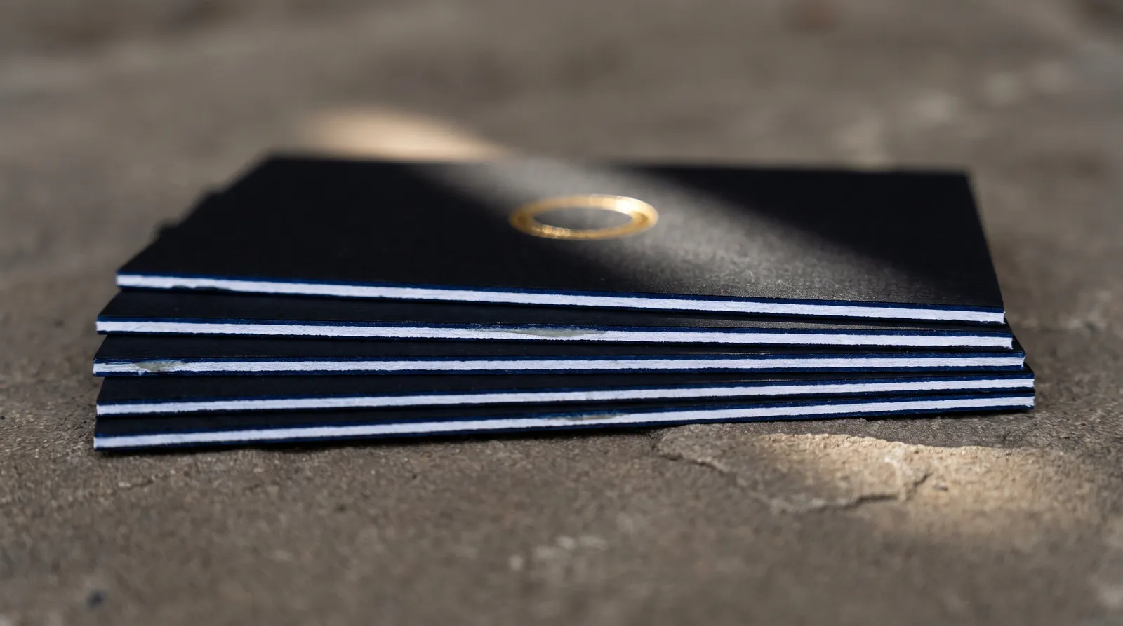
Front: FOIL-GOLD on black ply; Back: blind DEBOSS on white cotton ply; 32 pt duplex, black front ply and white back ply; edge painted. The front is a gold wordmark on black, the back a blind debossed monogram, and the edge shows the build.
| Order | Operation | Layer / swatch | Rule that governs it |
|---|---|---|---|
| 1 | Foil, black front ply | FOIL-GOLD | Lines and gaps 0.6 mm+, positive type 7 pt+, reversed 10 pt+ |
| 2 | Blind deboss, white back ply | DEBOSS | Stroke 0.5 mm+, gaps 1 mm+, type 10 pt+ medium or bold |
| 3 | Bond | Spec line | 32 pt duplex, so the deboss doesn't telegraph to the foil face |
| 4 | Die cut | CUT | Straight cuts, square corners |
| 5 | Edge paint | Spec line | Pantone U reference; foil 3 mm from trim |
The landmine: the deboss on the black side. A blind deboss reads by the shadow in the impression, and black uncoated stock barely shows a shadow. Put the blind deboss on the white ply and the gold on the black ply, and each finish gets the ground it needs. Two more to watch: a black or dark foil on the black face reads as sheen rather than contrast, so it can't carry the phone number; and if the card needs a QR code, it goes on the white back in ink, never in foil or deboss. The edge crosses a black ply and a white one, so choose the paint color with that in mind; a deep color reads as one continuous edge. On a very dark build we may recommend edge foil instead of paint; that is a case-by-case call we make at quote.
Build 3: a packaging sleeve in CMYK, spot UV and a die cut
Outside: CMYK + SPOT-UV on coated board; CUT and CREASE dieline. A printed sleeve for a box, with gloss UV picking out the logo and a shaped window.
| Order | Operation | Layer / swatch | Rule that governs it |
|---|---|---|---|
| 1 | CMYK print | ART | 300% total ink maximum; type 6 pt+, reversed 8 pt+ |
| 2 | Flat spot UV | SPOT-UV | Lines 0.3 mm+, gaps 0.5 mm+, type 8 pt+, ±0.5 mm to print |
| 3 | Die cut and crease | CUT, CREASE | Inside corners 1.3 mm radius+, cuts 3 mm apart, 3 mm bleed past the cut |
| 4 | Fold and glue | Spec line | Glue flap named in the spec line, kept clear of UV |
See CMYK, rich black and ink limits and die cut file setup for the full rules on each layer.
The landmine: the late switch to uncoated board. Somebody wants a more natural, kraft-looking sleeve after the artwork is built, the board changes to uncoated, and the spot UV stops working, because UV soaks into open fiber instead of curing on top. If the board goes uncoated, the UV layer becomes foil or a blind deboss, and the file changes with it. Two quieter rules: keep UV off the glue flap, since adhesive needs bare board to grab, and keep it off the crease lines, where a hard coating cracks when the sleeve folds. Draw the UV layer clear of both and we set the exact hold-back at proof.
Preflight: the multi-finish checklist
- Every finish sits on a surface that can take it.
- No foil touches ink: knocked out, 1 mm gap. Touching foils trap 0.3 mm; separate foils sit 1 mm apart.
- Nothing depends on a fit tighter than the tolerance between its passes.
- Foil and emboss that must align share one combination die.
- Foil sits 3 mm inside trim or bleeds 3 mm past; it stops 3 mm short of a painted edge.
- Painted edges: square corners, straight cuts, 32 pt or thicker.
- Impressions on both faces: duplex, one per ply.
- QR codes and barcodes in ink.
- One layer per operation, one reserved swatch each, and a spec line that names them all.
If a combination isn't in the matrix, ask before you build the file; a build is cheaper to fix at the sketch stage. Order a sample pack to see duplex, foil, deboss and painted edges in the hand, or browse the paper library for the stocks each finish needs.
More on File Setup & Prepress
How to Set Up Print-Ready Files: The Complete Checklist for Specialty Print
Read guide →Minimum Line Weight and Type Size for Every Print Process: Foil, Letterpress, Emboss, UV, CMYK and Die Cut
Read guide →Spot Color and Pantone for Print: Choosing, Specifying and Curating PMS Colors
Read guide →Continue reading
FILE PREP
How to Prepare Your Artwork for Foil Stamping
Read guide →FILE SETUP
How to Prepare Files for Letterpress: Plates, Impression and Ink
Read guide →FILE SETUP
How to Set Up Files for Embossing and Debossing
Read guide →FILE SETUP
How to Set Up a Die Line: Die-Cut and Custom-Shape Files
Read guide →FILE SETUP
Designing for Painted Edges: Thickness, Corners and Color
Read guide →FINISHING
Can You Combine Foil with Embossing, Spot UV, or Letterpress?
Read guide →PAPER
Business Card Thickness Explained
Read guide →FILE SETUP
How to Set Up Print-Ready Files: The Complete Checklist for Specialty Print
Read guide →Send us the build before you finish the file
Start a custom quoteTell us the finishes, the stock and the build. We check the combination against the house rules before anything is set.